1 / Experimental
research readings
2 / Singapore
collection archive
3 / Peer tutorial
on arduino
4 / Consultation
5 / Code experiment 3
EXPERIMENTAL RESEARCH READINGS
Chapter
40.
Emotion and
website design
“Research on color suggests hue (as in primary colors red, blue, yellow), brightness (light colors
such as white versus dark colors such as black or gray), and saturation (intense versions of a color
versus pastels) all have an effect on individual reactions and perceptions (Latomia and Happ, 1987).”
"Colors are known to possess emotional and psychological properties" (Lichtle, 2007, p. 91),
Dianne Cyr. The Encyclopedia of Human-Computer Interaction, 2nd Ed. Chapter 40.
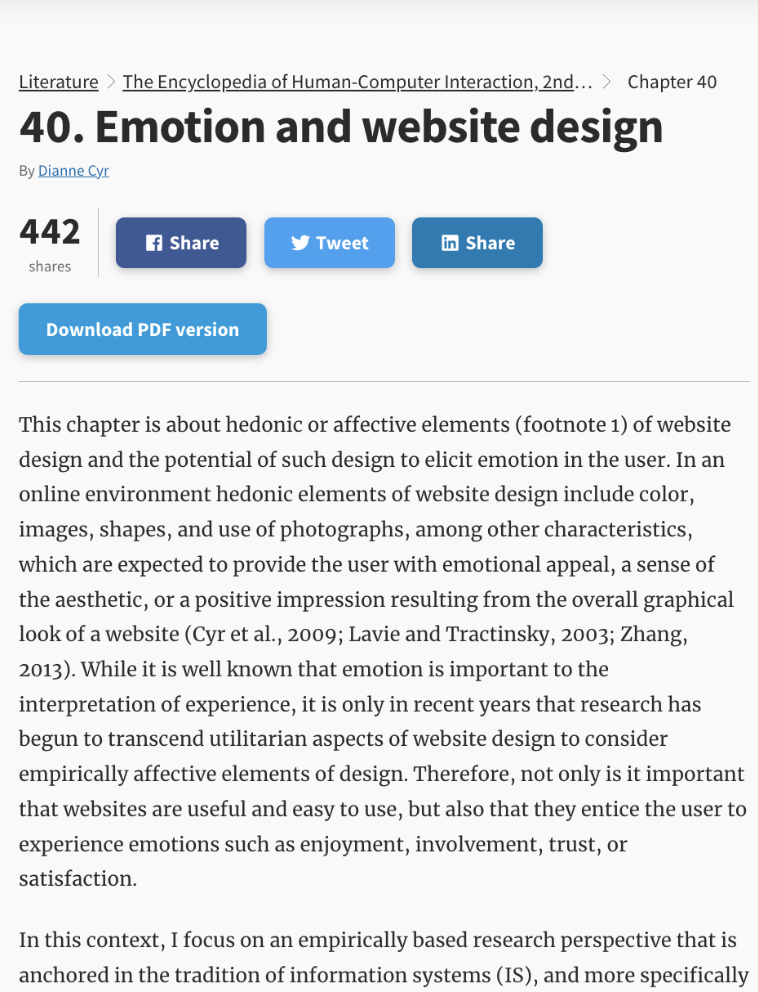
I thought this article was particularly useful in explaining the relationships between colour theories and emotions. Although the focus of this article is on psychology and marketing, I think it prrovides good starting points for understanding how colour plays a role in our emotions.
The Encyclopedia of Human-Computer Interaction, 2nd Ed. →Link to other articles→
WORKSHOP–CASE STUDIES
We did an exercise applying one of the following case studies research methods below to our research
topics. By using either of the methods, we should cover these areas for our research:
• defining the unit of analysis (aka unit of research)
• scoping (aka defining boundaries)
• sensitising concept(s)
• method(s)
• secondary and tertiary sources
• primary sources (where applicable)
The methods are divided into defining boundaries for our area of research:
1. an individual: e.g. a designer
2. an organisation: e.g. a group practice / collective
3. a theme: e.g. a design culture (or visual culture, material culture)
4. a process: e.g. a user journey
5. one item or a set or related items from an archive or
collection: e.g. back issues of a design-related periodical,
photographs and documents from an image archive
6. a location (complex, street, part(s) of a neighborhood
Case Studies
Exercise
Link to
Exercise
→
Defining the unit of analysis (aka unit of research)
-Generative visual Systems as forms representation of Identities in the digital space
Scoping (aka defining boundaries)
-Generative design as
a form of visualisation
-Visual systems as a
tool for identification
-Personal Identities
in the digital space
Method(s)
-Gather existing works that uses a set of parameters in its construction of visual languages
-Look into the different ways of communicating“identities”
-Experience with tools that are made for self-representation/ self-exploration
SINGAPORE COLLECTION ARCHIVE
From this exercise, Vikas also mentioned the Singapore Collection Archive being a good place to start if we are looking at a set of items/collections as our case studies as it it stores collections from way back in Singapore history. There’s even an archive of matchbox designs, stamps etc. ↓
This is a collection archive of works done by Choy Weng Yang. His works caught my eye specifically as he uses a modernist approach in his designs even decades ago. I think this collection is definitely worth a look as it houses many great pieces of design.
↘ Link to profile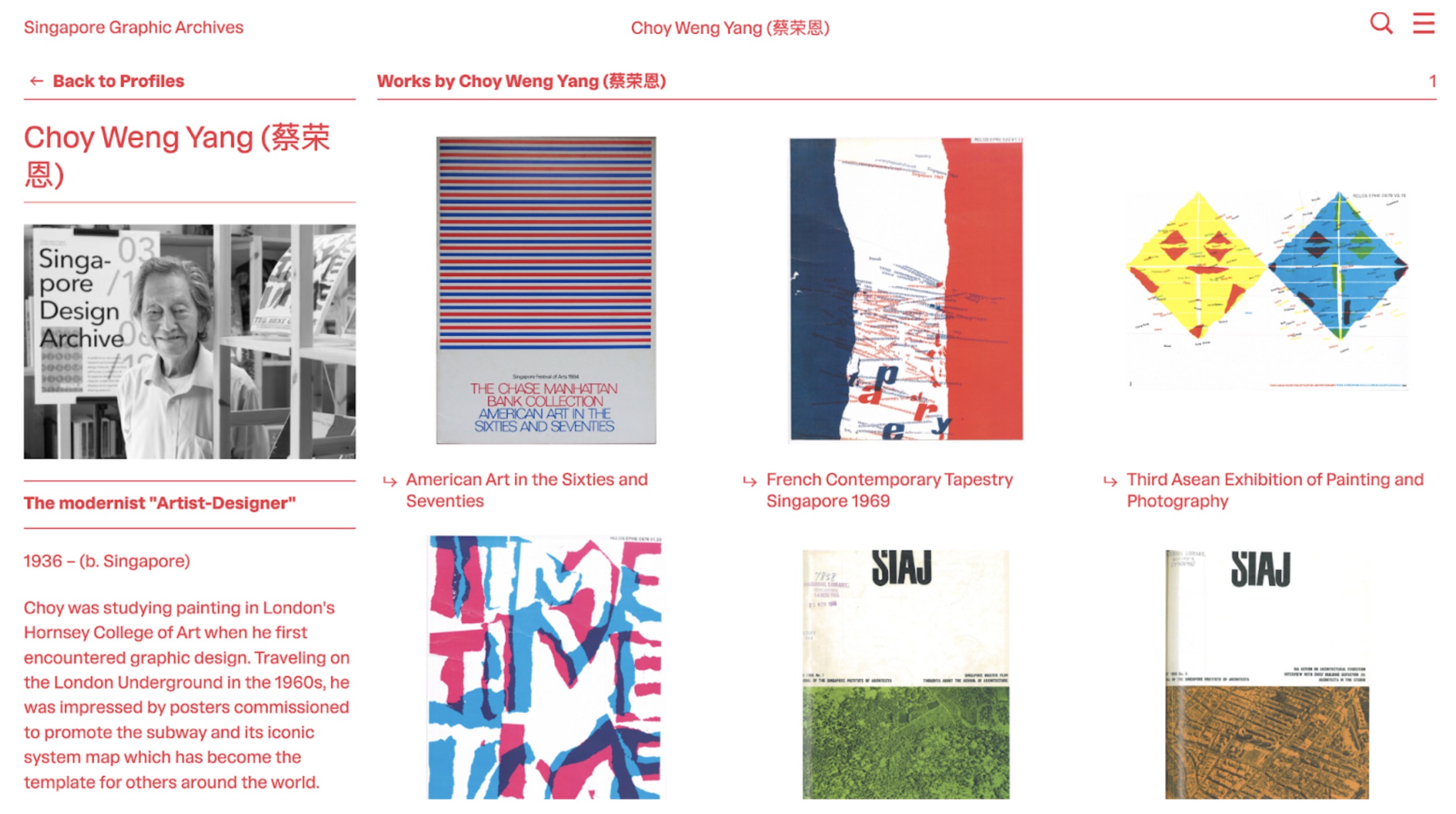
-
"Spurred to learn more about graphic design Choy signed up for evening classes in the London College of Printing. At Hornsey, he also took up courses in fabric design and theatre lighting. Besides such formal education, Choy also learn about graphic design through browsing various magazines where he picked up the importance of typography as well as ideas of “simplification” and “systems”—the tenets of modernist graphic design." – Choy Weng Yang Bio
-
A quote from his bio that I thought was interesting as the page talks about how his designs uses the idea of “systems” which was what first caught my eye. After looking through his colllection. I started to gain a new sense of “systems” as well.
-
↘ 1985 National Day Art Exhibition
I found this poster in the collection and found it pretty similar to Swiss Style designs, and the use of colours reminded me of last semester where we analysed Josef Albers’s concept of colours. From this poster, I found out that the designer was actually a Singaporean who had attended Josef Albers class as a student!!
Image: 1985 National Day Art Exhibition. Lim Ching San,Choy Weng Yang 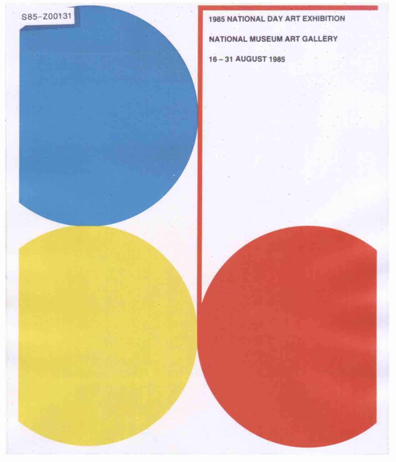
Other works that
I
found to be related to my topic
-
↘ My Life in the Year 2000
Invite for an exhibition featuring entries from a drawing competition to commemorate the International Year of the Child.
Image: My Life in the Year 2000. National Museum of Singapore. 1979.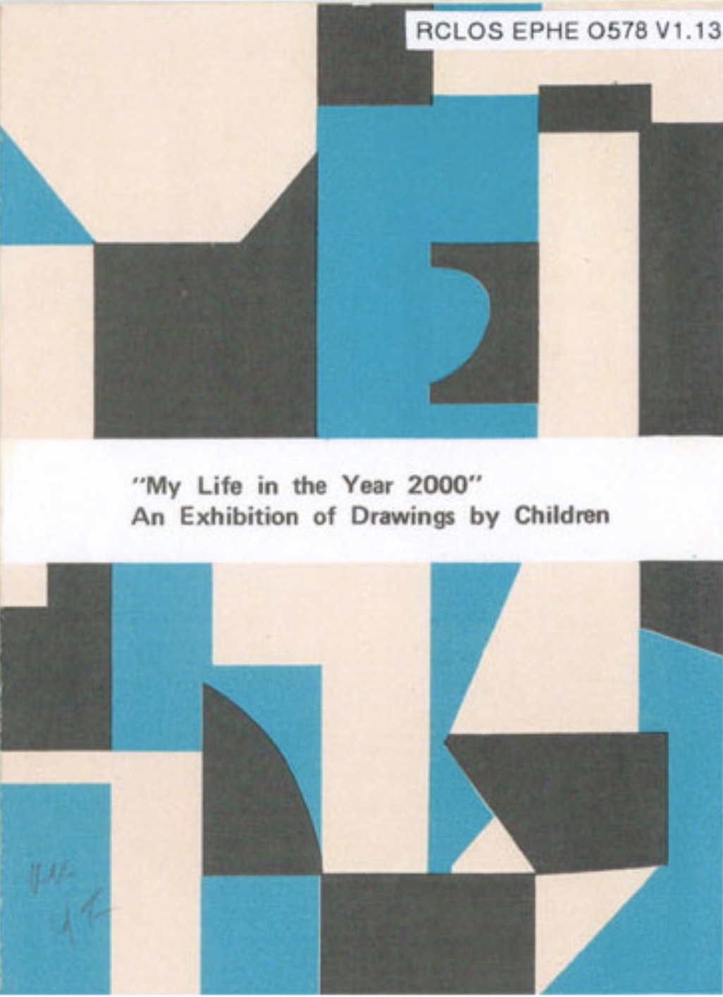
The cover of this ephemera was actually what caught my attention. The systematic use of shapes and colours to build the pattern was something I wanted to try out myself in my topic.
-
↘ Baharuddin Vocational Institute
The magazine showcases the works, staff and students of Baharuddin Vocational Institute (BVI). On the cover is a pattern created from BVI's crest.
Image: Baharuddin Vocational Institute. 1971.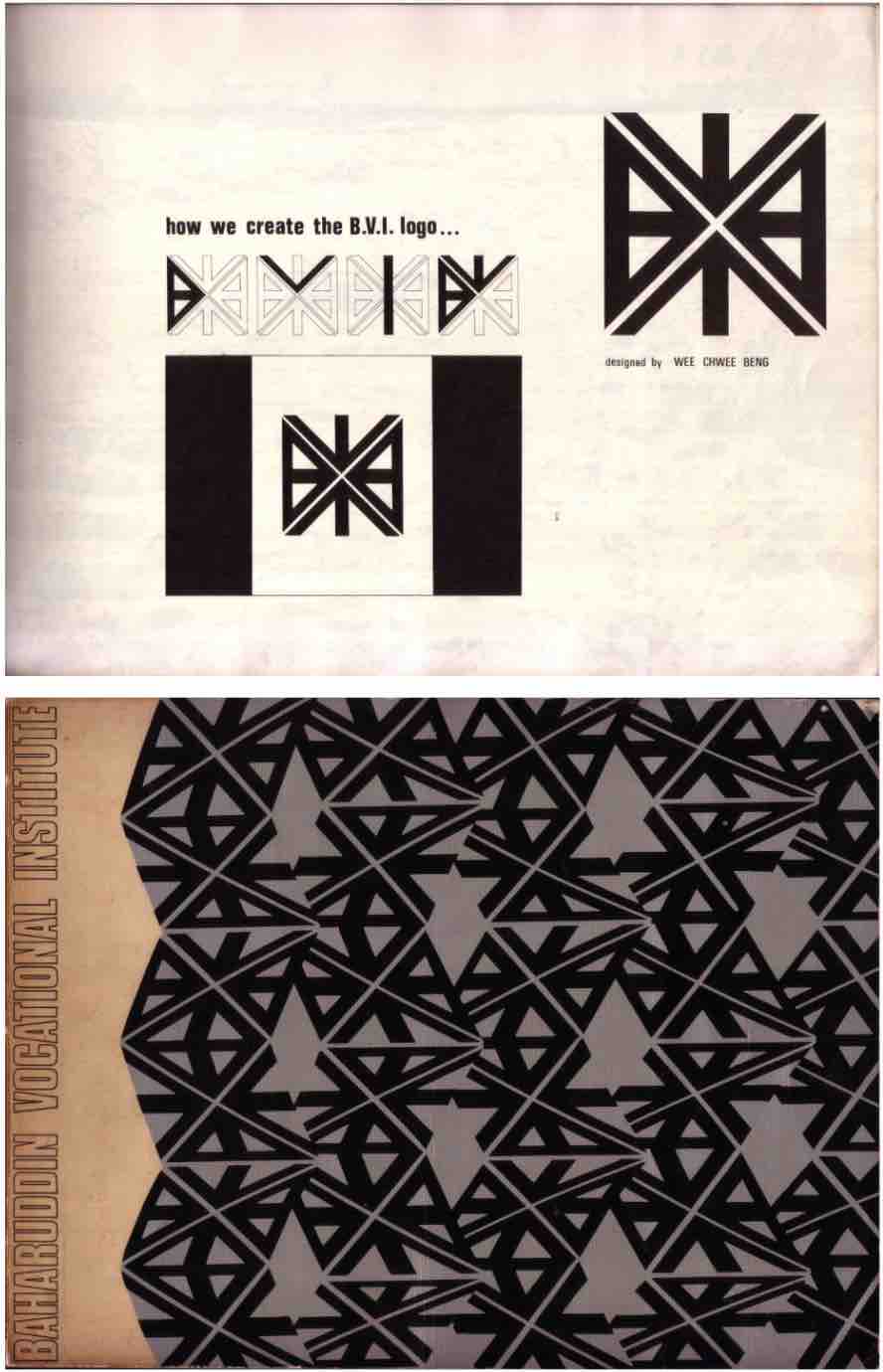
Interesting to see how a logo form is being broken down to create a pattern that acts as the visual identity of the institute.
PEER TUTORIAL ON ARDUINO
WHAT IS ARDUINO?
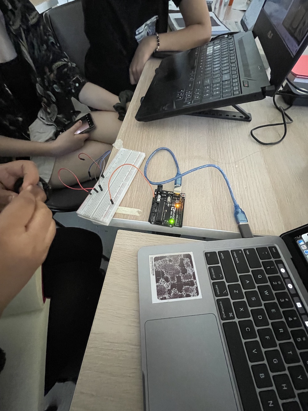
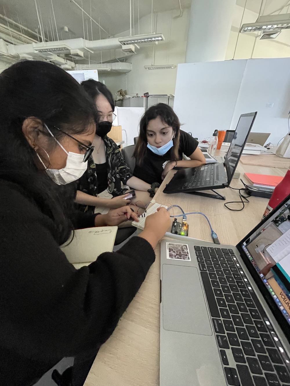
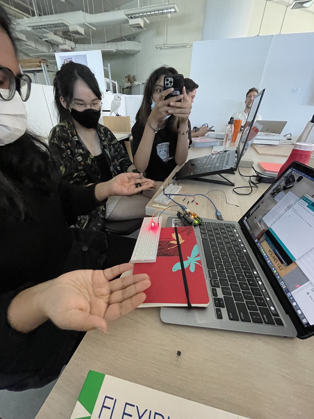
A small tutorial conducted by Aditi where she went through the basics of what is Arduino and how to use connect them to all these circuits and tools in order to create something tangible and interactive.

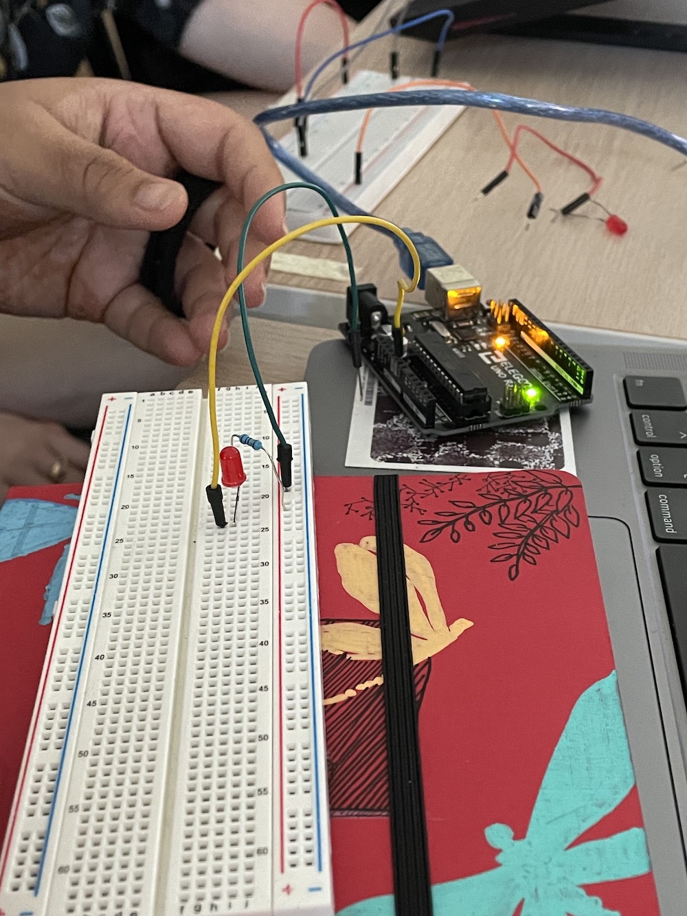
Here she showed us how to use Arduino to control the flashing of light. She showed us the functions of each wire and the placements of each element to create a workable circuit.
This impromptu tutorial had been such a fun learning experience, despite it being a short one, I’m glad to have been introduced to these set of tools as it presented so many possibilities for how we can push our ideas and experiments further by incorporating something physically interactive. This session definitely got me thinking of new and exciting ideas that I would probably not have thought about before.
CONSULTATION
Getting feedback for code experiment 1
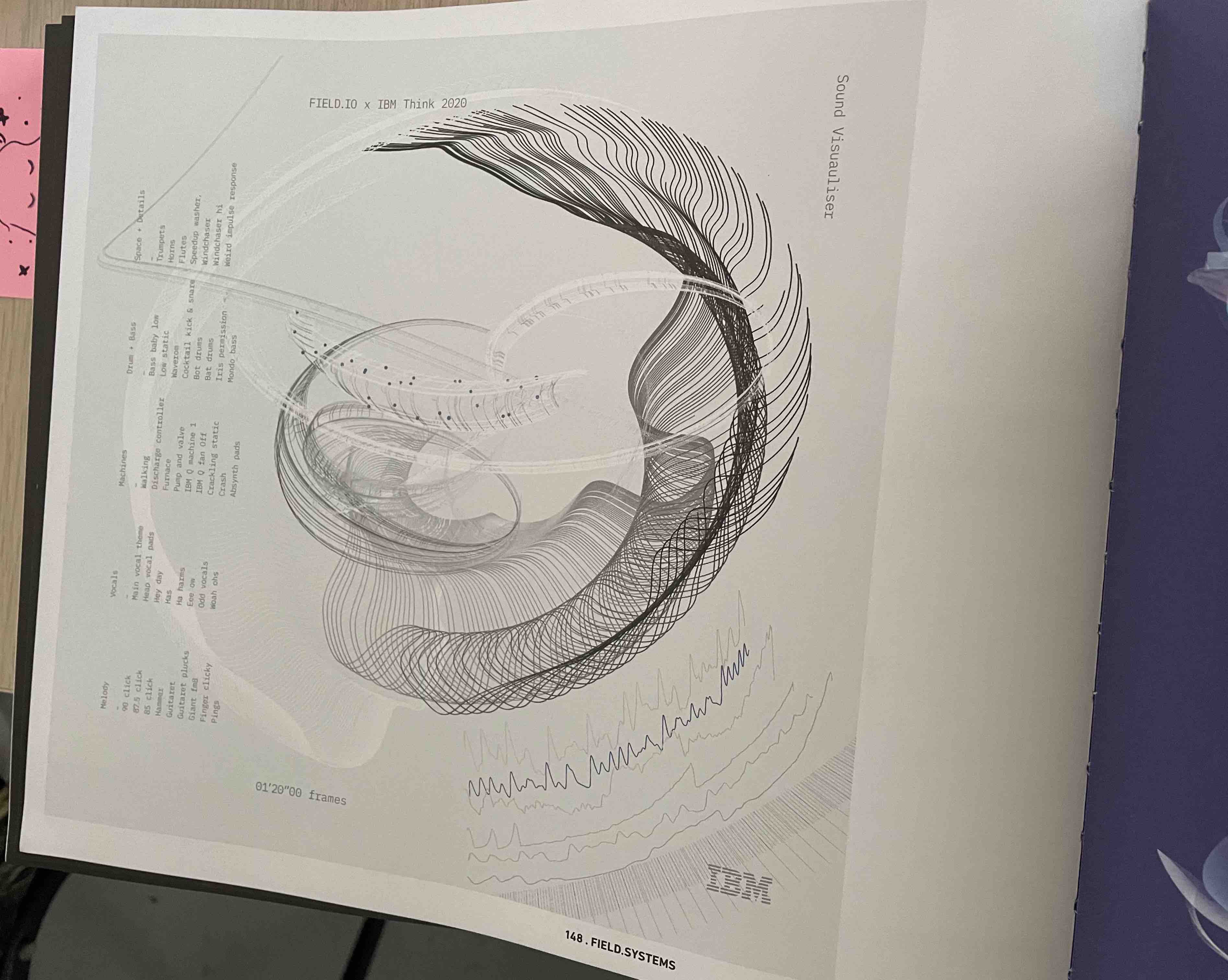
During our discussion, it was also pointed out from that sometimes simple visualisations can be more effective than making something complicated.Data visualisations should not be too complex and abstract which becomes difficult for readers to understand what the visualisation is trying to convey, for instance in the The Age of Data: Embracing Algorithms in Art and Design, there was this example of a data visualisation that had alot of miniscule details within the visual which kind of makes the information hard to grasp and somewhat unclear as the visual is drowned with overwhelming information.
Book: Niggli Verlag. The Age of Data– Embracing Algorithms in Art & Design. Braun Publishing AG. 2021.
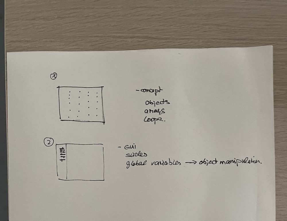
Also, during the consultation, Andreas went through
the different ways in which I could approach the visual system through code, is it through a grid system like experiment 1 or an interactive tool like experiment 2. And what ingredients go into each approach, like how arrays and loops will be needed for a grid system however, functions like sliders and variables will be needed for the manipulation of object for interactive tools.
CODE EXPERIMENT 3
RE-ATTEMPTING TO CREATE THE GRID SYSTEM
SHAPES
COLOURS
SLIDERS
MBTI TRAIT
For this experiment, I wanted to try visualising MBTI traits. As many young people nowadays identiify themselves as their MBTI personalities, I think it would be a good starting point to look into MBTI traits as a representation of our actual identities. MBTI is an easy way for people to identitfy themselves and form commonalities with others, hence for some MBTI has become a part of their identities.
↘ Myers-Briggs Personality Type DatasetTaken from the above dataset, each slider will be used to represent an axis: Introversion (I) – Extroversion (E), Intuition (N) – Sensing (S), Thinking (T) – Feeling (F), Judging (J) – Perceiving (P)
-
Draft 1
Getting a hang of associating functions to sliders–using slider values to change the size, colour and rotation of elements.
-
Problem:
Still trying to fix the grid system – managed to assign one type of shape to the grid correctly, however once I include other shapes, those shapes take on the same grid position, as a result it causes some overlapping between different shapes as seen in the draft.
-
Draft 2
Trying another variation of the grid system, whereby the sizes of the shapes are the same and constant while the rotation and colours change, to make the reading process less complex. Also using the semi-circles from Draft 1, I combined them to form a circle, kinda like a piechart to show more depth into the traits.
-
What I liked:
I quite liked the look of the grid system, where all the shapes are neatly organised and of the same size, which makes it less messy and confusing to look at. Also it resembled a pattern in a way! -
Problem:
However I did still find it a tad bit chaotic with all the rotations and colour changing since they were not in sync and only some changed accordingly.Also the semicirle combis were not perfect since it was manually positioned to fit together.
-
Draft 3
From Draft 2, I had the idea to create a pattern out of the grid system, so in Draft 3 thats what I mainly explored. To do so, I used only one type of shape, in this case it was a semi-circle. I removed the random function from the visibility to display the shape on every cell of the grid. I used two colours for each side of the semi-circle which would combine to form a full circle. By scaling up the size of the circles, the overlap of circles created this optical pattern. Then by applying the rotate function to the slider, the user was able to control the movement and formation of the pattern. I also added the slider values to the colour of the semi-circles, which made the colours of the semi-circles inverse as you move the sliders.
-
-
What I derived
For the final outcome of this experiment, I revisited the original idea which was to create a grid system that depicts your MBTI traits. Instead of creating a pattern or use different shapes to represent each trait, I decided to keep it simple. Using only cicles and different colours to symbolise different MBTI traits, the sliders will determine the visibility of the circles. As such, when you move the sliders, the amount of circles will appear on the grid. At the end of it, a system of coloured circles will showcase your MBTI pattern.
-
Problem:
I feel like the idea of identity through just a grid of circles still isn't obvious enough, I can't tell how the pattern represents my identity. Moving forward, that will be something to work on–creating a visualisation that better depicts the idea of identity as whole instead of just visualising one aspect of identity.
