1 / Research Topic
Presentation & Feedback
2 / Design Research + Case Studies
3 / Conference Papers
+ Proceedings
4 / Podcasts
5 / Effective Computing
Sharing By Matthew
6 / Research Mindmapping
7 / Code Experiment 1
8 / Code Experiment 2
RESEARCH TOPIC PRESENTATION & FEEDBACK
Insights from peer presentations
↘ BYSINGHONG
–Soundwalks//inspiration on how computation is used in the visualisation of sounds from nature/investigating the relationships between human and the environment
↘SERIAL
–inter-media studio that blends digital and analogue to curate experiences//local inspiration for digital experience works
↘EXPERIMENTS WITH GOOGLE
–good source of case studies on different types of computational design that involves AI, VR, creative coding etc.
Link to current research topic presentation slides
Feedback from presentation
Focus on building tools-like photoshop and illustrator they are building tools.
Buidling tools with slides that allows us to customise values
Keywords to take note
- Unseeable
- Senses and emotions
Future Readings
- For the books, expand on these three pillars
- Explore a different discipline for the sensory design book
- The visual thinking book should explore the present visual thinking as it may differ from 50 years ago
- Compare how the two visual thinking differ and change
Moving forward
Start small exercises building your own emotion icon, try out the typographic visualisations
DESIGN RESEARCH + CASE STUDIES
Using Data to Connect Global Teams
This article shows how a digital system is being used as a set of help managers pinpoint the right internal experts and identify new opportunities for collaboration across global teams.
I found this article pretty interesting, how they were able to use data about people and map them to
suitable partners for a more fruitful collaboration. In a way this helps to take away to confusion
that many face when set back with a challenge and not knowing who to get help from or who to work with
on a project etc.
Article: IDEO. Using Data to
Connect Global Teams. 2013.
CONFERENCE PAPERS + PROCEEDINGS
Data Visualization as Portraiture: An analysis of the use of personal data in the visual representation of identity
This article analyses aesthetic and design artefacts that represent the identity of an individual through the visualization of personal data, focusing on their reflexive, documental, and biographical potential.
Motivated by these ideas, this paper is part of an ongoing research that
explores the concept of “data portrait” as coined by Xiong and Donath to describe “representations
of
people made by visualising data by and about them”
(Donath 2017, 187).
Sampaio, Catarina &
Ribas, Luísa. xCoAx2022. Pp.204.
I found this term “data portrait” really interesting as its like a combination of the computer as a machine with humanly traits. It also sparked a thought–using computation to represent humans, data to our identities
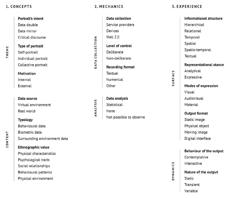
Found this section from the article sharing the different categories for application which I thought could be helpful at a later stage for experiment purposes.
Typology Of Data
–namely their physical characteristics, psychological traits, social relationships, behavioural
patterns, or their
physical environment.
Experience Of The Data Portrait
–which can be hierarchical, relational, temporal, spatial, spatio-temporal, or textual.
the representational stance of the visualisation can be analytical (if the visualisation favours
legibility) or expressive, when it favours a subjective experience of the data, or an aesthetic
experience promoting reflection and inciting emotional response.
Modes of Expression
–visual, audio-visual, or material, and the output format of the visualisation system can be a
static image, a physical object, a moving image, or a digital interface.
Nature Of The Output
– the nature of the output can be either static, transient (time-
based) or variable (real-time).
–the overall behaviour of its output can be merely contemplative or devised as an
interface allowing interactive exploration.
Article: Sampaio, Catarina & Ribas, Luísa. Data Visualization as Portraiture: An analysis of the use of personal data in the visual representation of identity. xCoAx2022. 2022.
Another conference paper that I read was the "Computational Aesthetics of the Collective Affective Dynamics of IMDB Movie Reviews", which I found to be useful as well as it covers the practices and methods used to visualise emotional states through a generative artwork.
Computational Aesthetics of the Collective Affective Dynamics of IMDB Movie Reviews
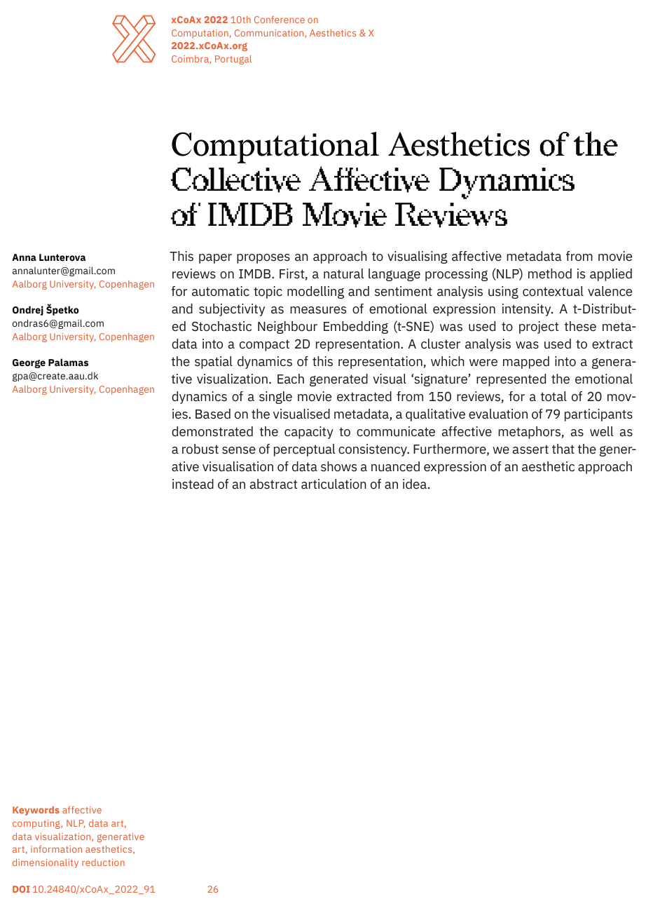
This article explores interdisciplinary concepts, such as machine learning, visual communication, aesthetics and art through the assessment of emotional metadata of IMDB movies.
After reading this article, I found some underlying connections to my current research topic. The article introduces lots of concepts on understanding the human emotions and sentiment analysis of such abstract data. It also discusses the visualisation approaches and methods used to depict these complex information through art, which I found extremely helpful!
Listed down some keywords which I found interesting from this article:
emotion
metadata
data-driven
neuro-aesthetic
emotional dynamics/states
psychological subsystems
Article: Lunterova, Anna, Špetko, Ondrej and Palamas, George. xCoAx2022. 2022.
PODCASTS
Design Disciplin
Helps to create that link between you as a designers, practitioner and researcher
1. Research for Design - for the artefact
2. Research into Design - more theoretical, doesnt look into the disciplines
3. Research through Design - context that you want to build
Focus on Research through Design
→ Link to podcastNear Future Laboratory
Listened to the
Nº43–Computer Art Pioneer Herbert W. Franke & Susanne Paech
I thought it was pretty insightful on the perspectives on what is considered “aesthetics”and “art”especially through the collaboration between us, humans and machines. Susanne also talked about Herbert’s interest in using the computer to construct visual art, as he believes that visuals should be dynamic and machines like the computer is a partner-collaborator that helps to achieve that.
→ Link to podcastApplying Frameworks
Setting the tone for your idea
Challenge or overlap/overlay the frameworks to find the most ideal path and trajectory
I think my current research topic fits into the third framework–experimental design as I will be using generative design as an approach in my explorations.
1. A commercial design agenda centres on profit
-make money
2. A responsible design agenda centres on serving the underserved
-something that is responsive
3. An experimental design agenda centres on exploration-structure
- don’t have a plan → make plans, testing, note the outcomes down and repeat the experiment- through
iteration → approach something with value, impact and knowledge
4. A discursive design agenda centres on audience reflection
- going into the community,
RESEARCH MINDMAPPING
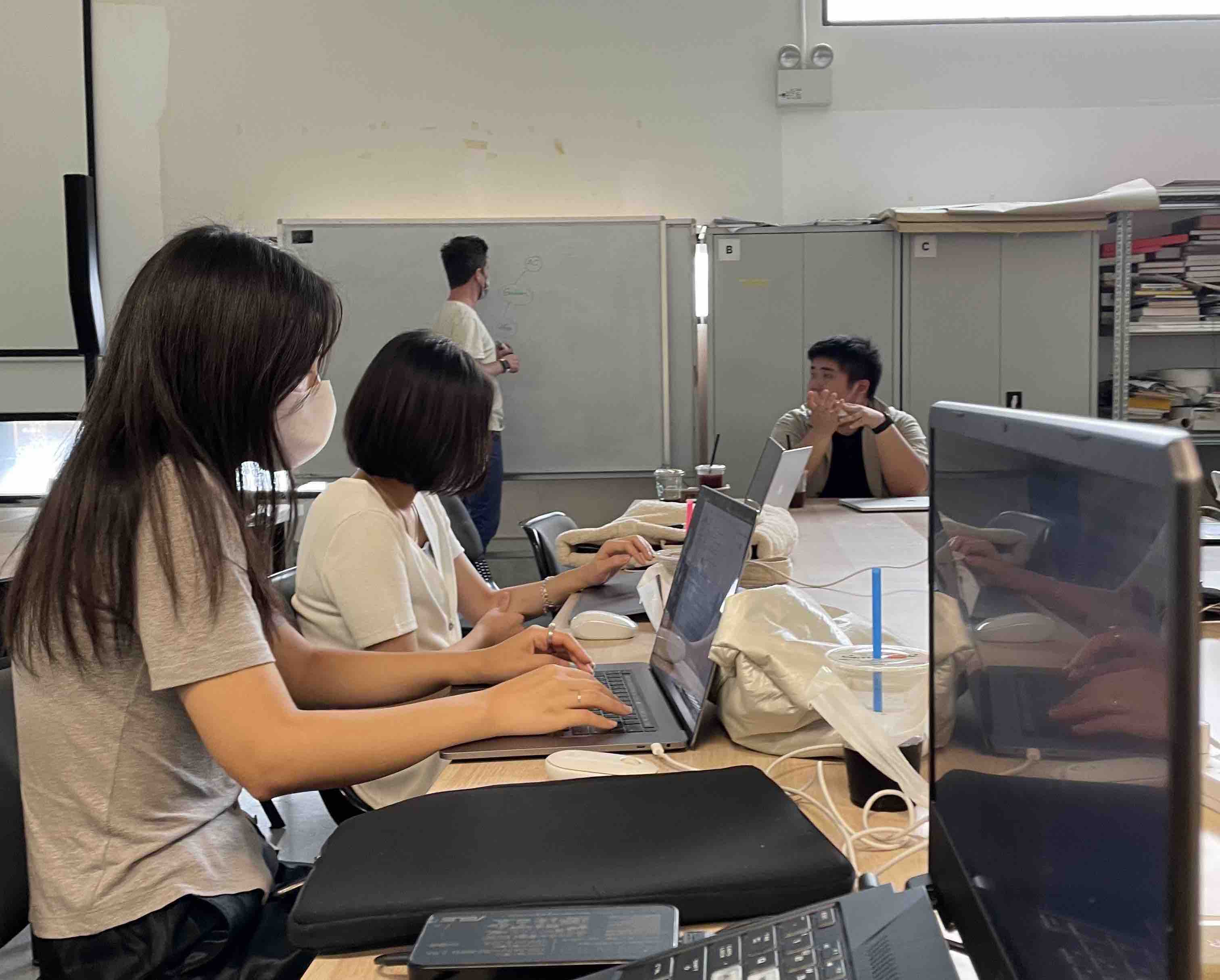
For the in-classs activity, we were tasked to mindmap keywords from our research topic and break them down into categories like methodologies/frameworks etc.
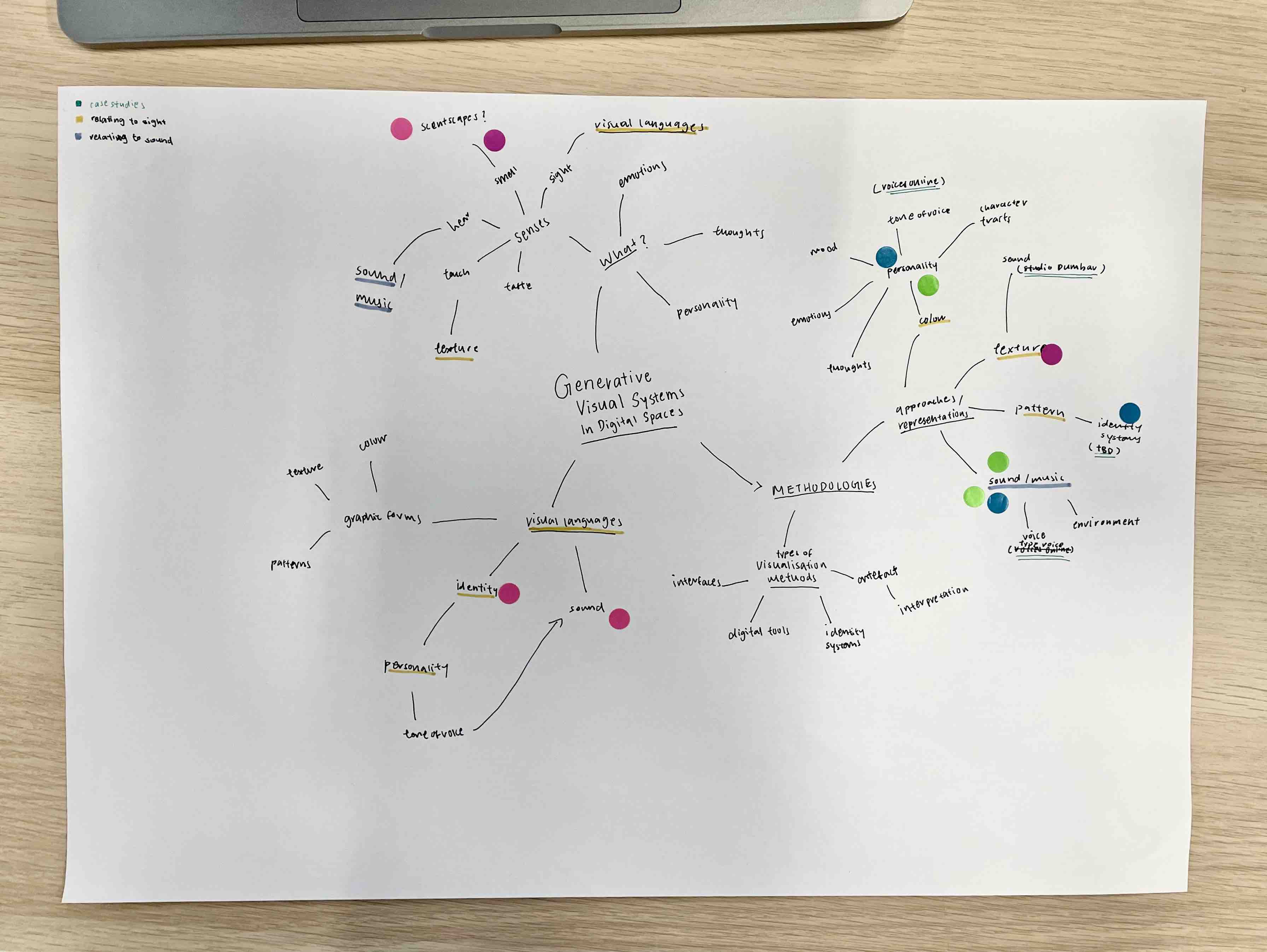
Image: Research Topic Mindmap. In-class Activity.
From my current research topic, I mapped the topic into three categories: methodologies, what subject matter and what visual language. The category–what subject matter– is broken down into the possible themes that I will be researching on such as senses, emotions and personality etc. Visual language delves into the types of visual languages that can be communicated through generative visual systems. Methodologies are further divided into two sub-categories, approaches/representations where I listed down keywords of the different visual forms that could convey the meaning of the subject matter and types of visualisation methods where I explore the mediums to produce the visual form.
CODE EXPERIMENT 1
Trying to create
a system with different
voice icons
STARS
POLYGON
ELLIPSE
CIRCLE
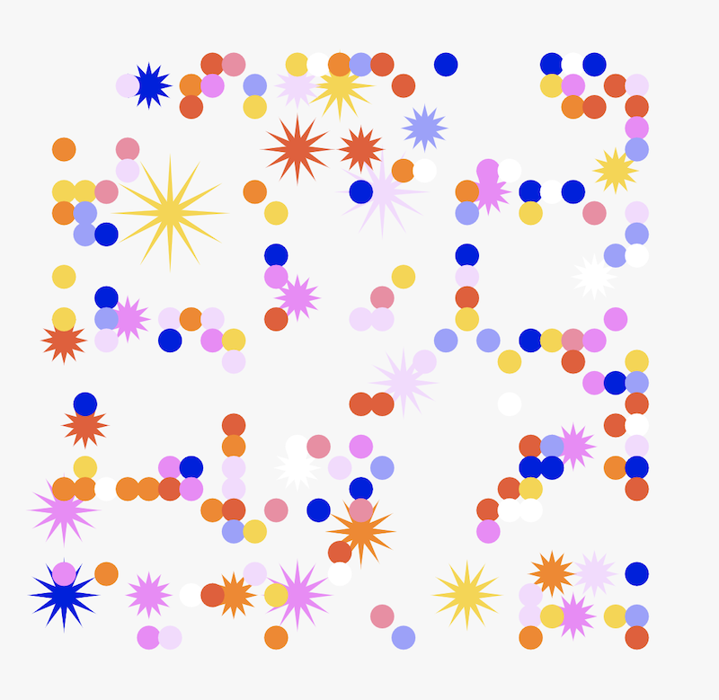

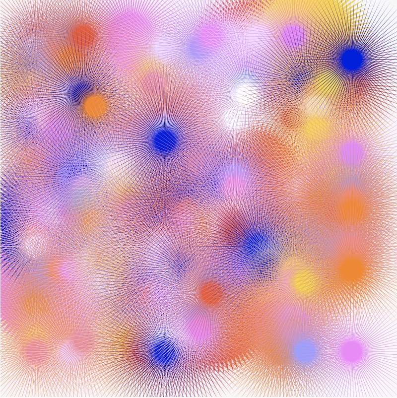
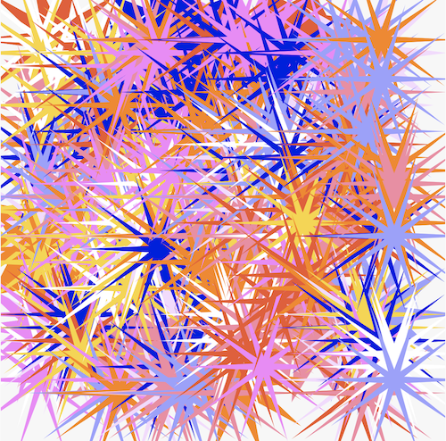
Instead of squares and circles, I decided to use stars as the variations of shape asa a polygon allows the basic shape to take multiple different forms. With the different number of edge vertices, this could help to represent the various emotions I’ve listed down. The different coloured stars communicate the complex emotive traits. The colours symbolise the emotion behind the voice, while the number of edge vertices that determines the look of the shape can symbolise the tone of voice. Lesser vertices forms a more rounded, or even square-ish polygon which can be interpreted as a deeper tone of voice , while more vertices forms a sharper star which can mean loud and striking tone of voice.
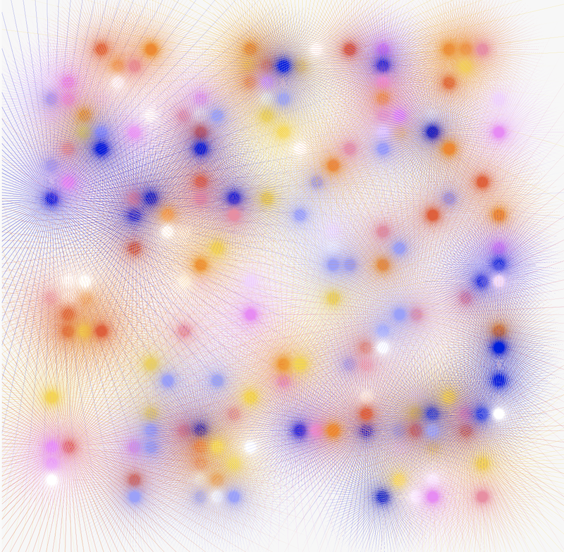
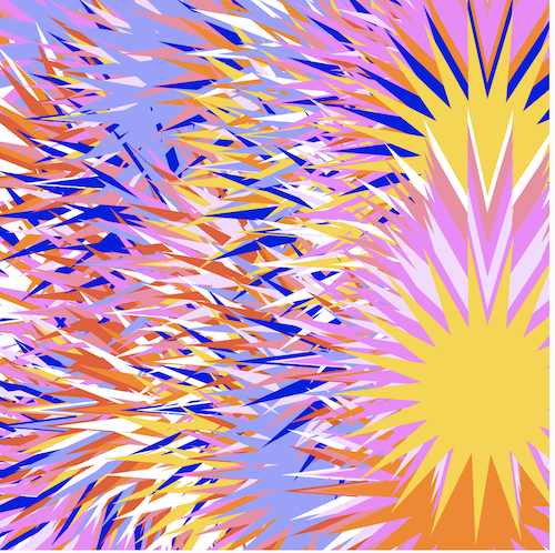
In my further explorations, I tried increasing the star vertices to an even higher value which resulted in the above^. The vertices became so thin, that the originally spikey and loud form almost disappears and instead, the thin vertices give off a soft and wispy look which presents a whole new interpretation for the tone of voice here.
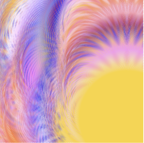
The final output of this exploration while using an extreme value for the star polygon vertices has achieved a different look and feel of the original idea of “systems” – a clear constructed visualisation of symbolic representations of our voices. In this route, the outcome was more interpretive in a sense, where the visualisation takes on a aesthetic approach in communicating the tone of voice. The overlapping of star polygons, and the lines created by the edges of the stars, create a “buzzing” effect that is similar to the sound frequency of our voices.
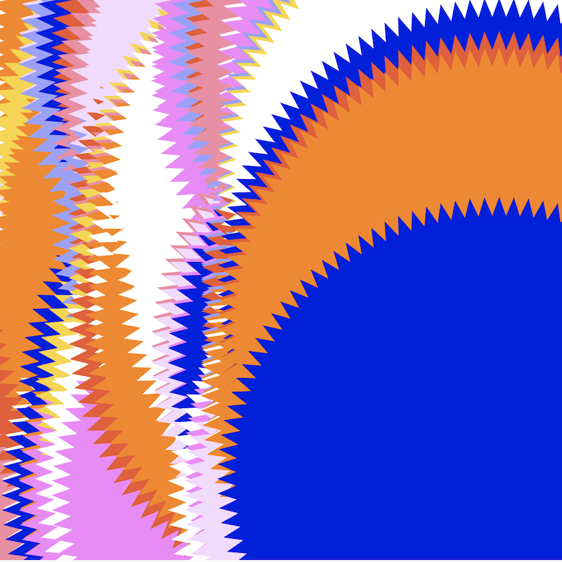
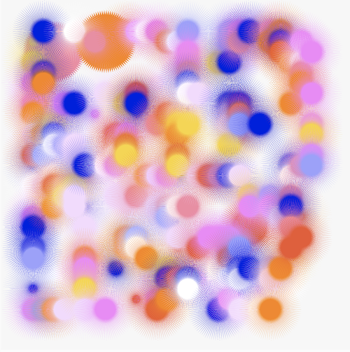
In this other exploration, I tried visualising the idea in a different approach as compared to the style in the previous visualisation. This exploration focuses more on solid graphic forms. Using the same method of overlapping the symbols to create a visual form to represent our tone of voice. I think this is a clearer way of making distinctions between different colours, However, in the midst of this visualisation I realised that the different shapes seem to be lost in this exploration, hence it doesn’t accurately depict the tone of voice as a result.
CODE EXPERIMENT 2
Using sliders to
control gradients
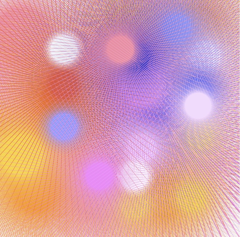
This experiment is an attempt at using sliders to interact with shapes and colours. Slider values are being assigned to the shape, as the slider moves, the shape is being multiplied to give the illusion of the form being manipulated and distorted. Through this experiment, I was also able to practice how to assigin variables to sliders, and using inputs from the slider to change the characteristics of the shape.
In the sketch above, the first slider changes the form of the circle, while the second slider gradually changes the colour of the circle by adding in a gradient as the slider moves.Tried to control the gradient of colours through sliders, but it didn’t work out that smoothly.
