1 / Selecting List Of Methods
2 / Applying Methods
3 / Peer Sharing & Feedback
SELECTING LIST OF METHODS
Survey
Virtual Ethnography
Symbolic Interactionism
Open Coding
Clickable Prototype
Meaning
Interpretation
Data Saturation
Visual data
Visual data displays
Tentative Methods:
Raw Data?
Internet In Qualitative Research?
Imagination In Qualitative Research?
Here are some methods I’ve selected based on my current research topic. I’ve chosen these methods in relation to the experiments I will be conducting and hopefully by using these approaches, this will further my research to gain more insights.
The above methods are selected from the Sage Encyclopedia of Qualitative Research Methods by Lisa M. Given in 2008.
APPLYING METHODS
Clickable prototype
To start off my exploration of using methods and approaches, I tried to match my experiments to the list of selected methods. Ultimately, I decided to use ‘Clickable Prototype’ as the methods for this code experiment as I think the steps for these methods would complement the evaluation of the code experiment the best as compared to other methods at this stage.
↘ Link to toolkit
There are four steps to this method
When: User behaviour input
Why: To check if the design behaves as intended
Output: An overview of which problems are at the core of a project, and which are concrete
Next Steps: Evaluate, process, adjust, iterate
-
USER BEHAVIOUR INPUT
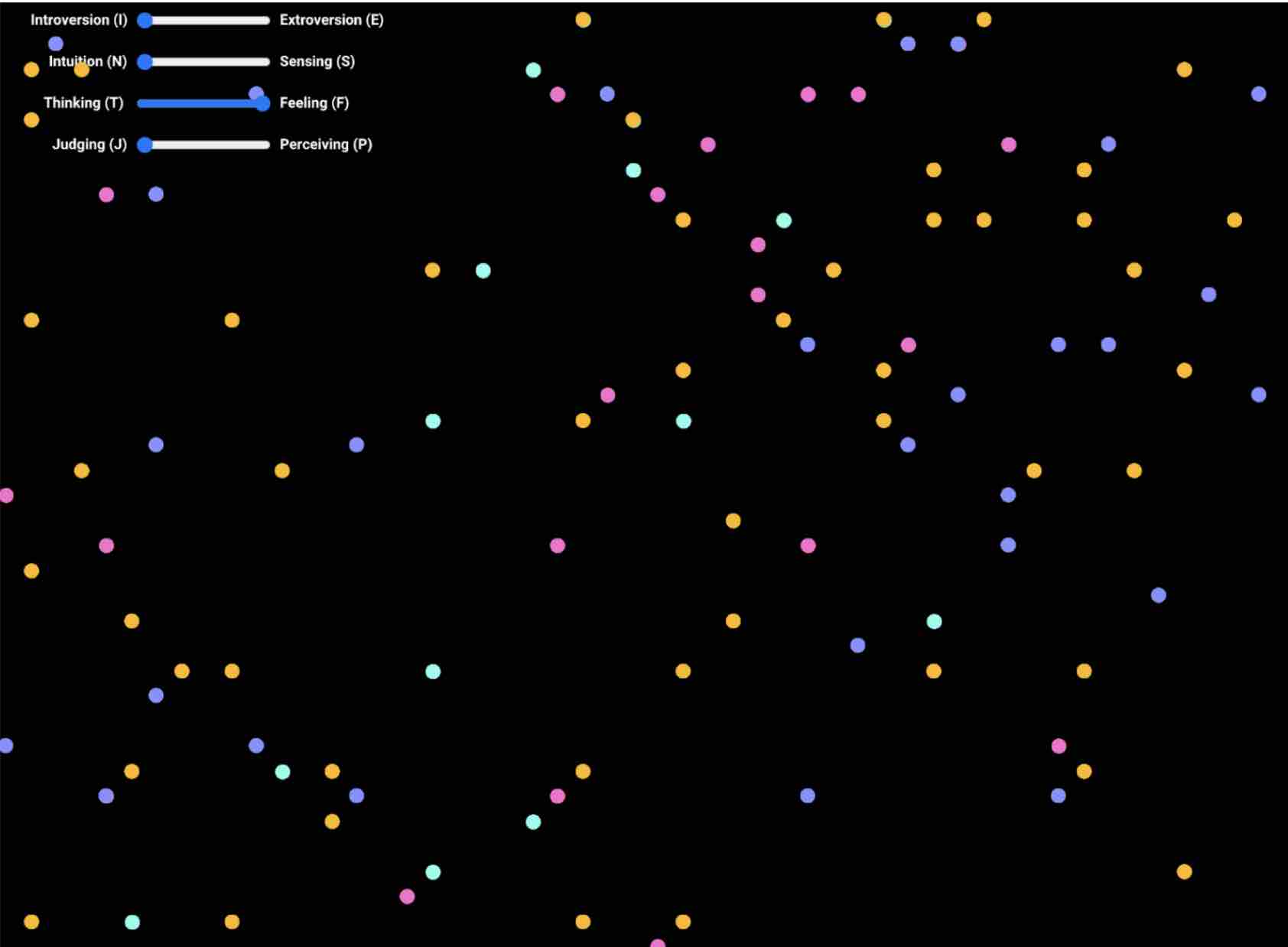
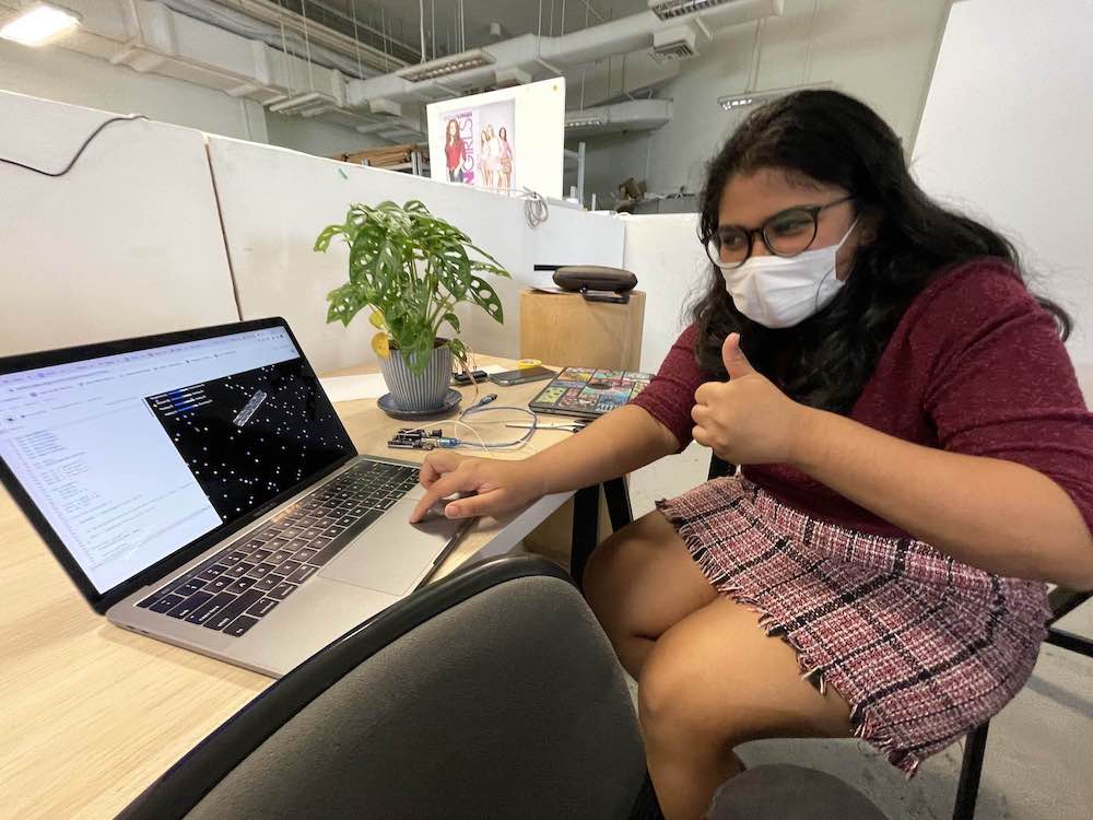
Tried this code experiment with three peers, Sadhna, Aditi and Matin. They were given the task to map their personal MBTI to the sliders in order to visualise their MBTI through a set of dotted grid patterns. However, after they have plotted down their MBTI traits on the sliders, the visualised outcome was not as ideal as the generated pattern is too scattered to create any comprehensible form. For instance, the above image shows Aditi’s MBTI– INFJ mapped using the sliders, however the generated visual from that data cannot be readily perceived as a pattern as the generated dots are too spread out and shows no correlation between the visual and the data to give meaning to the values.
-
INTENDED DESIGN
The code experiment does not provide the intended outcome as a data-centric pattern is not visible through the experiment. The pattern should be unique and easily recognisable to the user and should hold some tangible value to enhance the identity of the user through the mapping of MBTI values. However as the pattern is not obvious to the user, the outcome is not as ideal.
-
PROTOTYPE PROBLEMS
Visual data portrayed through the patterns become less obvious when lesser dots are generated, however the prototype becomes laggy when more dots are generated. The patterns are compromised by the generated dots. There should not be a middle ground between the two extreme MBTI values, hence a slider may not work as effectively in displaying the MBTI traits.
-
RE-EVALUATION
For the next code experiments, the grid system should be adjusted to create a more effective pattern. By either increasing the iteration of generated dots within the system to produce a visually denser grid system to be able to identify shape forms and patterns within the grid, or by enlarging the dots to fill up the empty spaces as a way to make the pattern easily recognisable while having less dots generated to prevent lag of the interface.
All in all, this evaluation of the code experiment through the method–clickable prototype has been really beneficial as it provided quite an in-depth understanding of the user experience, the prototype functionalities and problems.I believe this is an essential step in producing user-centric solutions for my future experiments, hence this method should be a key aspect for my approaches later on.
PEER SHARING & FEEDBACK
After completing our methods applications, I was paired up with Aditi to share about our processes and outcomes for the activity.
Image: Aditi trying out the
clickable protoype code experiment
Feedback from Aditi
-
She only remembers her MBTI percentages for instance introvert to extrovert 49%/51% In the MBTI survey, there’s usually an indicator of what percentage of each characteristic you are, so it would be good to include that so that it would make sense for there to be a range of values using the slider. When faced with the issue of not knowing what makes up an identity: Aditi also shared that another way to look at it is through zodiacs. As lots of people identify with their horoscopes, sun/star/moon signs etc these days, to them these traits would be the ones that define their identity as a result.
-
This provided me with a new perspective on personal identities–as I was so focused on identities in a more ‘scientific’ point of view, this showed me another way of viewing identities through a more cultural lens.
-
During the sharing, she also mentioned the use of cameras in data visualisation. For instance, using a camera to record the appearance of the individual and using that as data for representation. She shared a work that she remembered seeing last year, where a camera was used to capture the facial features of the individual and using that to create type. A person who has a rounded face would have a bubbly typography. She also shared with me a work done by
↘ Pentagram , for the Mellon foundation, where they did a flexible visual system using the ‘M’ of the logo, using it as a dynamic visual form. She suggested looking at dynamic shapes instead of grids, or using other forms of shapes instead. Another thing brought up was fingerprint scanning–this could be a fun way of interacting with the individual while building on a sense of identity -
I thought this was an interesting suggestion and looked into the use of fingerprint scanning through code. I started to think of ways that maybe fingerprints could act as a mode of interaction between the user and the interface?, maybe to establish human-technological connections? A method to enhance the sense of identity? Not sure about the technicalities of using fingerprint scanners, I did a quick search online for tutorials to do so. I chanced upon this video where this guy connected the fingerprint scanner to java. It's not the most accurate tutorial for what I want to achieve but it does show me a starting point in how I can connect code to the device.
We also discussed how personality is interesting as it is something that is always changing and transforming so maybe this project could allow the user to see how their personalities change. They can even come back in a year and do the visual test again to see how they progress and change. We also discussed how personality is interesting as it is something that is always changing and transforming so maybe this project could allow the user to see how their personalities change. They can even come back in a year and do the visual test again to see how they progress and change.
-
↘ Dear Data Project
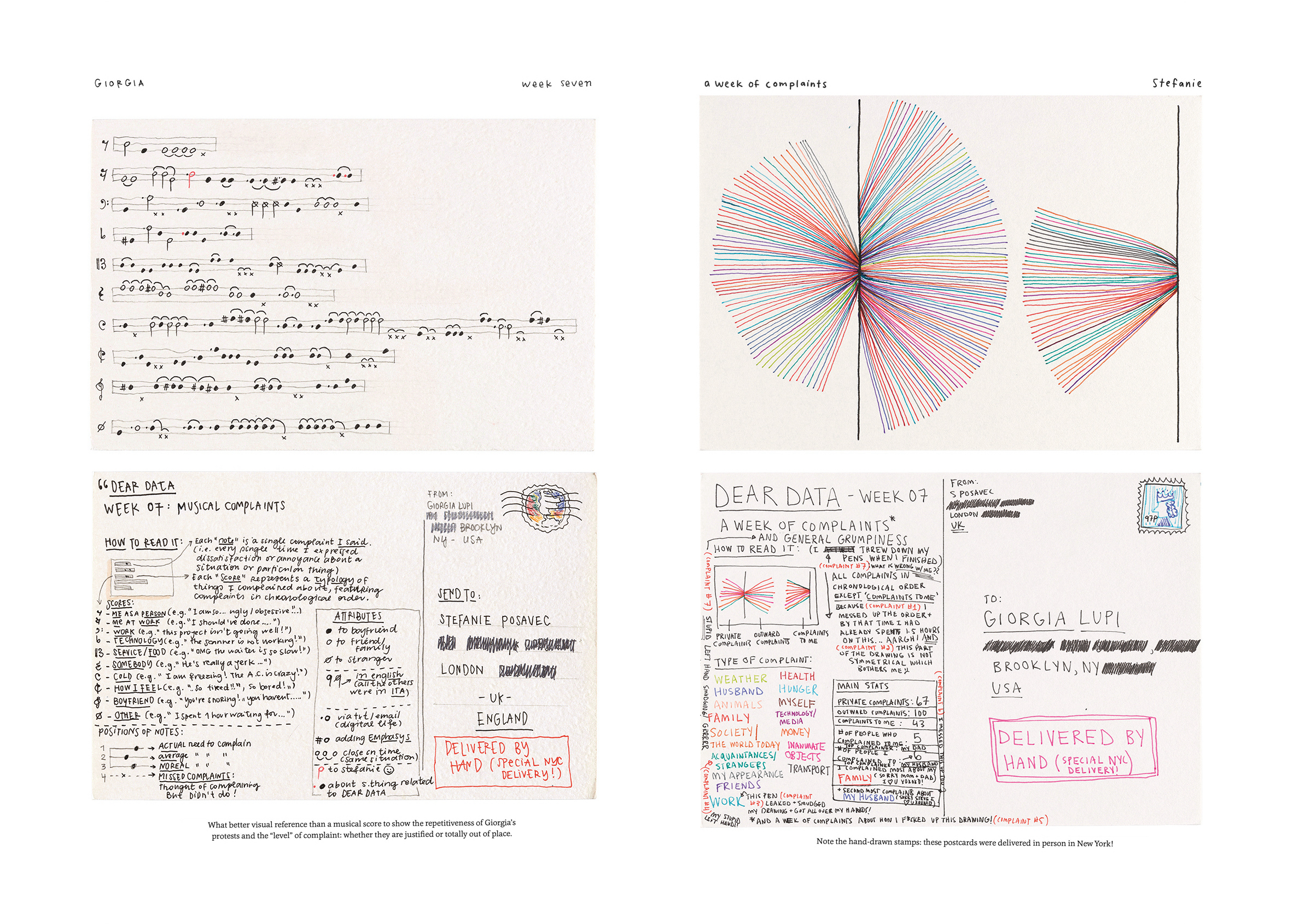
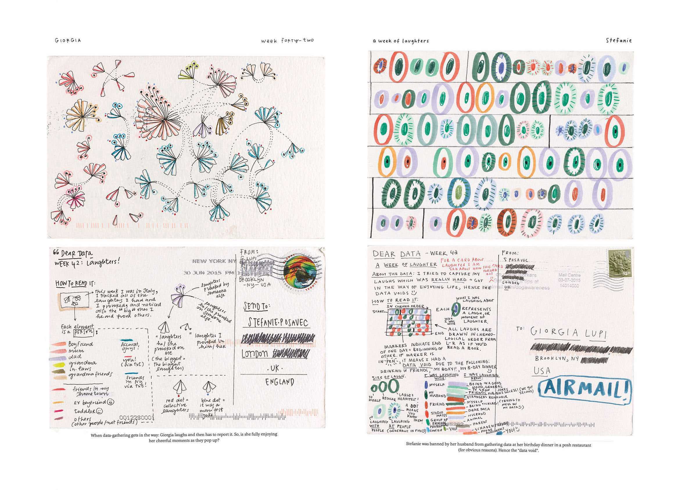
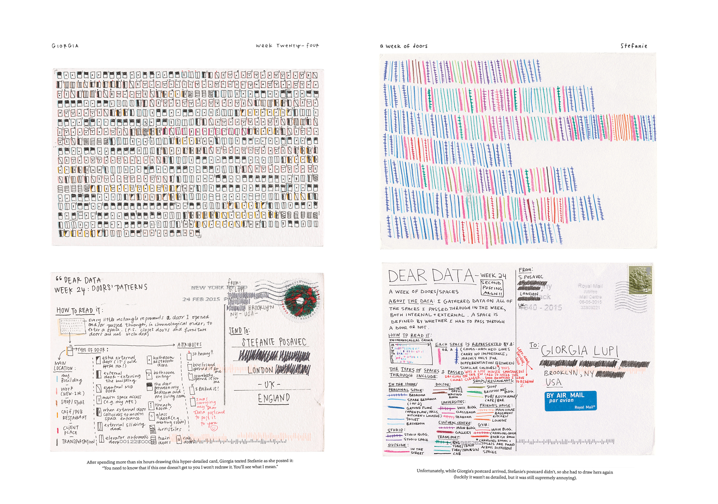
Last but not least, Aditi showed me this website called Dear Data, created by Giorgia Lupi and Stefanie Posavec, where they mail each other sketches of data visualisations daily as a way to talk about their day. The website contains a year long of analog data drawing exchanges between the two.
-
I thought this website was pretty cool as it showed us how data visualisation can be used as a form of communication for even the simplest things like how many times I’m hungry or a data viz of laughs (size of laughs, tone of laugh etc.)
Images: Giorgia Lupi and Stefanie Posavec. Dear Data Project. 2015.
Above are some of the data visualisations from the Dear Data Project which I found interesting and relevant to what I was trying to visualise with my experiments. The data drawings by Giorgia Lupi and Stefanie Posavec visualises a day of laughter, indecisions etc. I thought the drawings were rather abstract yet accurate representation of the feelings and act of laughter or indecisions. This will be a good reference and maybe a practice for one of my experiments.
Matin also shared some feedback on the code experiment:
-
Similar to aditi, he suggested that the values should be broken down further so that it would be clearer to users on what the values mean, cause it seems rather vague at this point.
Or I could even try adding in a characteristic that is derived from the values that the users select, by allocating a characteristic to give meaning to the values of the slider, for example 51% extrovert could connote being outgoing etc.
He also suggested creating a form asking people what they identify with the most, drawing categories like “in terms of appearance, which parts of your looks do you think define your identity best?”, or is it music that best represents you? Or can even add a “others” at the end so if there’s other elements that they identify with, I could also add that in.
I think this was pretty helpful feedback as I was also considering doing a survey at first, but I was hesitant as I was not sure what the subject/aim of the survey should be and what parameters I should consider in my questions in order to gain qualitative responses.
The mention of "music", reminded me of this data visualisation done by Spotify
Spotify ID is an app that generates a unique data visualisation of that represents their musical identities through their most listened generes and playlists.
I thought this project would be a good reference/case study to analyse as it ties in closely with my research on using personal data in the construction of identities.
EXHIBITION–MENTAL: COLOURS OF WELL-BEING
Also chanced upon this exhibition called Mental:Colours of Well-Being, that is currently going on at the Art Science Museum. I thought this exhibition was quite related to my topic as it focuses on the individual. Through the exhibits, it showcases visual arts combined with technology in its expression of the state of mind which reminded me of our experiments-how we utilised technological methods in our practical experiments for designs.
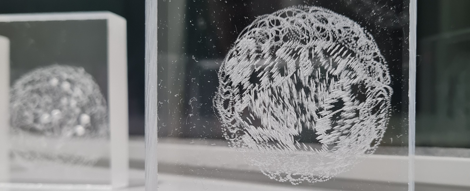 ↘ Your State of Mind
A particular exhibit that caught my eye was the "Your State of Minid" where our thoughts were expressed without words. In this masterclass conducted by Lee Yi Xuan, participants are able to get into the mode of mindful drawing exercises where they can scratch and scribble circles on a piece of acrylic block s a mean to help one express and understand their innermost feelings on a deeper level–which is a common method in art therapy. I thought this exhibition was particularly close to what I was researching- a way to express ourselves through visuals.
Lee Yi Xuan. Your State of Mind. 2022.
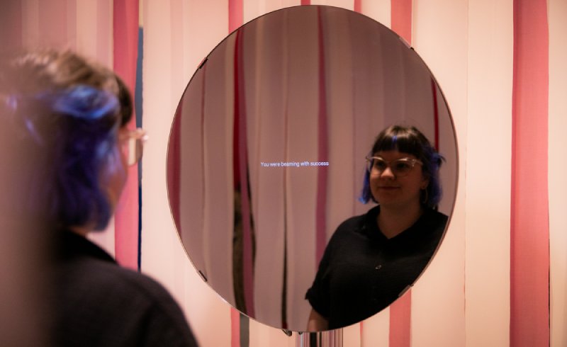 ↘ Mirror Ritual
Also this exhibit called “Mirror Ritual” where a poem is generated based on the individual’s expression. Mirror Ritual provokes you to reflect on your internal emotional state, drawing attention to its intentional or unintentional expression, highlighting the harmony or the conflict between the two. Rather than prescribing your emotional state, the work allows you to freely reflect on how you’re feeling, entering into an interpretative dialogue between human and machine. I thought the application could be a reference for my experiments as well as it involves the user's interaction and input.
Nina Rajcic. Mirror Ritual. 2020.
