1 / Acrylic Cover Making
2 / Publication Making
3 / Poster Design
4 / Set-Up Considerations
ACRYLIC COVER MAKING
Cover Printing
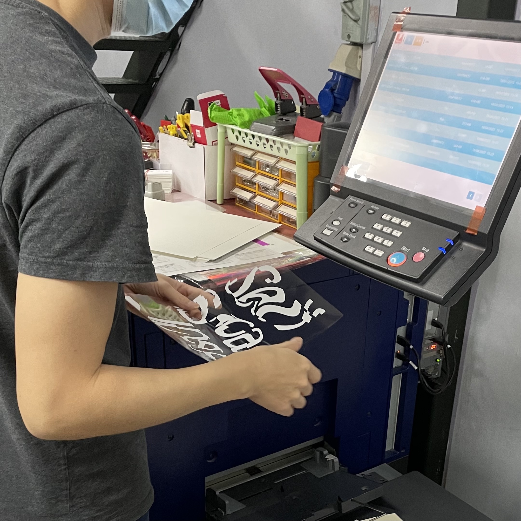
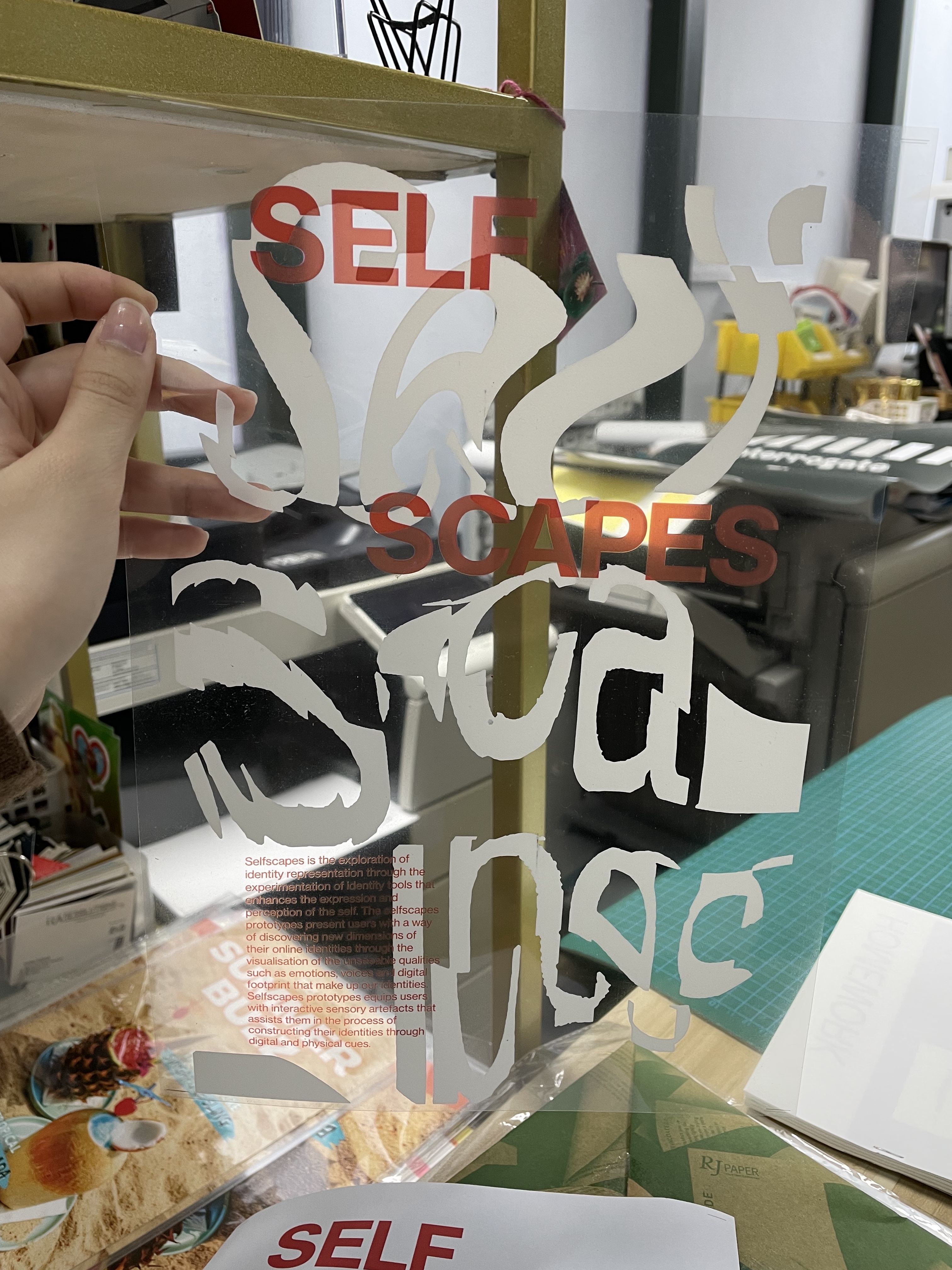
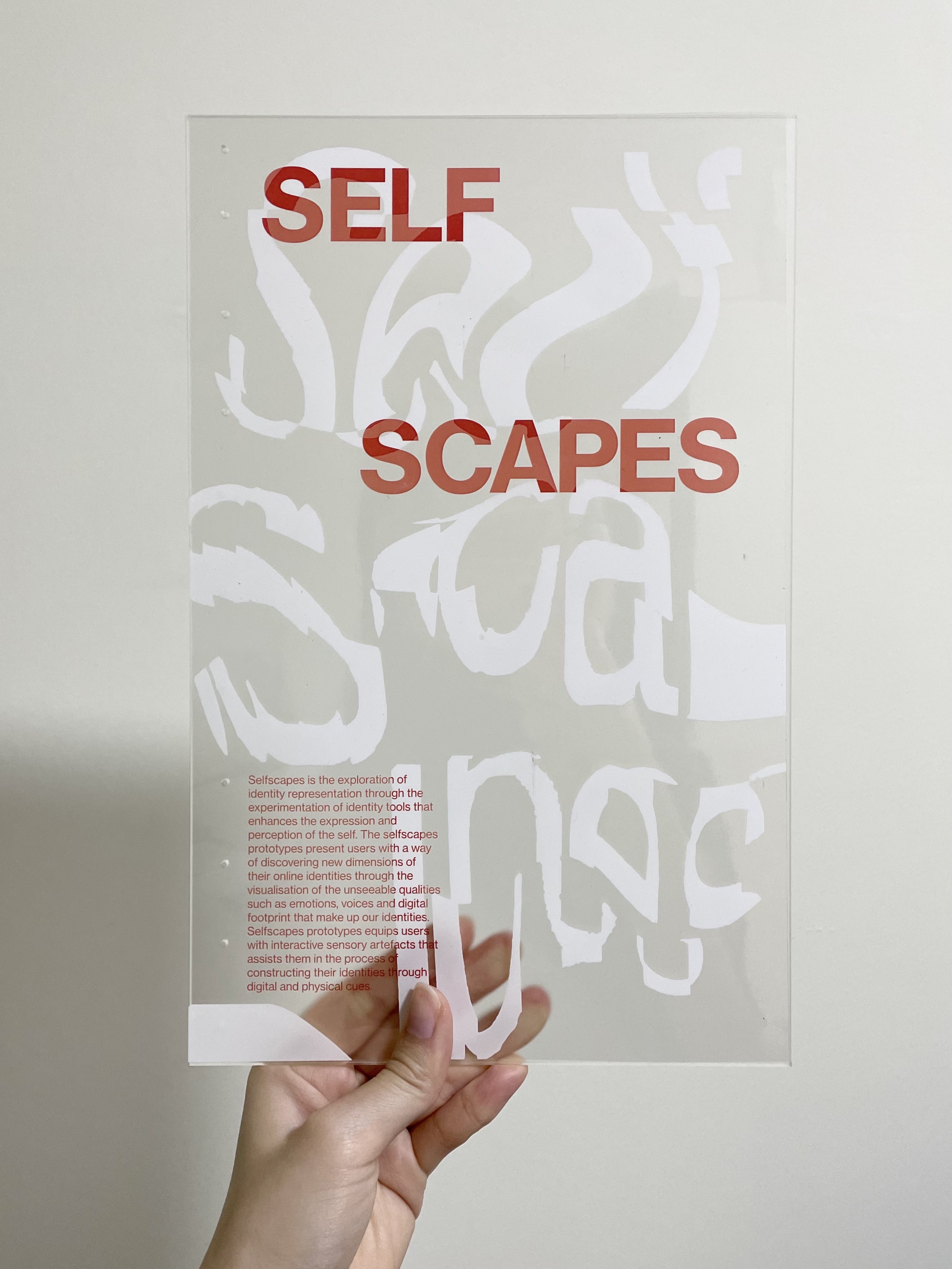
As the transparent sticker method did not work out, I tried printing on transparency sheets instead. I had the white and orange colour separated on different layers to aid in the printing. The orange coloured text were printed on a Konica printer for a higher quality colour output.
Acrylic Cutting
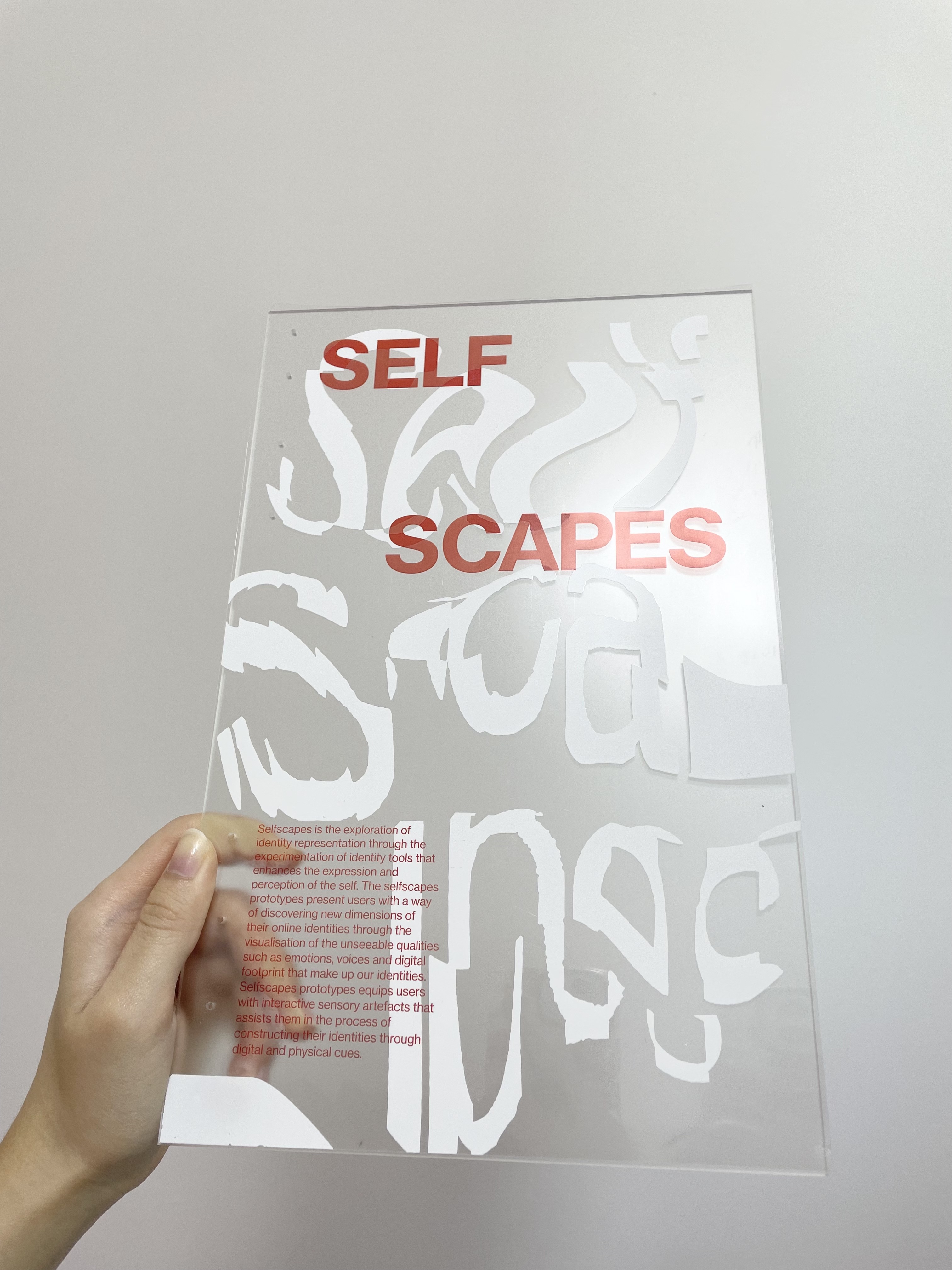
Using the laser-cutting machine, I laser-cutted holes on the acrylic cover to prepare it for binding.
Acrylic Mistakes
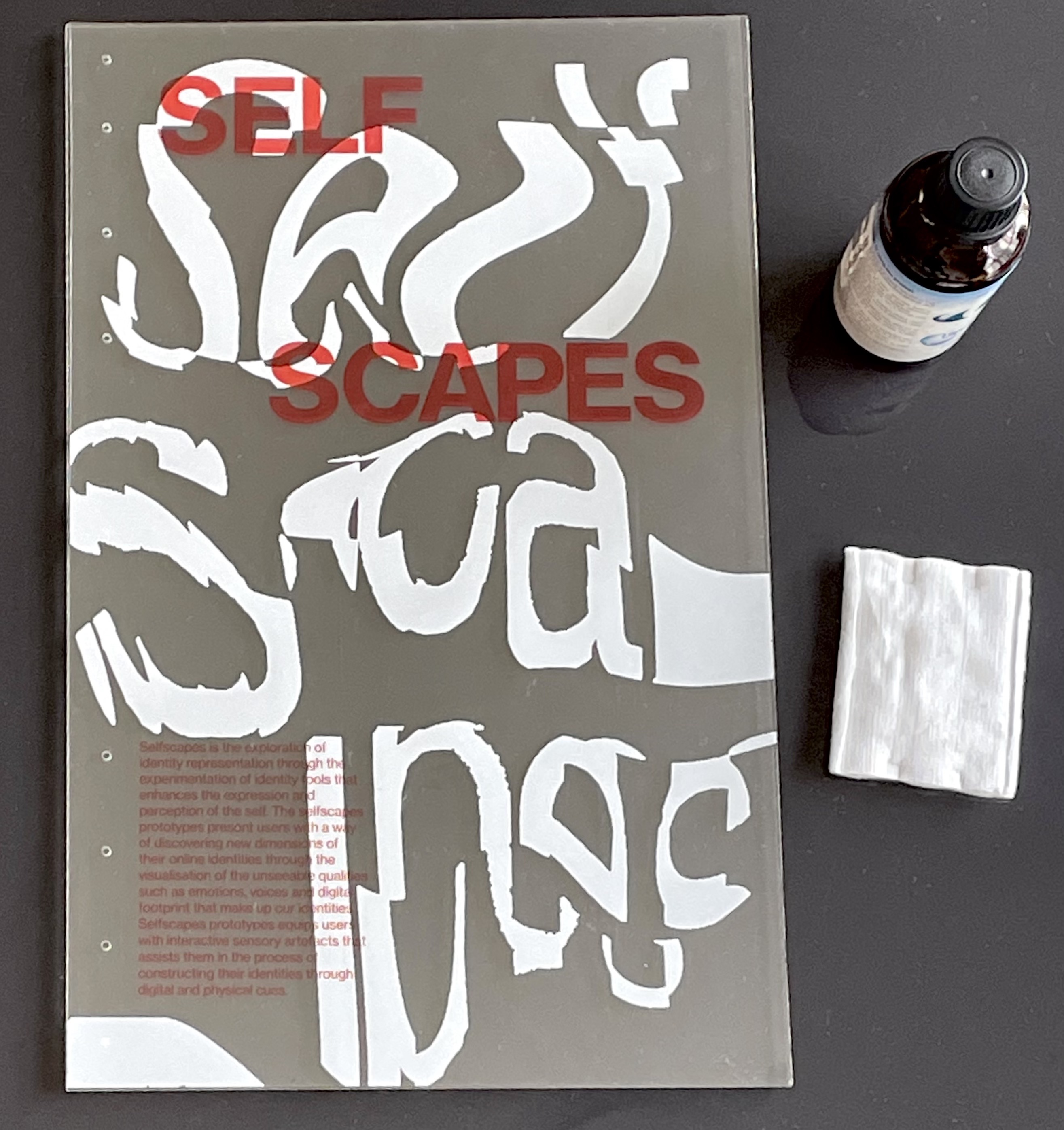
After some material test, applying the acrylic glue on a small sheet of transparency and acrylic, the bond was successful and I proceeded to apply the acrylic glue on the acrylic cover itself. But that was a huge mistake, as I wasn't familiar with the act of pasting transparencies and working with acrylic glue, when the transparency was laid on the cover, alot of air bubbles were present which destroyed the look of the transparent effect.
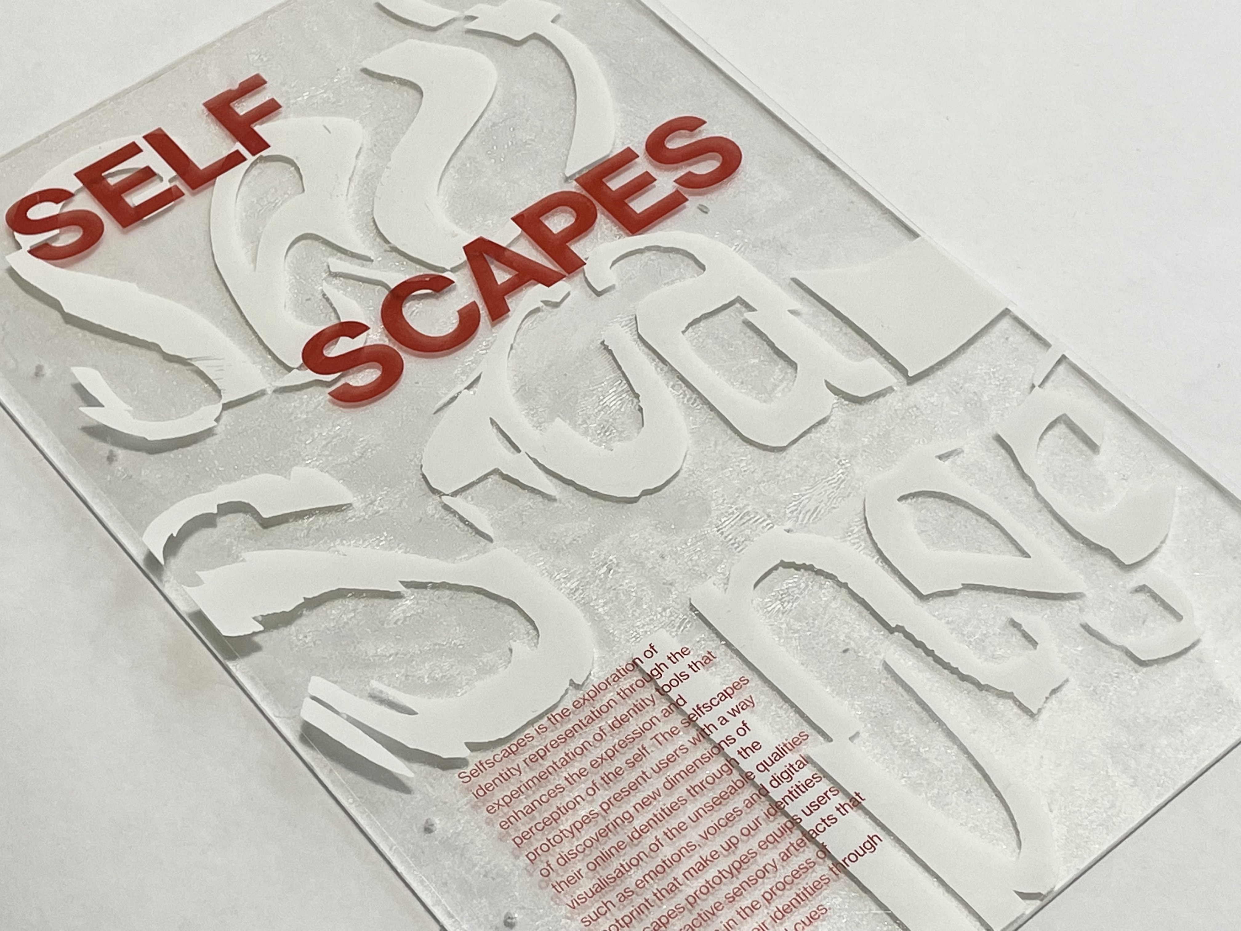
I tried all sorts of ways to remove the glue without damaging the acrylic but it didn't work out as the glue had already dried up. From this, I learnt that time and speed was especially crucial in applying and removing acrylic glue. As I spent too long trying to get rid of the air bubbles instead of removing the acrylic glue from the start, this resulted in the hardening of glue which made it impossible to remove and use the acrylic again. In addition, the transparency sheet was also destroyed from the hardened glue.
All in all, despite the unsuccessful acrylic cover design, I think it worked out for the better, as I can display the (extra printed) transparent sheet as a separate work on its own, highlighting the concept of Selfscapes, instead of stacking it on the publications. I also figured the stacking would be distracting especially if the readers can't see the text when it overlays on the publication. Instead, when displayed on a clean surface, the text legibility improves alot and the publication itself can be seen as well.
PUBLICATION MAKING
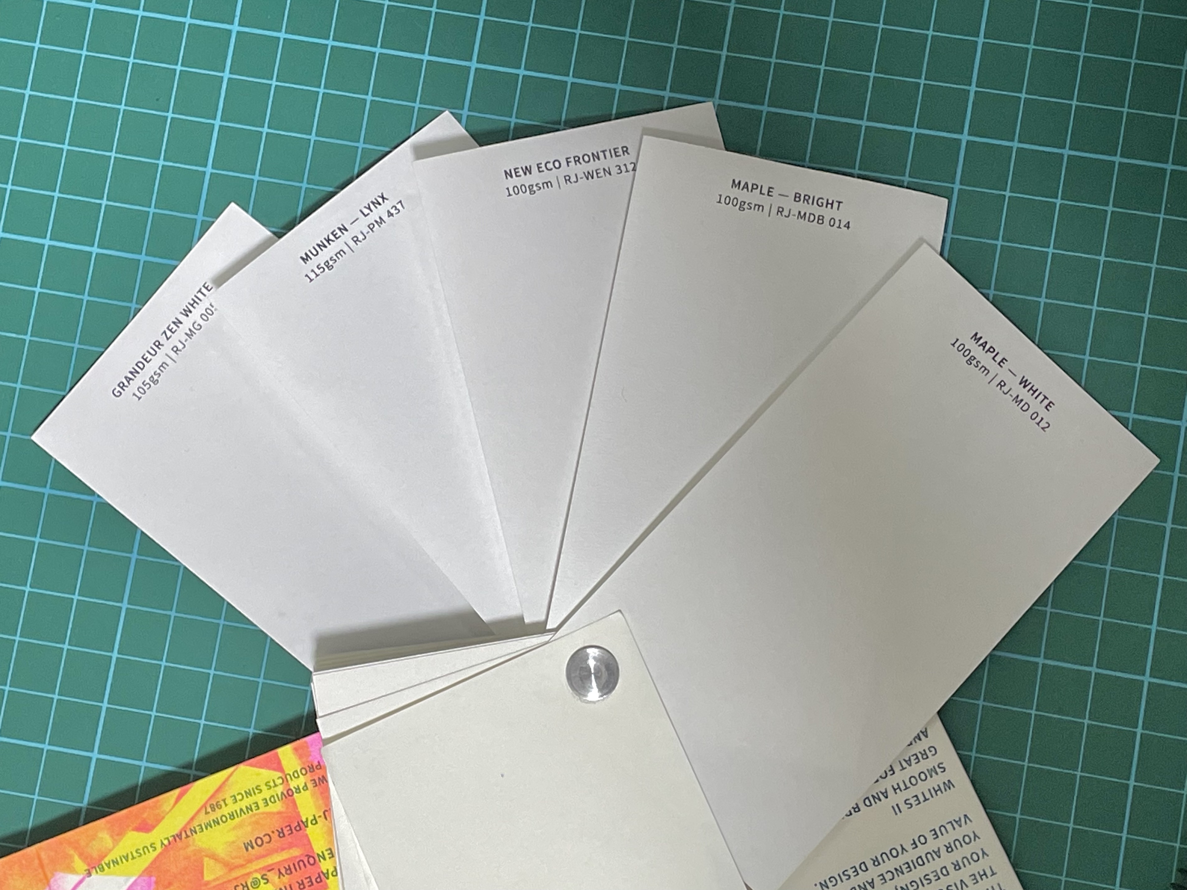
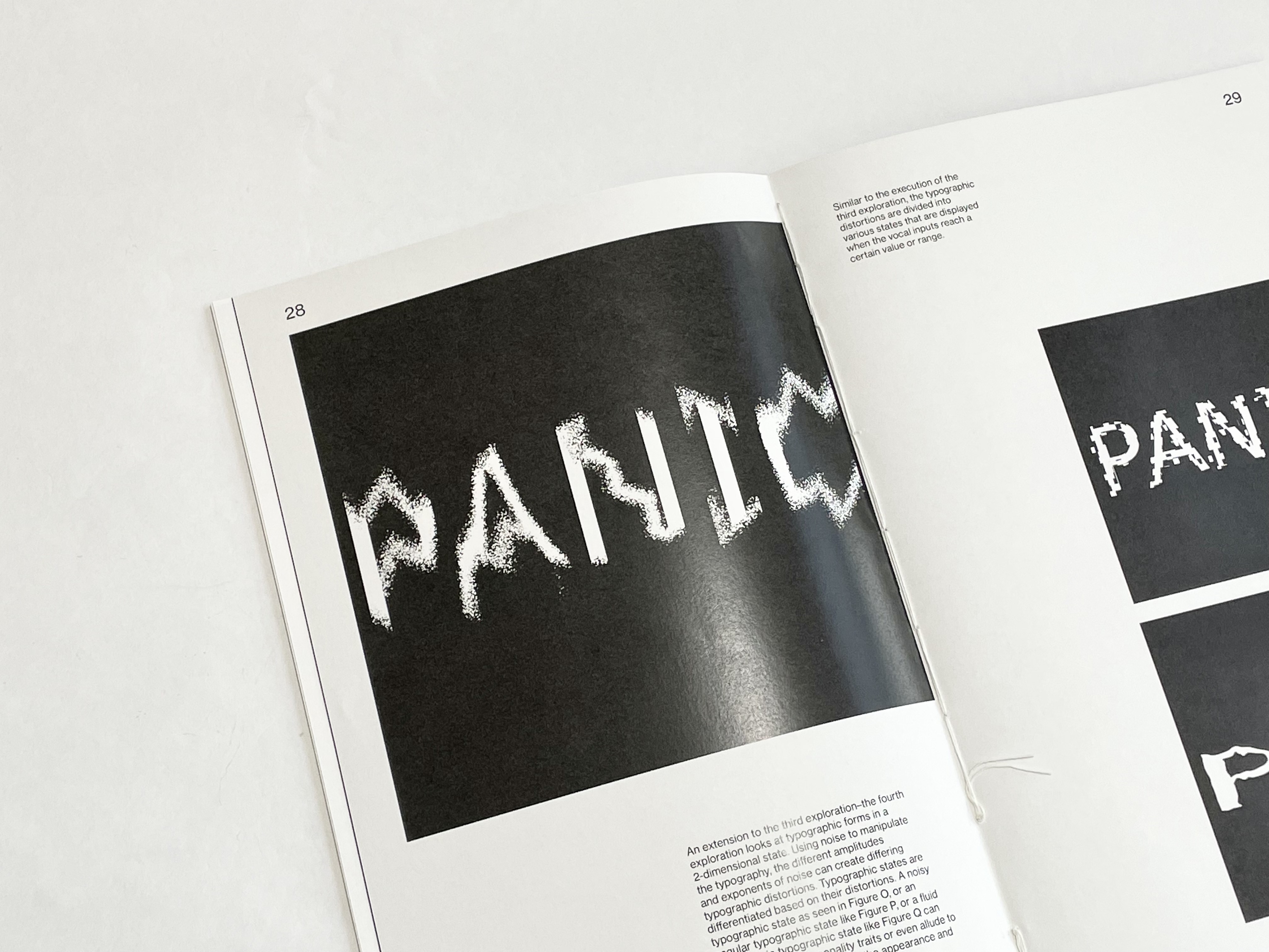
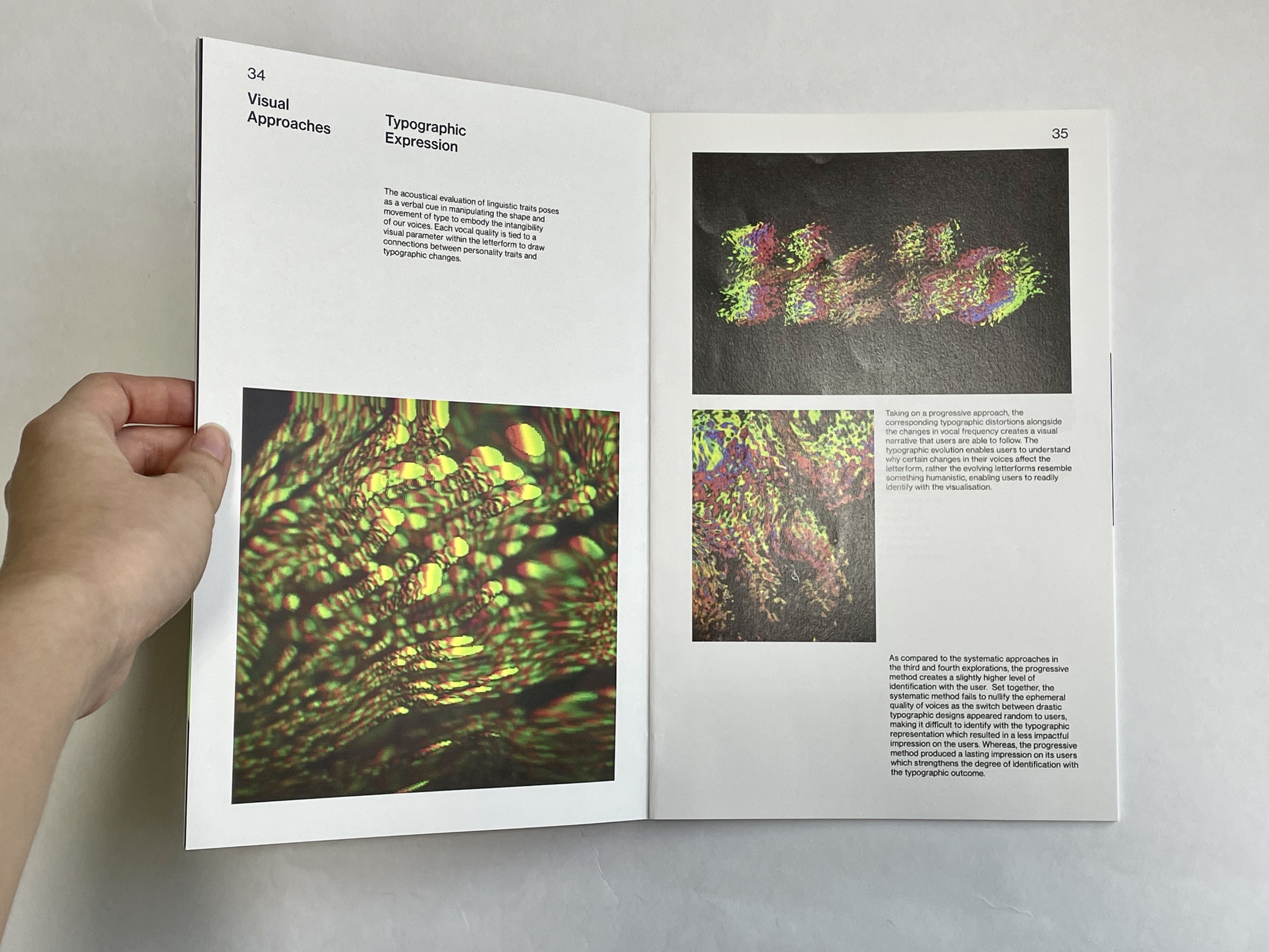
For the reprint, I selected Munken Lynx as the inner paper type and using Munken Polar Rough as the hard cover. This time round, the print turned out better, plus with the RGB printing available at the print shop, the colour of the images were processed much better and accurate to the digital copy
For binding, I decided to do coptic stitch as I had a hard acrylic cover placed ontop. I learned how to do so by watching these two videos (on repeat).
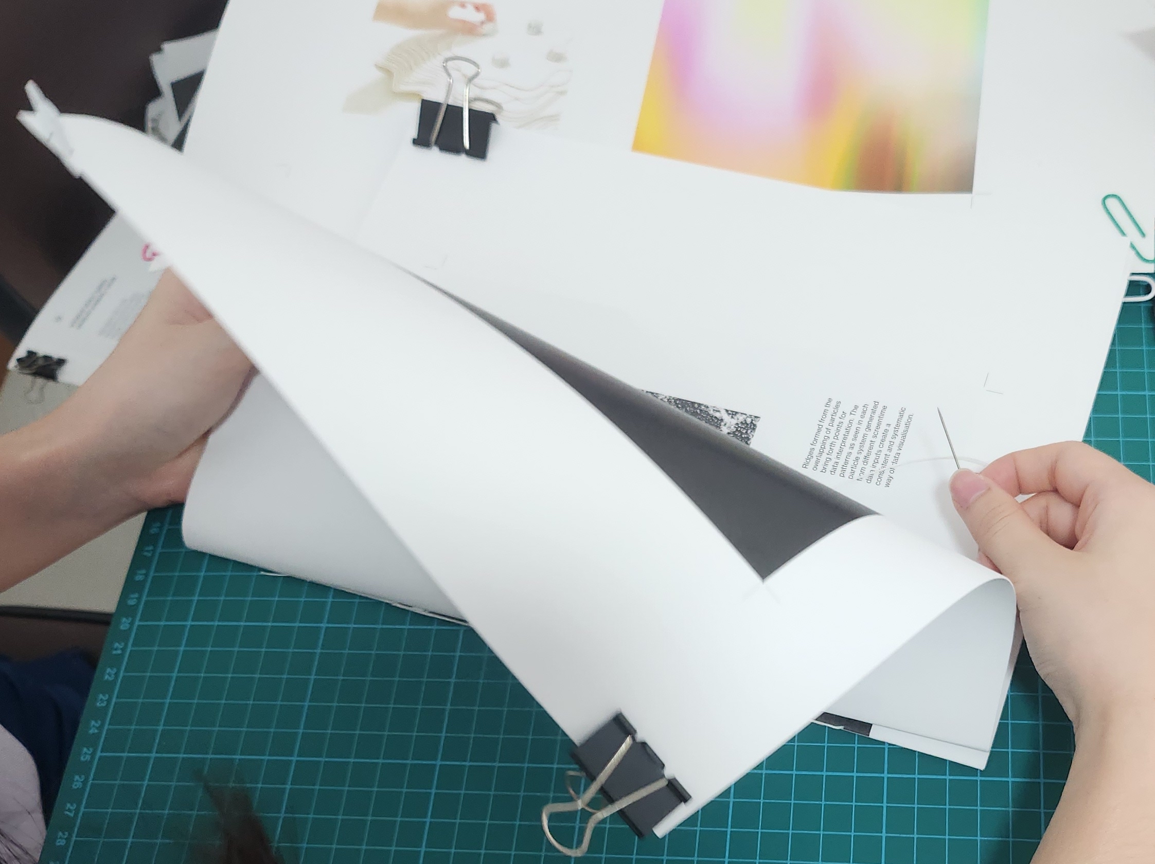
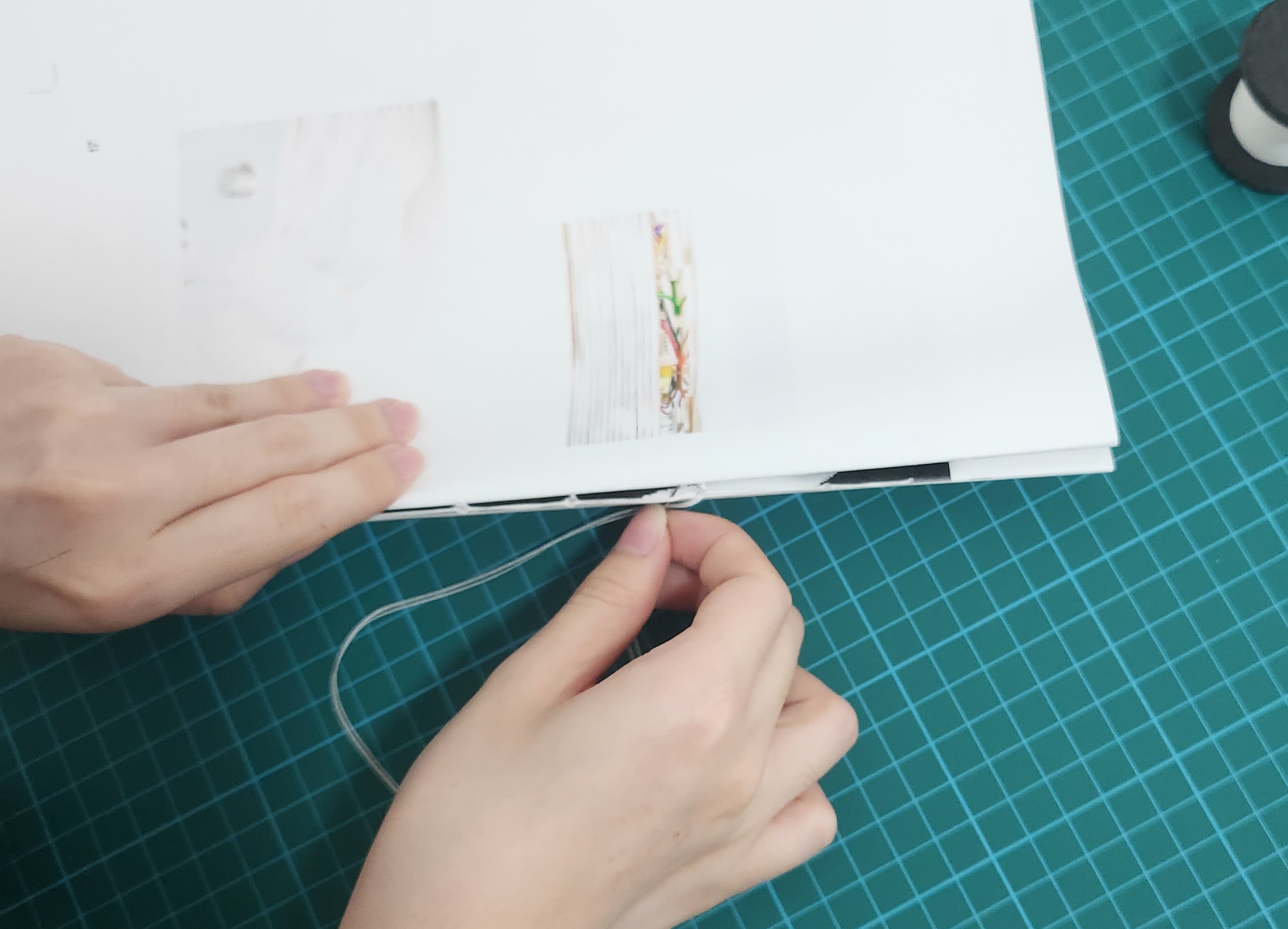
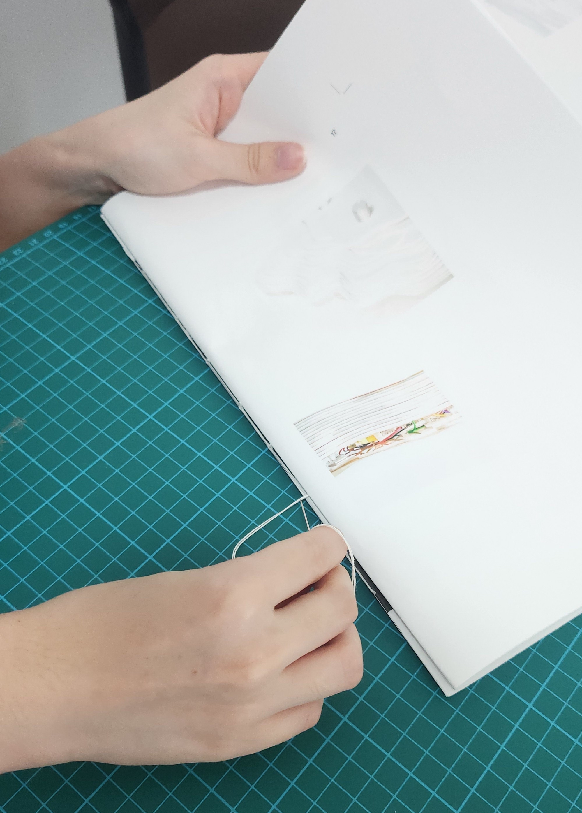
Something I found out while learning to coptic stitch was that stitch binding styles can actually be customisted to adapt and fit to your publication. As I intended to bind three publications of different sizes plus a hardcover acrylic together, following the coptic stitch tutorial alone would not work out. Thus, I also referenced this text block binding tutorial to learn how to bind separately binded publications together. I needed to go with this method of binding when combining the publications as the different sized publications can only be binded together after each publication is individually binded and trimmed.
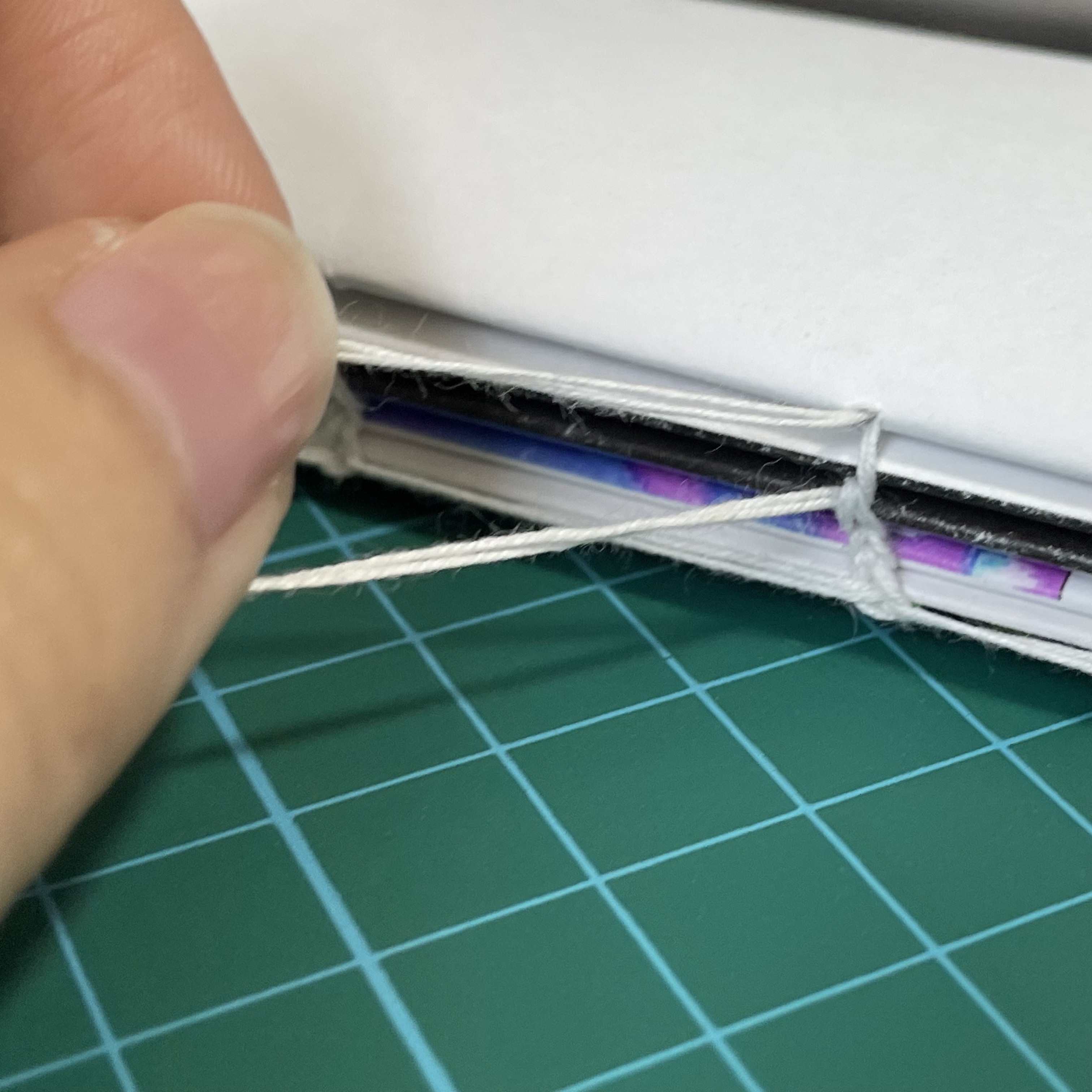
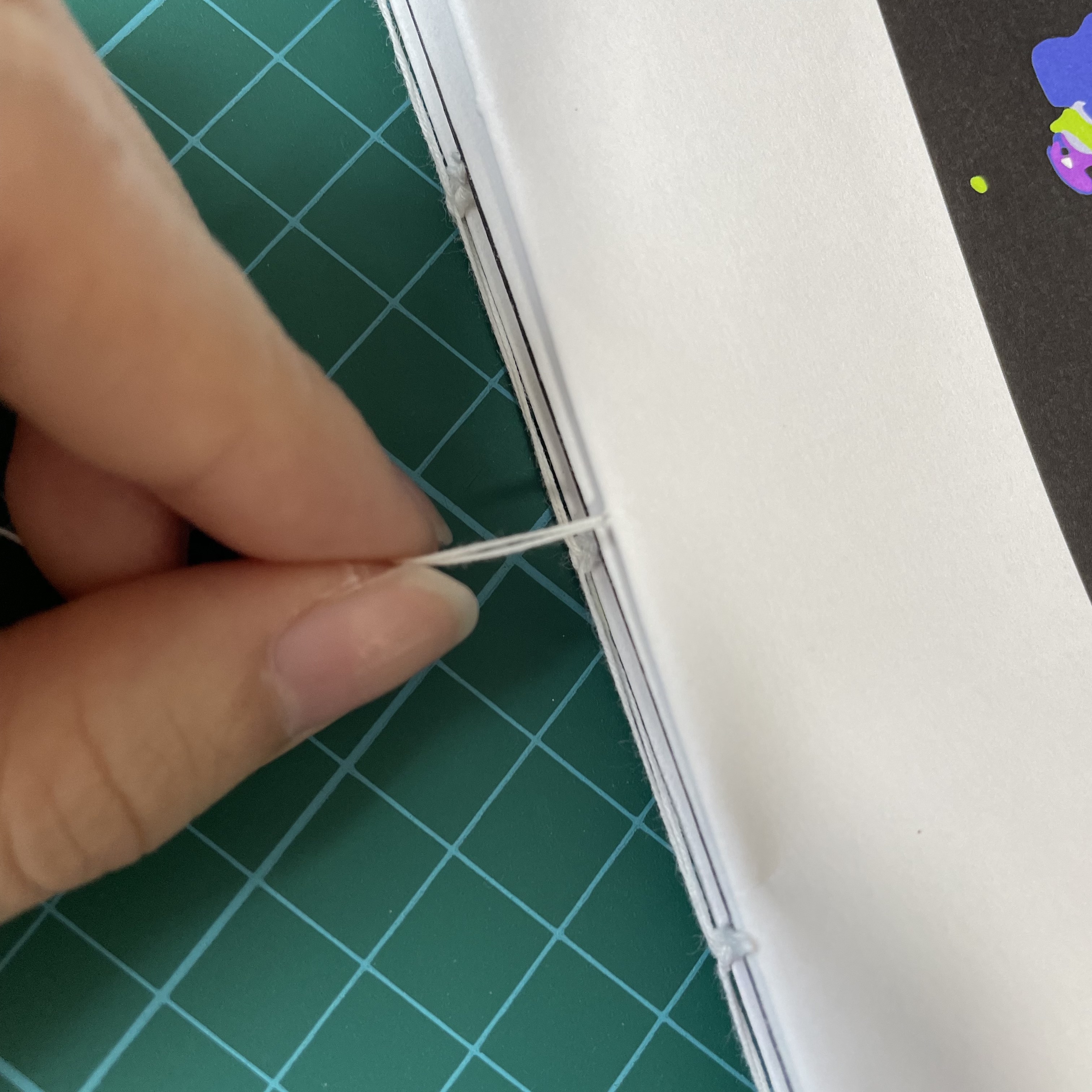
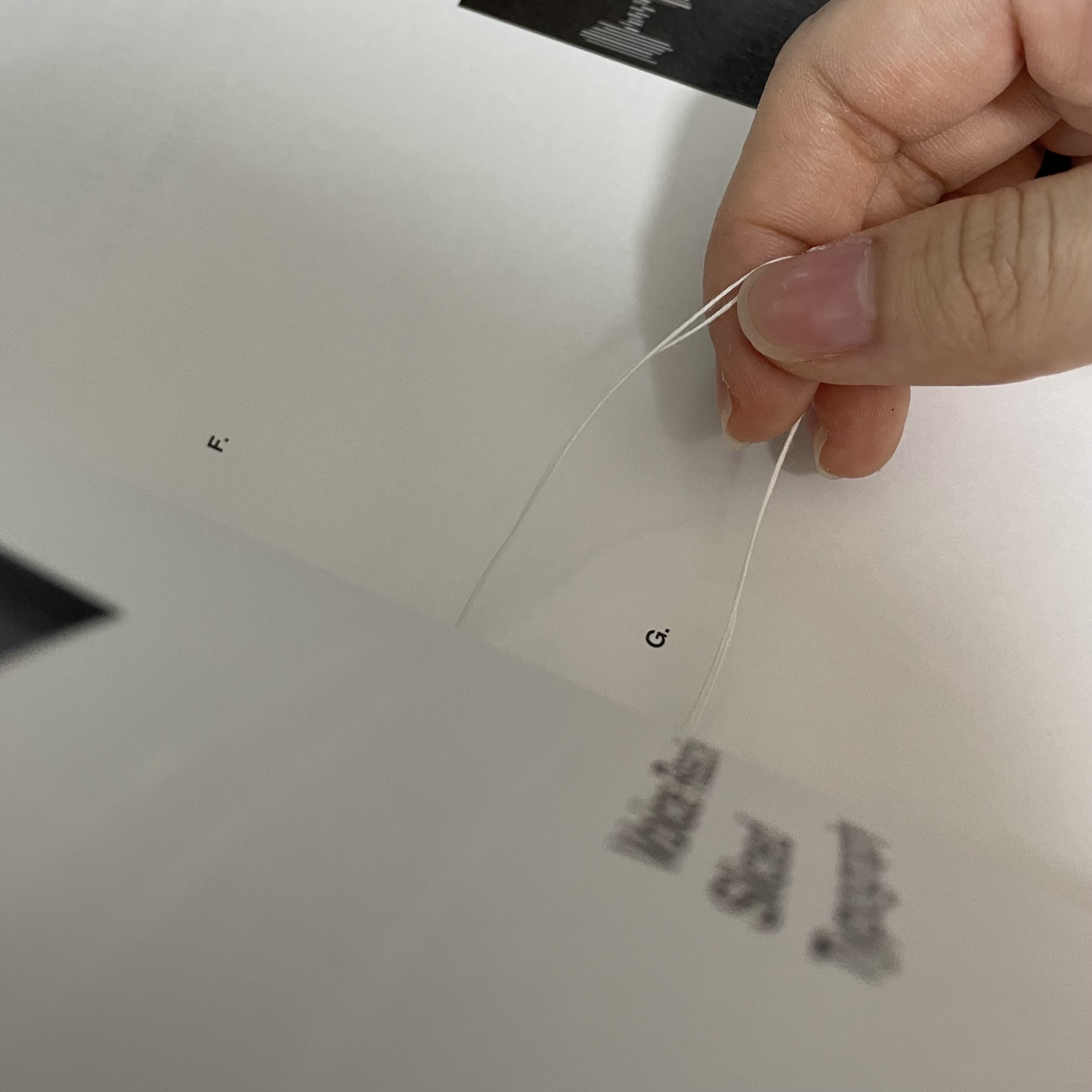
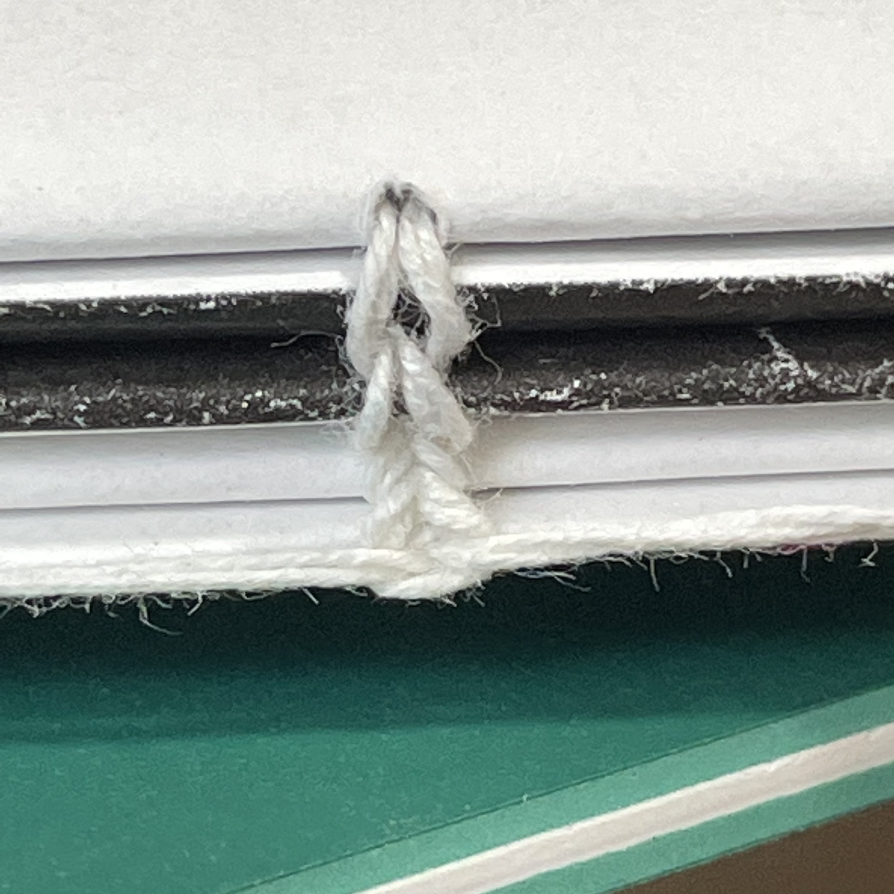
While binding the publications, I learnt a couple of binding tricks and ways to sew the publications better and more efficiently along the way.
One of the tip I kind of picked up while binding the signatures was that I should pull the threads hanging before and after a particular stitch or 'joint' tight or hold them straight in order to prevent unintentional knots and avoid tearing the paper.
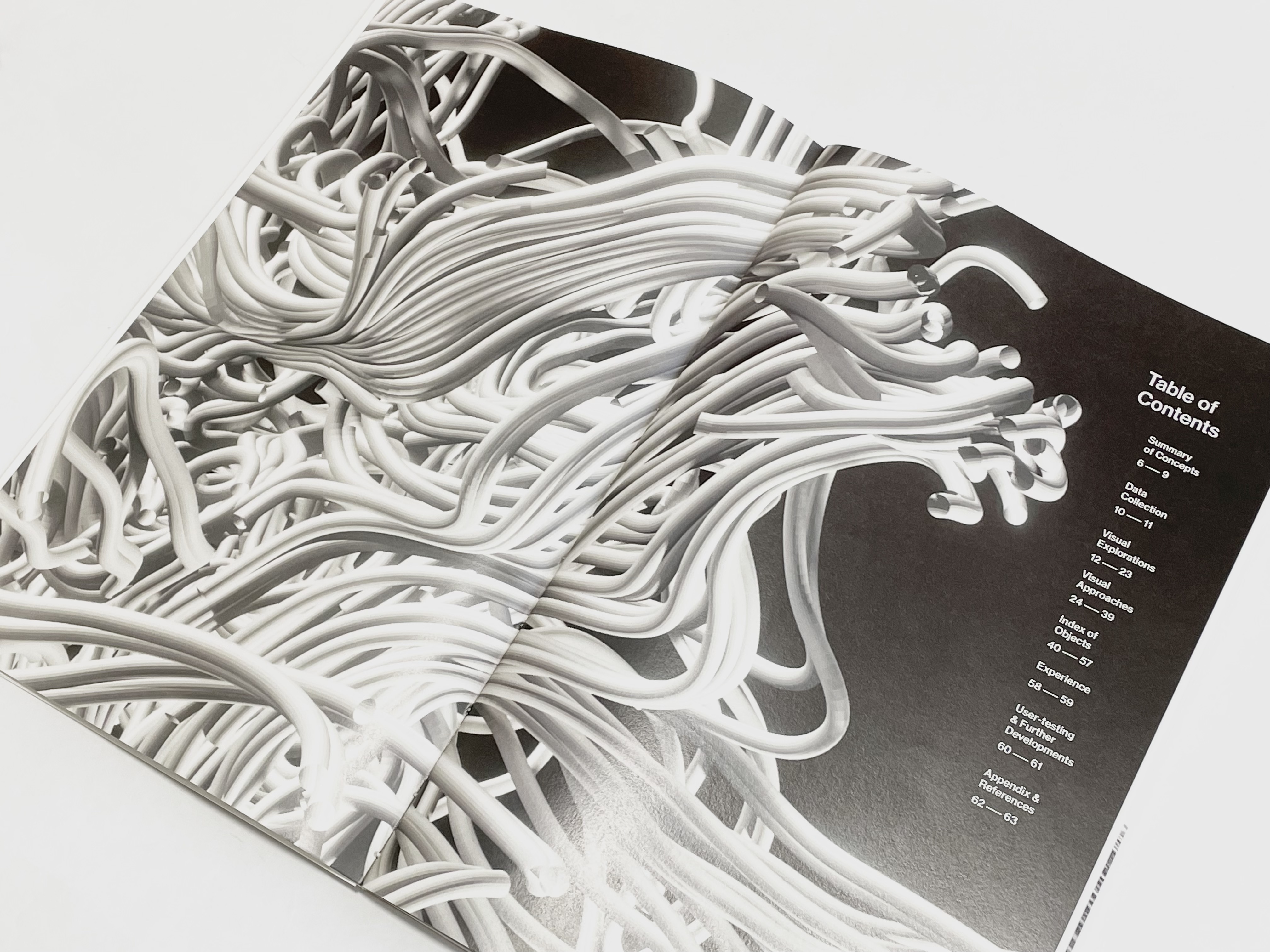
Also as I sectioned my publications with different signature sizes based on the number of pages, I realised that the smaller the signature size (more signatures stacked together) would form a nicer stitch as compared to a large signature size. As seen in Behavioural Constructs publication, with a signature size of 16, resulting in only three signatures binded together. The stitchs in this publication is not as visible as the other two publications with more signatures stacked together.
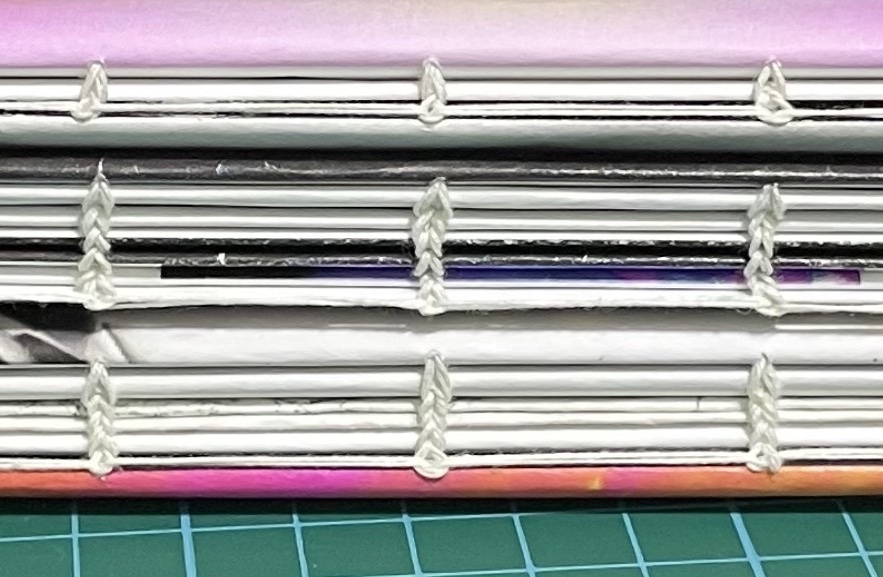
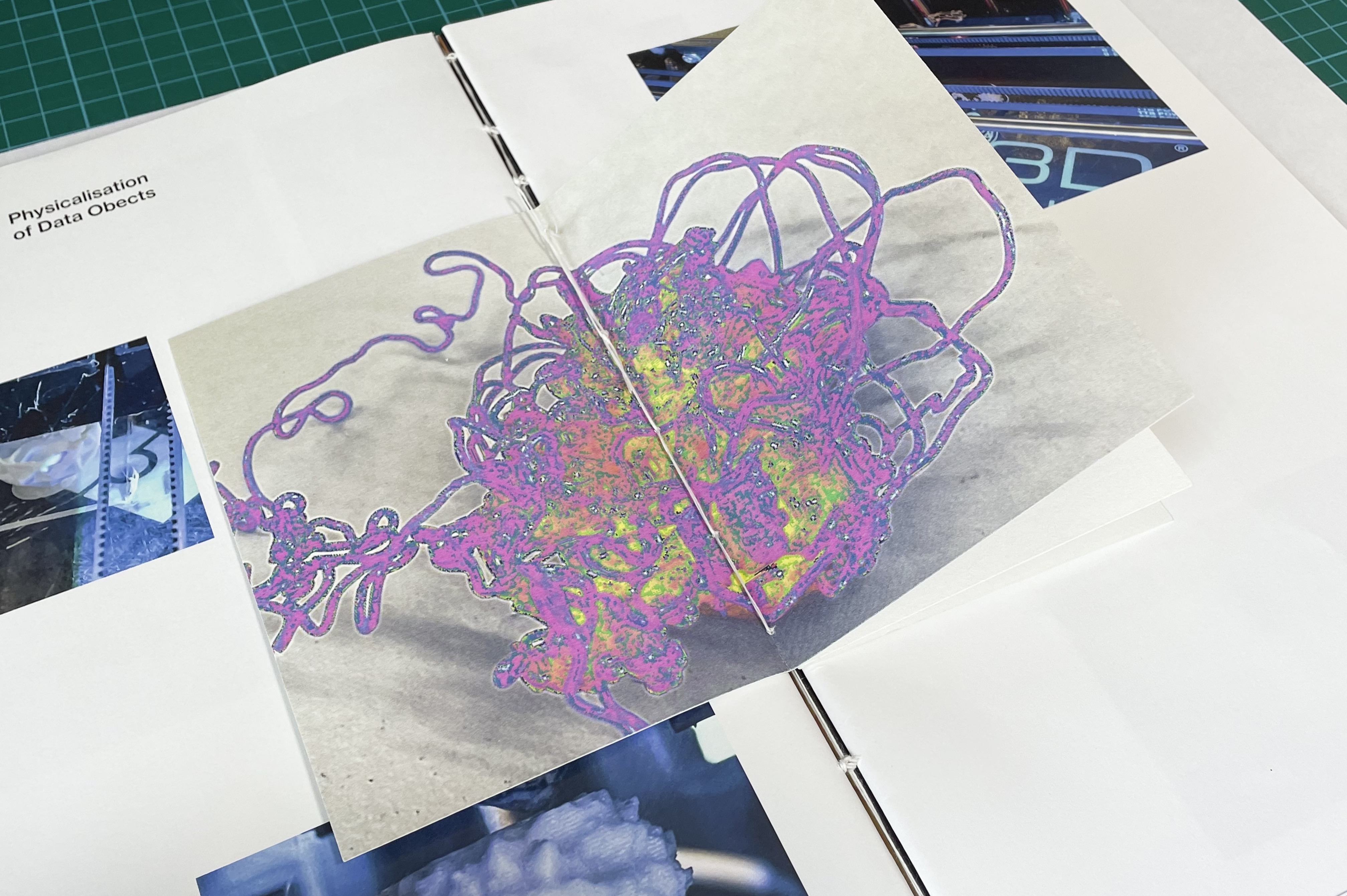
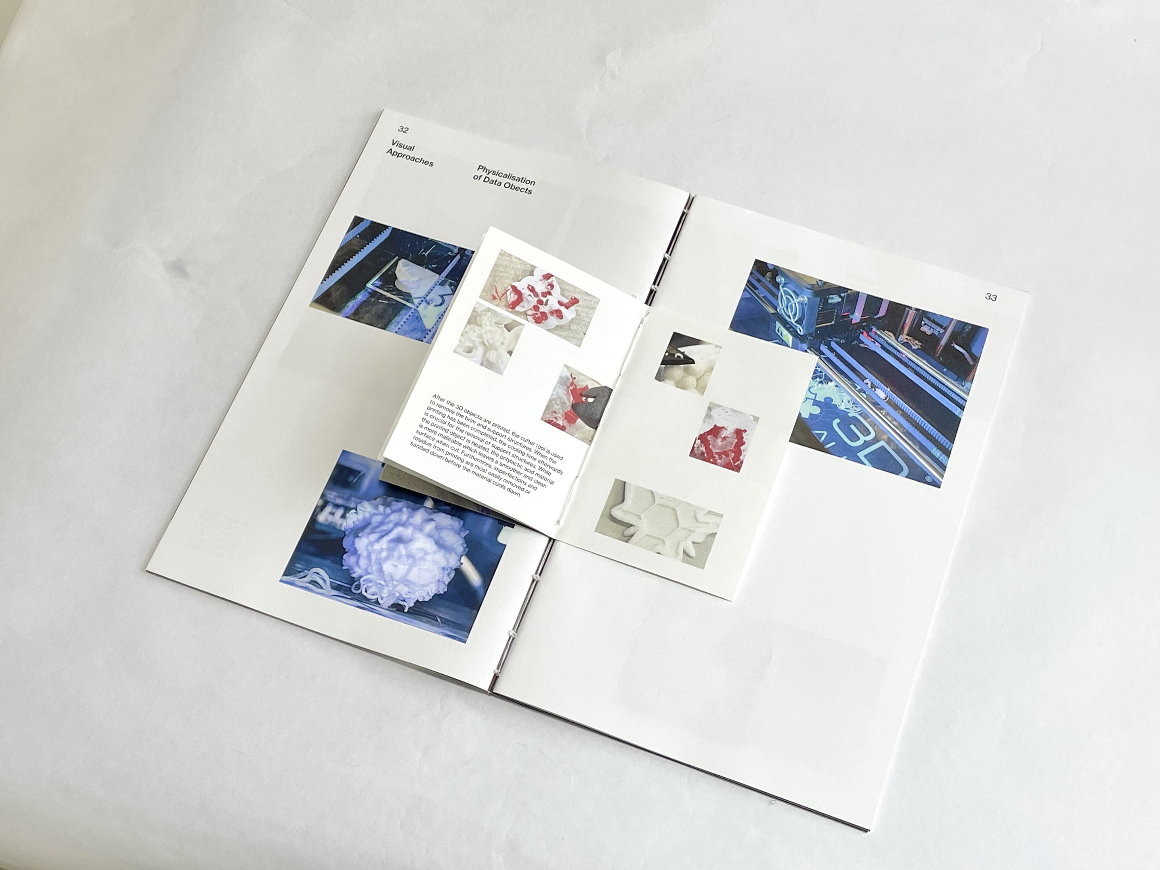
I also challenged my binding skills by adding a third binding style to sew the insert booklet together with the Affective Data Objects publication. To do this, I used saddle stitch binding and coptic stitch to bind the booklet itself and insert it between the signatures in the publication.
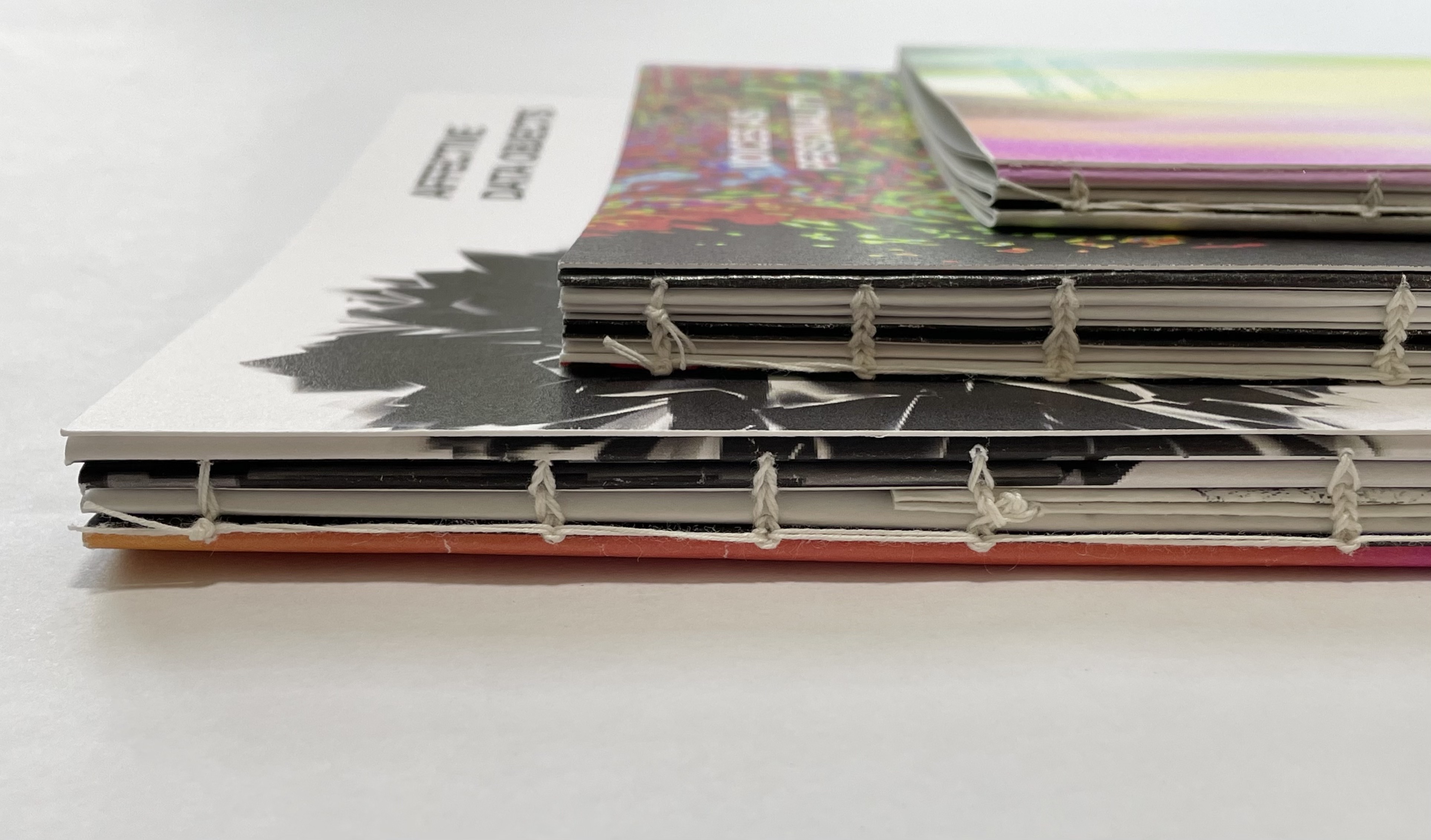
Bind + Trim + Glue
As the publications no longer have an acrylic cover, I decided to not bind the three publications together as well. This was because from a viewer standpoint, I feel that the experience being able to look through individual publications would be better than having all three sewn together as one. Also, the thickness of each publication when binded as one would form a really thick book which may affect the flipping of the pages as well.
Below are some shots of the completed publication after binding, trimming and gluing of the stitch.

POSTER DESIGN
To present the user-testing & insights of my project, I was decided between, binding the SIPI responses into a small booklet or make a collate poster. I went ahead with the poster idea as I figured that with three publications, there would simply be too many similar designed deliverables if I went with a booklet.
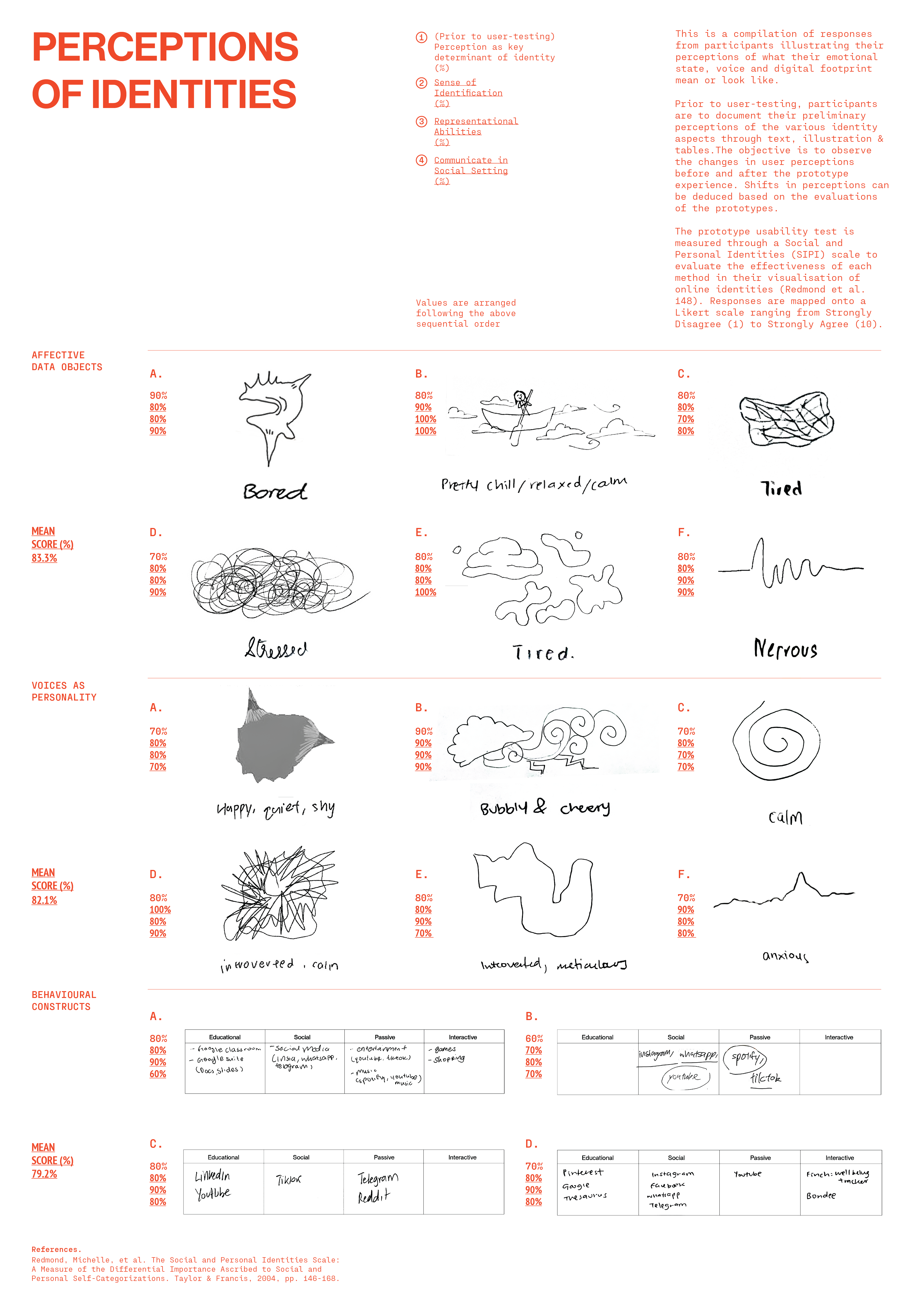

I designed this poster with a data visualisation approach in mind. Situating the sketches that were illustrated by the participants as a portrait representation of their identities, I placed their sketched out perceptions of emotional states and voices, together with the descriptions of what they perceive their identities are. For Behavioural Constructs, perceptions are structurally organised within a table instead.
SET-UP CONSIDERATIONS
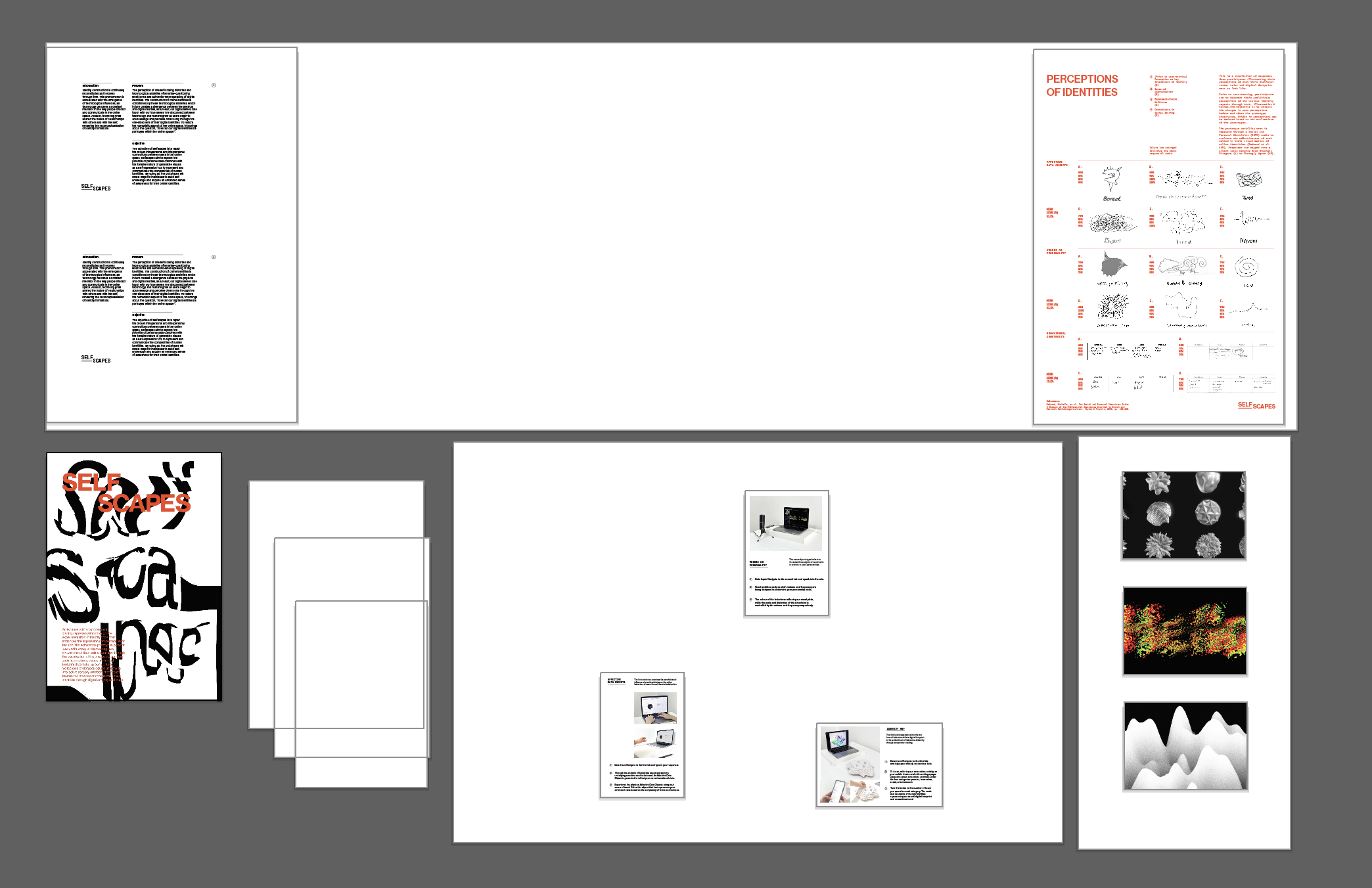
I had quite a difficult time planning the layout of the table as the space was quite tight. I sketched out some table layouts using artboards with the actual sizes of the acrylics, table and boards to help myself better visualise and plan for the set-up.
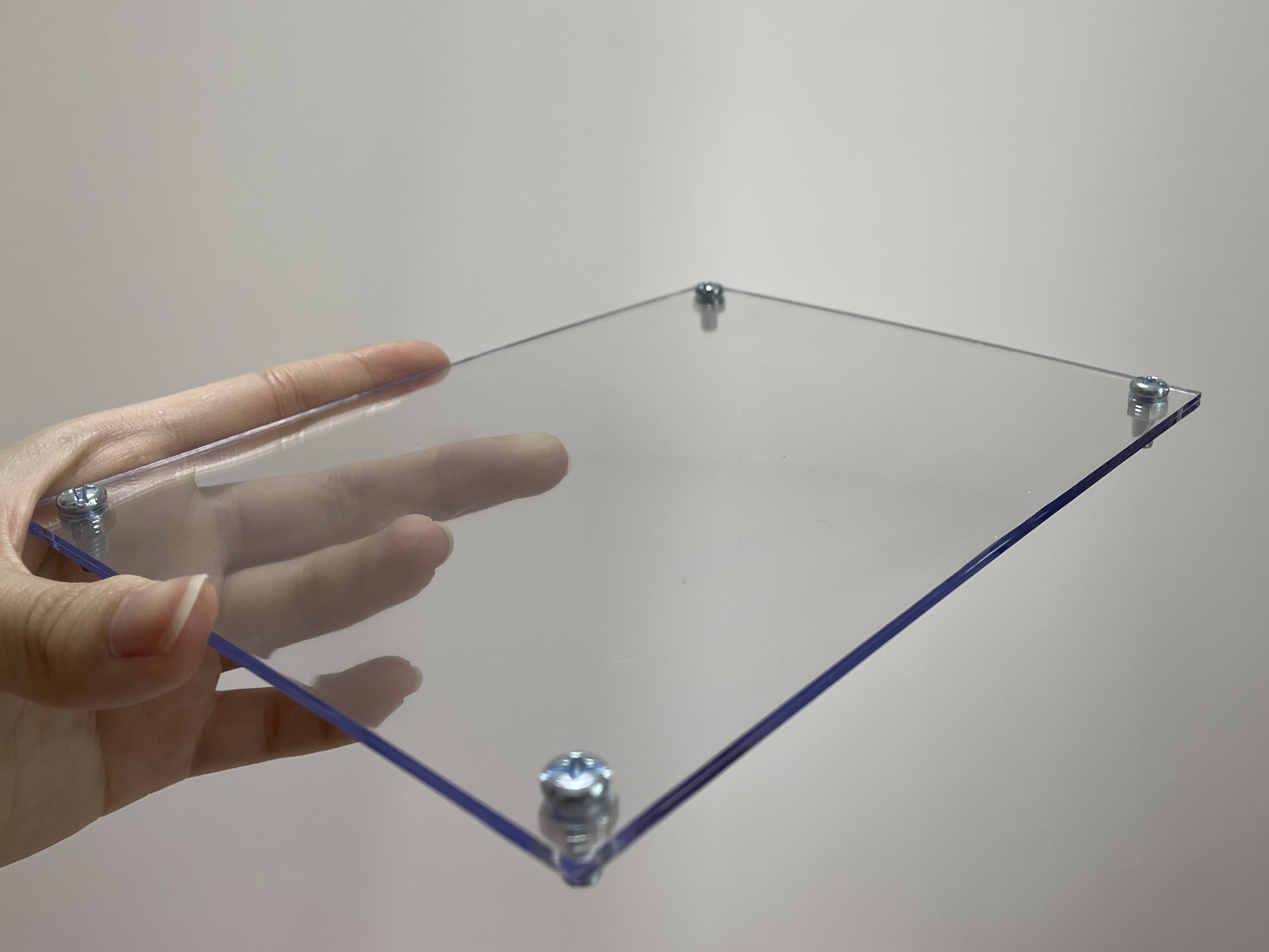
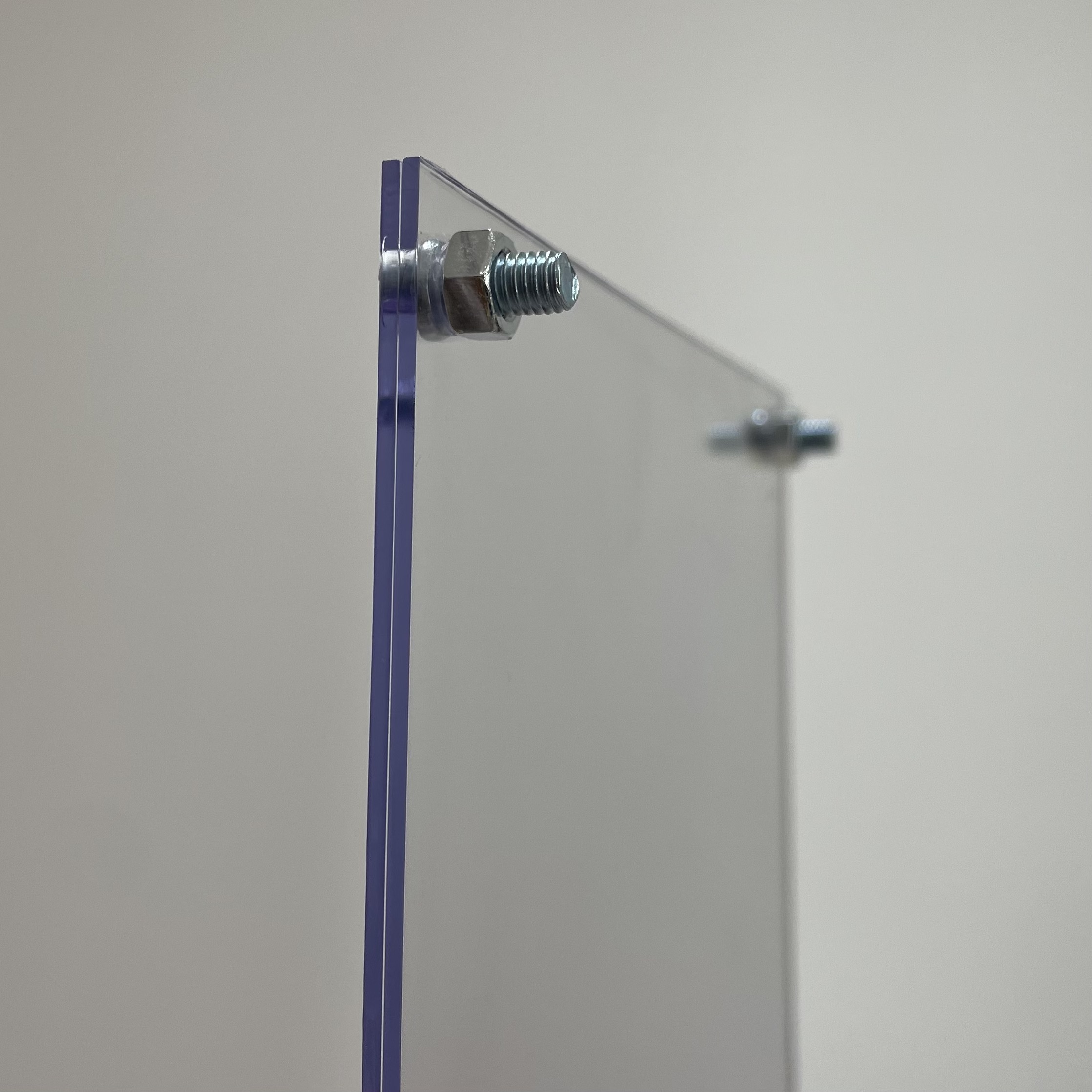
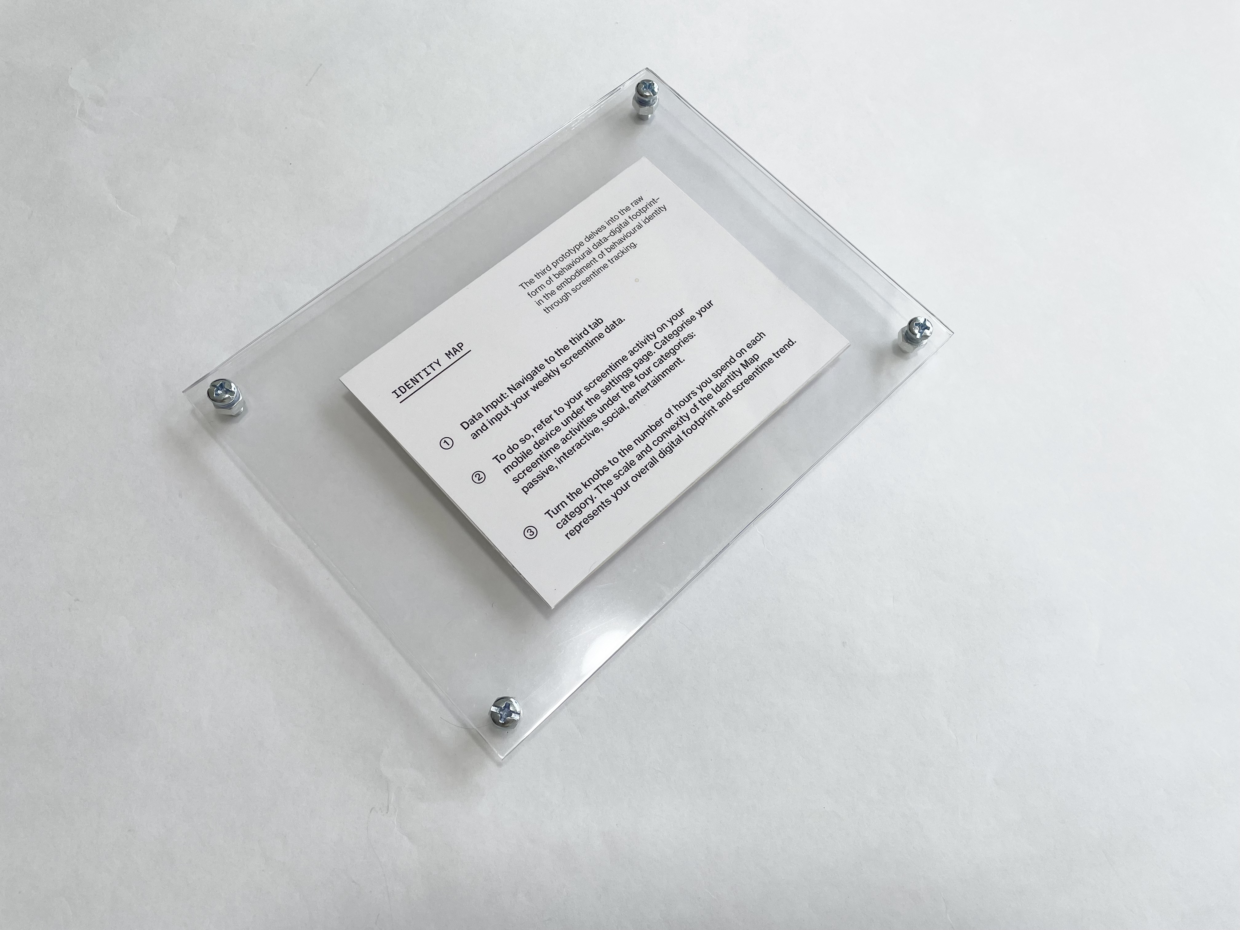
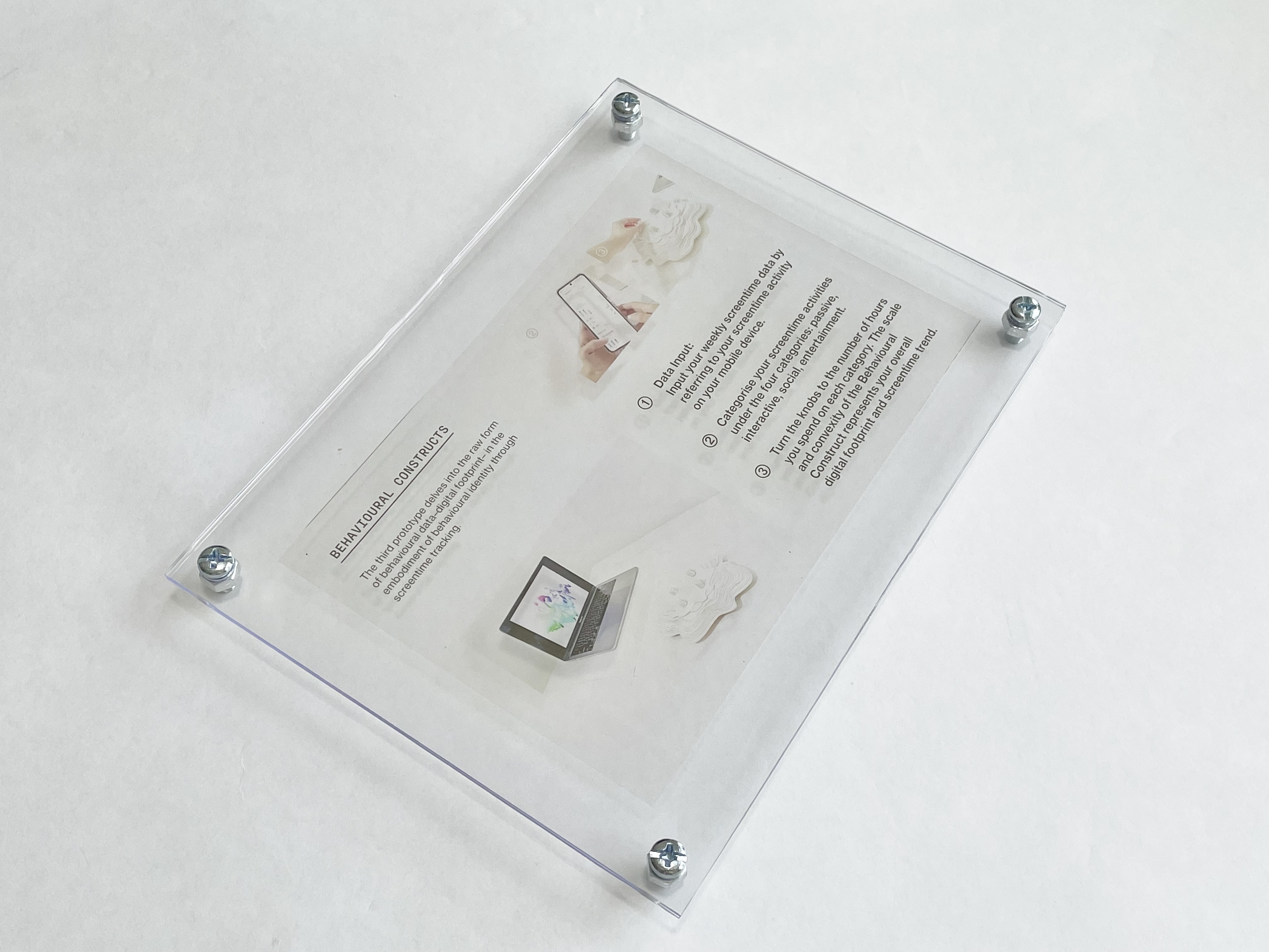
For the set-up, I'm planning to use white acrylic transparent acrylic and wood as the main materials of the display. As there were limited materials that we could use, I also bought some polysterene covers that help to elevate the prototype descriptions. I replaced the silicone screw that came with the product with some silver screws.
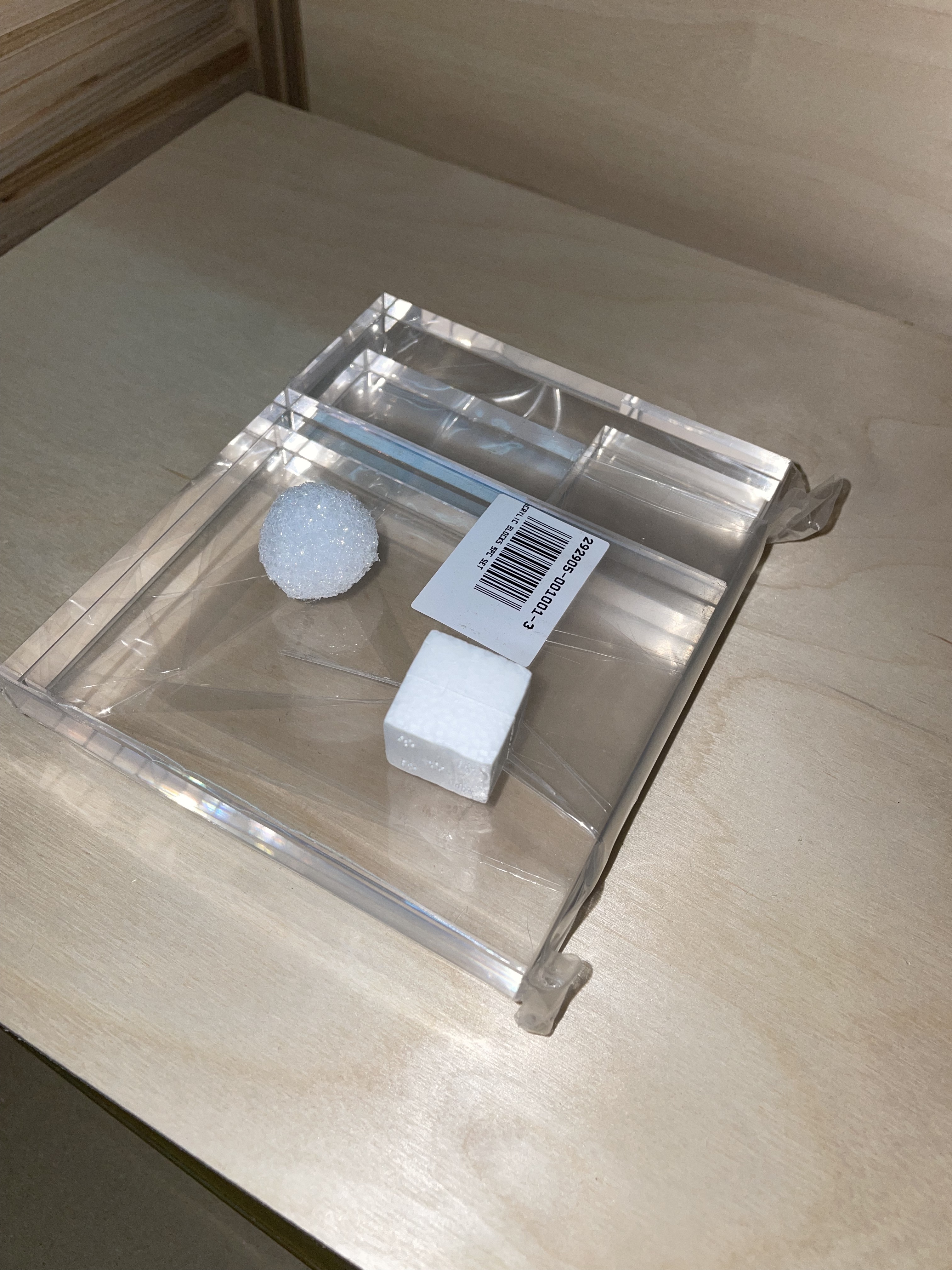
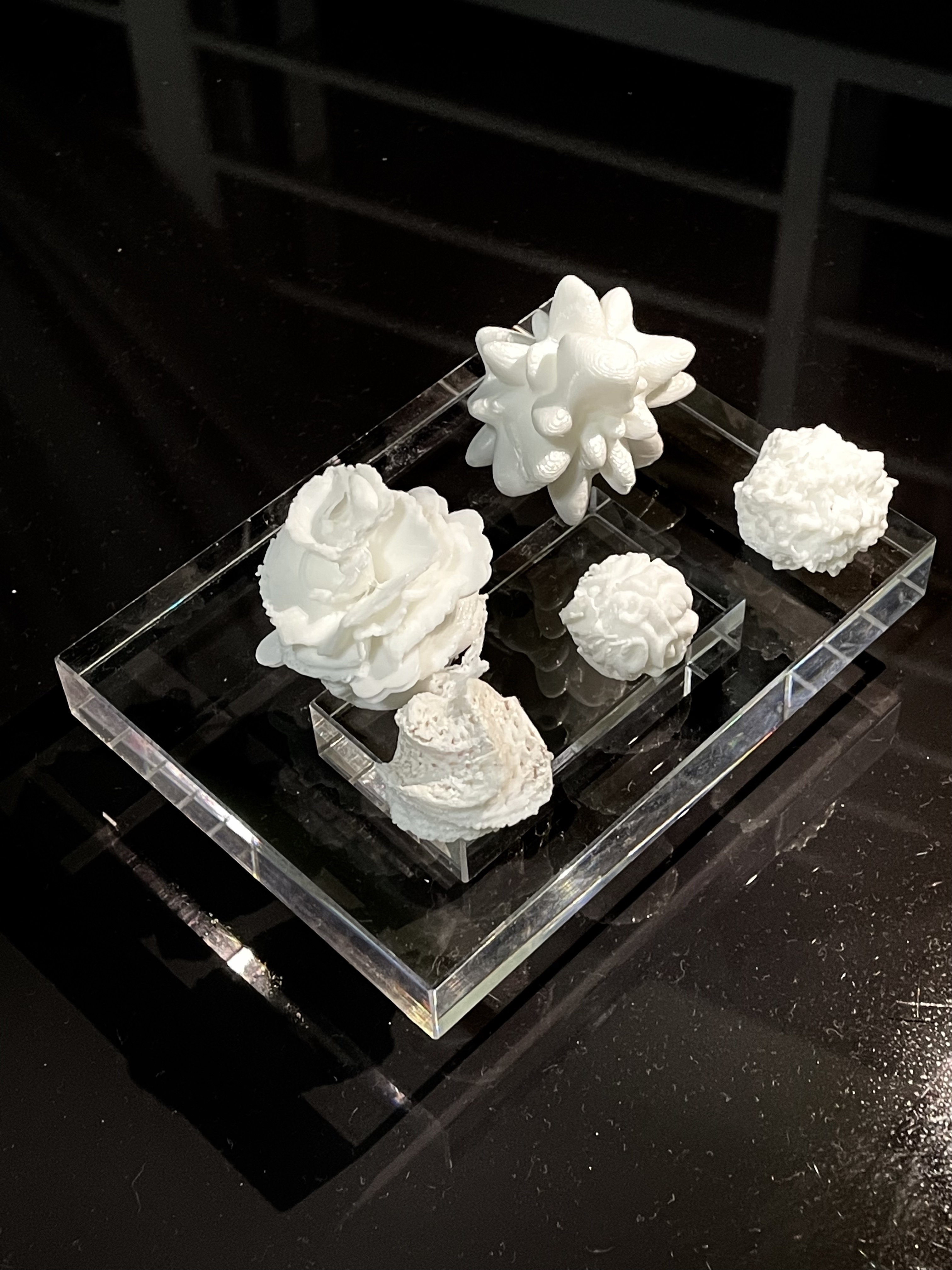
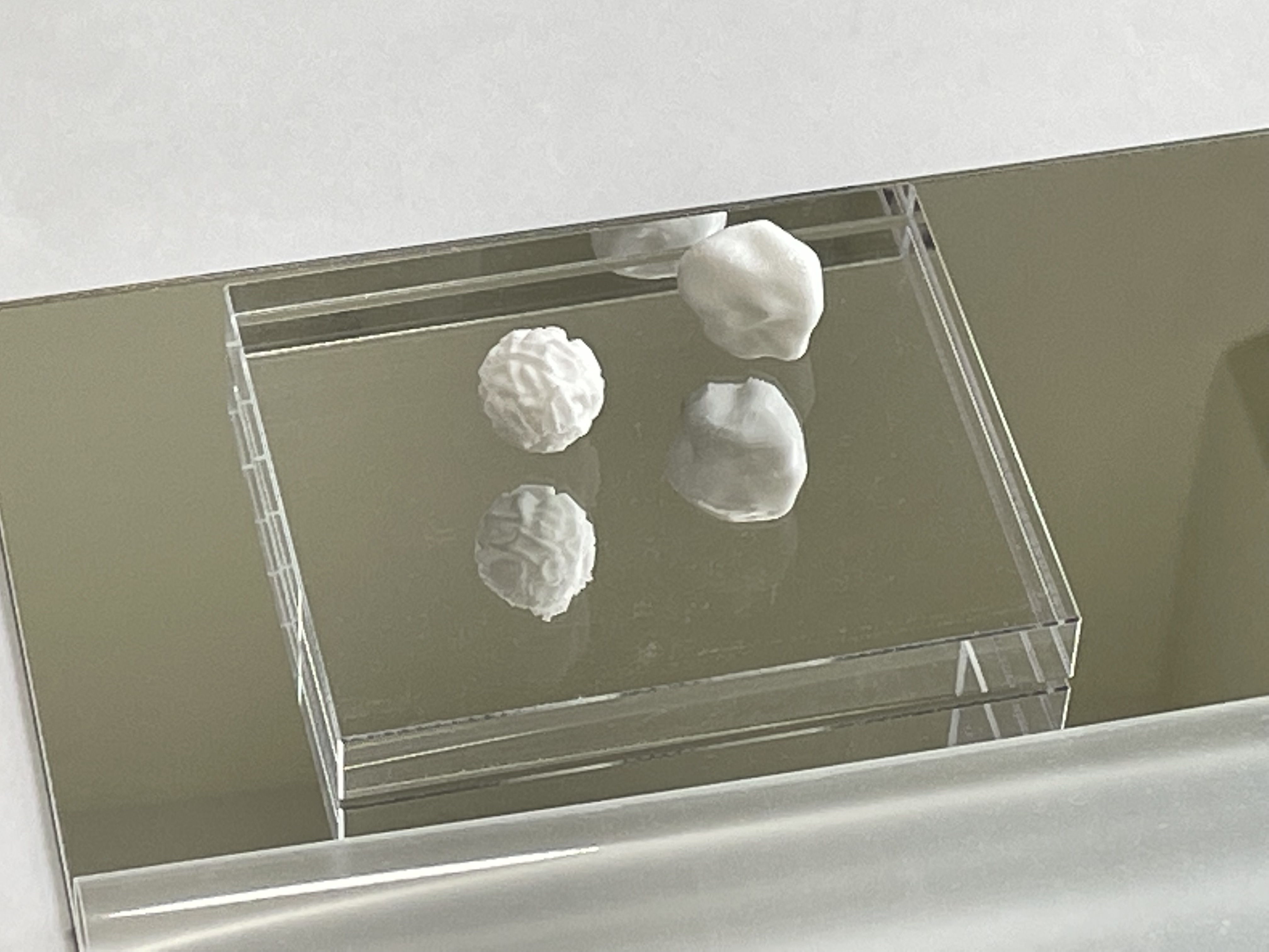
I bought some acrylic blocks from Artfriend as I thought that they would make nice stands for the 3D data objects. At Artfriend, I tested the layout with some foam balls that I found in the foam section which surprisingly resembled my 3D data objects. I also experimented with reflective mirrors as its base, to reflect the 3D prints through the acrylic to provide more depth in the layout. In addition, the use of mirror is to allow viewers to see the base of the 3D prints as well.
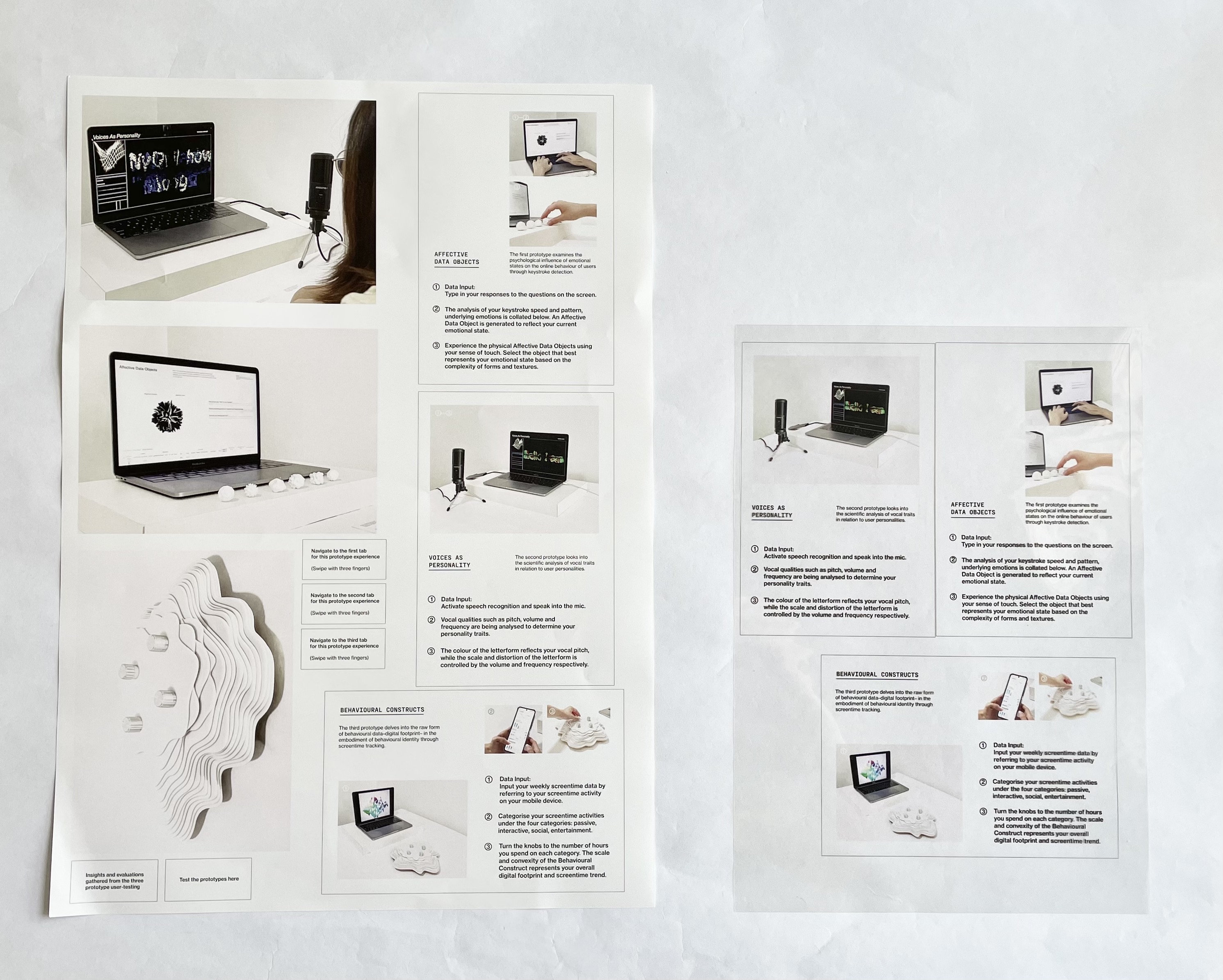
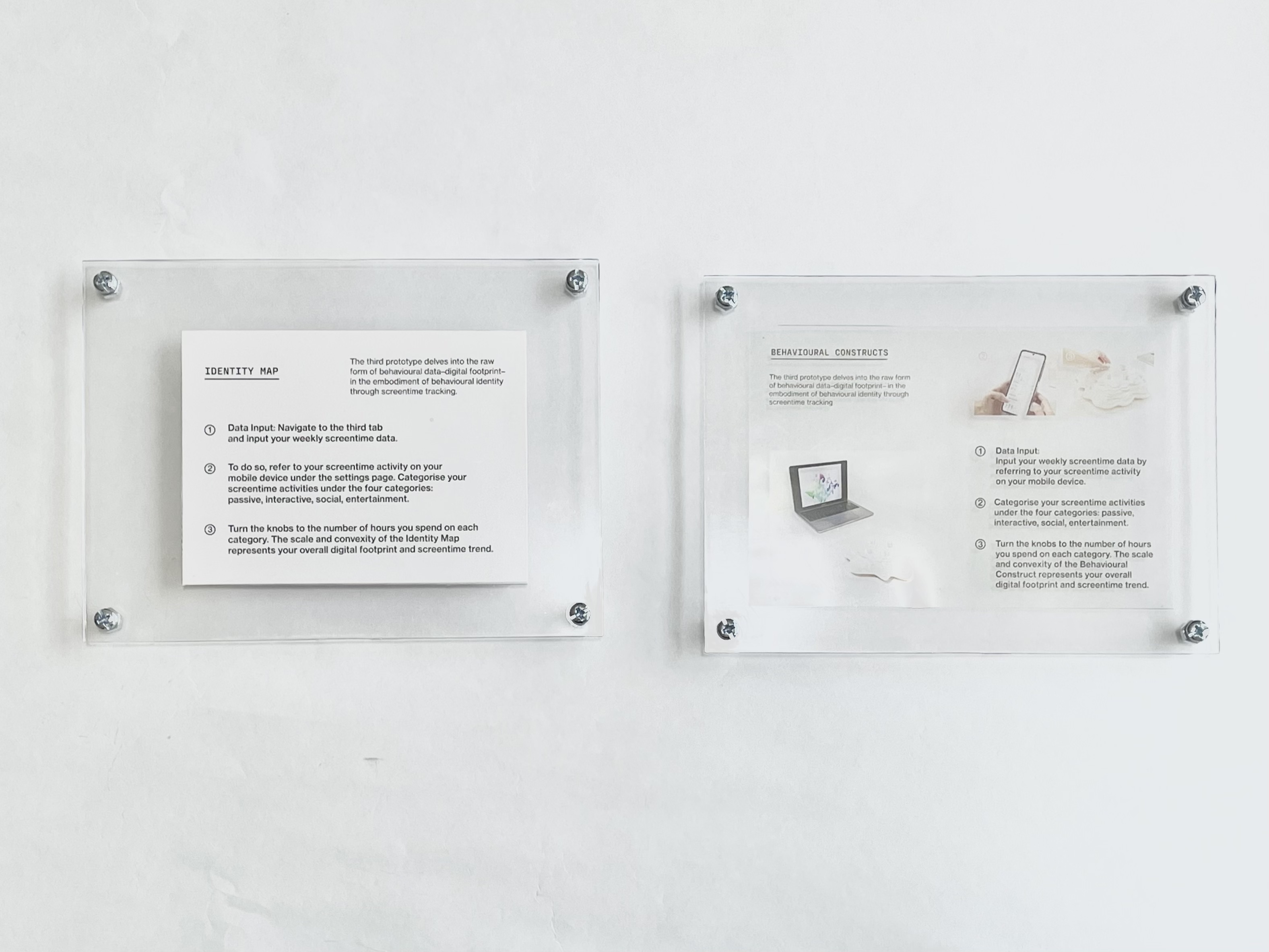
Lastly, for the labels, I explored the use of transparent sheets and paper against the polysterene covers. Visually, the transparent labels look more interesting, however an issue with it was that the images can't be seen clearly.
