1 / User-Testing Behavioural Constructs PrototypE
2 / Publication Design
3 / Publication Printing
USER-TESTING BEHAVIOURAL CONSTRUCTS PROTOTYPE
From last week's development, I decided to change the name of the prototype, from Identity Map to Behavioural Constructs, so as to give a hint and provide some context through the name of the prototyope.
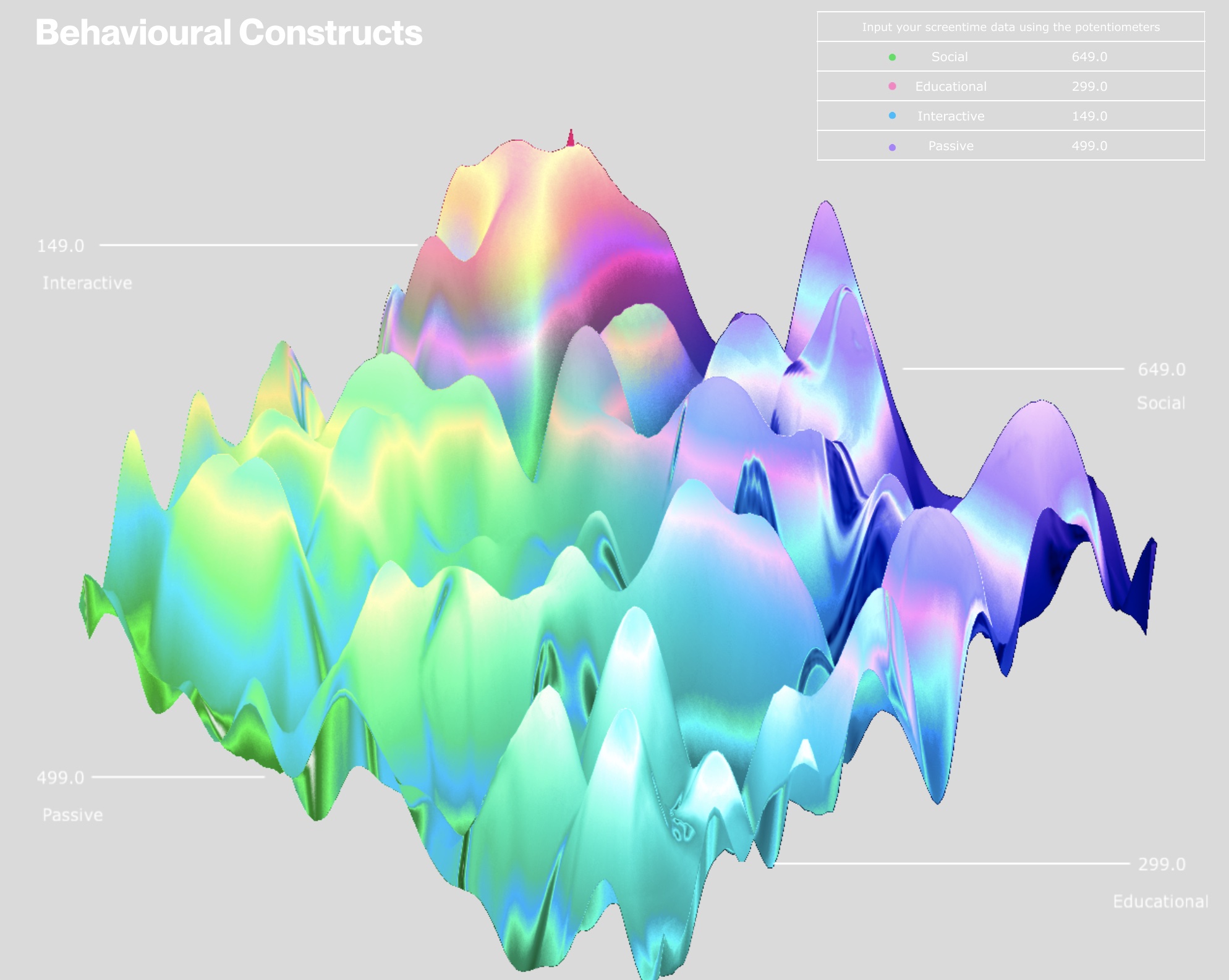
In addition to that, I refined the labelling system used in the digital visualisation, to help guide users in understanding the categories.
I thought of using a map as a legend instead of a table, outlining the overall shape of the visualisation. However, I figured that would not resolve the issue of the labels being unclear. Hence, I decided to using lines to draw connections to the category names and values. I thought that the table was still necessary as it helps to consolidate all the data and provide a comparative overview across the values.
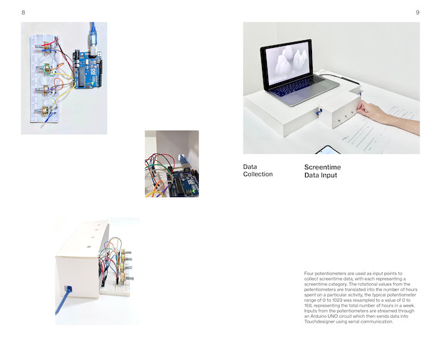
After which, the prototype was user tested with the new circuit set-up and visualisation. There were quite a few issues during the configuration of the new set-up and visualisation. I kind of expected this to happen since the circuit was quite messed up in the process of getting everything to fit in the correct position within the acrylic casing. Also, some issues related to the Arduino port connectivity, which I spent hours trying to figure out. In the end, a proper computer restart managed to get the circuit connected and ready again.
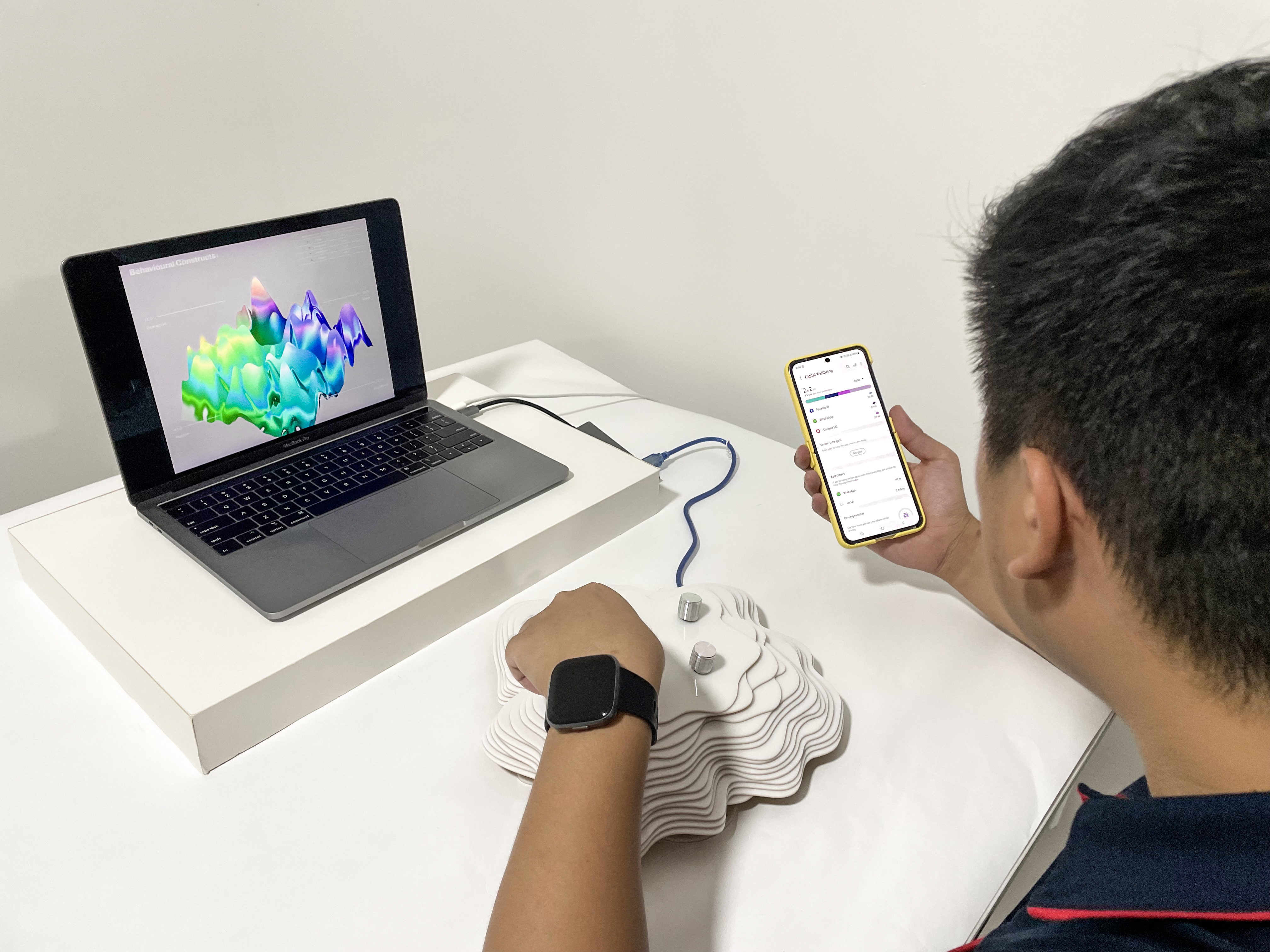
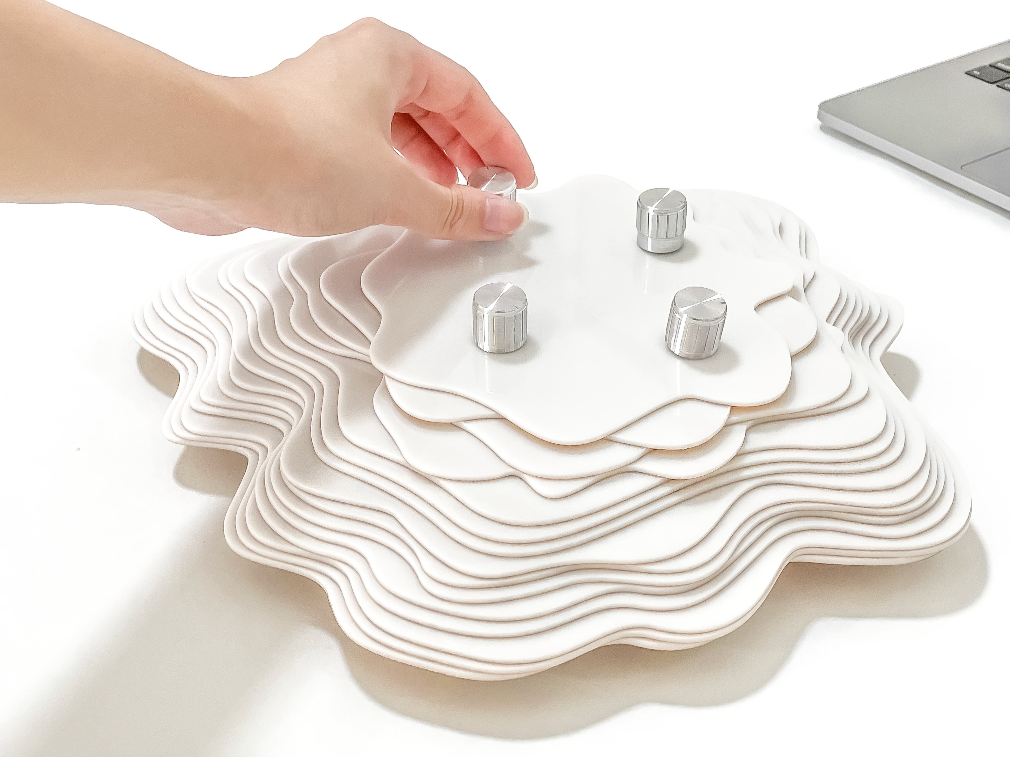
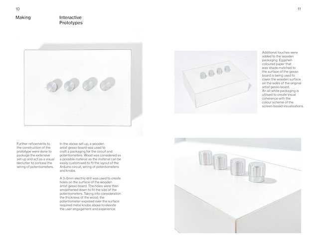
I also took the opportunity to reshoot the prototypes for the website and video documentations. Below are some of the shots that were derived from the reshoot.
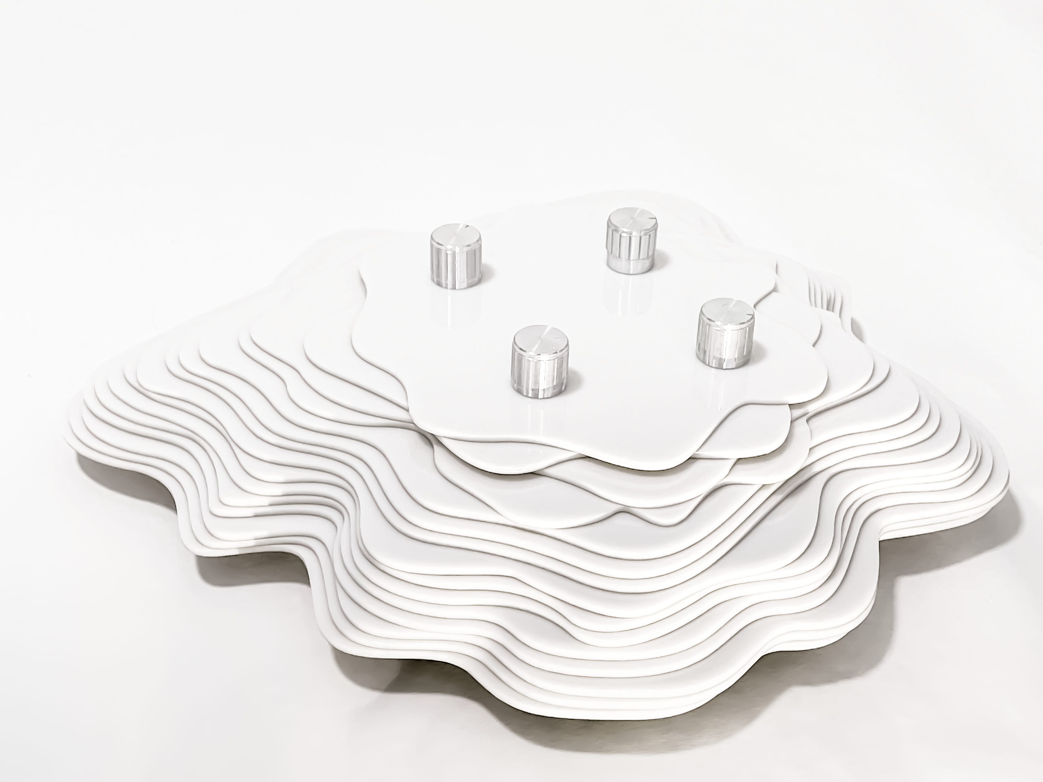
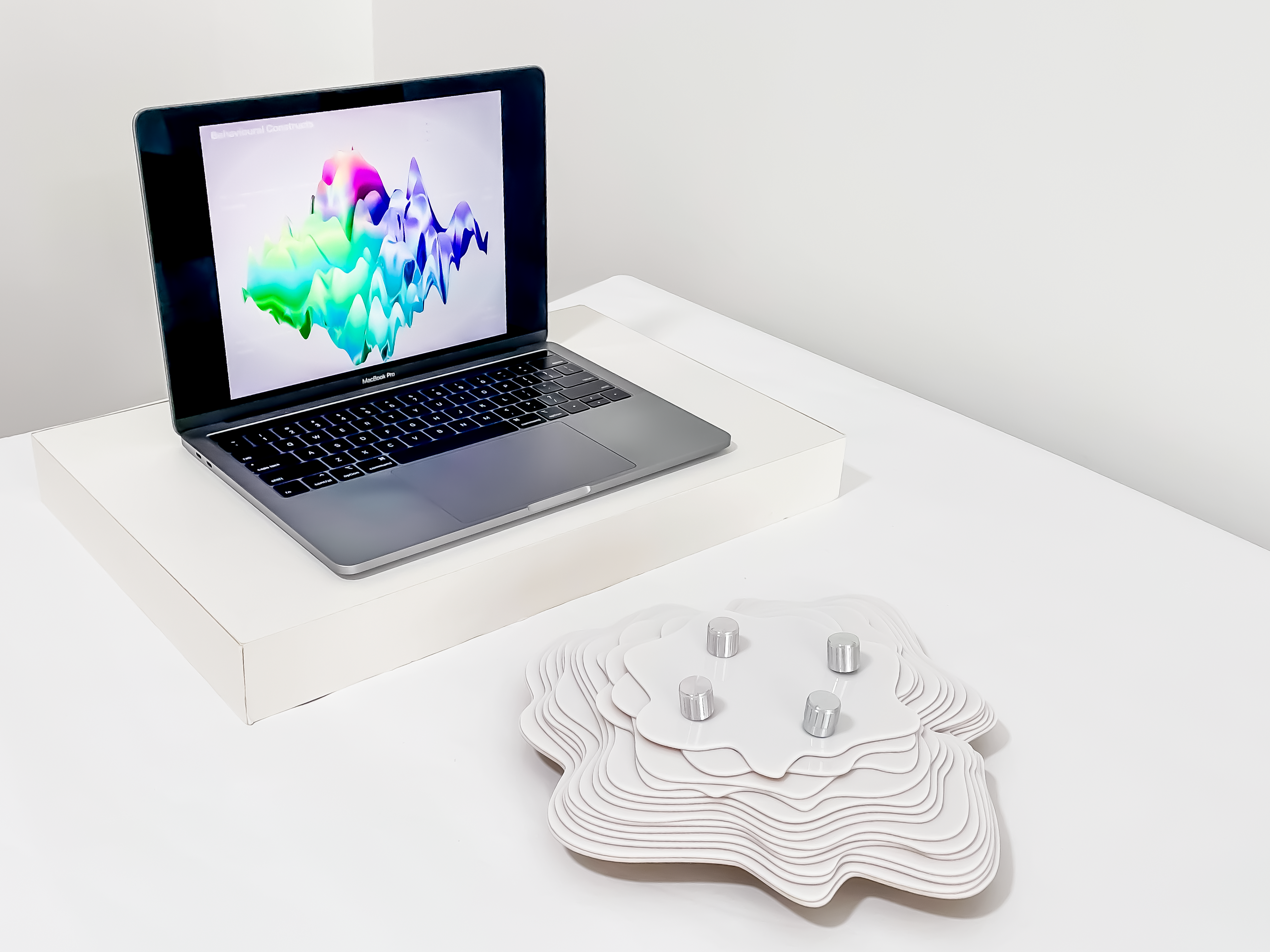
PUBLICATION DESIGN
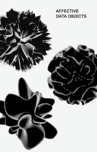
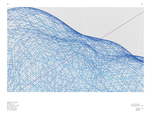
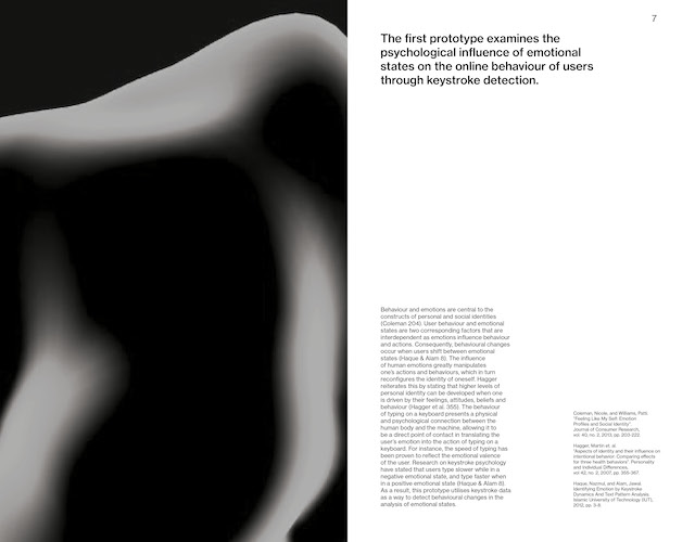
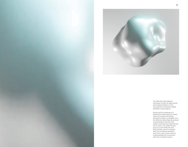
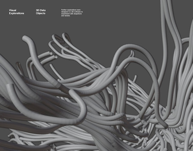
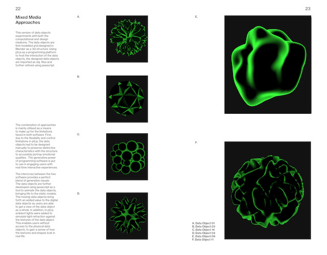
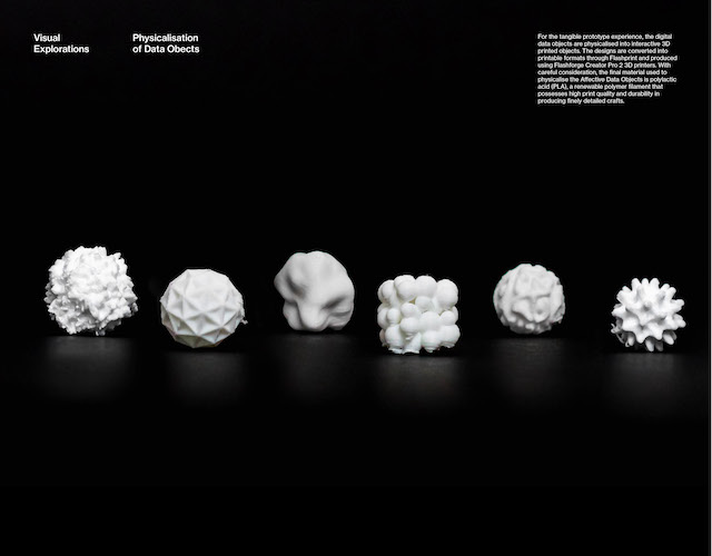
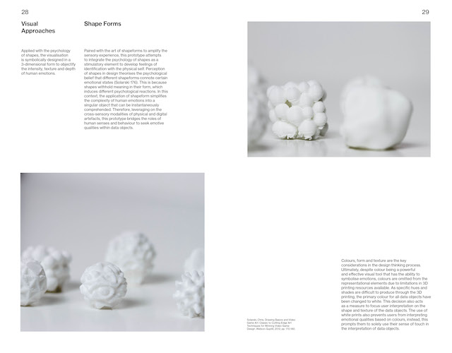
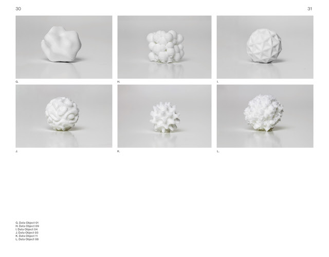
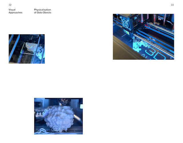
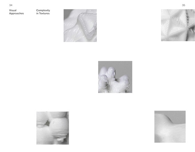
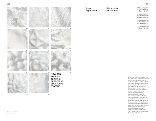
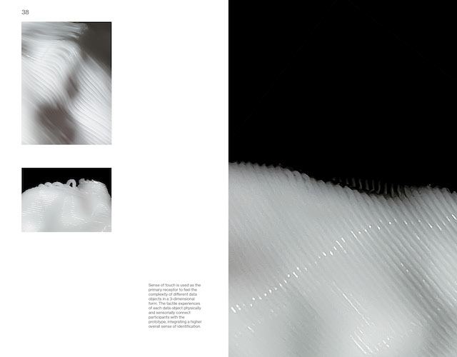
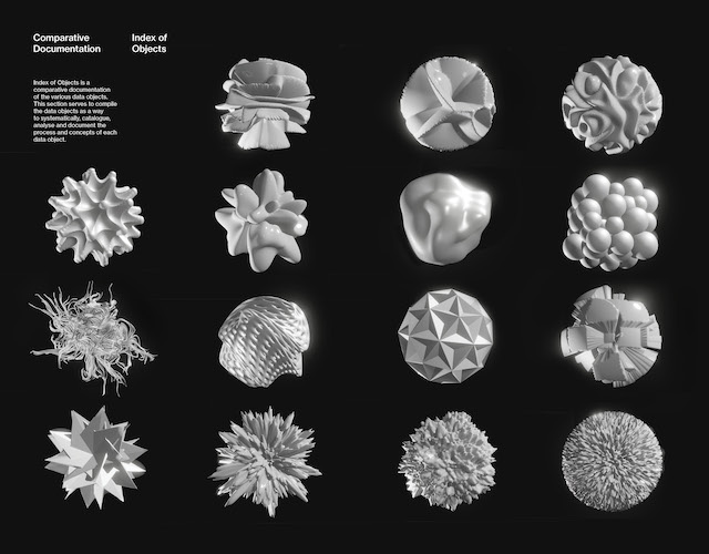
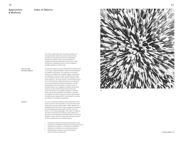
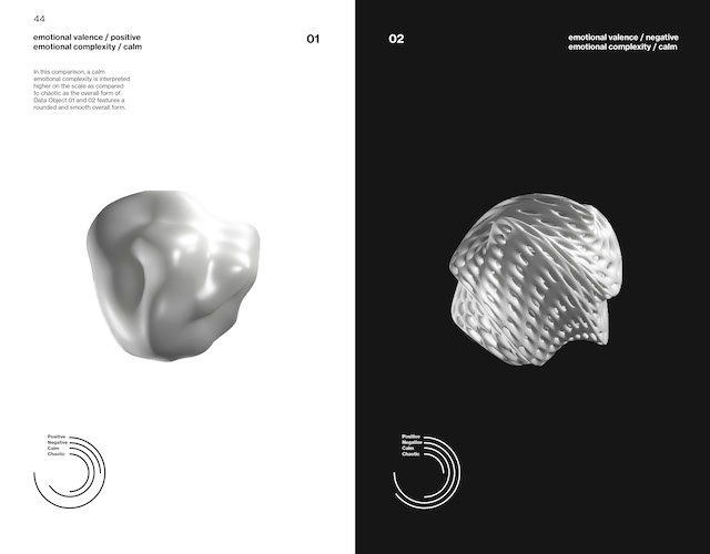
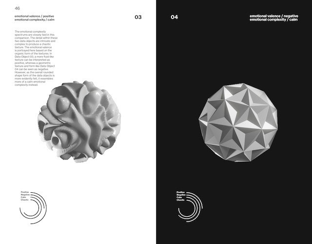
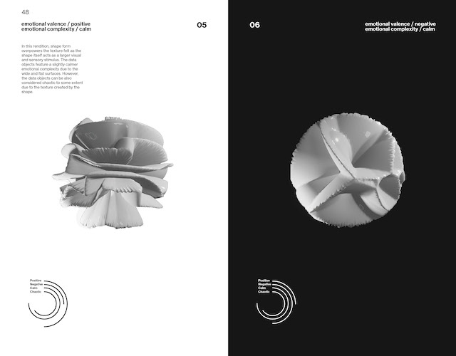
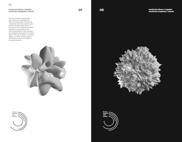
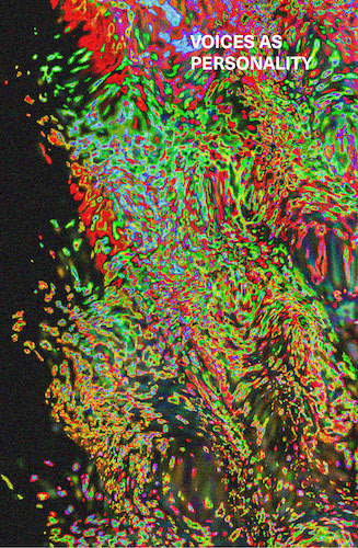
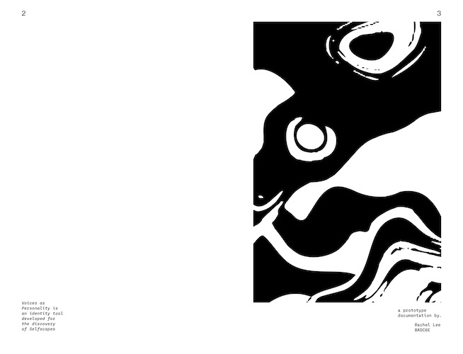
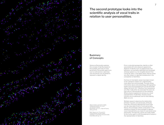
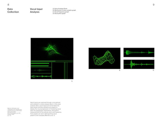
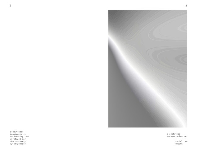
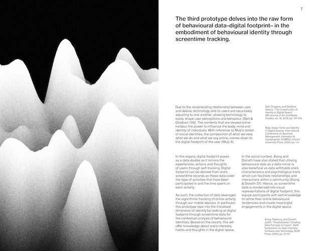
For the publication, I intend to combine the three publications into one. To do so, I will be making them different sized publications and they will then be binded together with each stacked on top of one another. The publications have been expanded to around 50 pages each since the Open Studios. I've also rememebered to add in a colophon page in my publications as mentioned during the Hanson Ho feedback session during Open Studios. During the design process, I kept in my the tip that he gave–to include full-bleed images/tightly cropped images in the publication. I thought this feedback was very helpful has it really helped to tie in the visual language and make each publication stand out from one another.
PUBLICATION PRINTING
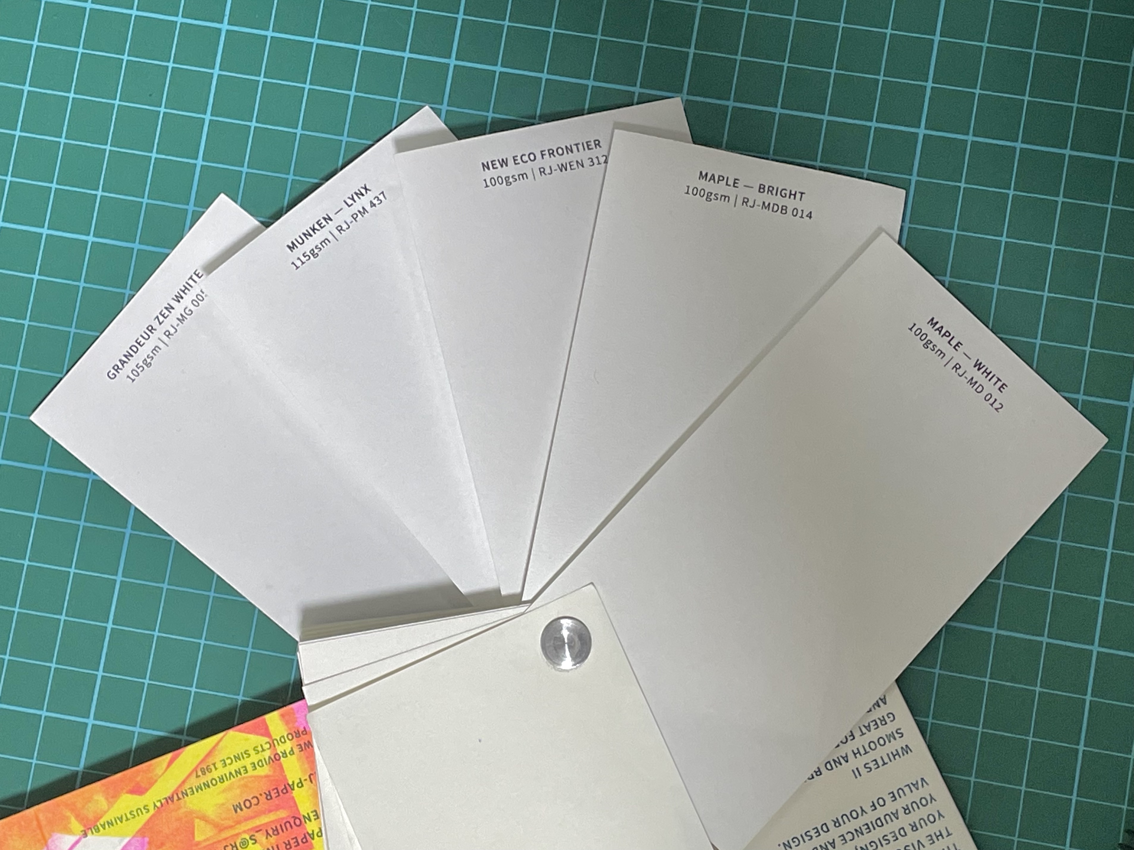
From the open studios, one of the feedback was that the paper felt too thick. In the previous draft I used a 120gsm Grandeur Zen White paper from RJ Papers. As the thinnest gsm for that type of paper only runs till 120gsm, I selected a few other options for my final publications. I downselected five different types of paper that had a similar shade of white. I didn't consider any cream or yellow toned papers as it didn't fit the tone of the book. I narrowed down my selection to New Eco Frontier as it has a good gsm weight, shade of white and plus it has a unique texture.
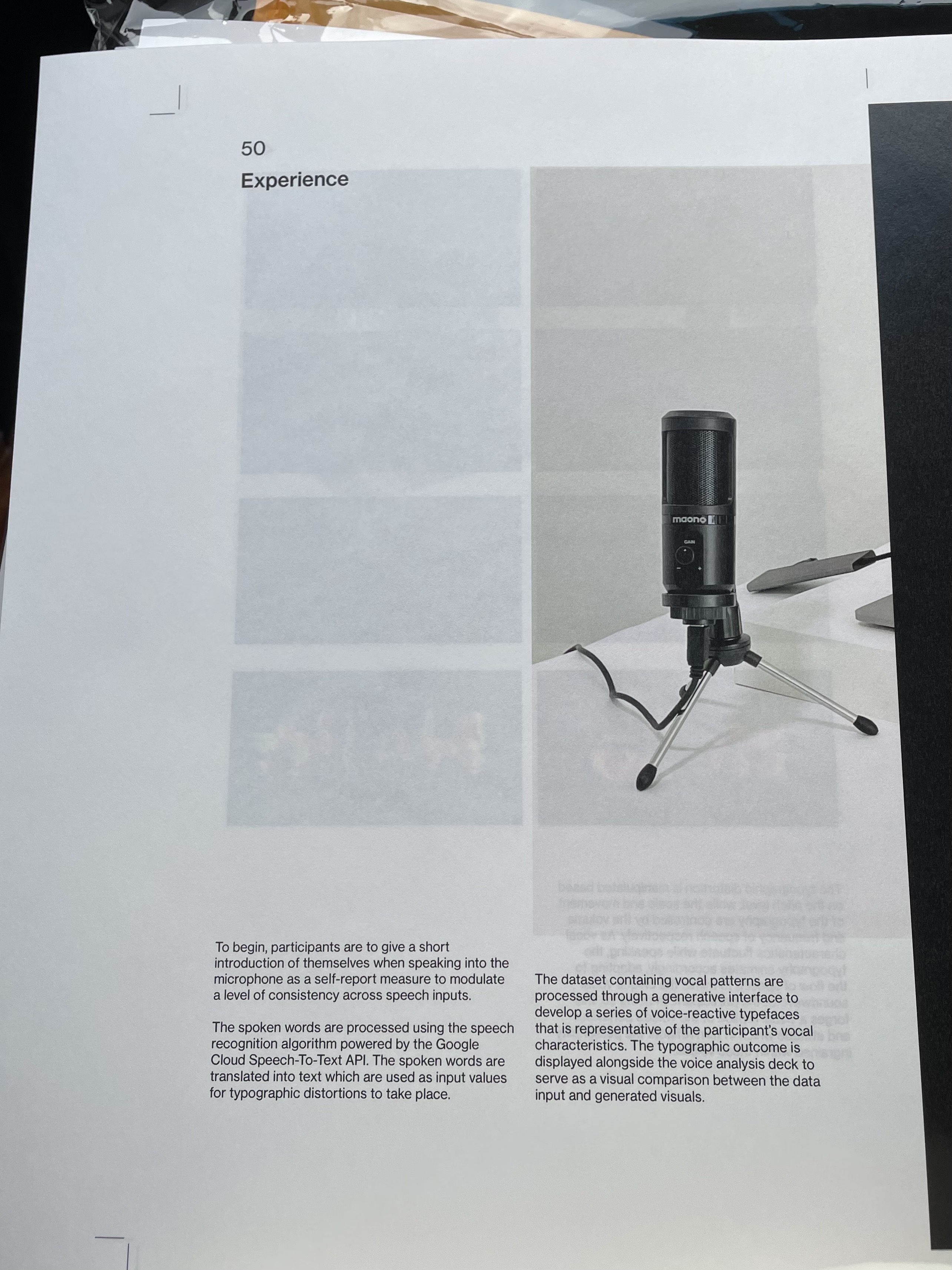
After receiving the paper from RJ papers, I printed the publications but to my dismay, the printing didn't turn out well. The content from the page behind seeps into the front page, making the images blurry. It was even worse with spread that had black images or text, as the translucency is quite obvious and the blending of contents became quite a distractions for reading.
To label the individual potentiometers with its screentime category, I printed the labels on a diecut transparent sticker sheet. However, the issue with transparent stickers is its so difficult to handle. The moment I paste it on a surface I can't remove it without damaging the sticker. As seen in the image on the right, that was what happened when I try to adjust the sticker after it is being stuck. The act of peeling creates creases and 'cracks' that cannot be undone on the sticker material itself.
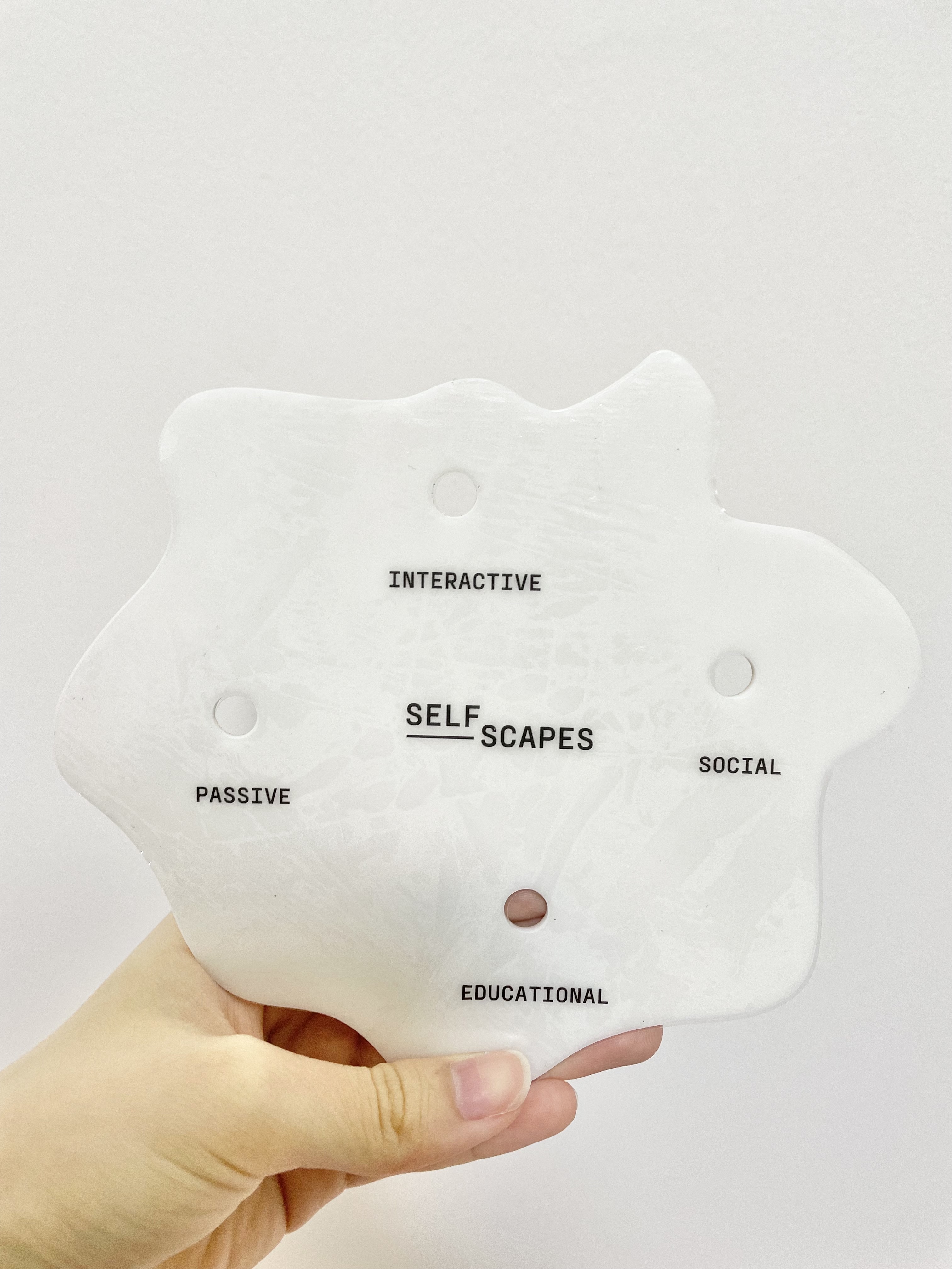
Laser-etched labels

Instead of the transparent stickers, I decided to laser-etch the labels for the screentime categories on the acrylic itself, similar to what I've done for the word 'Selfscapes' in my first laser-etching attempt. Visually, the black labels from the sticker on a white background looked quite harsh. In addition the sticker gave off a slight yellowish tint to the all white prototype. Hence, I think etching the text on the acrylic itself was the next best option.
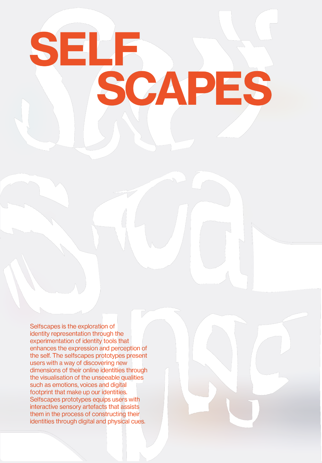
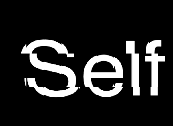
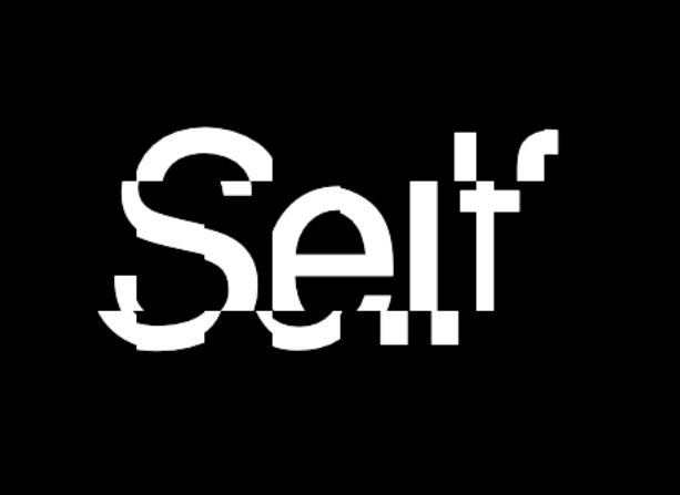
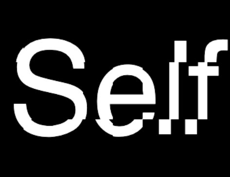
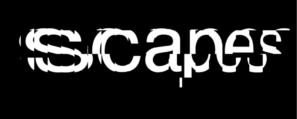
Same goes for the front cover of the publications. I decided to create a matte acrylic with the Selfscapes title and introduction printed and stuck on. The acrylic sheet is intended to binded with the publications using coptic stitch. This will act as a front page/preface that covers the three publications. I thought of doing this as a way to package the three publications under Selfscapes and at the same time, avoid repeating the same Selfscapes preface at the start of every book.
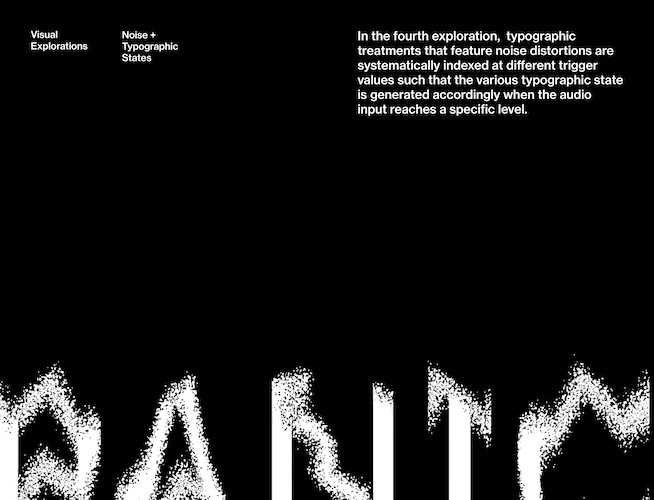
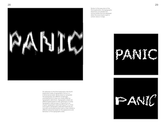
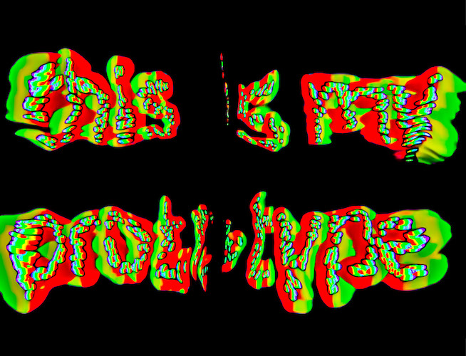
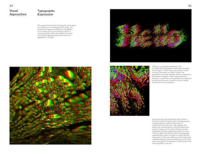
In addition, I liked how having a transparent acrylic above kind of serves as a narrative to explaining how the three publications, each representing an aspect of identity comes together to form Selfscapes. In a way, the three publications become the content that makes up the Selfscapes publication. I created the typographic distortion graphic using p5.js! I distorted the text by using the float method as taught in the Tim Roden Broeker tutorial
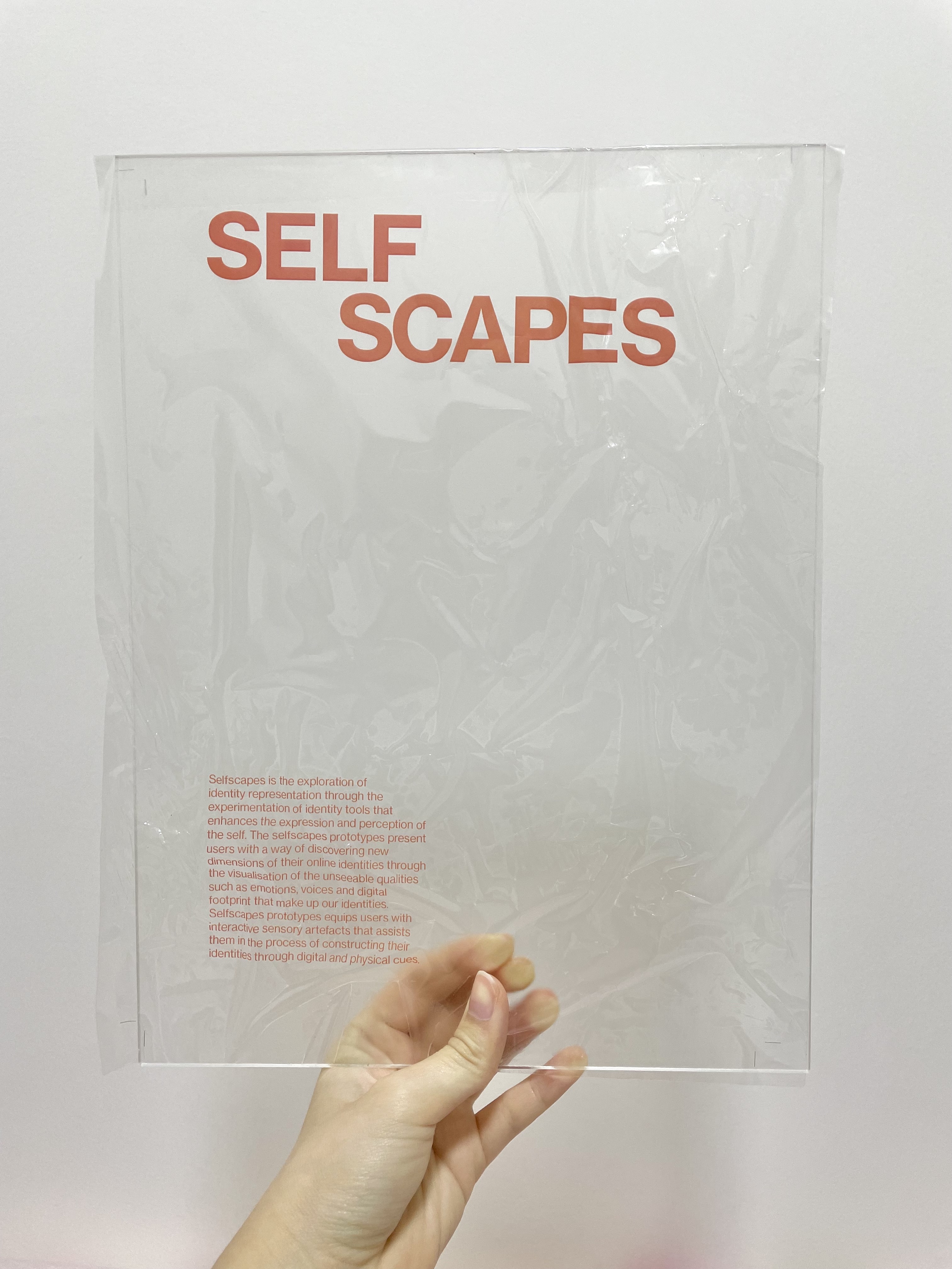
Applying the same method as the labels, I thought of using transparent sticker to print the text on, then pasting it onto the acrylic sheet to mimic a printed acrylic look. I also chose a matte clear acrylic to provide slightly more opacity to enhance the readability of the text.
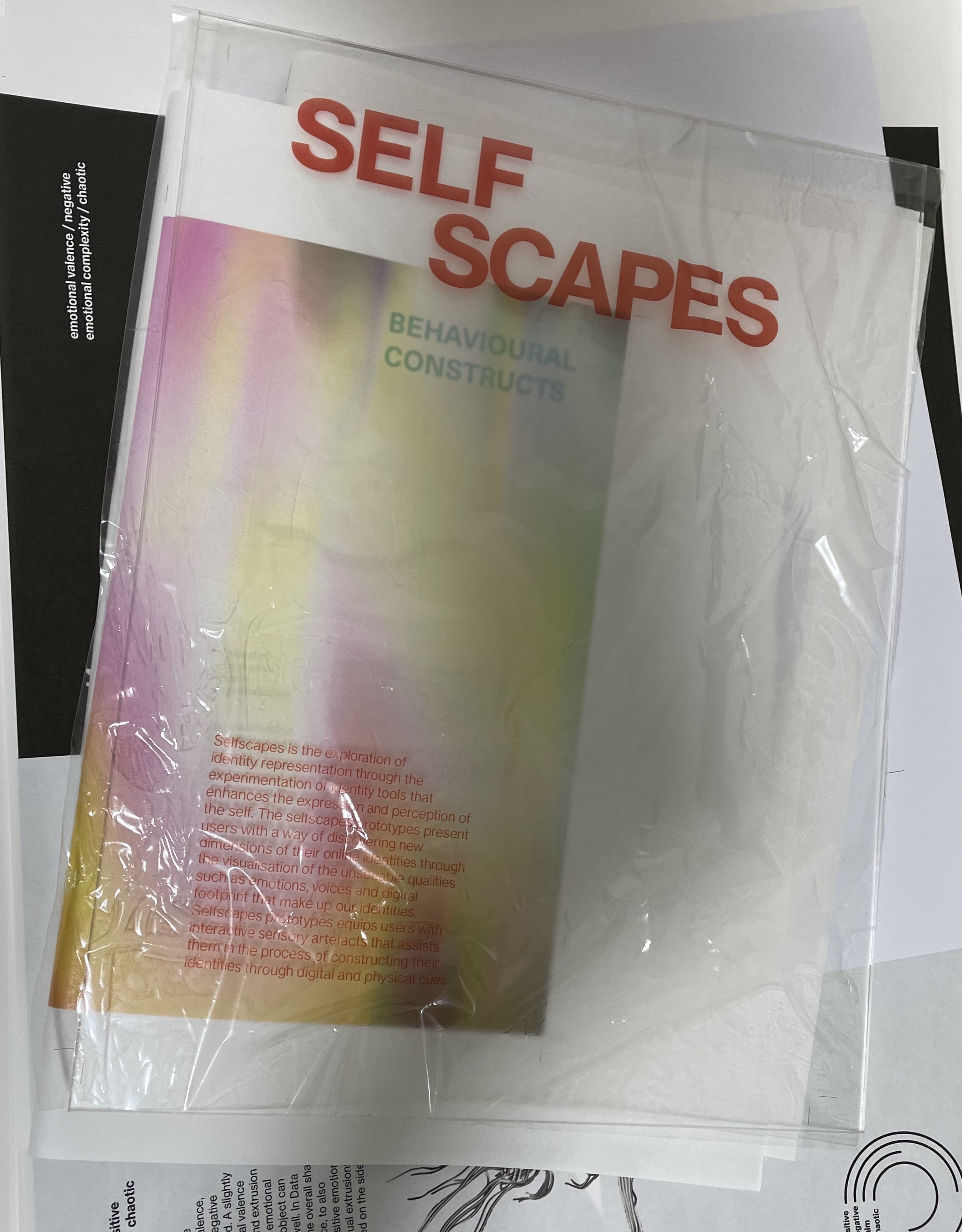
Same as the labels sticker, the process of sticking it on was a mess. However, the failed attempt resulted in this effective that felt and looked quite interesting. The texture felt very plasticy and stiff which was cool as the stick on was no longer flat but 3-dimensional. Visually, it looked interesting and the bubbles and creases of plastic against light created shapes that almost resembled the typographic distortion I had in my print (which did not get printed as it was in white–this was another mistake during the printing process).
