1 / Prototype Sketches
2 / Consultation
3 / Prototype 3–Visual Updates
PROTOTYPE SKETCHES

In my first sketch, I did a wooden cube with a metal or white acryllic surface top. I combined the wood material with metal or white acryllic to make the prototype casing more similar to the visual aesthetics of the outcome which has a grey background. Also, this is to avoid a completely wooden prototype which may appear too organic for a concept focusing on digital footprint.
I spent quite a long time trying to figure out how to improve my digital footprint prototype casing. I didn't like the bulky box look that it currently has, hence I'm trying to think of ways to create a more compact prototype casing. Also, taking into consideration the materials that I have to work with, I needed to think of how I can drill holes into the surface and conceal the circuit below.
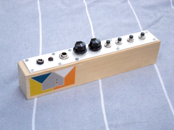
Image: Noise Circuit. Yuri Landman.
CONSULTATION
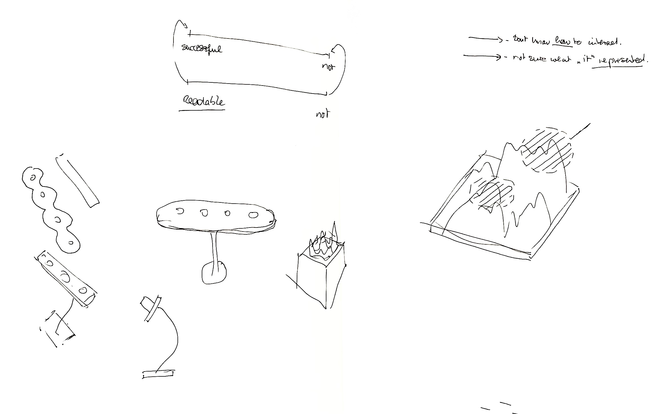
–The main focus should be on 'how to interact', 'what it represents' and the readability of the prototypes. In this case, readability plays an important role in the success of the prototype, if the concept behind it is playfulness it might work but if not then the work will be challenged.
–Your target audience needs an entry point into the prototype
–Should build a strong narrative around what you have to explain it better instead of focusing on the technical aspects like if the visual fits.
–Prototypes can draw inspiration from art, installation, sculptures etc. Some possible areas for referencing prototypes is Teenage Engineering
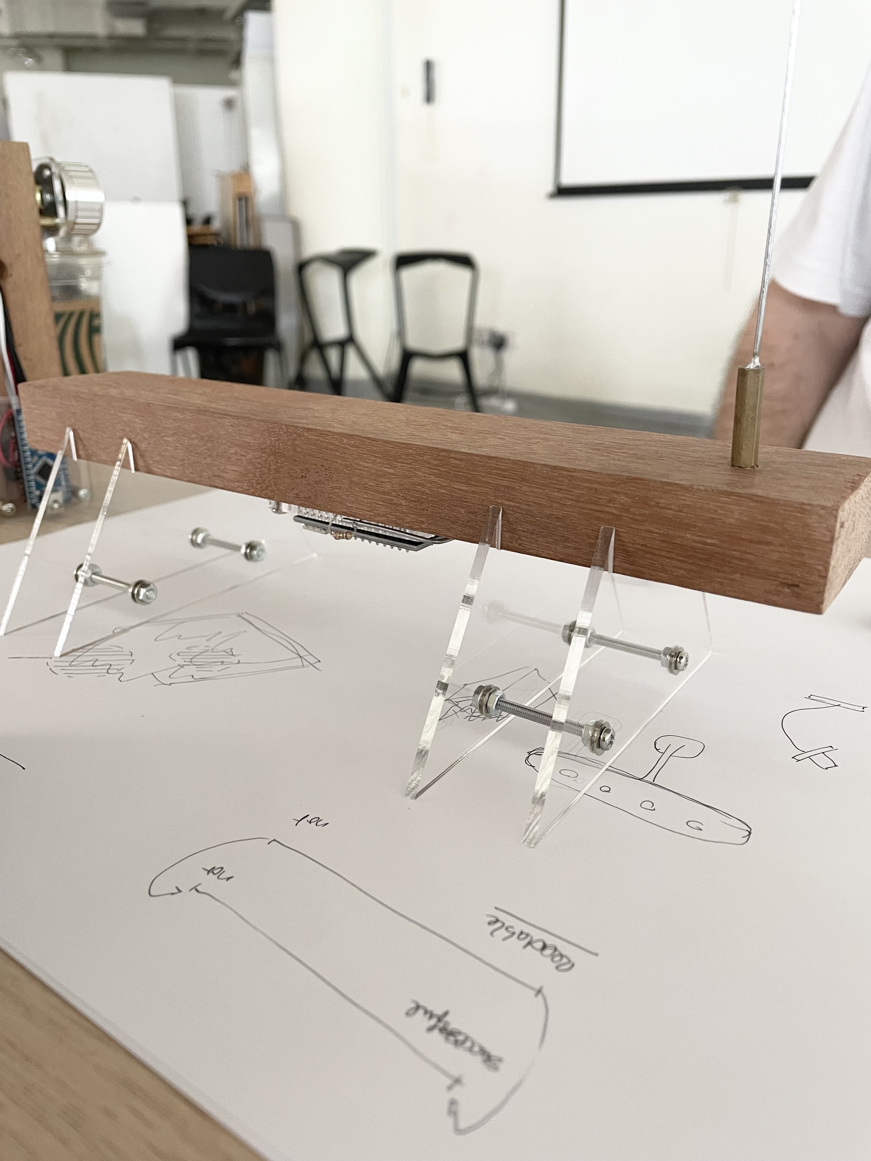
–Prototypes need not be in the form of a cube, think outside of the cube. Something more organic like the visual? or for instance the visual looks as if it is floating, so a surface that is flat and elevated maybe?
–It can even be something other than knobs, like sliders or light dependent resistors
Initially, I was quite confused and lost on how to approach the making of the prototype, but seeing for instance the use of acryllic to lift the prototype to portray a floating surface really helped me process how prototypes can be built. It also got me thinking how I could focus on what/how I want the prototype to be interacted and experienced instead of focusing on hiding the circuit.
Sketches & Ideation
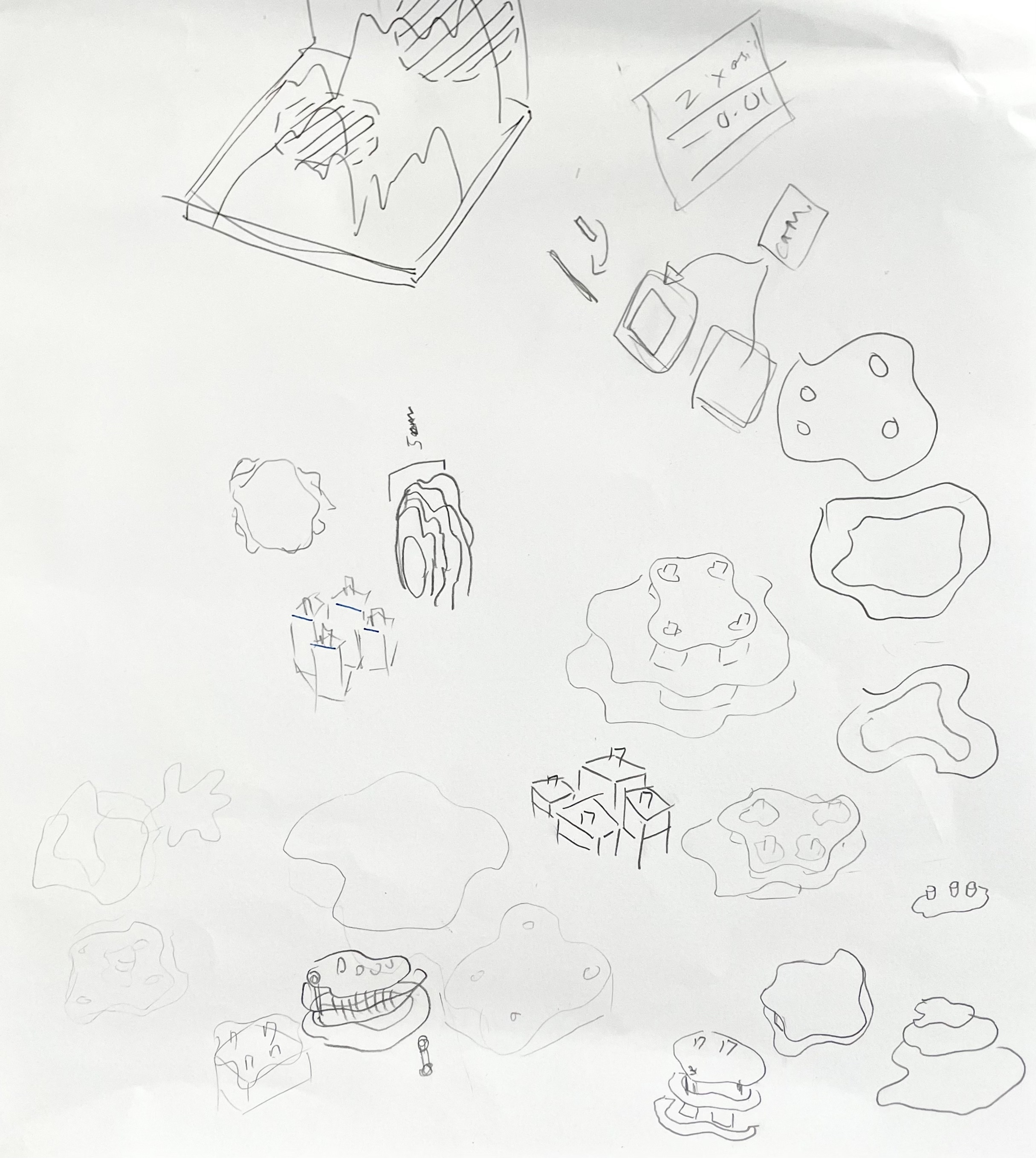
I did some sketching to generate some ideas. First I thought of making tiered platforms with different heights to mimic the angular positioning alike the visual. Next, I tried sketching something more fluid like the nature of the visual. I also started to look at the prototypes Andreas brought to work out what materials, tools and mechanics are used to create a prototype.
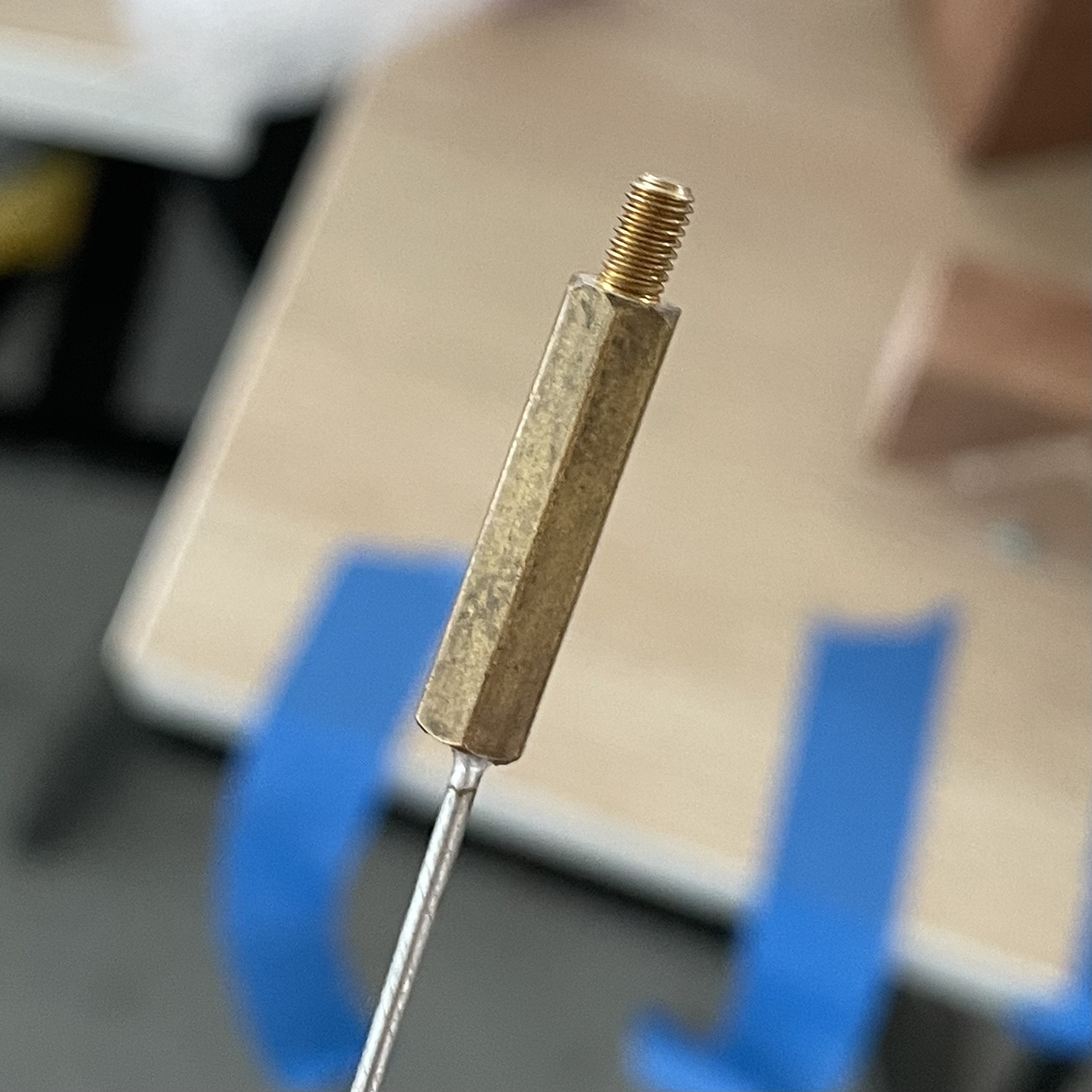
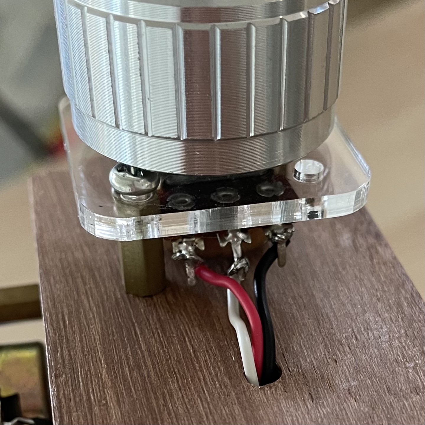
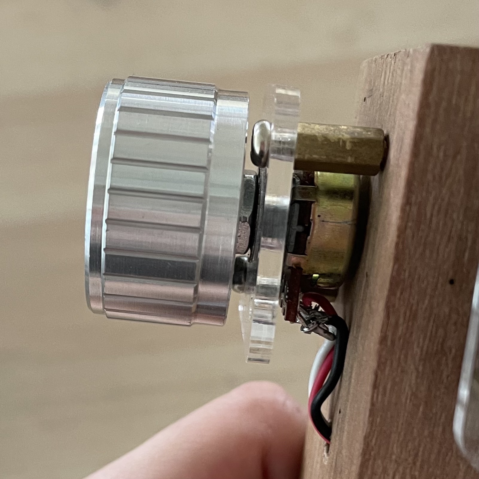
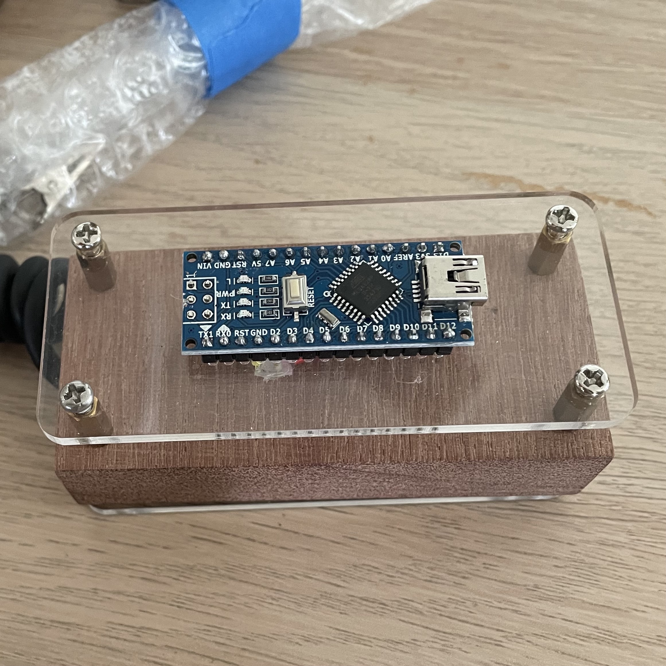
After sketching some more variations, I decided the fluid-like prototype worked best with the visual due to its organic shape. I thought about using spacers to levitate the surface, but also debated this as I didn't like how messy the circuit looked. Thus, I thought that the tiered option would not be the best. I struggled lot trying to make the fluid surface work with sides that can be built to cover the circuit inside. Due the curvatures of the top, I found it difficult to construct the sides of the prototype.
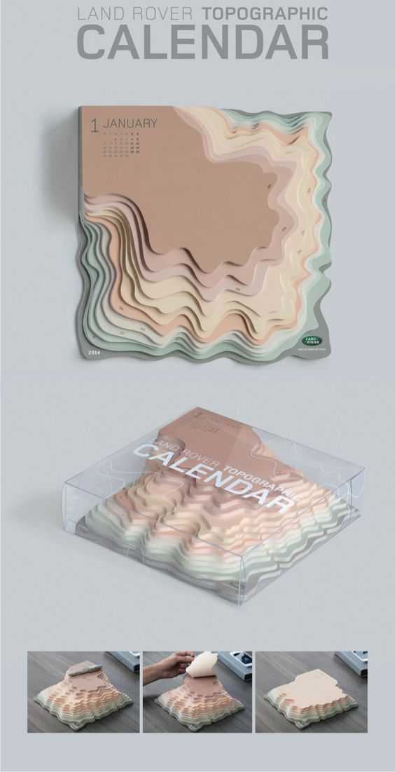
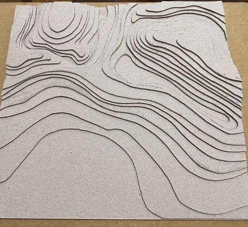
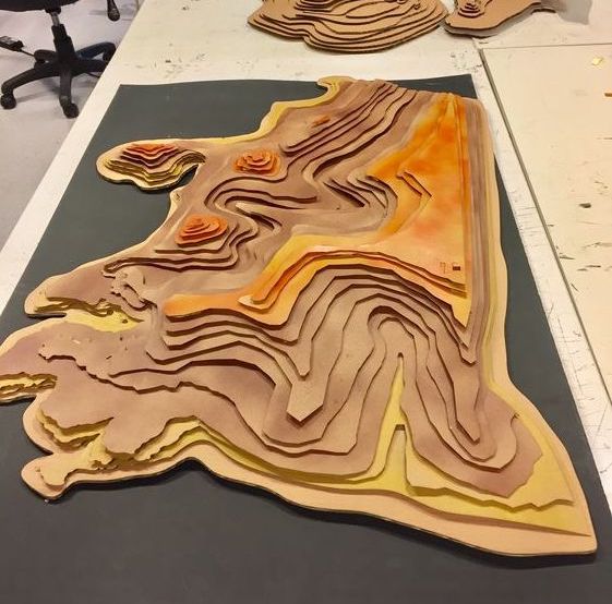
I went around looking for inspiration and luckily came across topographic models that are built with paper, cardboard, wood etc. From this, I thought of stacking the layers of material to form the sides like a landscape. By making the inner hollow, leaving only the edges/non-overlapping areas, I'll be able to conceal the circuit in the inside.
Laser-Cutting Material Test
I decided to just try laser cutting a few pieces to test the concept. Following the length of the box from my previous prototype casing, I used the same distance between the potentiometers as a way to gauge. Using an A3 white acryllic, I managed to fit three layers in. in my first test, I also wanted to try out etching out labels for the potentiometers on acryllic, so I added in the labels for each screentime category that the potentiometer controlled.
Thanks to Matin's guidance, I was able to quickly laser cut my first piece of material test quickly!
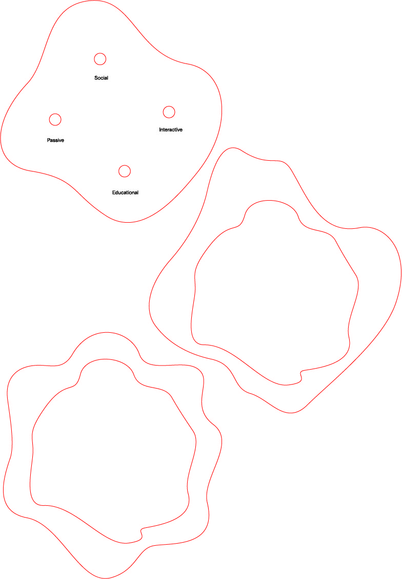
I think the outcome was quite satisfactory, the circuit was able to fit into the laser-cut pieces and the white layered acryllics turned out quite nice after stacking as well. However, one thing to note was that the etched out letters of the screentime category labels were not easily readable. This was something that I should consider in my next material testing.
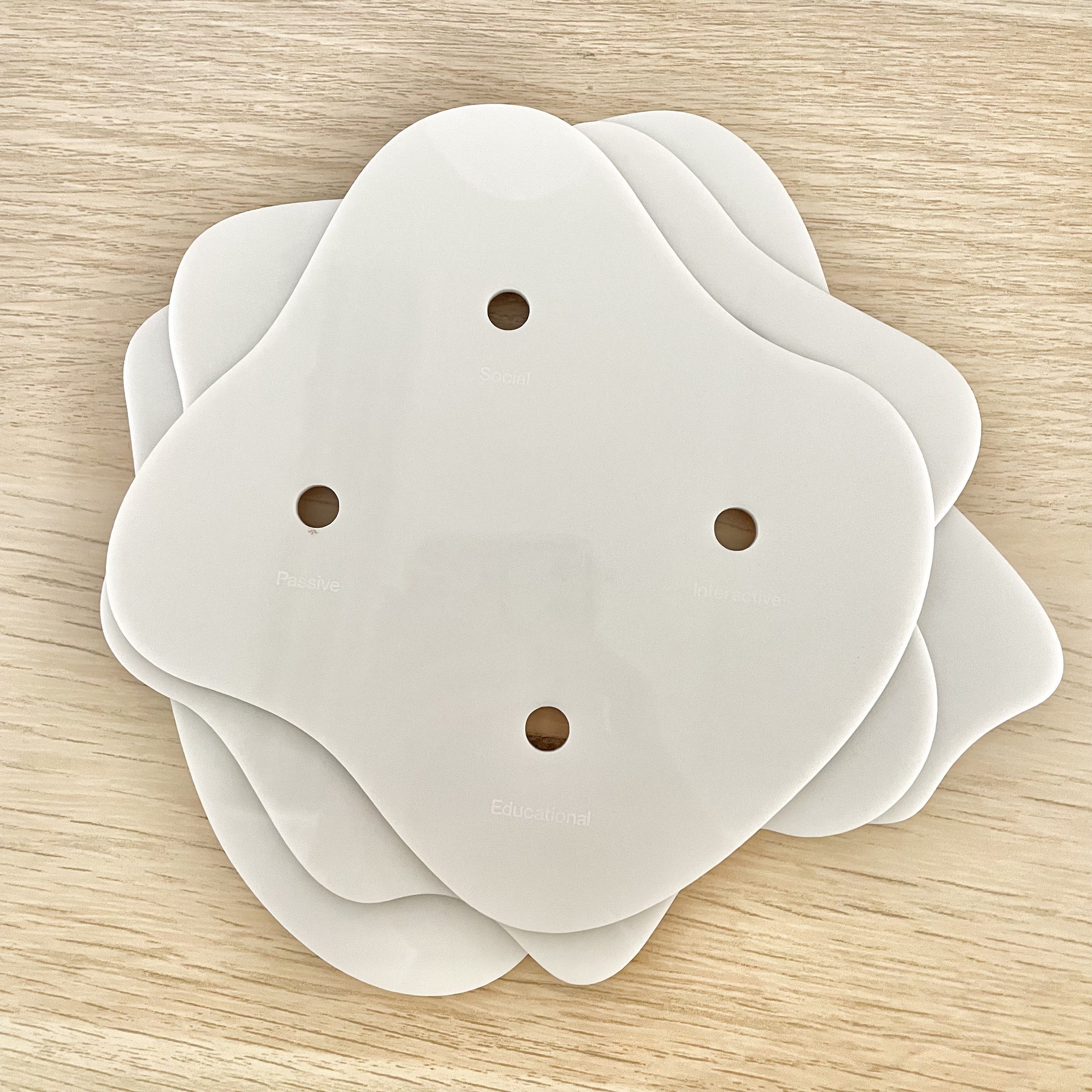
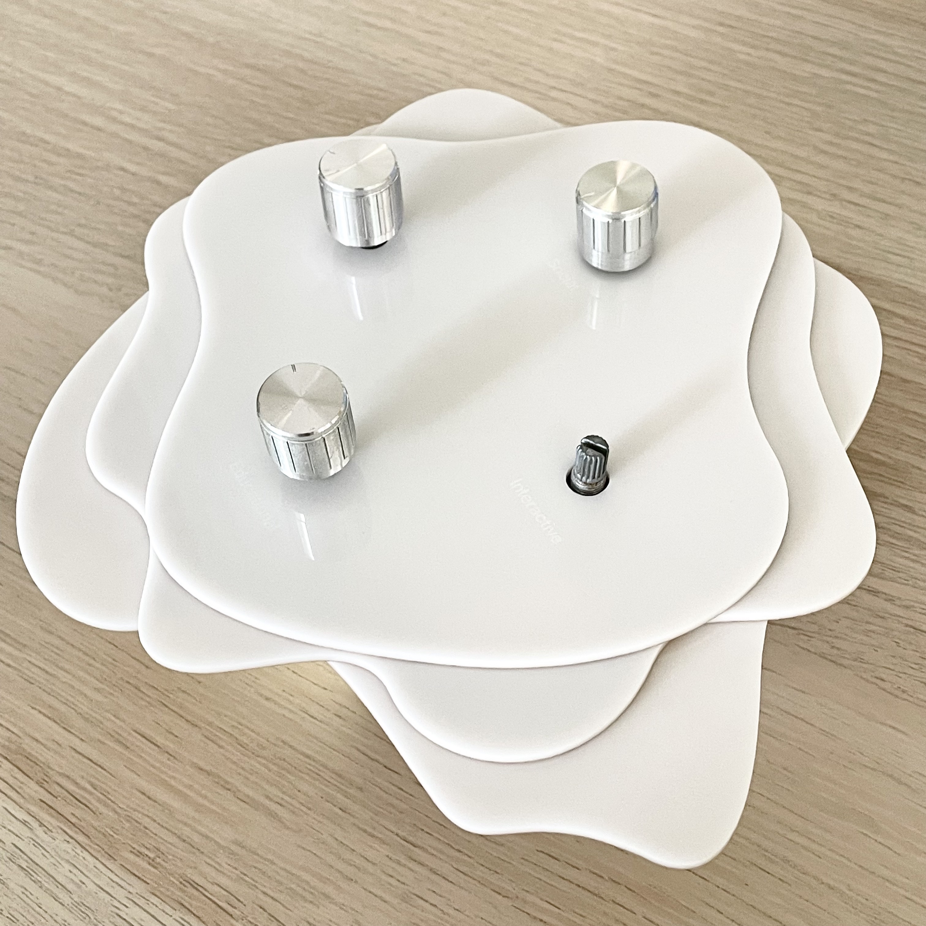
Please ignore the missing knob :(
PROTOTYPE 3–VISUAL UPDATES
To address the feedback received from Open Studios last week, I wanted to improve my third prototype on digital footprint to make the visual representation more readable and easily interpretable. Ontop of the feedback from Roundtable, I thought that I should veer away from the aesthetics of a scenic landscape so avoid looking too much like nature which might throw users off when they first look at it. I hope to keep the visual more abstract yet still retain hints of landscape to maintain the narrative.
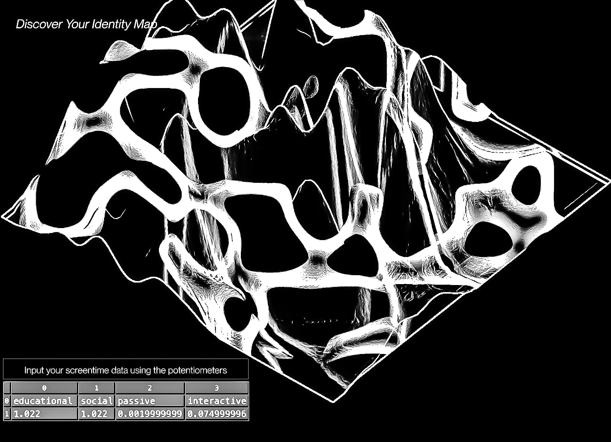
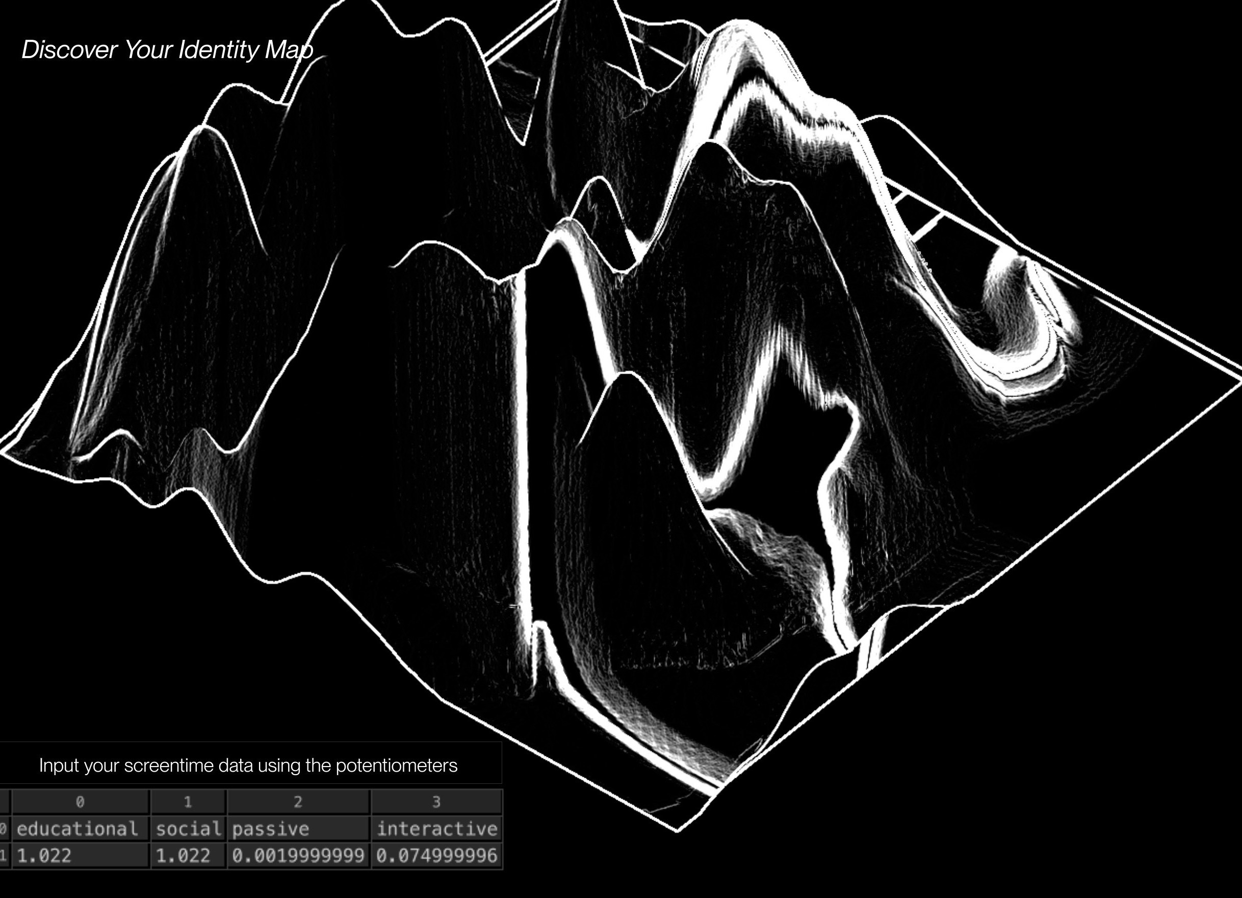
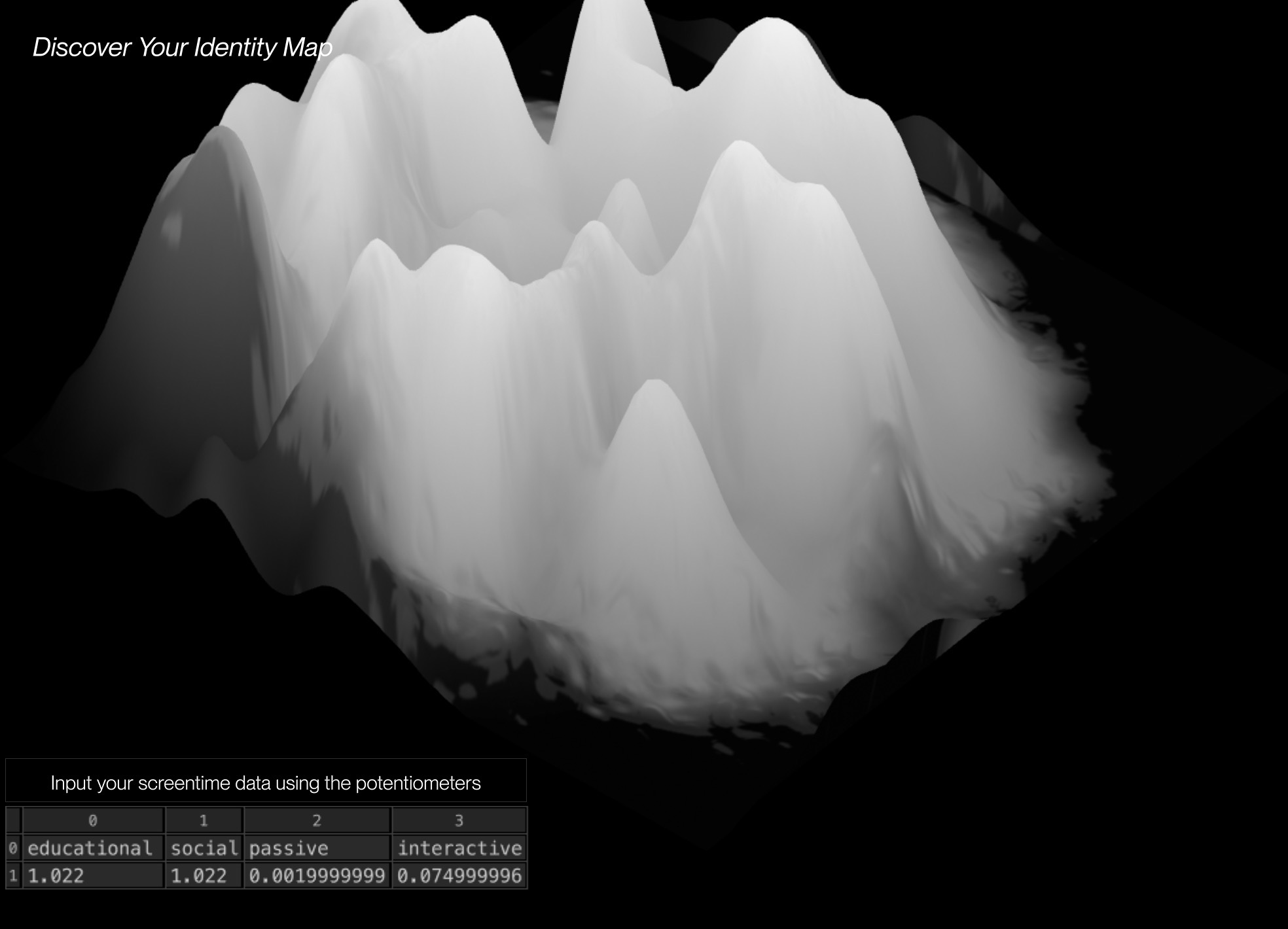
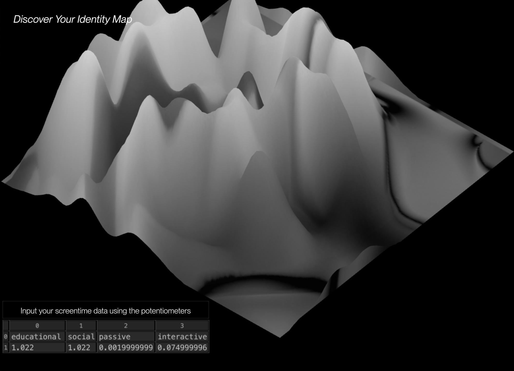

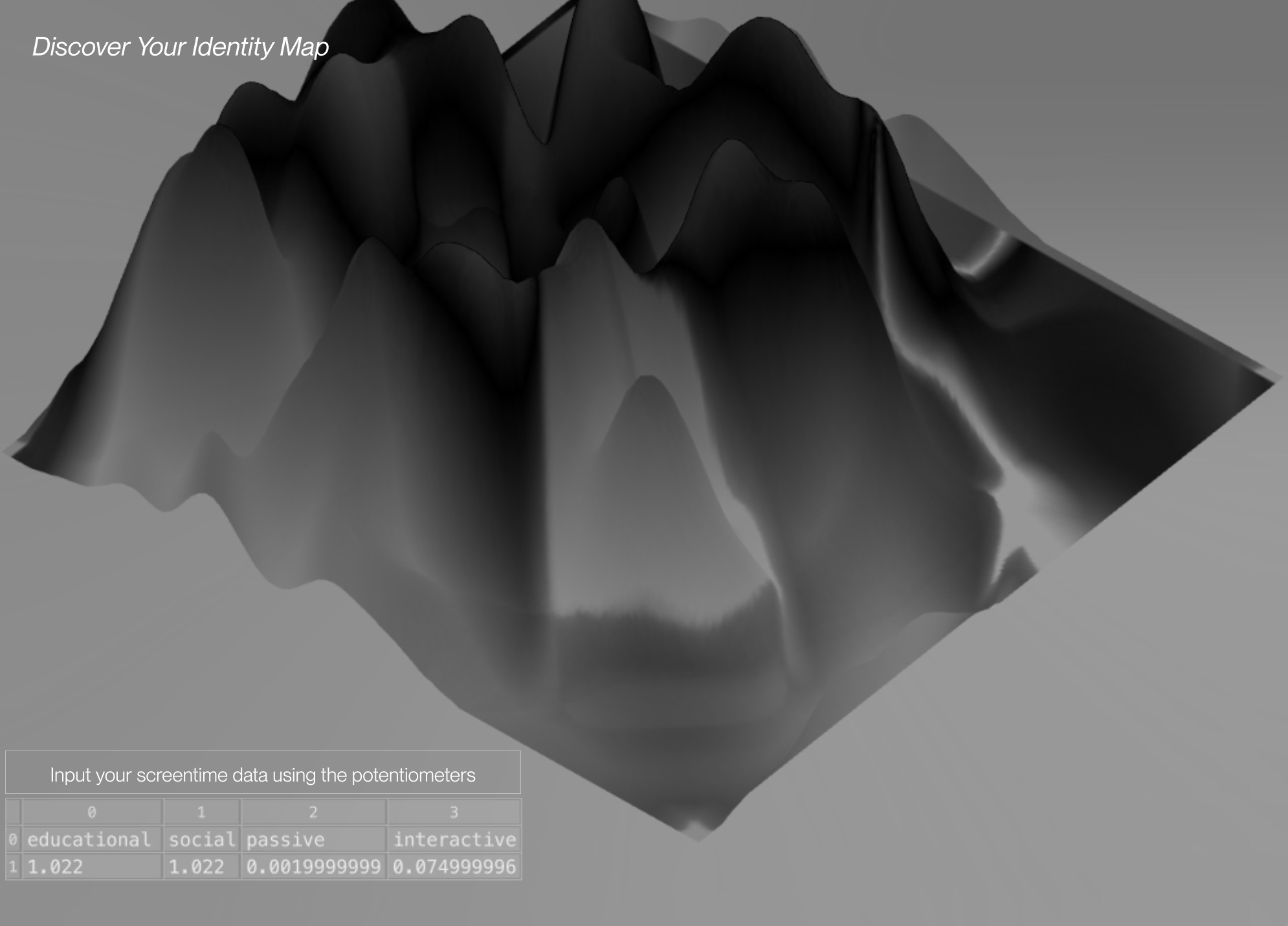
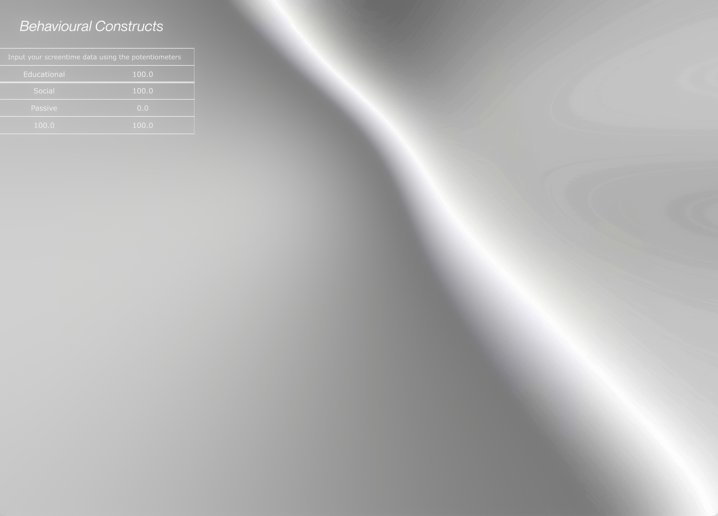
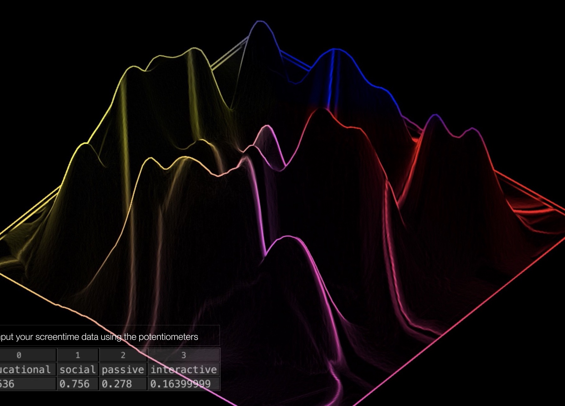
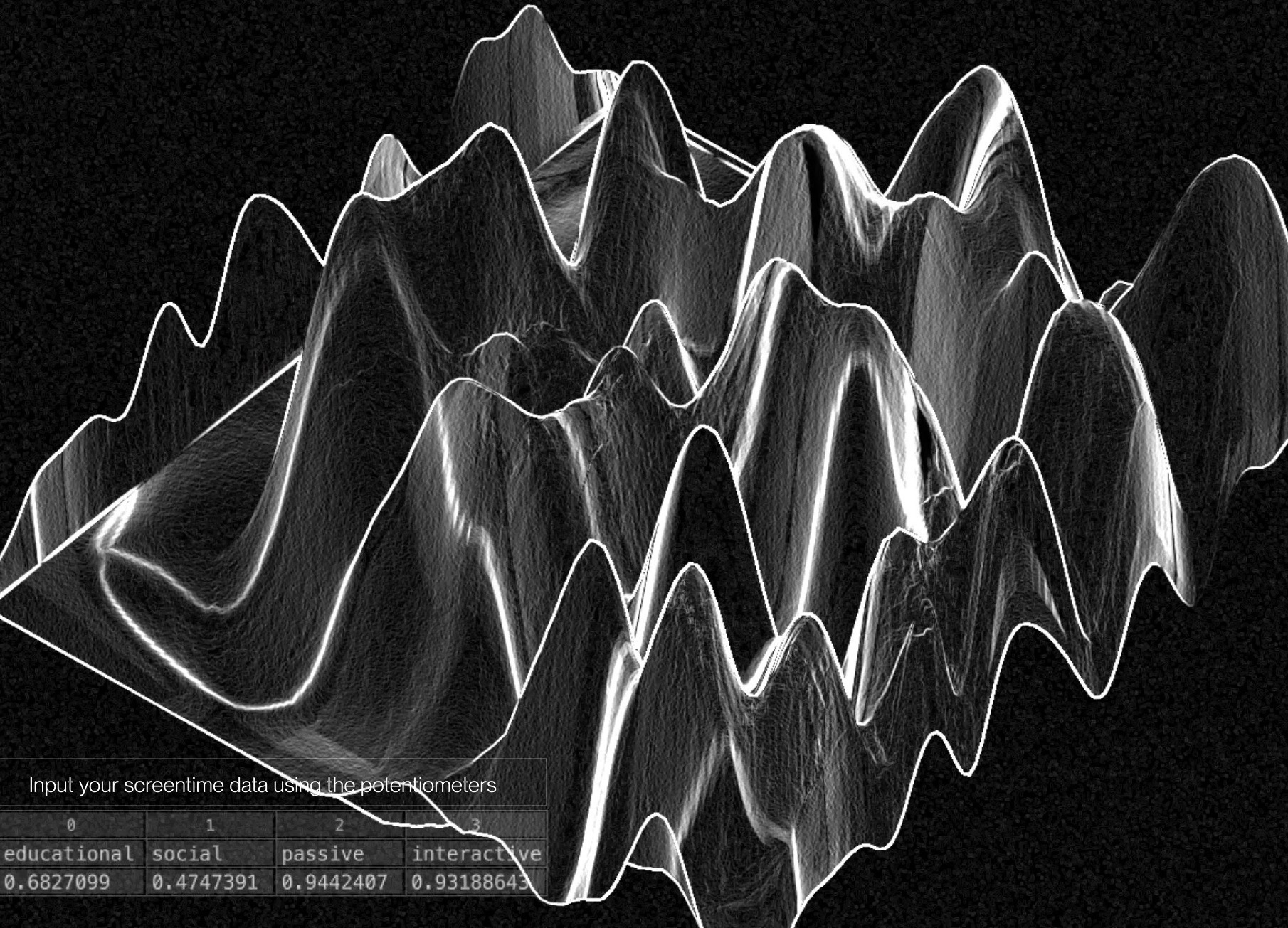
I tried making the terrain look more like a scenic landscape, which it turned out like mountain which may appear random to users when they first view the prototype. Thus, I tried to explore more ways of data representation, through texture, lines, patterns and colour. I also tried versions with wireframe texture but it looked too similar to a data visualisation.
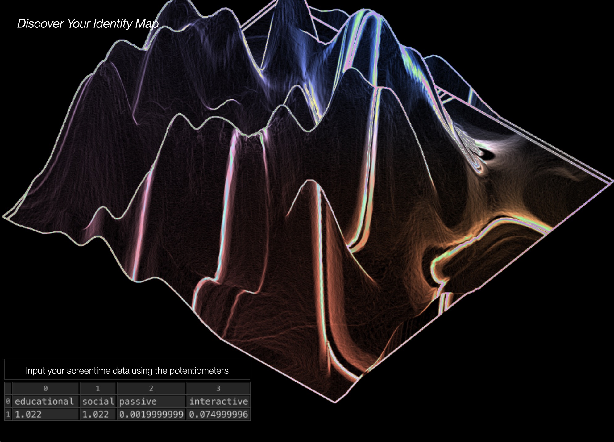
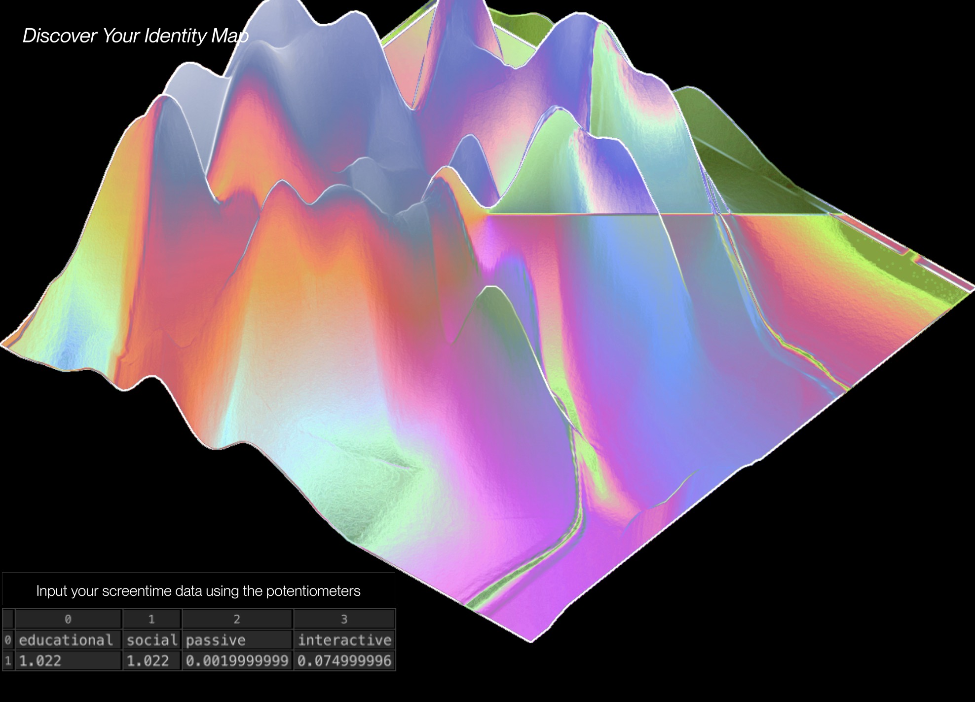
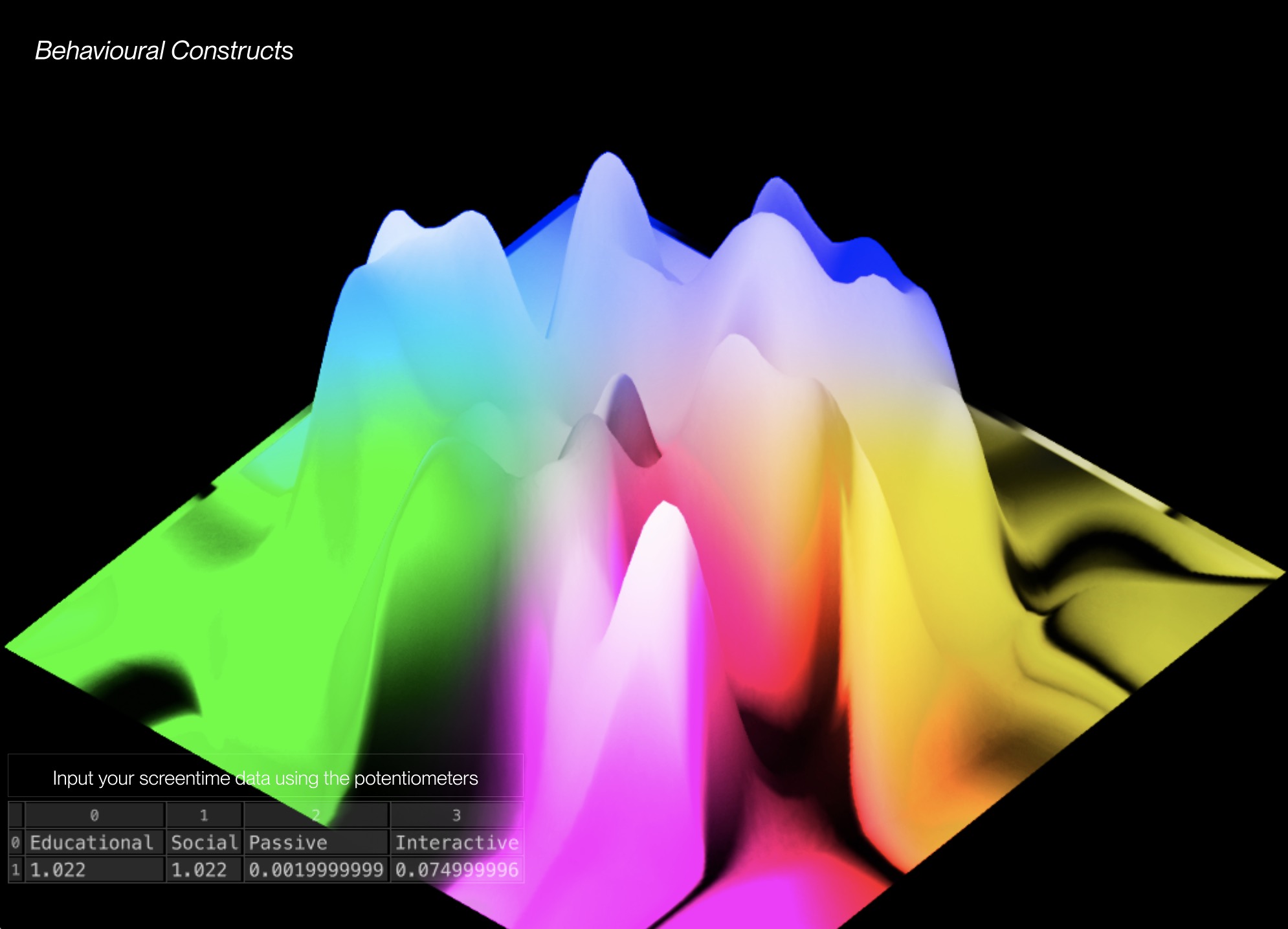
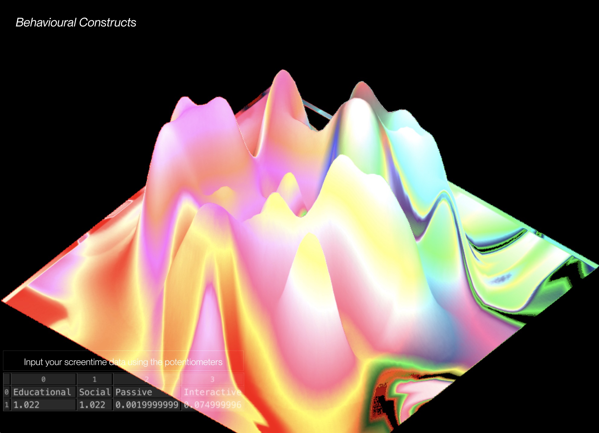
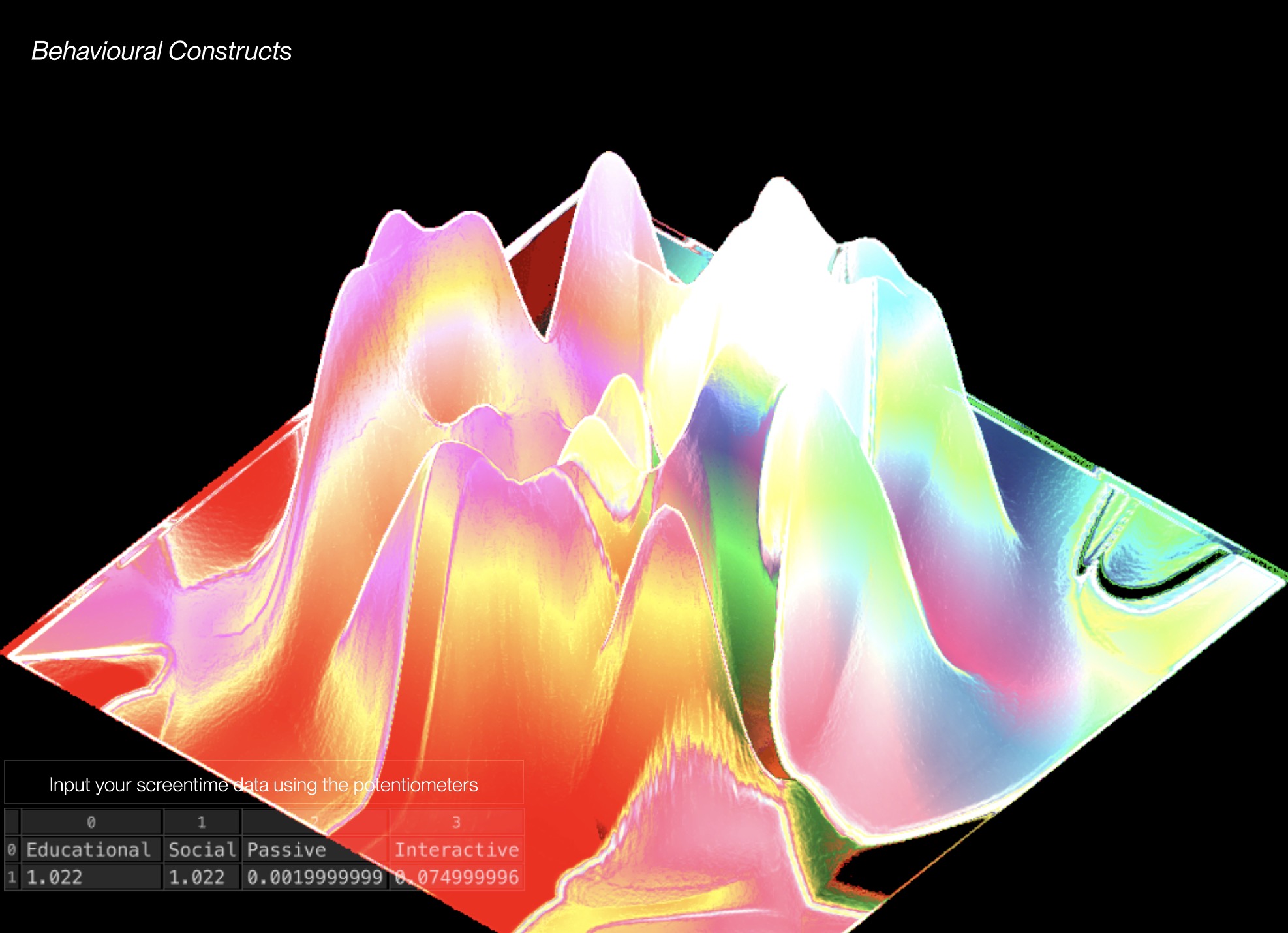
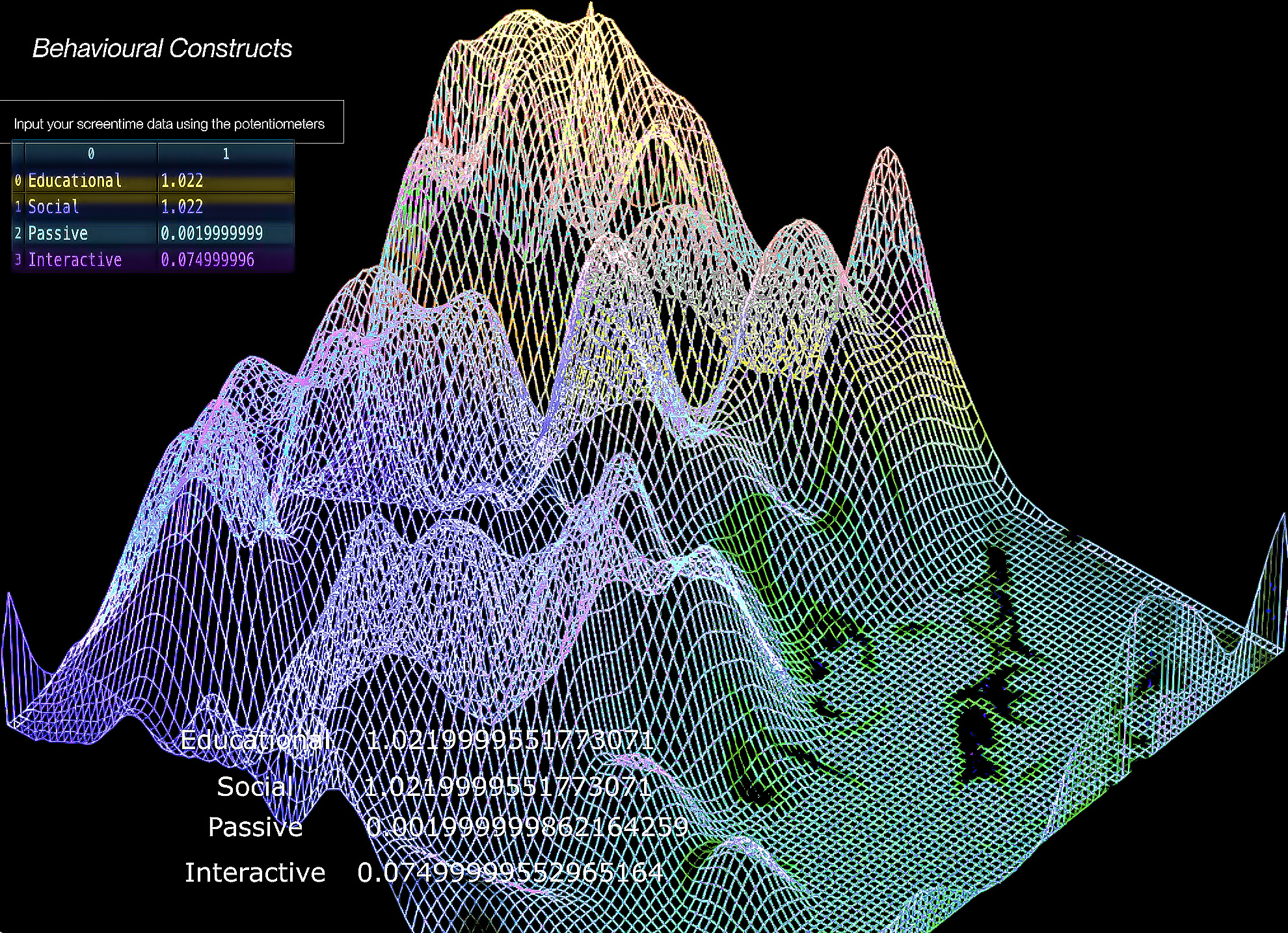
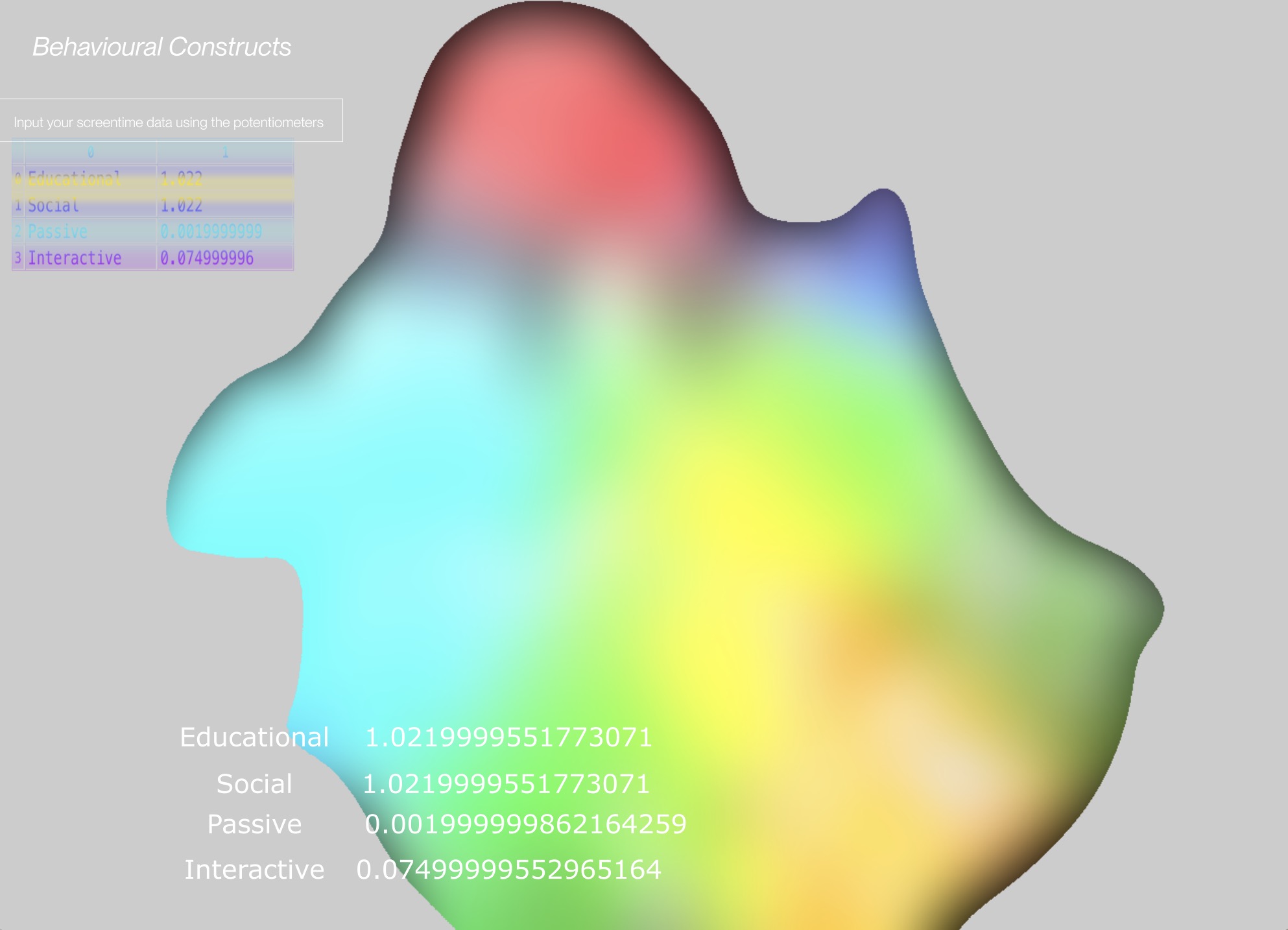
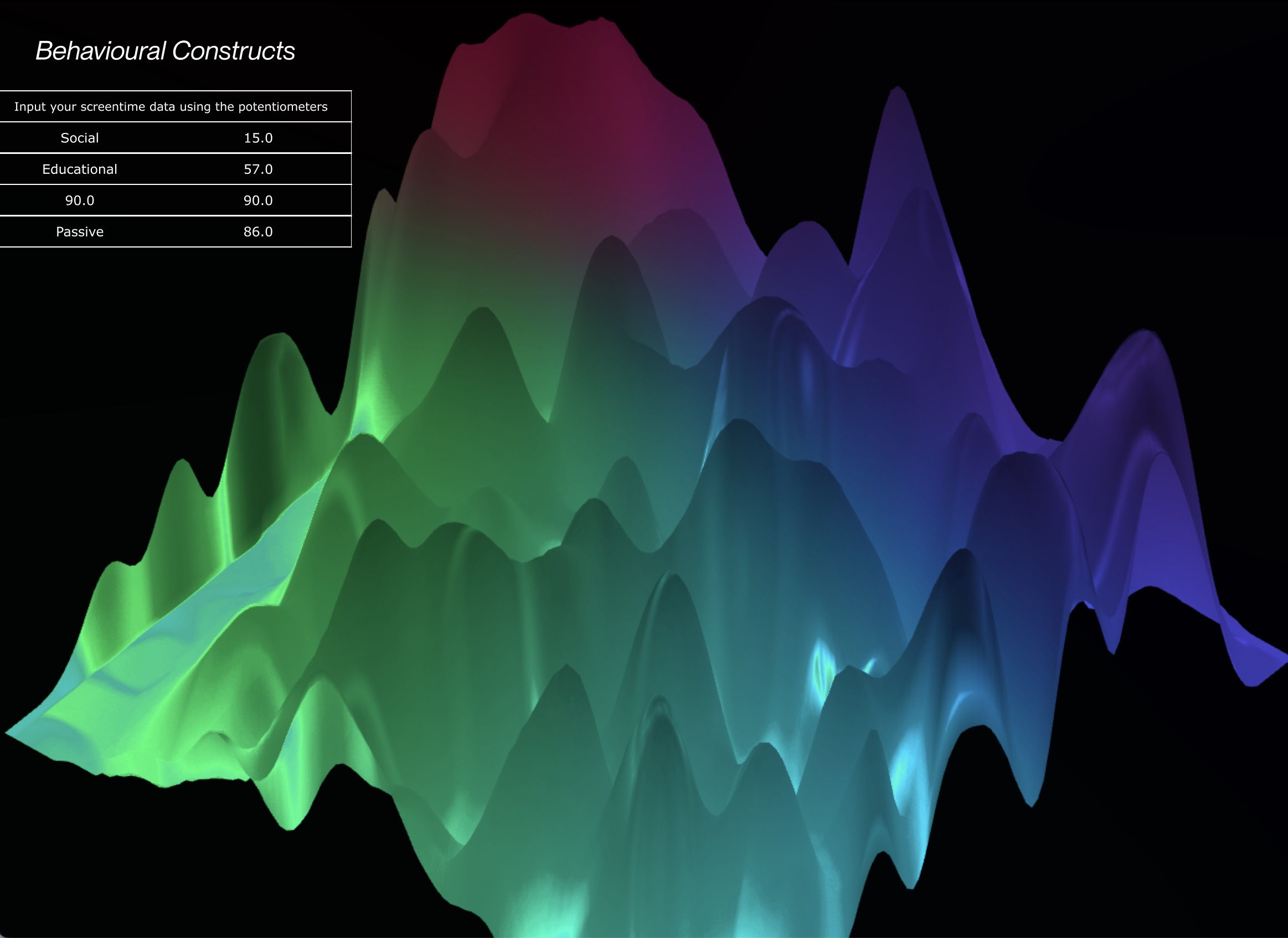
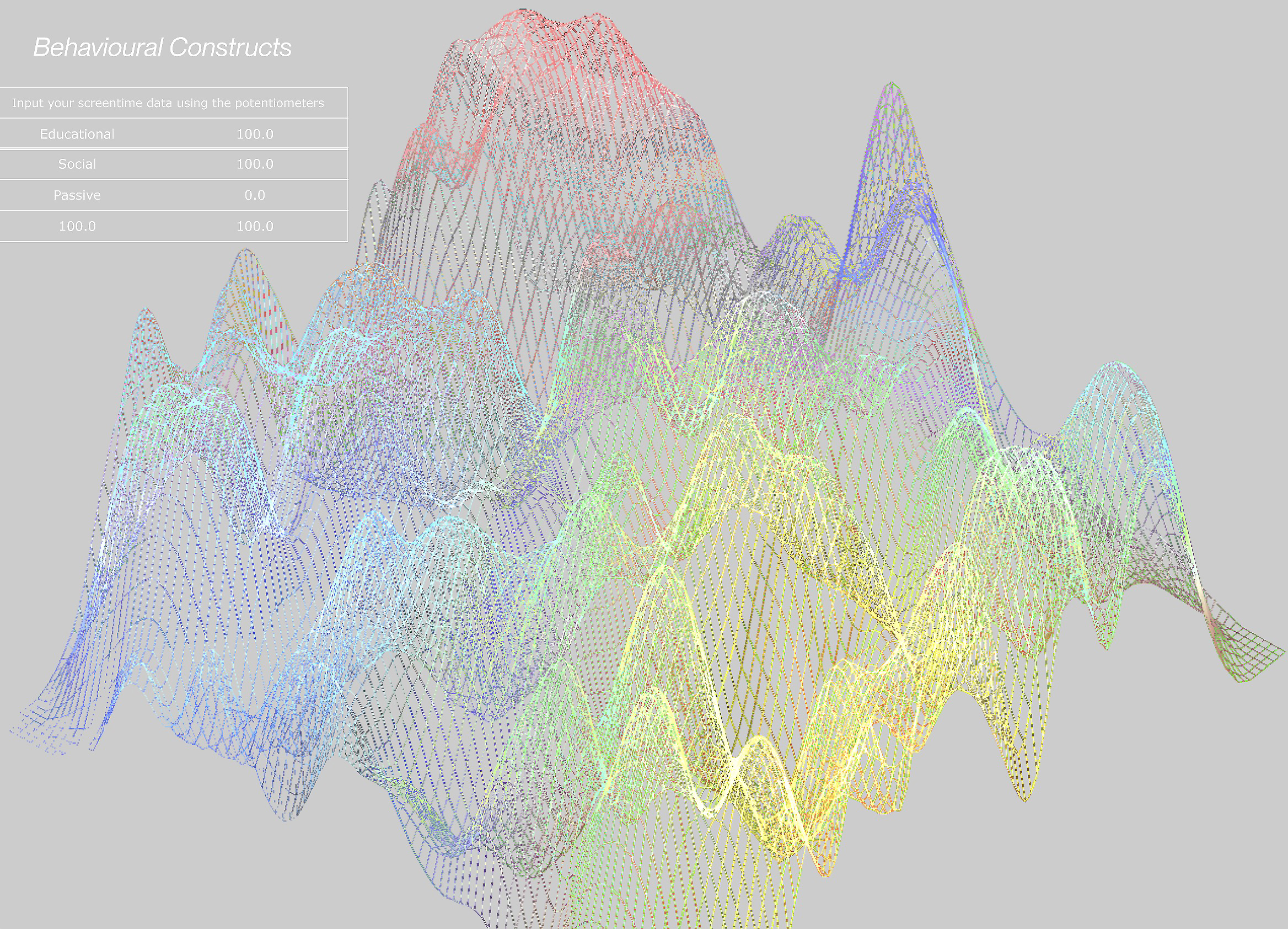
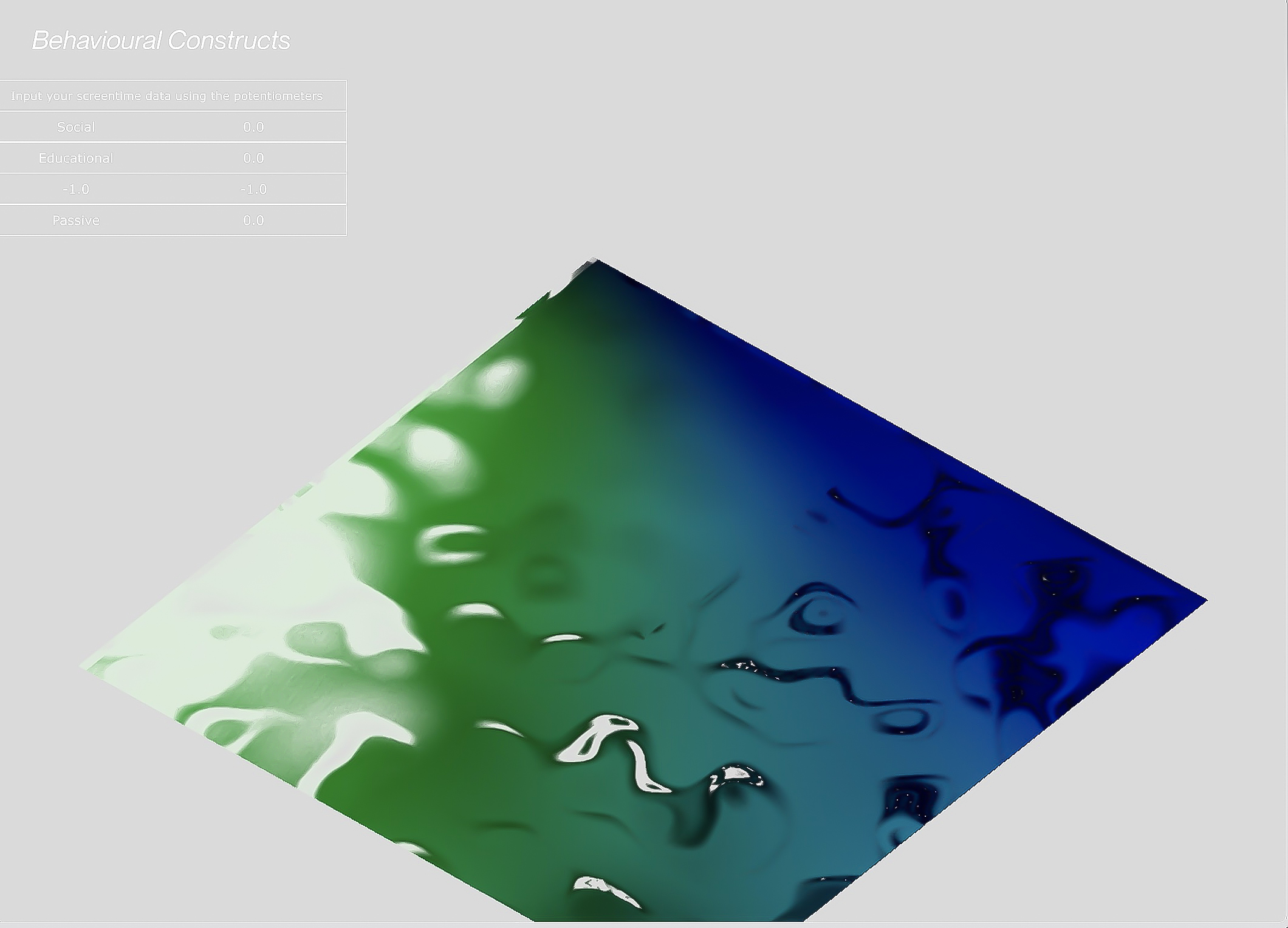
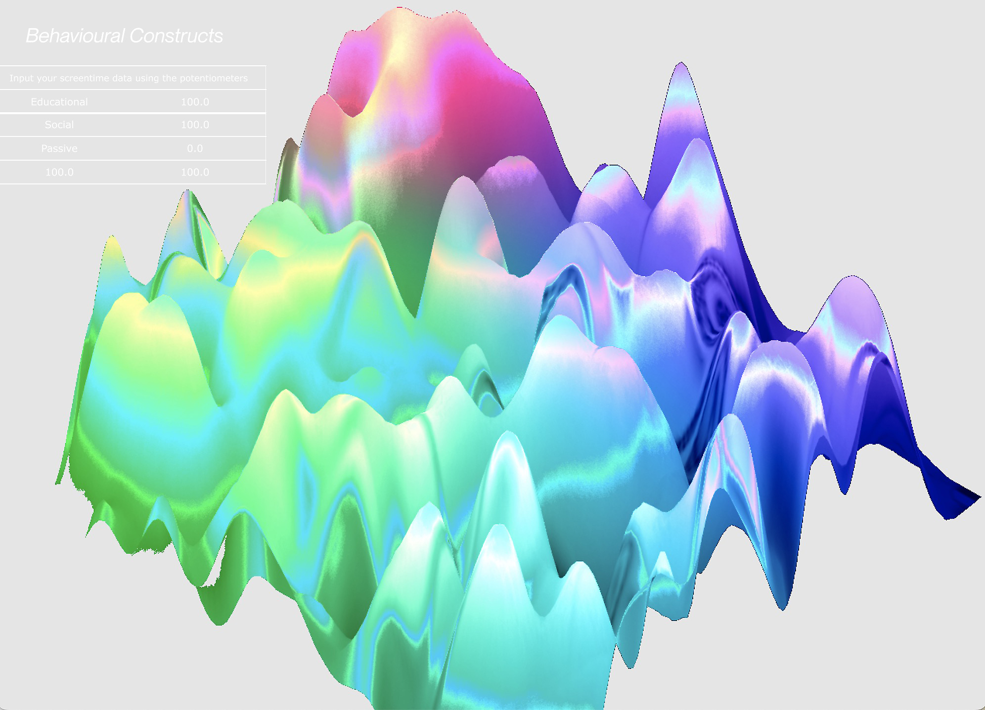
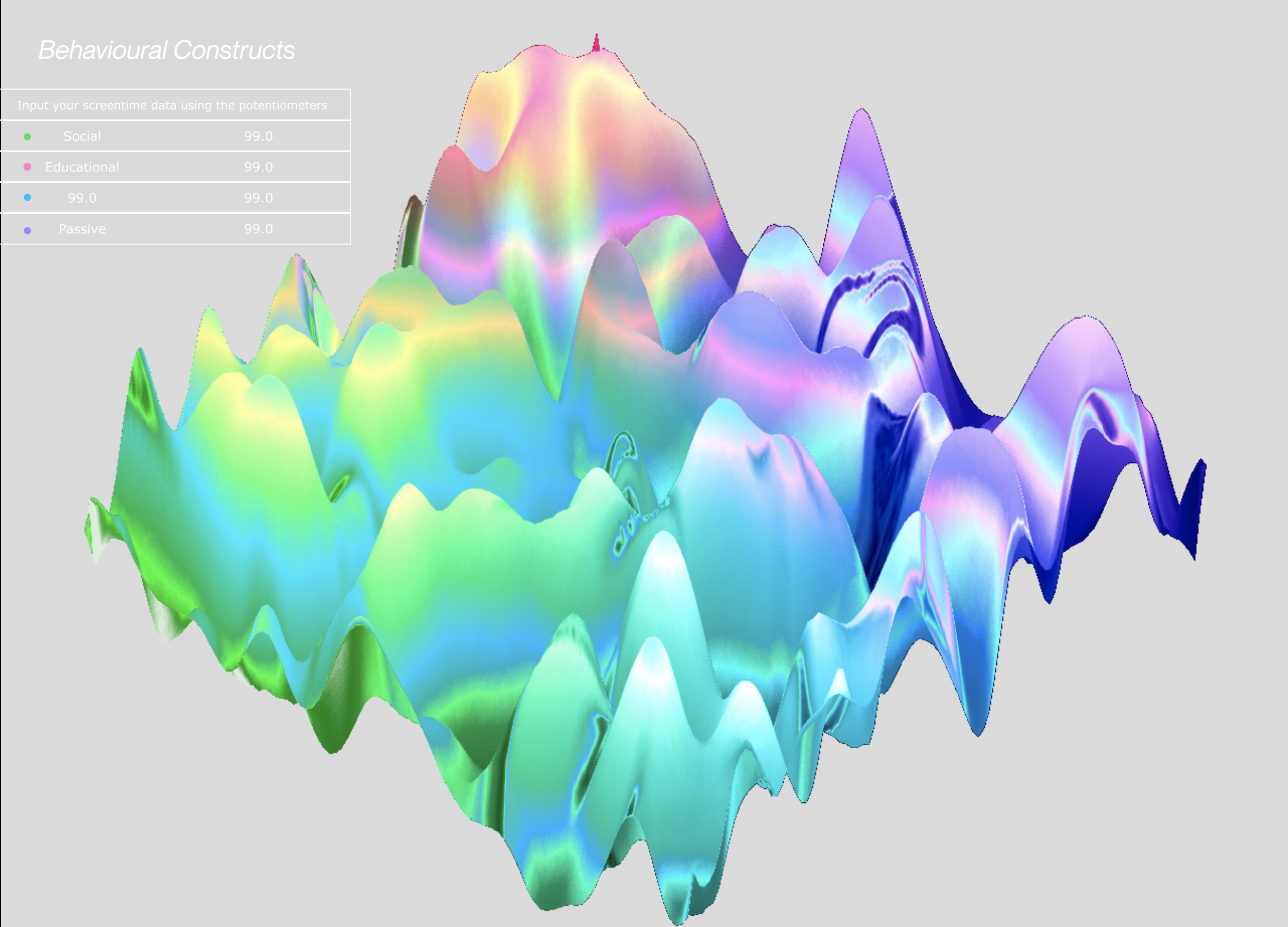
After many variations, I think using colours to differentiate the screentime categories still worked the best as compared to the other applications. Using different a combination of comp layer adjustments, I was also able to play with the colour movement and fluidity. I also updated the table of screentime data being displayed as the original utilises the OP Viewer which is less customisable, instead I created a table using text TOPs and Containers.Additionally, I switched up the name of the prototype, from 'Identity Map' to 'Behavioural Constructs' as the narrative doesn't focus much on the 'map' aspect anymore instead I hope that through the updated prototype name, users are able to gain a sense as to what the prototype might be about.