1 / Publication Feedback From Hanson Ho
2 / Feedback
3 / Open Studios
PUBLICATION FEEDBACK FROM HANSON HO
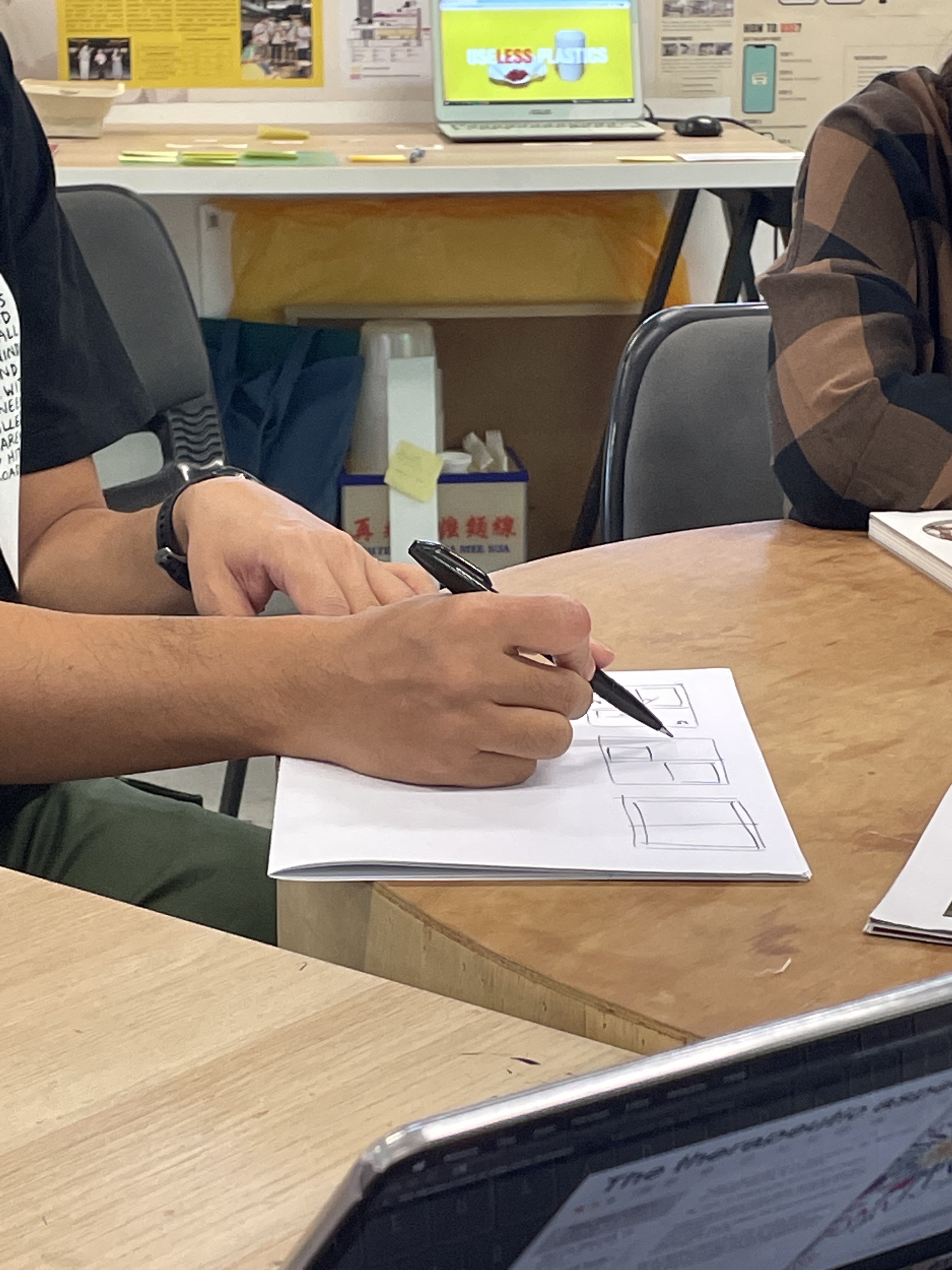
The publication sharing with Hanson Ho was very insightful as he shared many tips and tricks to make the process of designing a layout more efficient. For instance, he shared how we can simply create guides using rulers in the master spreads to act as temporary columns and grids that can be moved around. The guides provide a more flexible layout when you are testing out the number of columns in the intial phase. Additionally, if we were to include lines in our publication design–to determine the thickness of the stroke, we can reference the letter 'I' or the '_' signs.
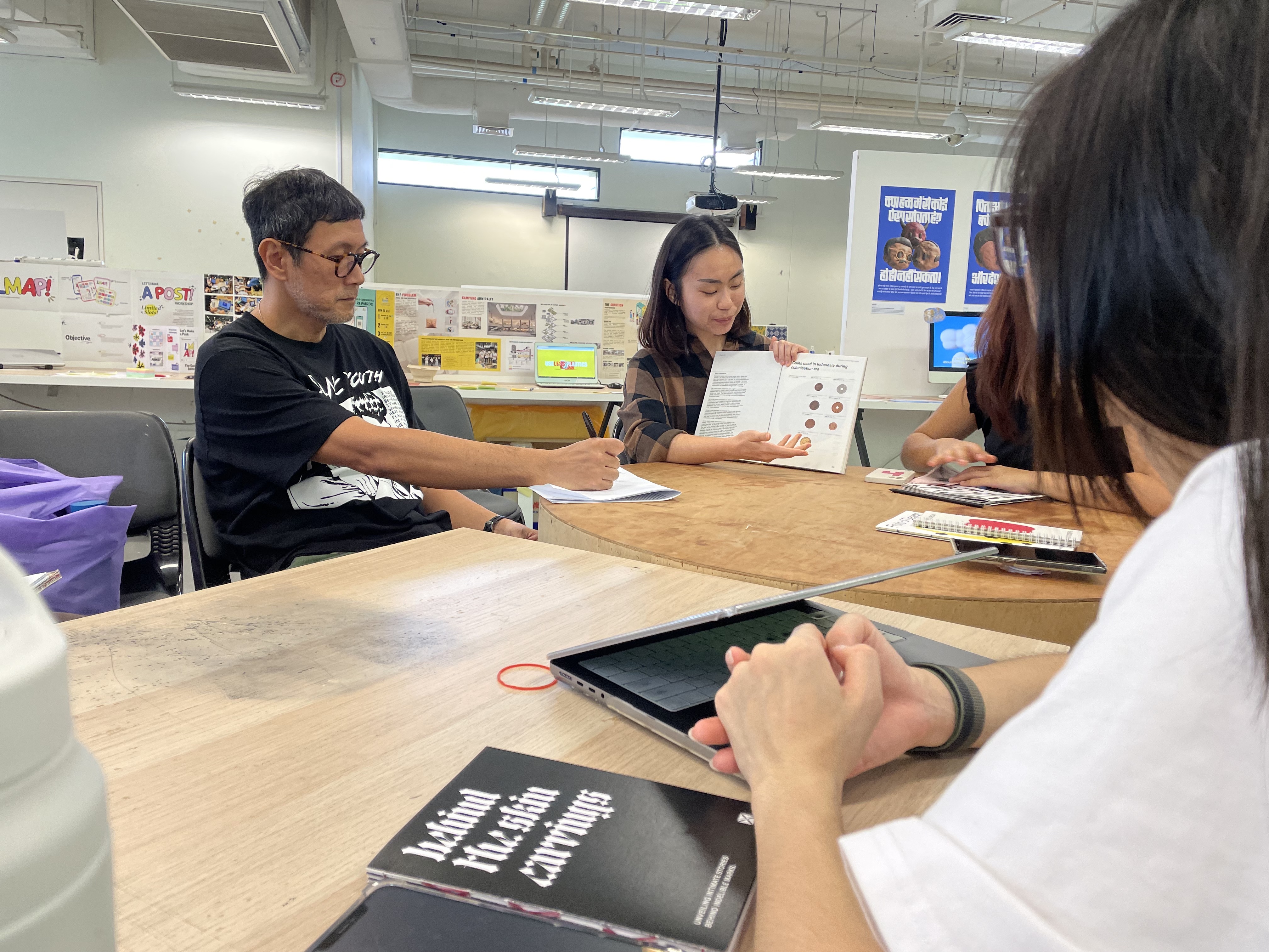
During Deborah's sharing, I also picked up the way to manage a more dynamic flow in layouts. When the layout are repetitive throughout a few spreads, it is good to swap/switch contents on the left and right pages between spreads and move the text around to avoid repeating.
Feedback for
my Publications:
–Should explore a larger format, consider scaling up the publication as they are too small
– If certain aspect ratios do not fit, you can consider cropping the images.
–By including big full bleed images that are tightly cropped can be arresting and grab more attention
–Think of it like an art booklet instead
-There should be more diversity in the book
–Try using coloured paper, silver or even metallic paper
–Print on different materials and shuffle them around for a more refreshing process
–If you were to combine the publications into one, either use sectional dividers, like colour or different types of paper
Other General Notes:
–Always start with the cover, followed by the colophon page, then the table of contents
–To play around with layout, turn off the text layer, and compose the layout only with images, then add back in the text to fill in the white space
–Explore different placements of the caption layout to have more typographic dynamics
–For tip in pages, you can either bind them at the juncture in between signatures or you can use double sided tape
FEEDBACK
Feedback from the class:
–Try focusing on only one interactive prototype for users to test out, as having too much might make the experience overwhelming
–Can have one displayed on the ipad as a video while the other is interactive
–Include more visual print outs and have them on the walls
Something that Sadhna pointed out which I've also observed during the Open Studios was how people tend to gravitate towards the publications when they first come across the project or when they are confused as to how to interact with the prototypes. This might be an opportunity to create an informative documentation of how the prototype works and how it can be interacted with.

Feedback from Andreas:
–Consider other types of paper materiality, thinner high quality paper would feel better flipping through and nicer to touch. The current paper choice combined the type of printing can sometimes make the printed areas 'sticky'
–Also the experiments and developement visuals are missing from the publications, do consider including those processes as it can enhance the contents of the publication
–Relook into the presentation of the materials
–Having too much material can easily lose the focal point of the presentation
–Something to experiment with for the Affective Data Objects, the 3D printed objects can look nice on thin acryllic stands (white or transparent)
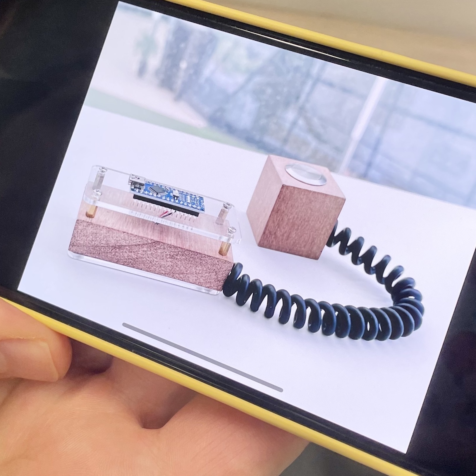
–Can consider concealing the microphone for Voices as Personality in a casing
–For the Identity Map, the box can definitely explore other materials, something sleeker or more compact?
–For publication, can look at Grid Systems by Josef Müller-Brockmann
–Typography for publication can take reference from Dutch design or Swiss graphic design
OPEN STUDIOS
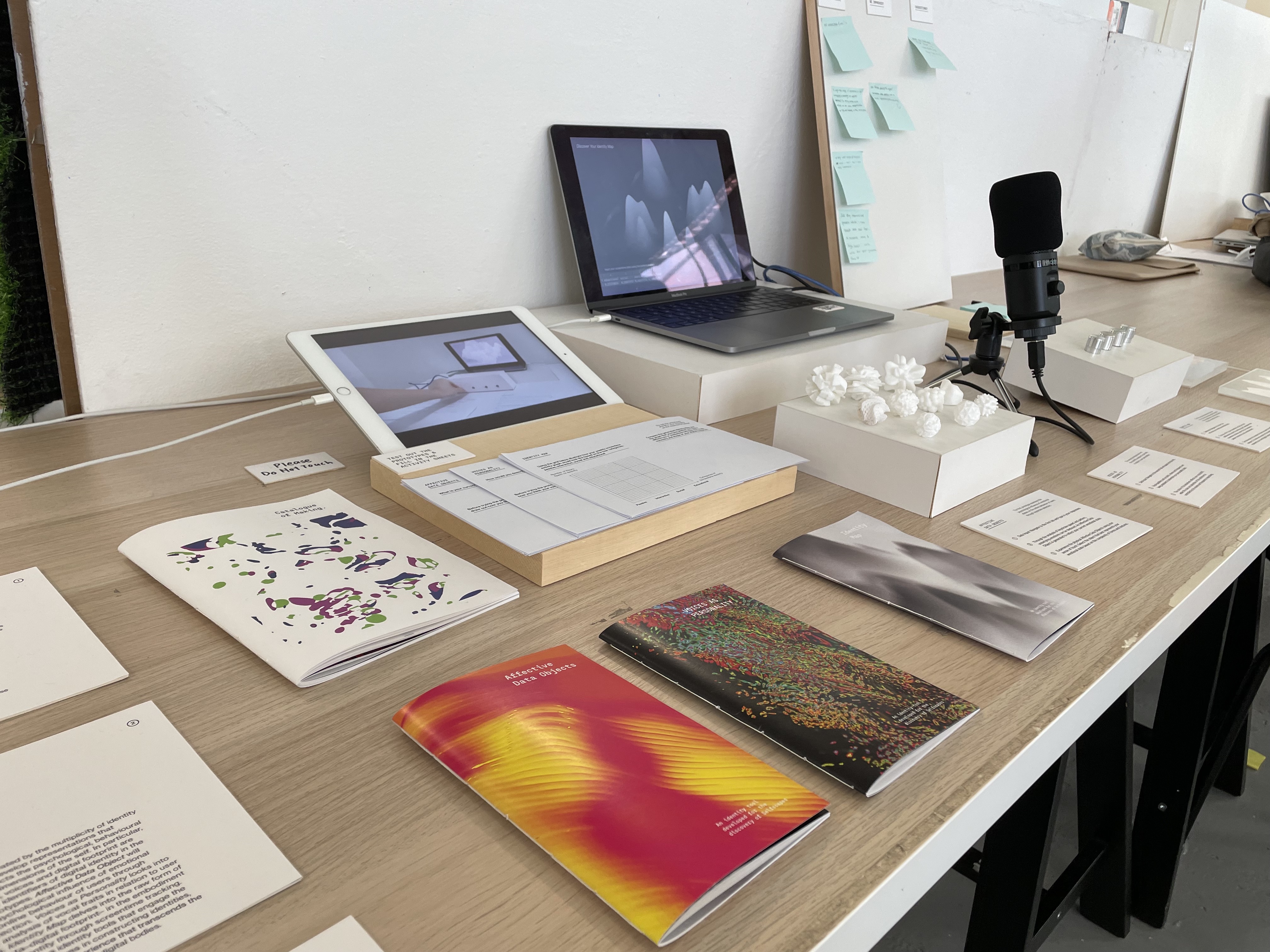
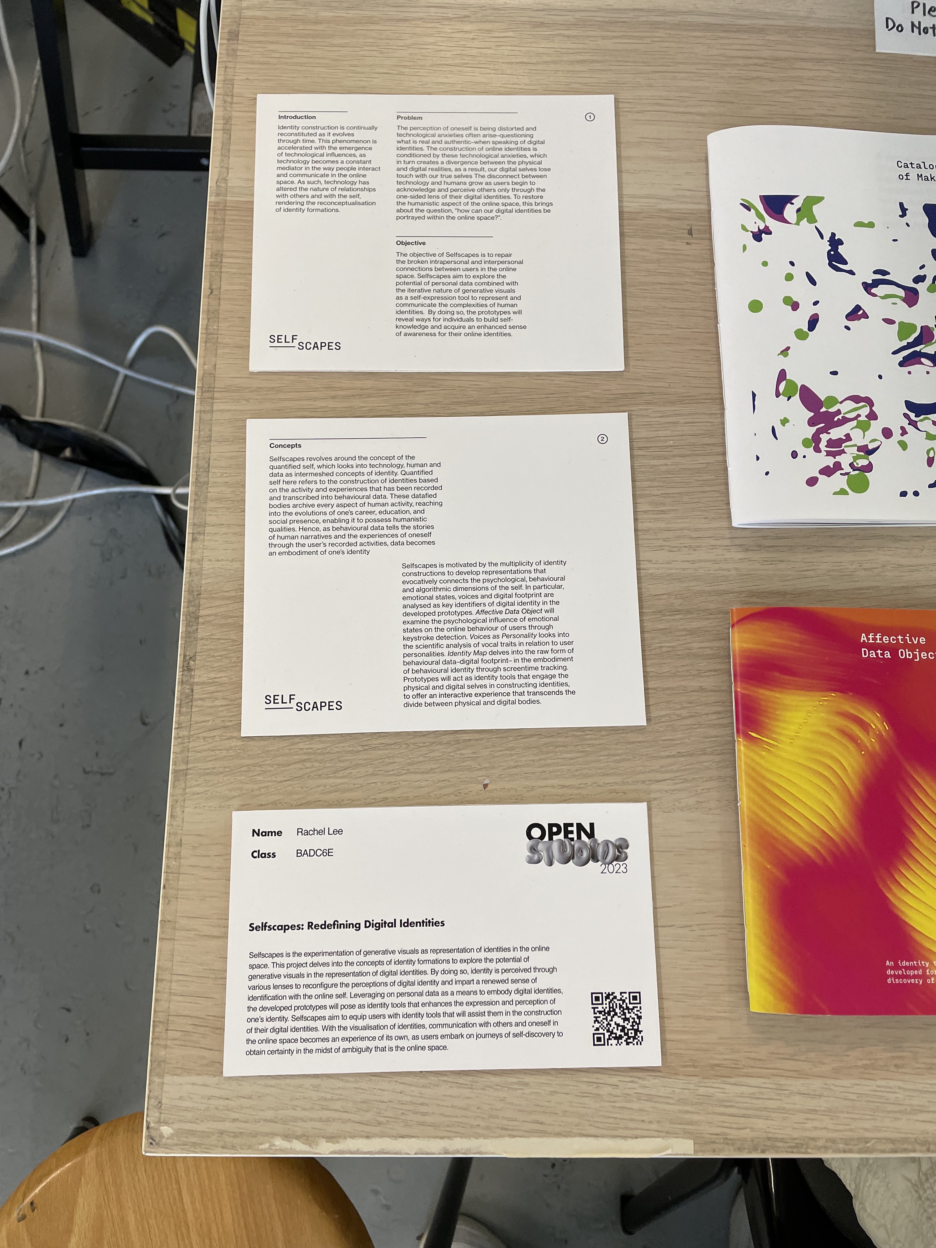
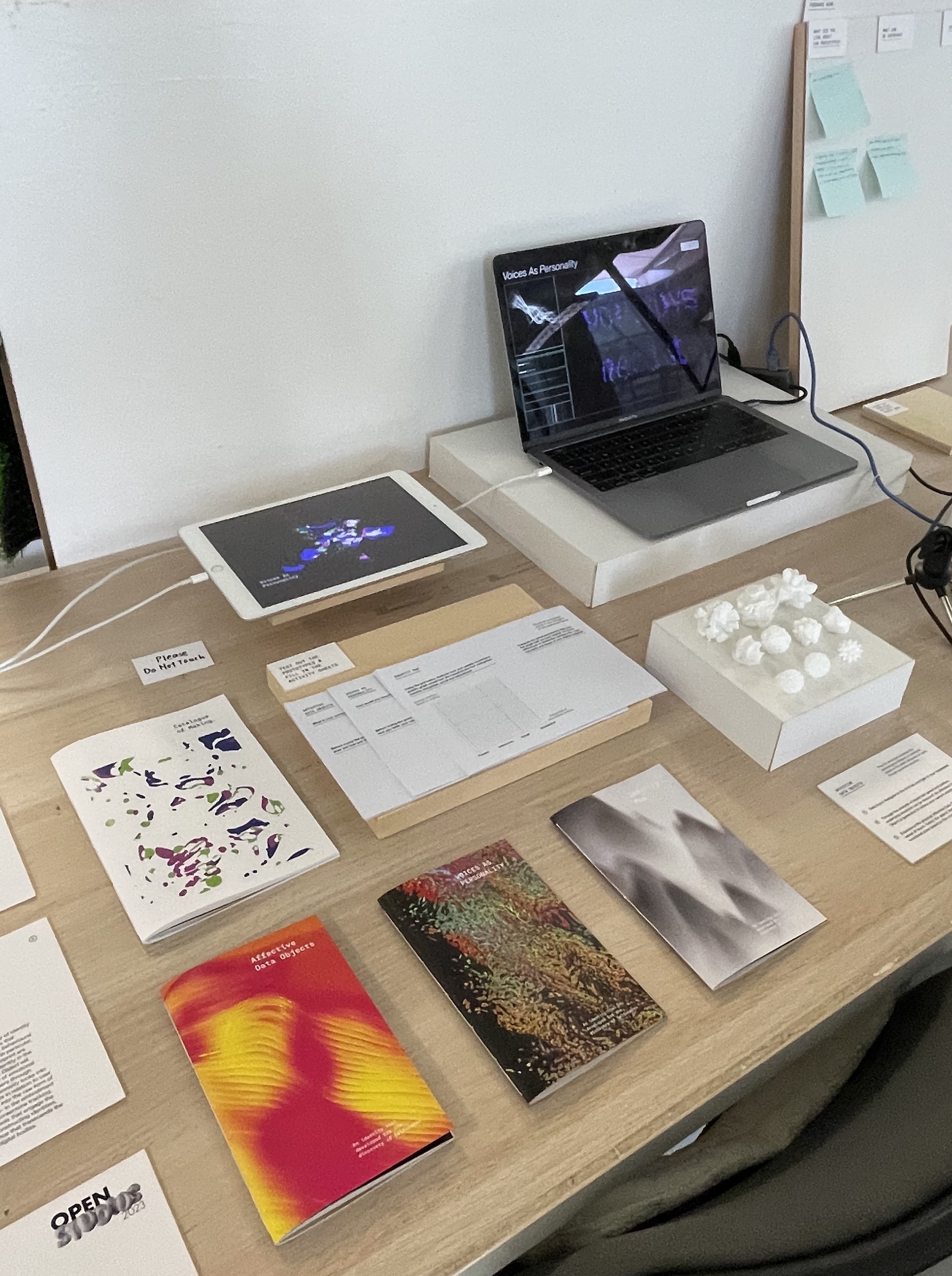
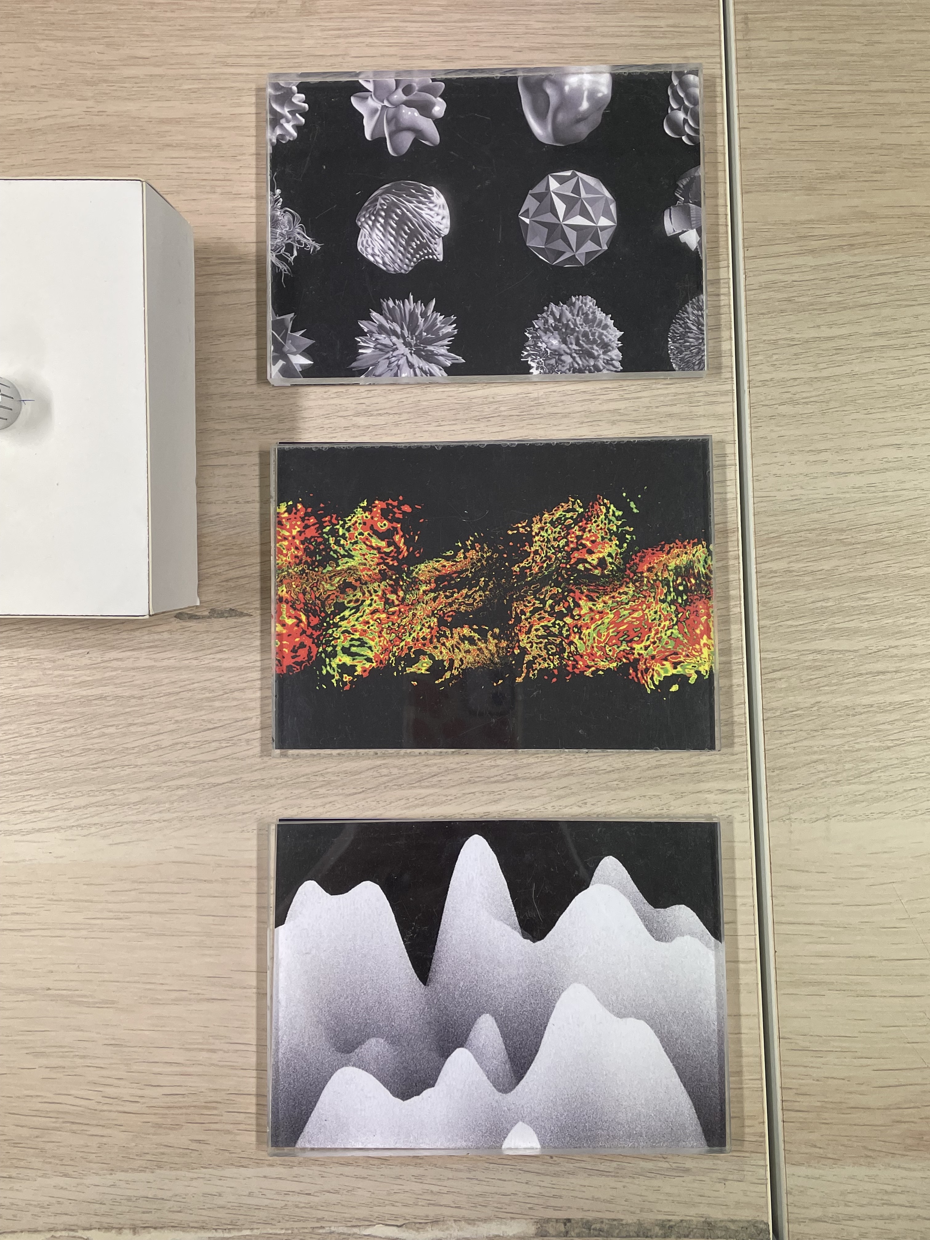
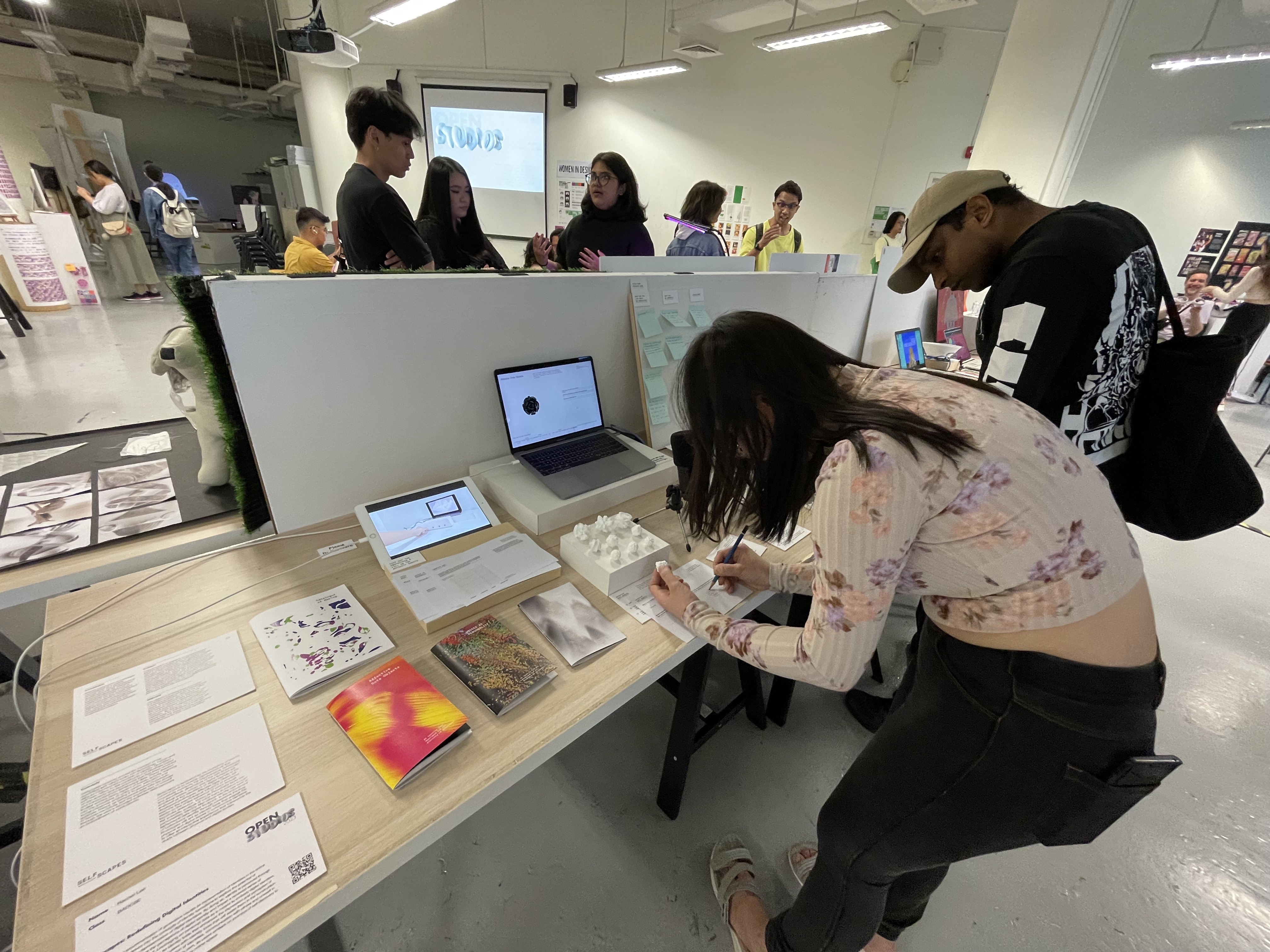

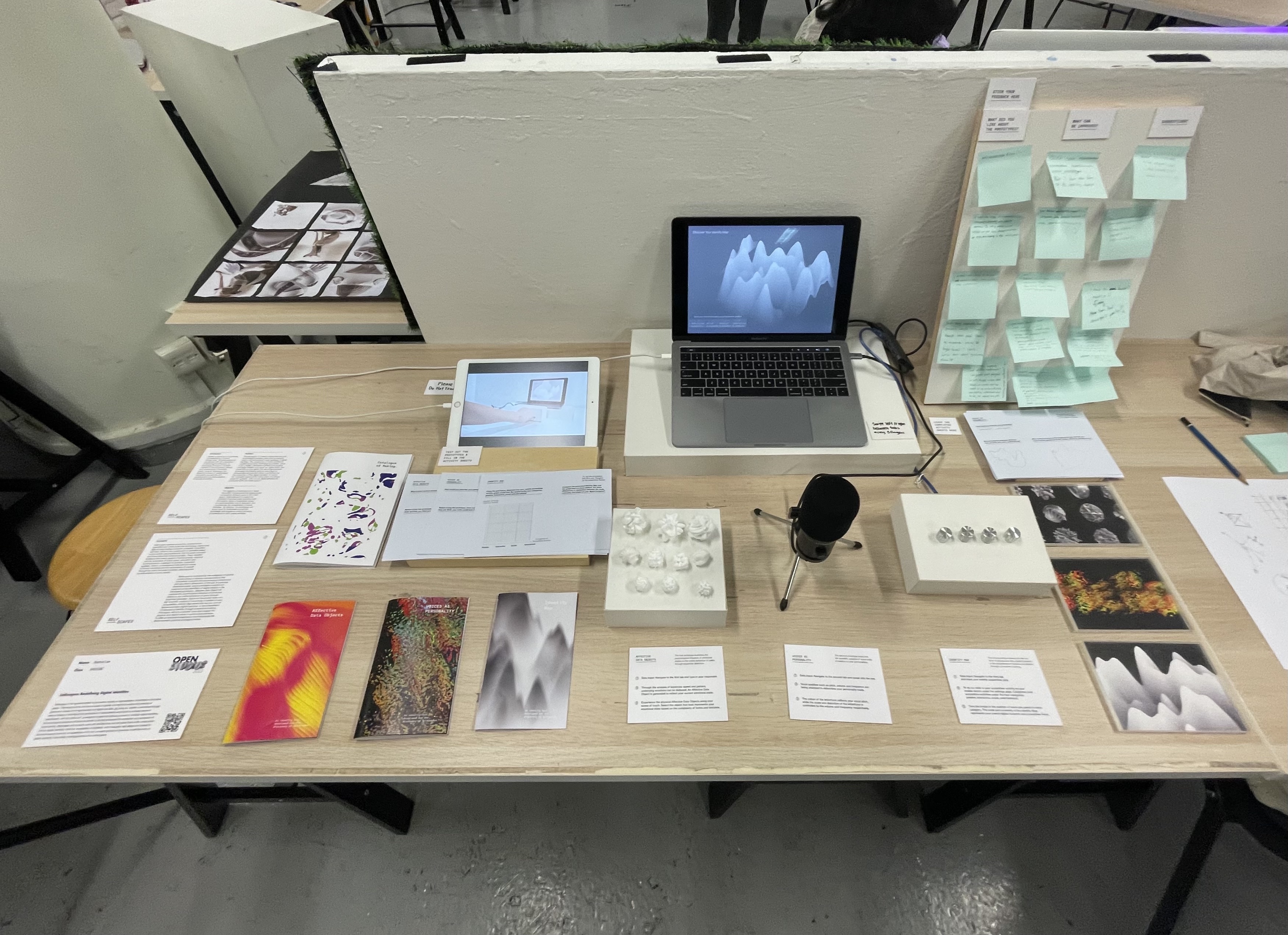
Pictures taken by users:
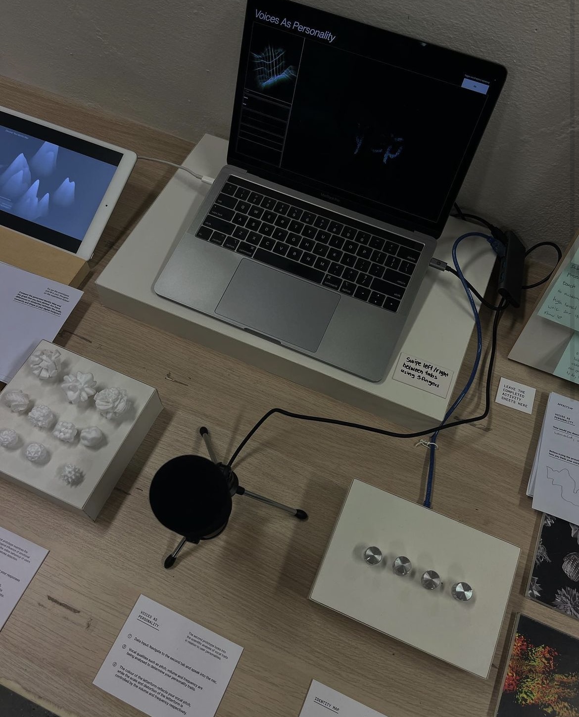
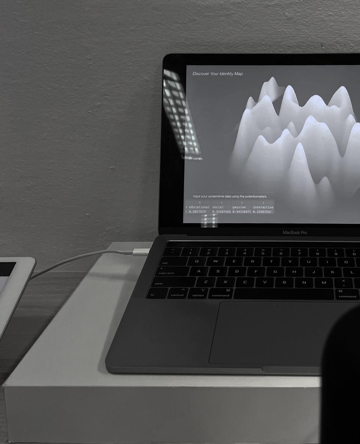
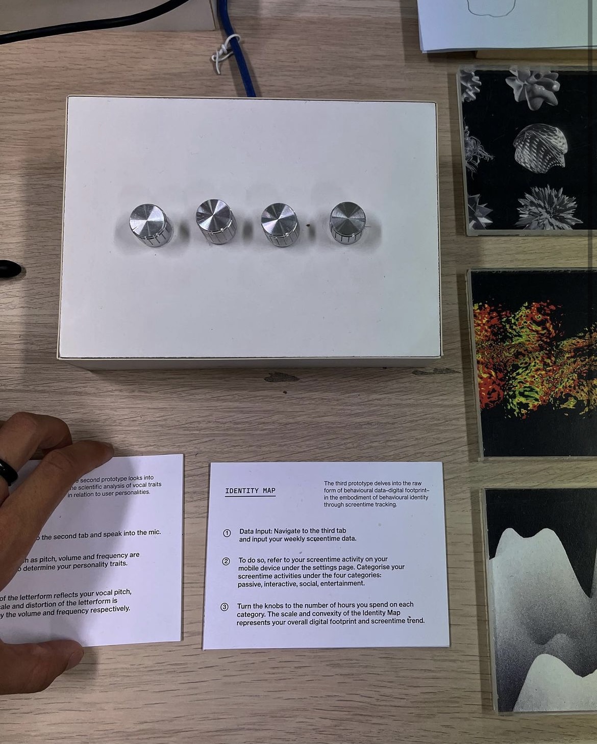
Images: Shawn Thomasz Instagram
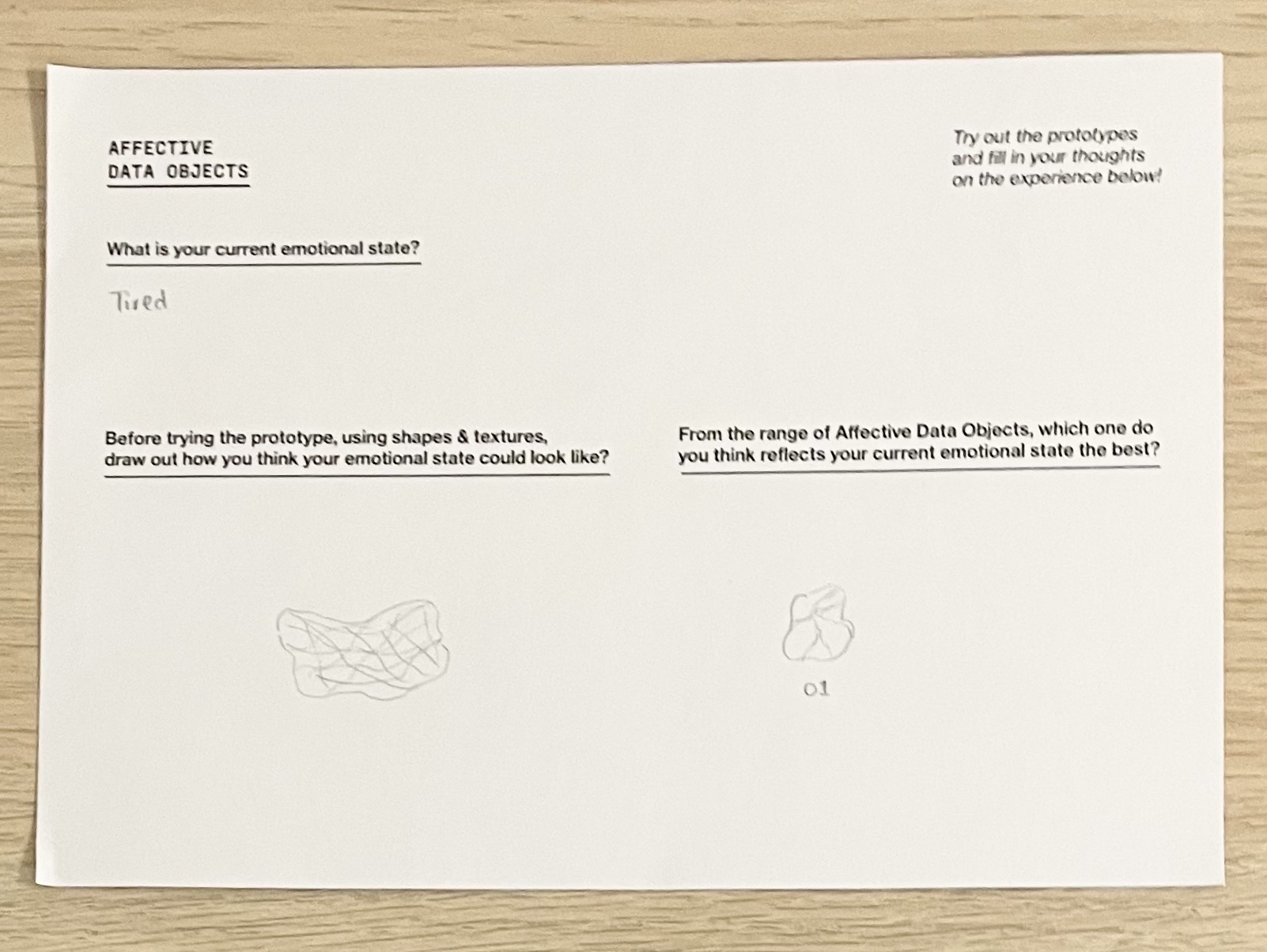
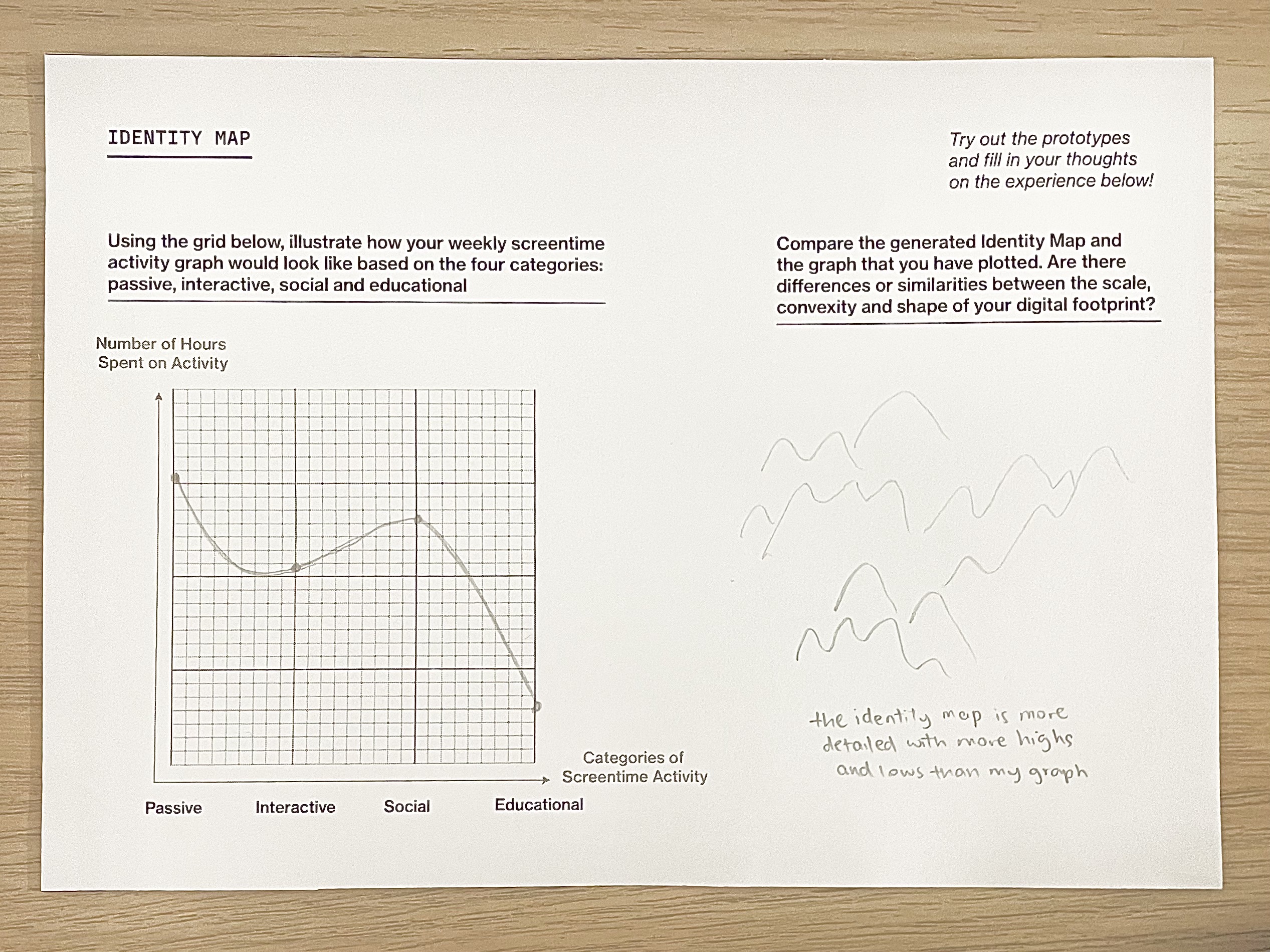
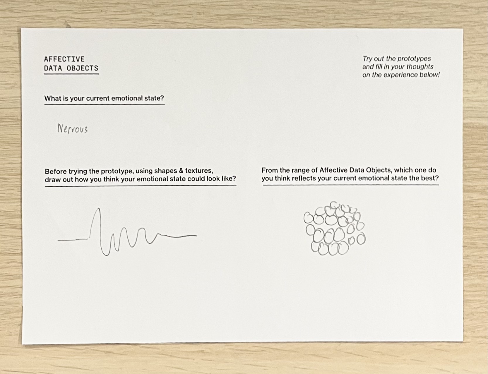
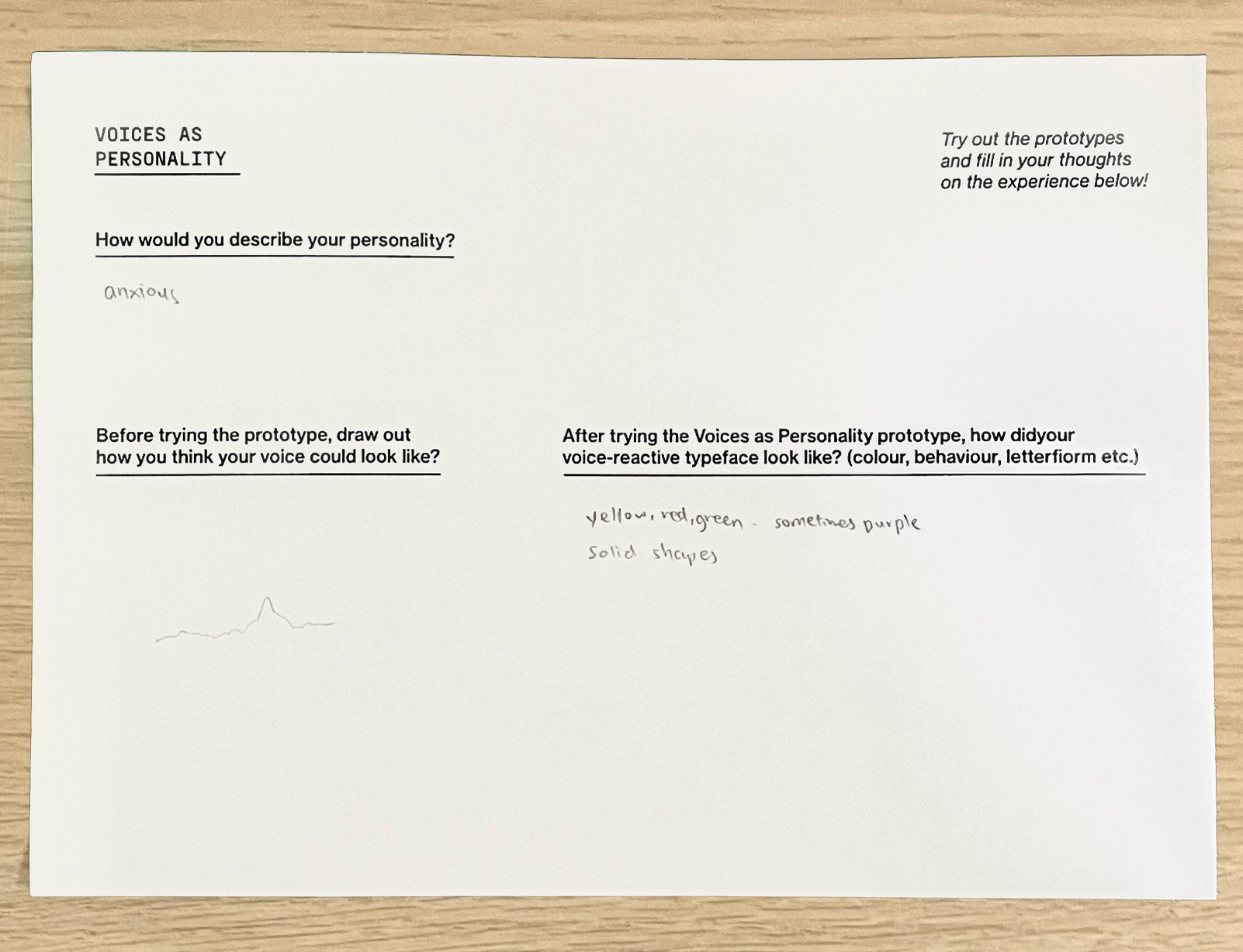
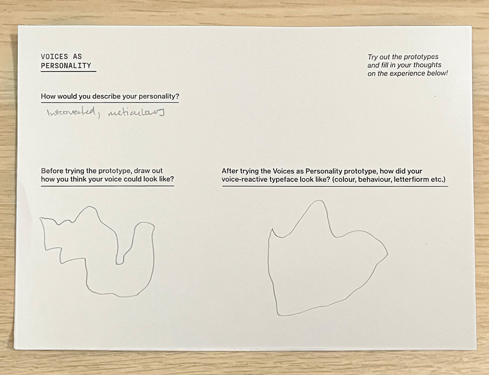
During Open Studios, I also printed out some SIPI scales for users to try out as a form of activity guide. I reedited the SIPI scales used for dissertation and condensed the length of the survey so that users are able to complete them. Above is a compilation of the completed SIPI activity guides that were gathered from Open Studios.
Feedback received from Open Studios
What do you like about it?
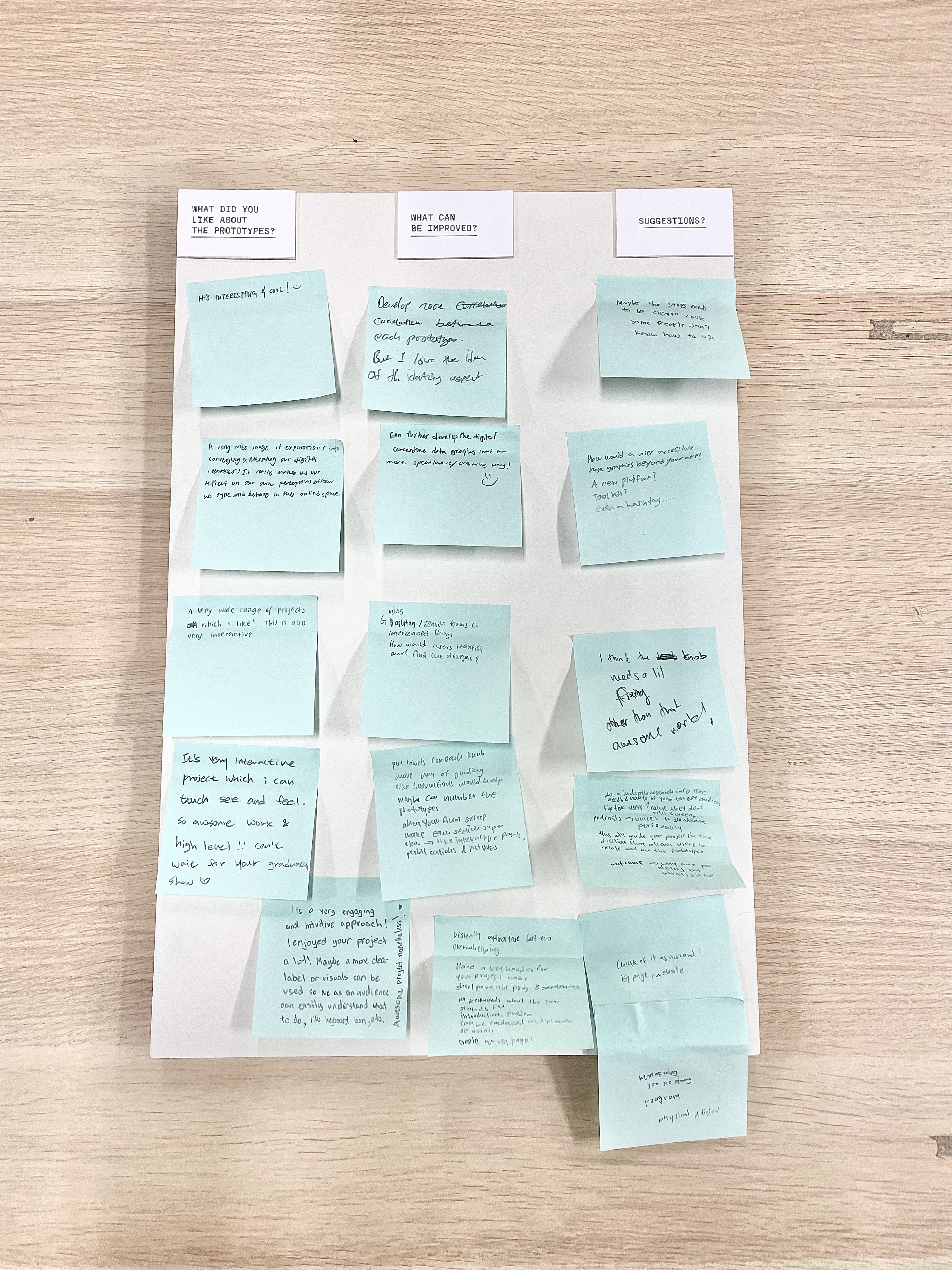
–It's interesting & cool! :)
–A very wide range of explorations into conveying and executing our digital identities! It really makes us reflect on our own perceptions of how we type and behave in the online space.
–A very wide range of projects which I like! This is also very interactive.
–It's a very interactive project which I can touch, see and feel. So awesome work & high level! Can't wait for your graduation show
–The visuals by itself are very strong and eye catching (audio transcription)
What can be improved?
–Develop more correlation between each prototype. But I love the idea of the identity aspects.
–Can further develop the digital screentime data graphics into a more speculative/ executive way!
–Put labels for each knob. More ways of guiding like instructions would help or maybe can number the prototypes. In your final set-up, make each section super clear, interactive parts, publications and pictures.
–Its a very engaging and intuitive approach! I enjoyed your project alot! Maybe a more clear label or visuals can be used so we as an audience can easily understand what to do, like keyboard icon etc. Awesome project nonetheless!
–Visually attractive but too overwhelming
–Have a key header for your project name, a short paragraph of about 3 sentences. And keywords, what the project stands for. The introduction, problem can be condensed and placed on a wall. Creating an IG page would be helpful for users to navigate to your project!
Suggestions?
–Maybe the stops need to be clearer cause some people don't know how to use.
–ow would a user access/use these grpahics beyond your app? A new platform? Toolkit? Even a hashtag...
–I think the knob needs a lil fixing. Other than that awesome work!
–Do an in-depth research into the needs & wants of your target audience. If they are tiktok users? cause they deal with screens most of the time. Or podcasters where they use their voices to showcase their personality. This will guide your project in the direction that allows users to relate and use the prototypes. Outcomes -> why are you doing this, what is it for?
–Think of it as an IG page/website
The feedback I received from Open Studios were really helpful! After reading through all the feedback, I could draw out three main issues with my current work. 1. The display of prototypes needed clearer instructions such as labels or diagrams to guide users in the way of interacting with the protoypes. 2. I needed to provide more correlation between the prototypes and its users. 3. I needed to restructure my layout with more keywords and less materials to have a strong focal point.
Other than those, the feedback also provided an alternative perception of my works from people of different expertise. For instance, a service designer from Tan Tok Seng, suggested for me to look into my target audience's wants & needs in order to develop that connection between my prototypes and how it can be used by the target audience. A Lasalle alumni also gave feedback on how I could set up my works in a more compelling way and create some form of content hierarchy by enlarging the project tile, couple with some keywords etc. In addition, the alumni suggested for me to create an IG page using the visuals that I have already developed as a means to market and design a brand surrounding my project.I thought this was a good idea as I would then be able to package the three prototypes into one more effectively and this platorm will also serve as an informative source for users to get to know about the project.
Open Studios Works that Inspired Me
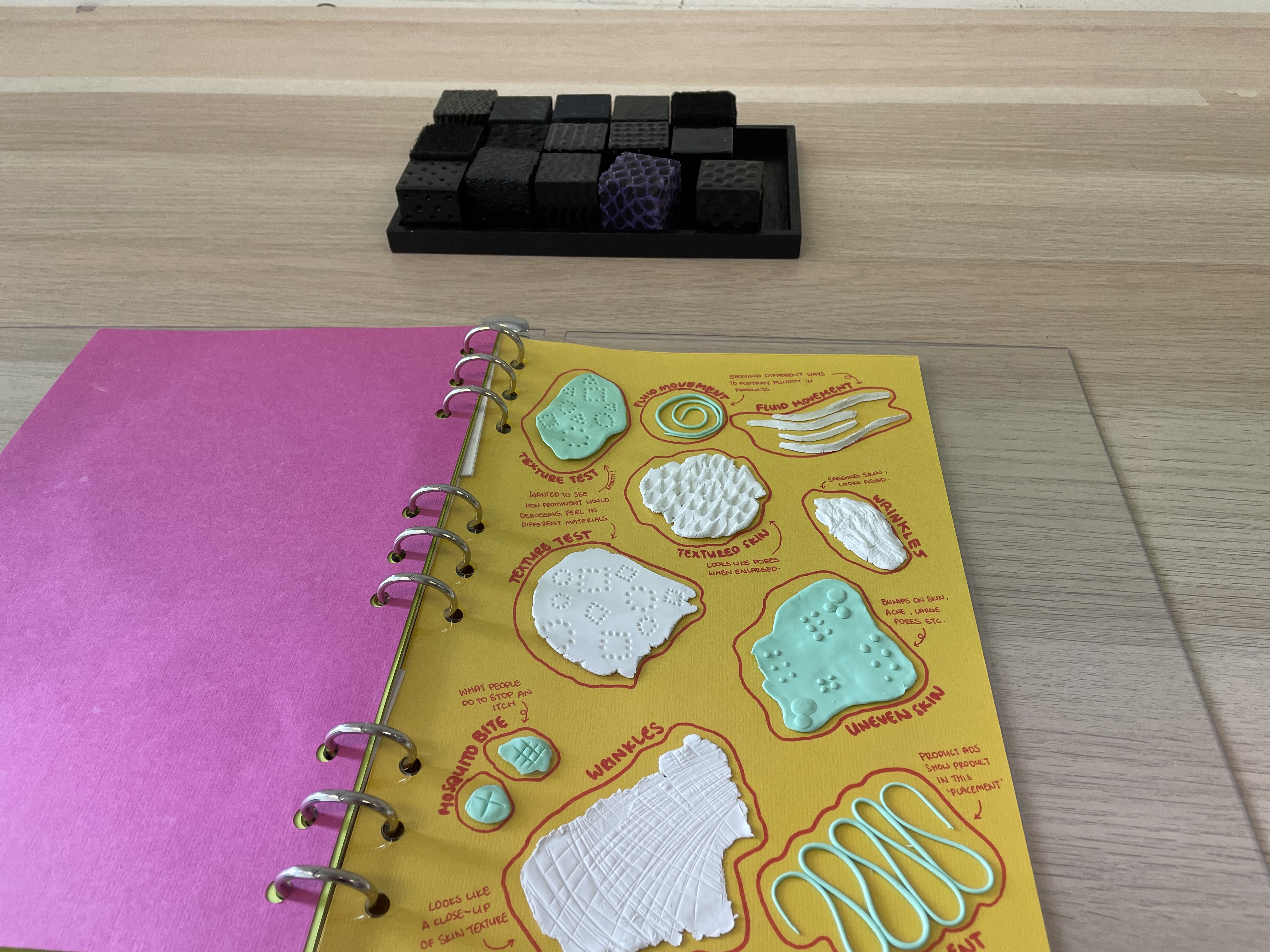
I found Jean's project on the Identification for the Unsighted really interesting. The approach of using texture as a means for representation and sense of touch as a tool for communication is similar to my Affective Data Objects prototype. In her project, she did an in-depth study on causes and effects of texture on skin through tactile symbols, which I thought was a very thorough sensory compilation. I liked the use of clay to mold the different textures within the publication as a way to document her work as well!

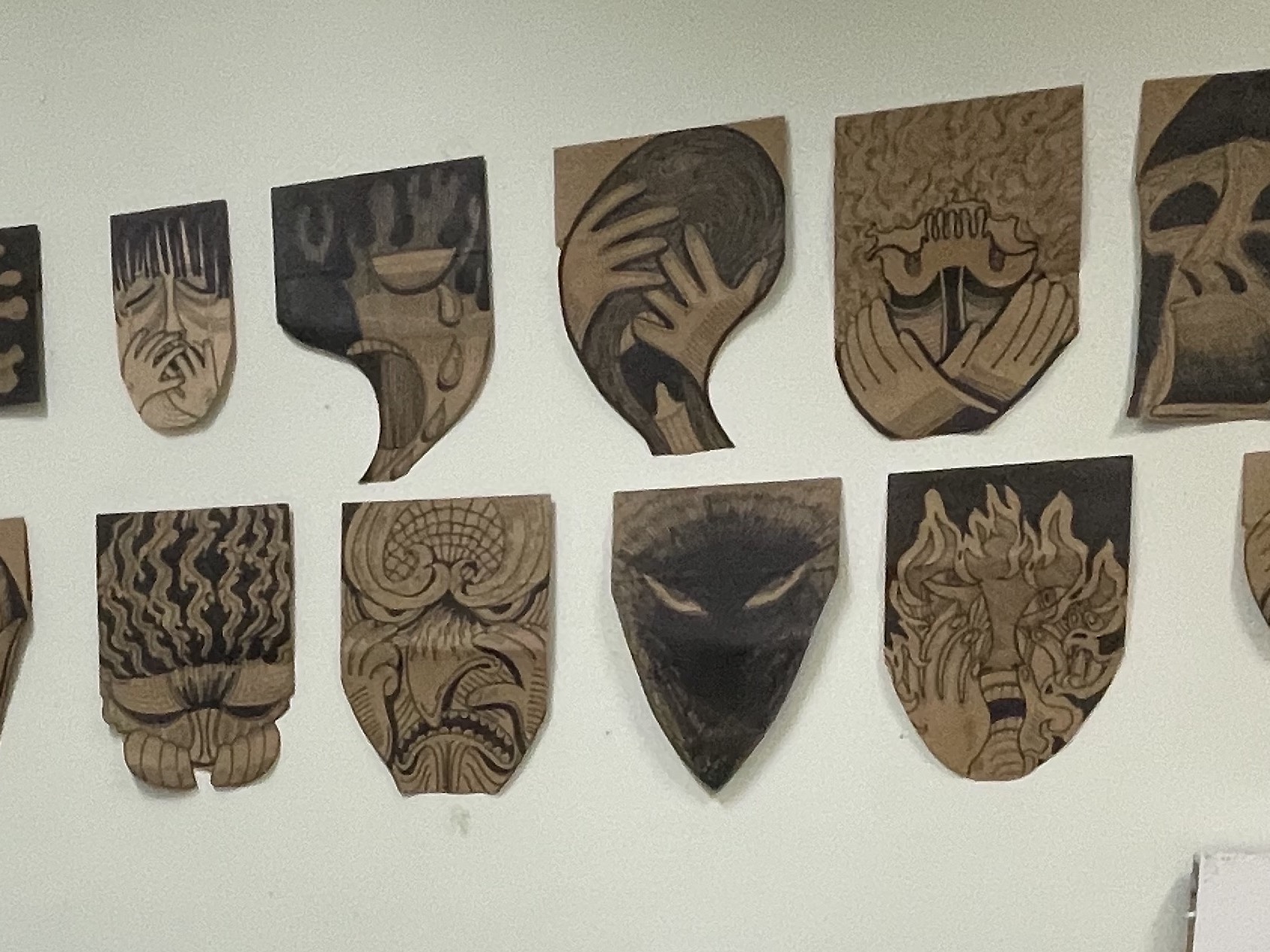
Also loved the illustrations for Masked Identities by Hyeji. The way of expressing one's identity through the mask really makes us reflect alot on the what it means to have an ideal self.
I really enjoyed reading through Ying Jia's publication, where she had printed spread by spread and pasted them on the wall. This display was very effective as it draws my attention to the publication and its contents much more.
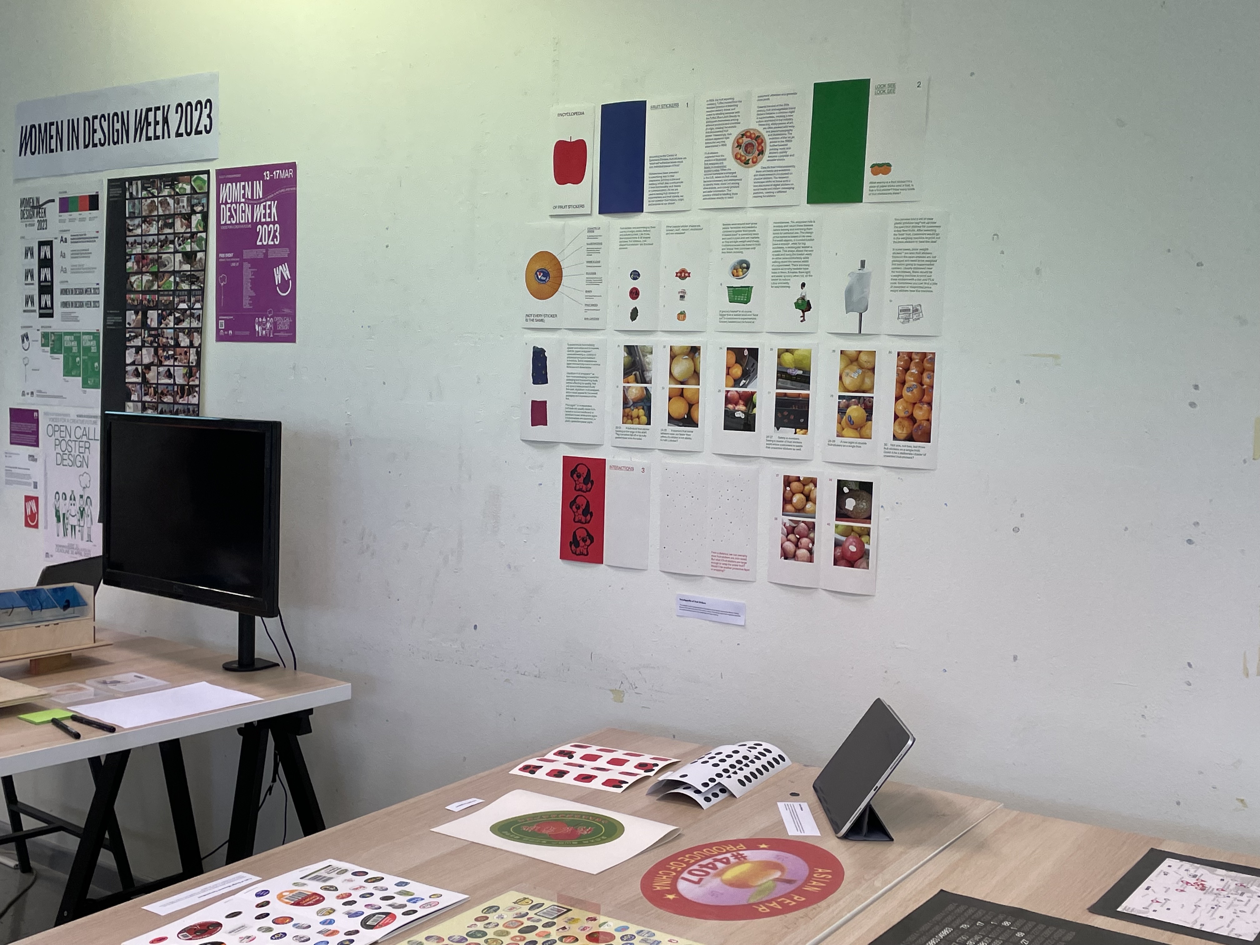
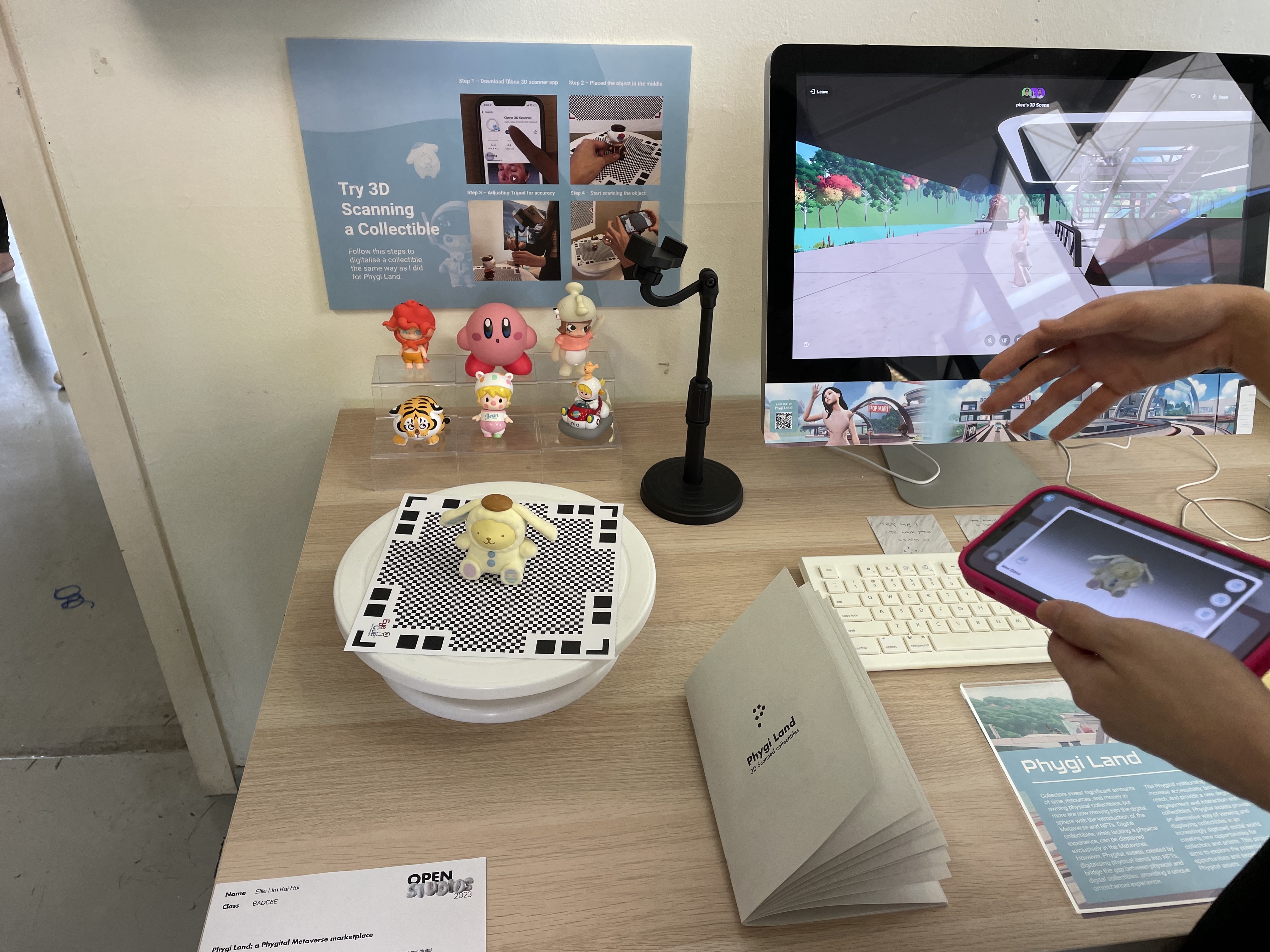
Something that I discovered from Open Studios is the Qlone 3D scanner app from Ellie's project! From her demo I found out that the app can simply scan any 3D object and translate it into a digital file, which I found really cool. I might be able to make use of this app to scan my Affective Data Objects into digital formats instead of photographing and cropping them out.
