1 / Update on Progress–Voice-Reactive Typography
2 / Update on Dissertation–New Findings
3 / Dissertation Consultation
4 / Cohort Sharing
UPDATE ON PROGRESS–VOICE-REACTIVE TYPOGRAPHY
Moving forward with my proposed developments from semester 1, I continued working on the Voice as Personality prototype. Previously, I had built a voice analyser deck back in term 2, hence during the holidays I started off by focusing on the aesthetics of the prototype. My first draft–reactive sliced type– gave more of an idea of how I wanted type to be involved in visualising the qualities of voice. From this draft, I wanted to work towards a more crafted and visually immersive and convincing prototype that mirrors the behaviour and personality of vocal characteristics.
-
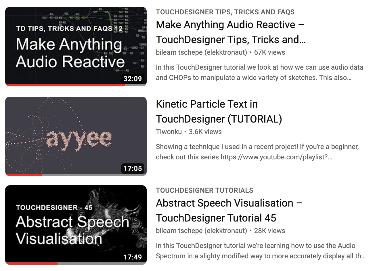
Here’s a compilation of tutorials from the last term and over the semester break which have significantly helped in constructing the mechanics of the voice-reactive typography. After trying out these tutorials multiple times, I picked out certain parts from each of them that I thought would be crucial in building the foundation of the interface. For instance, the first section of the interface required a set of operations to receive audio input, to complete this task I trialled and error several audio data collection setups, from which I’ve narrowed down to the Abstract Speech Visualisation and Make Anything Audio Reactive tutorial methods.
-
I found the former tutorial to be more appropriate for the type of data I was trying to collect as it focuses on the different types of audio levels channels in its analysis which is useful when I try to break down the different audio input qualities and match them to a visual output. Despite that, I still found the latter tutorial helpful in data collection as it emphasized more on how to amplify the input for our auditory and visual analysis in order to achieve a more accurate outcome.
Tips I Learnt
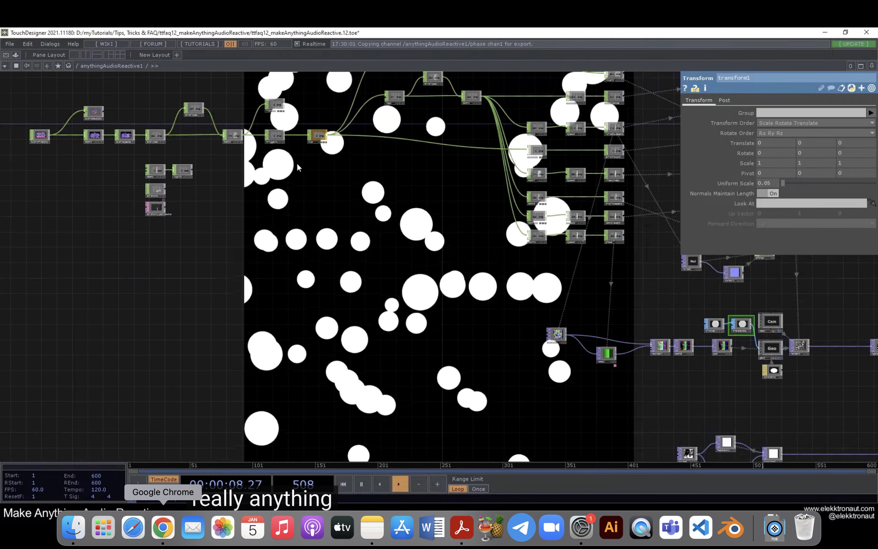
Something I picked up while from this tutorial was that we could use the transform operator to ‘crop’ the window to the exact dimension we would like the visual to be displayed, I think this would be a very useful tool for when I need to focus the window on certain aspects of a design etc.
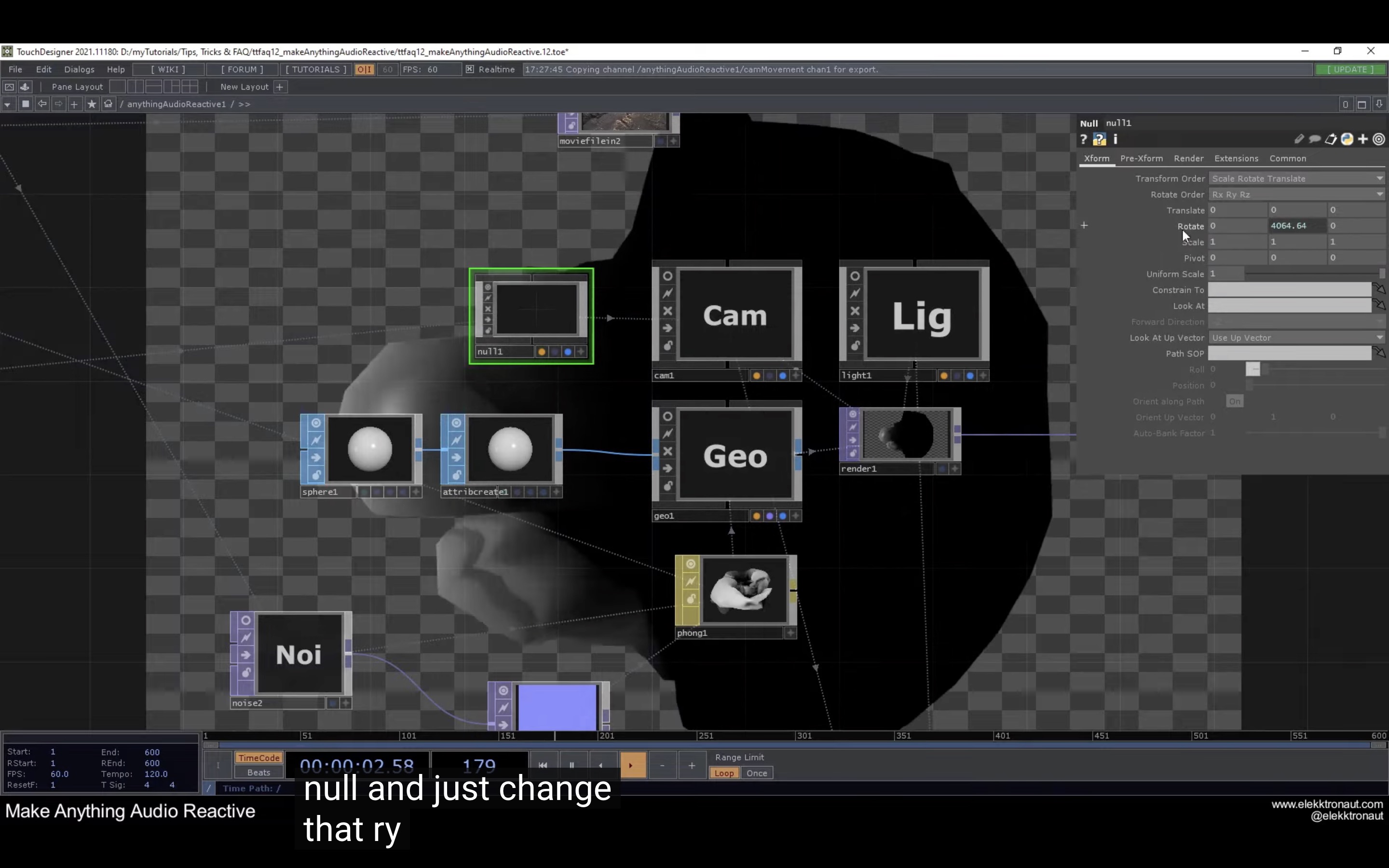
A tip that was shared during this tutorial was to attach a null to the camera to easily control the rotation of the camera instead of adding the CHOP reference on the camera operator itself. I thought that this was pretty helpful as the null acts as a mediator for the camera in a way allowing more control over how the camera moves.
Developing
the Prototype
Vocal Data Collection
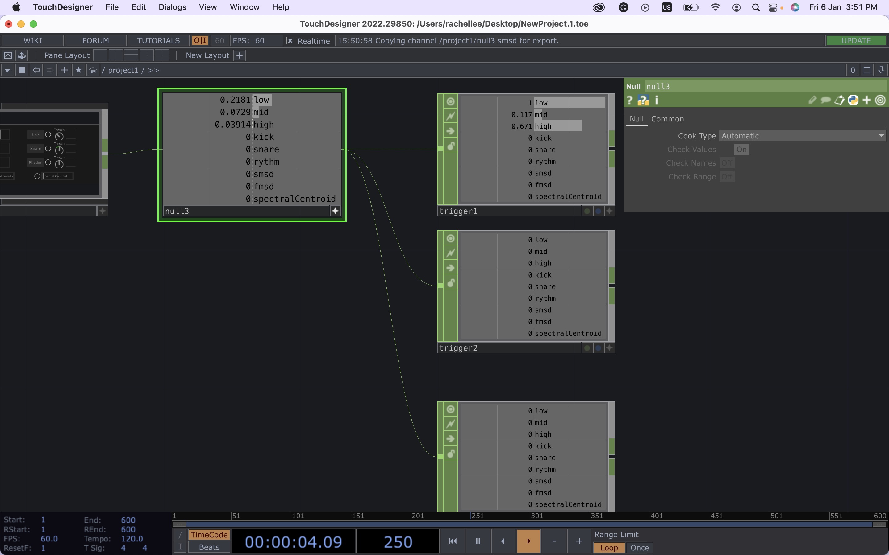
I managed to apply what I’ve learnt from the tutorial–Make Anything Reactive–to the construction of the interface. By utilising an audio analyser tool from the palette, I was able to break down the sound qualities into various channels and dedicate each sound input to a trigger outlet. As it is speech-reactive, only the low, mid and high frequencies could be detected through this method, hence three triggers were set up for this purpose.
Mapping Graphics To Typography
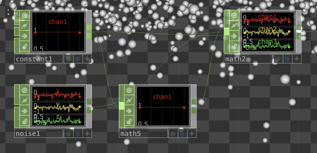
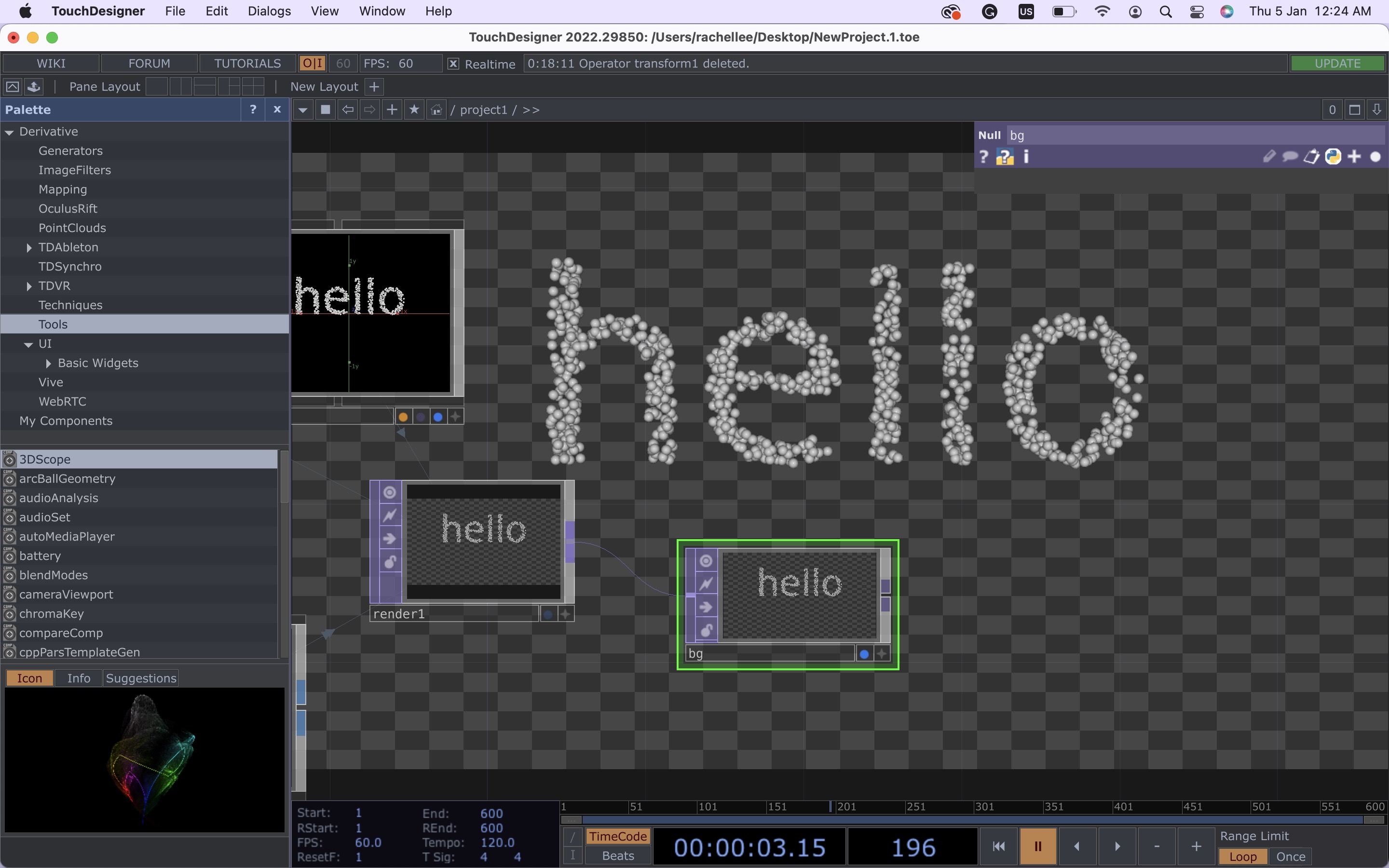
Following the Kinetic Particle Text tutorial, I tried to map 3D shapes to the outline of texts while having subtle movements animating the shapes to utilise movements as a way to signify behaviour.
A minor mistake which took hours to figure out! Over here, I’ve mistakenly attached the constant to both math operators instead of only one. Now, double-checking the connecting points would always be a step in ensuring that everything works perfectly.
Using Audio Input to Control Type
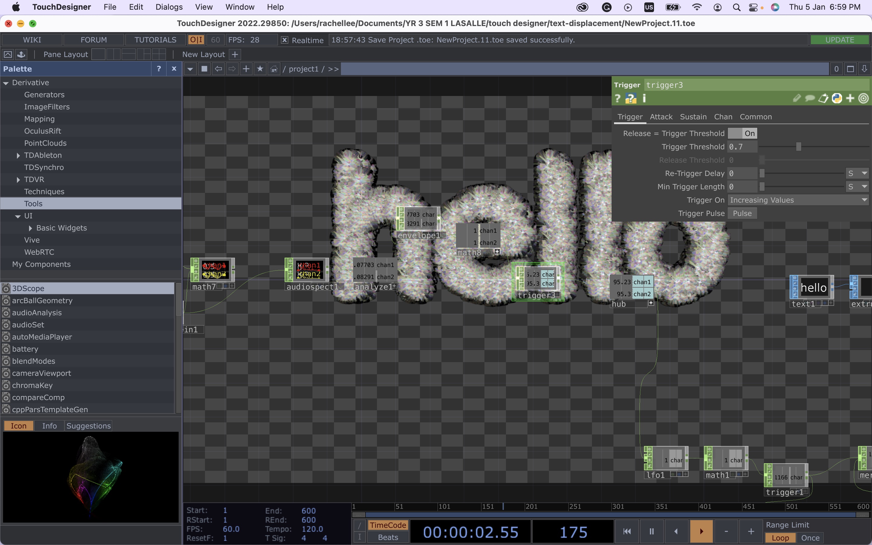
This was one of my initial attempts at connecting audio values to typographic elements where I applied the data collection set-up learnt from the Make Anything Audio Reactive tutorial and the type treatment from the Kinetic Particle Text tutorial. I’ve also combined some typographic treatment tricks I learnt from the audio reactive tutorial, by applying a noise and normal map to the material rendering, creating this displacement effect. However, this set-up didn’t really work well as only one audio channel could be used as input to control the type treatment, which is also one of the reasons I found the Abstract Speech Visualisation tutorial more applicable in terms of collecting and analysing data inputs.
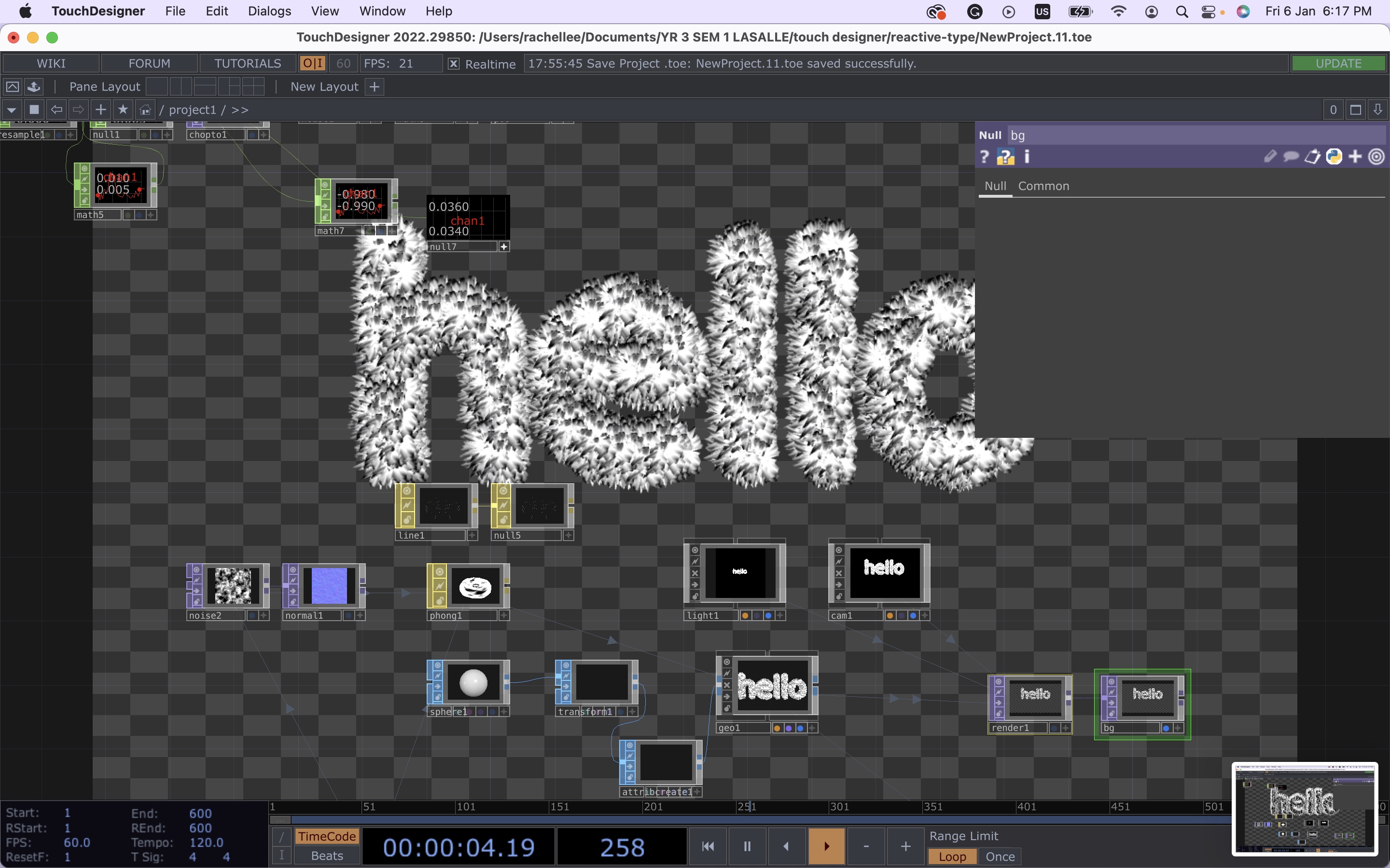
Here the typographic treatment is finally getting somewhere closer to how I envisioned it to be, a 3D kinetic and texturised type. This version of the interface was a mix of stuff I learnt from all the tutorials, there were problems with the material render as can be seen in the previous image and the animation of the type seemed slightly awkward which was fixed in this version. Additionally, I built a new data collection set-up here, where I attached an audio analyser tool that allowed me to use different sound characteristics as its own channel with the trigger operations to each channel.
Now to the last portion of the set-up, where the type reacts to the vocal data and changes its appearance and behaviour accordingly. I thought about how to execute this for quite some time, whether to have the input value attached to each visual characteristic or be more straightforward by associating predetermined personality to the individual designed typography and have the input value match with the typographic design. In the end, the visual output is somewhat of a balance between the two, where the intended typographic treatment is manipulated by the ‘low’ vocal channel and the behaviour and visual manipulation are controlled by the ‘mid’ and ‘high’ channels respectively.
This is because when I was testing the interface by myself, it was observed that the ‘low’ channel was the most active and frequent input that could even pick up small amounts of sound. The ‘high’ channel could detect sharp or high-volume sounds, hence I thought this would be visually appropriate to depict the visual manipulation of the typography to show the extremes of typographic application. Whereas the ‘mid’ channel was the least active channel as opposed to what I expected since it was an in-between of the other two channels. Nonetheless, I had the ‘mid’ channel attached to the behaviour of the letterform as the low levels of input helped to reduce the impact of the particle’s movement such that the overall behaviour of the typography would not be overwhelming but more subdued and controlled.
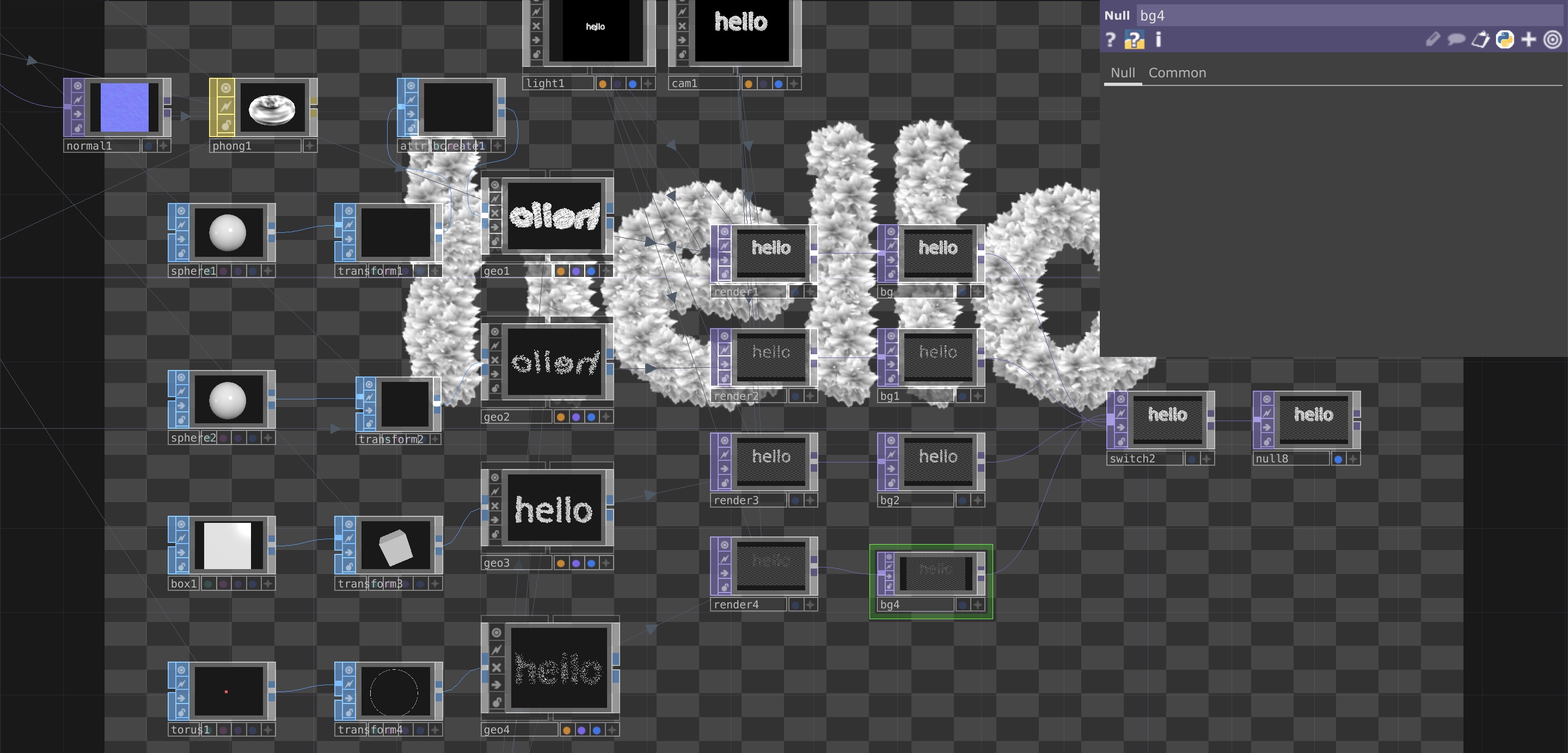
Challenges
To execute the above plan, I referenced the Make Anything Audio Reactive tutorial where I learnt to switch between multiple null operators.
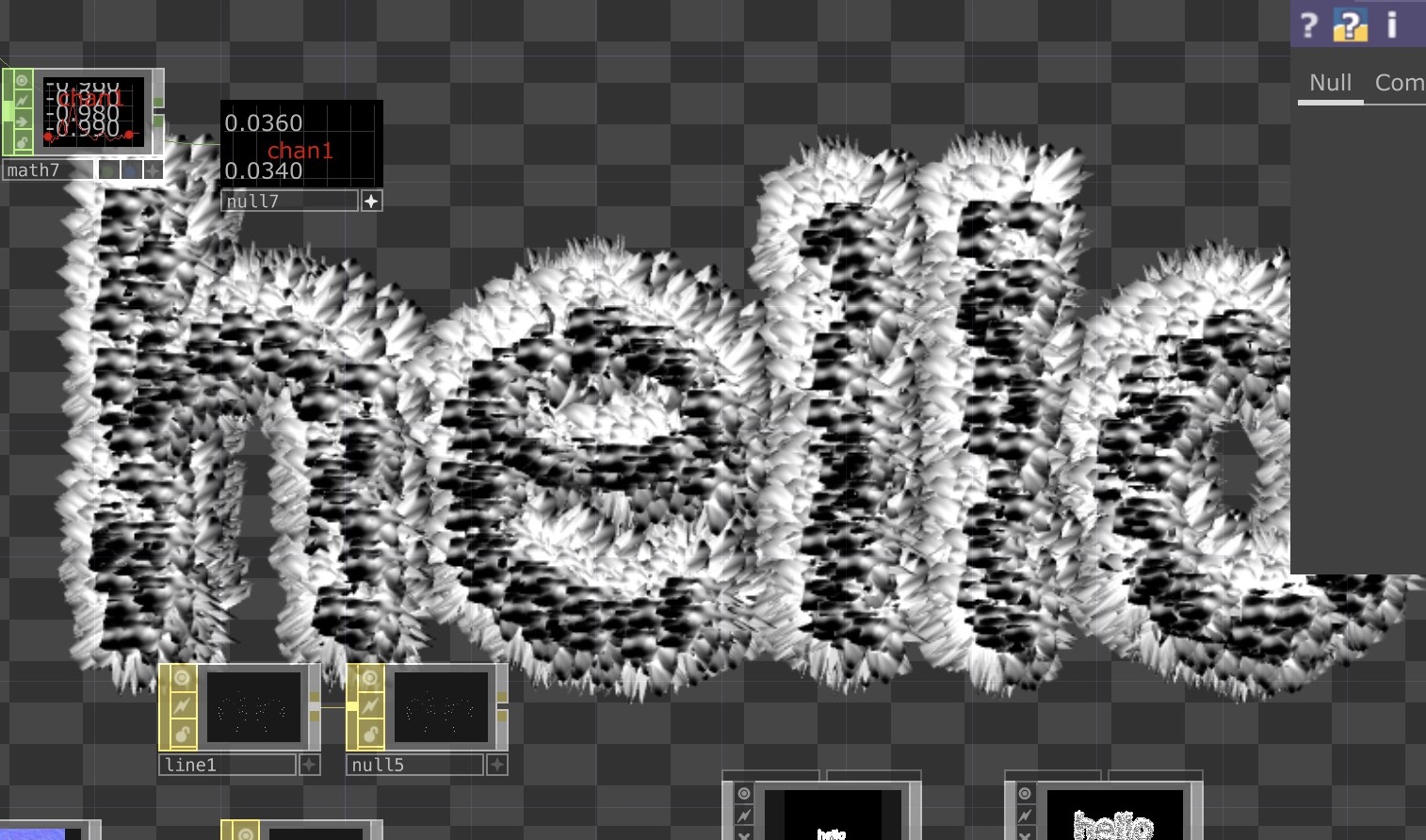
However, as compared to the tutorial which used all TOP operators, mine worked in the 3D space using SOP operators instead which was a problem when I tried to link a SOP to a TOP ‘switch’ operator in order to make the graphics interchangeable. After searching the web, I found this solution, which didn’t work in my context due to the ‘render’ operator which could not be attached to a remap function. I tried rearranging the set-up, by inserting the ‘switch’ before the ‘render’, which resulted in this monstrosity on the left where the displaced type and sphere type overlapped in one render. At last, I figured it out by myself after multiple tries, by separating the different outcomes into individual unique render channels to avoid merging the designs together and for the ‘switch’ to be able to change between different renders as the input is triggered.
End Result
The above is the current typographic outcomes I have so far that are reactive to voices. Here the volume of voices changes the typographic elements generated.I created four typographic treatments for the moment while I continue with exploring the rest of the 3D operators available in Touchdesigner, or if I'm able to transfer over a 3D file from Blender or code a 3D object within the software.
UPDATE ON DISSERTATION–NEW FINDINGS
Psychology
of Shapes
While working on the ideation section of the Affective Data Objbects prototype in my dissertation, I came across this design theory called the Psychology of Shapes. I found this theory particularly interesting as this theory was backed up by scientific evidence and numerous research which has proven that shapes has an influence on our minds and reactions. I also found so many books and design sites that have discussed this theory that I thought were interesting to read and enlightening:
- Knock Design into Shape. Psychology of Shapes.
Alina Arhipova. Tubik Blog.
- Understanding The Psychology Of Shapes To Design Better
NYX ditech. 2019.
- The Use Of Shape And Color Theory In Interpreting Character Traits.
Henderson Curtis. 2021.
DISSERTATION CONSULTATION
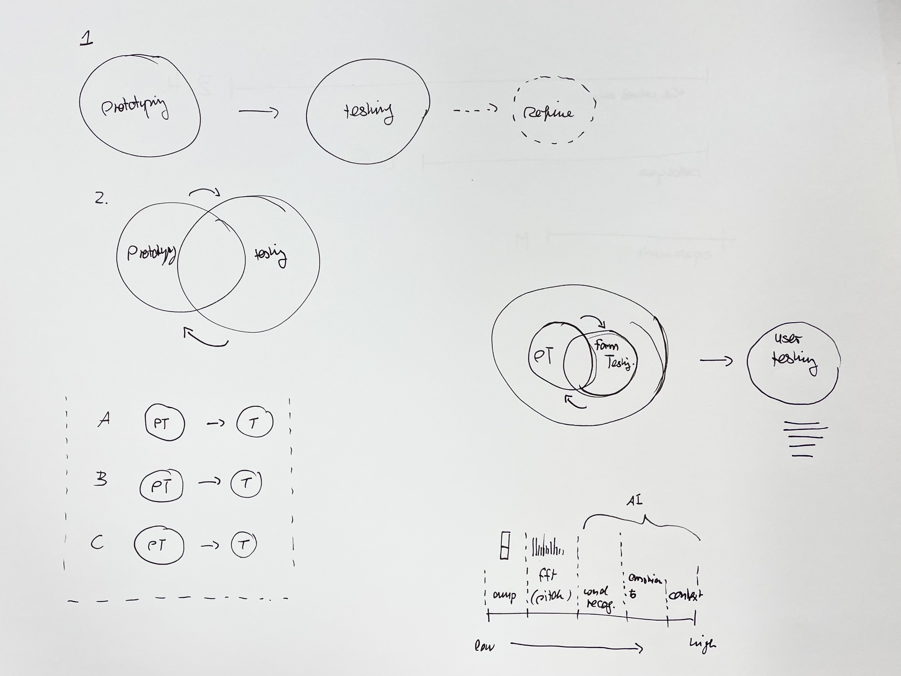
Dissertation Notes:
–When writing about critical journal >
prototyping should only focus on making
–Use subheadings in approaches and methods
–Add more images to highlight certain points or to elaborate and support the text
Prototyping Notes:
Method2 >
– Application testing + Functionality/Form/Behaviour and Aesthetic and Motion test
–Analysis needs to be fine-tuned in terms of the behaviour and narrative, instead of just the word and changing shape
–E.g Visuals can have a certain behaviour that reacts to the interaction
–The way of speaking may be different for each individual, so how can the behaviour of visual depict that?
–Can try based on fft(pitch), which gives you many different amplitudes to gather data from
–Try to analyse the sound at different frequency spectrums to gain a more individualised and detailed approach to the visual
COHORT SHARING
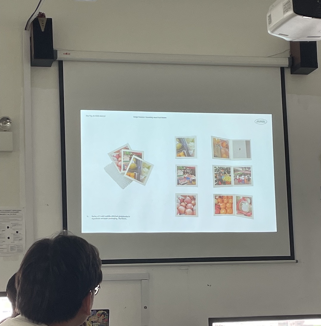
I really enjoyed Ying Jia’s sharing as I found her idea simple but exciting. Fruit stickers were something that I hadn’t considered to be significant, thus through her project I gained a new perception of the value of fruit stickers–they were not just labels or seals but something worth collecting. In addition, an interesting discovery that I learnt through her presentation was the fact that fruit stickers are being replaced by laser fruit stickers. As fruit stickers are also easily disposed of printed ephemerals, this adds to the quickly disappearing physical fruit stickers.
Something that I liked about her project was the explorations made with the materiality and quality of different fruit stickers. Also, I found that the mention of fruit sticker codes was an interesting way of categorising and sorting them within a collection.
Image: Sharing of fruit
stickers brochures