1 / RPO Consultation
2 / Catalogue of Making
3 / Cohort Sharing Insights
RPO CONSULTATION
Moving forward with Experimentations:
– Find visuals that you think relates to what you’re working on
– Do it as a map or moodboard, based on colour, based on style
– Look into screen-based, immersive environments, physical, anything that goes beyond the screen, wind, movement and sound
– Find new inspiration
For RPO:
– Framework is research through design
– sub-framewiork is the research through design
– Look into how others research through framework and how they apply methodologies and protoypes
– Design disciplin–research through design
– How research through design is conducted and practiced
– Interaction foundation website: research through design website 43.
I think the feedback on looking into other visual styles and methods for the visualisation of identities is very helpful, as I didn't want to limit myself to just the use of code in my project. I think the blending of techniques and tools like screen-based, movement, with something physical might be interesting to experiment with. Alse the suggestion to start a visual map would be helpful as I do feel abit lost as to what I want to do or how to portray my experiments in the future so I think this moodboard can help me narrow down on the visual styles.
DIGITAL REPOSITORY
For the Digital Repository, I mainly categoried my findings into three themes, namely digital spaces, personal data and visual systems. Digital spaces will look into the construction of idnetities within the online space, and case studies that surround self-expression tools that aid in the communication in the online environment are referenced here to show examples of how identity can be formed through this notion. Personal data will focus on how the use of personal data plays a role in the visualisation of online identities, through which case studies featuring the use of personal data collected through devices such as smartphones, wearables etc to generate a data visualistionf of personal identities are being shown in this section. Visual systems showcases examples of how generativitiy in this sense through user data input can drive the visualisation of personal identities.
A few projects that I discovered while researching for the repository and thought would be insightful for my project:
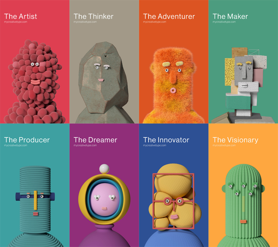
Images: Kashka Pregowska Anton Hjertstedt, AJ Joseph. Creative Types. 2020.
The Creative Types test is an interface that allows users to take a personality test to determine their creative personality type. Through this, Creative Type aims to identify the core personality of each individual and shine a light on the different creative personality types which may help to individuals understand their creative process better and reveal the individual’s creative potential.
Thoughts:
What I liked about this project was that the idea of identity was very strong and prominent, where each unique personality had its own representation, alongside a detailed analysis of their personality that. Also the use of 3D designed characters bring the personalities to life, bridging the gap between digital selves as it humanises the idea of personalities. I think the use of characters in this way is a smart as it connotes the personality types to a being and form which associates them with an perceivable identity that is easy to visualise and comprehend.
Another similar case study that I found called Microsoft Avatars also uses the same visual style of 3D textured characters as its form of identity representation. Instead it takes a different focus, away from the personality of users but these characters are a representation of feelings and experiences in a abstract manner.
Although these two case studies differ in terms of intention, the execution is the same whereby they both use visual styles to resemble human-like appearances and traits to symbolise the humanistic aspect of the characters, however, each of them deviate from the actual humanness form. I think this technique is great in the way it executes the the use of abstraction to depict the complexities of human form in order to make the meaning behind the visual easily understandable..
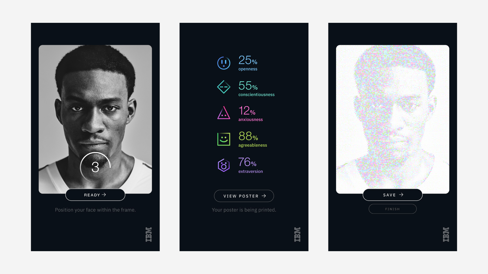
Images: Justin Au Brooklyn, Chris Rowson , & Bastien Baumann. Cognitive Photobooth. 2017
The cognitive photobooth is an interactive installation using IBM’s AI computing system to create data-driven portraits of people. Using Speech to Text and Tone Analyzer APIs, the system analysed the user’s answers to determine their personality.
Thoughts:
I found this project rather similar to my topic as it encompasses the aspects of human-technology interaction, generating data through user-input, and using that data to map our the personality/identity of the person. However, I do think that this project is a tad bit too much on the technical and data side, I would shift the focus back to the humanistic aspect of the project to keep it more balanced and bring in the organic side of things.

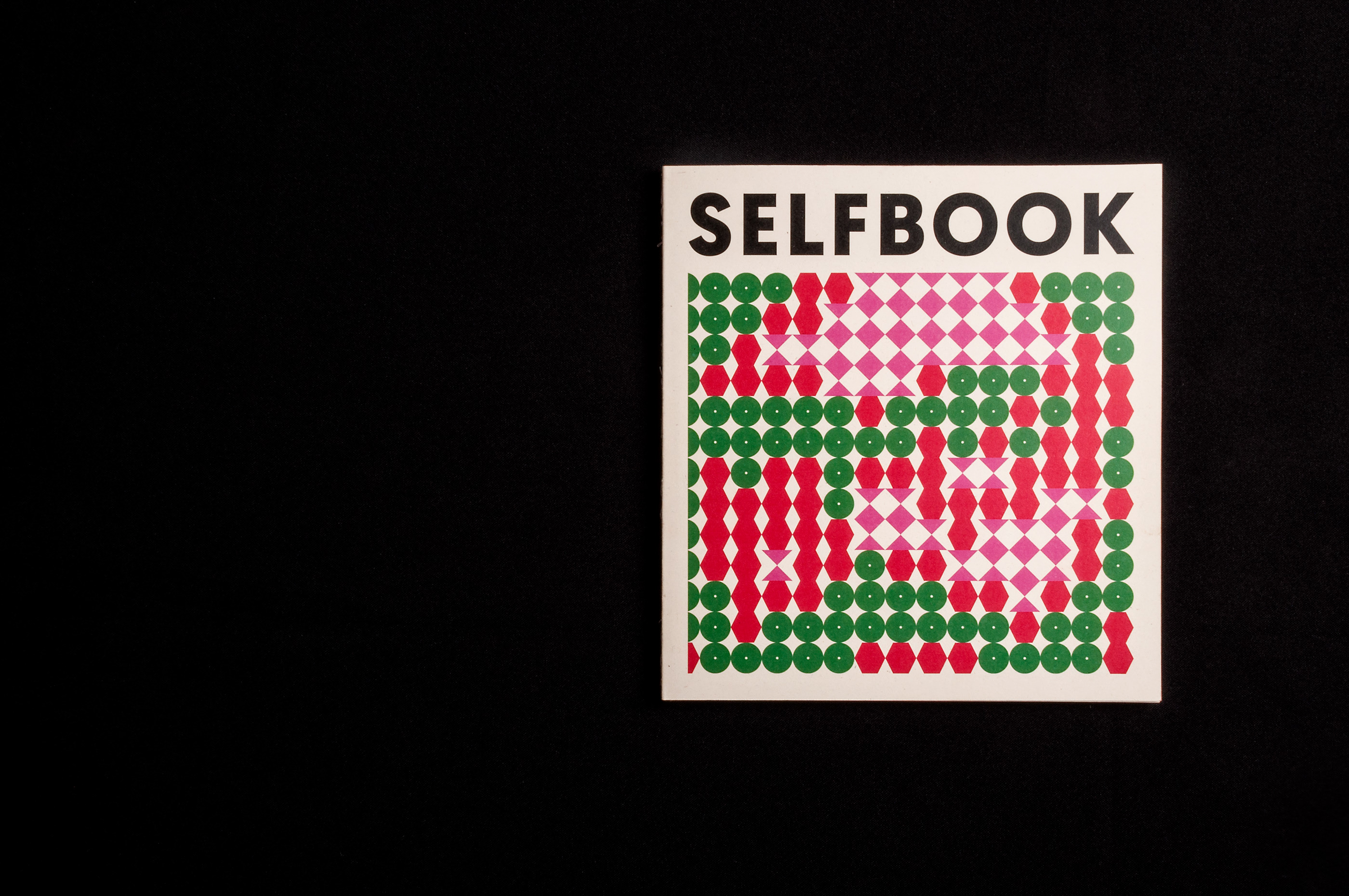
Images: Balázs Szemmelroth.Selfbook. 2018
Selfbook is another case study which I found interesting, as it is a photography + generative art editorial publication that showcases the visualisations of different portraits of people who answered the same set of questions. The differences in each individual's answers generates the design of their portraits.
Thoughts:
I thought the use of photography as a visual medium was cool as I would’ve never thought to include or combine photography in a generative media so I thought this was refreshing take on generative art.
CATALOGUE OF MAKING
Link to
Catalogue
of Making→
While working on the Catalogue of Making, I wanted to create secondary visuals using elements from the experiments to add to the aesthetics of the website. When picking apart my experiment outcomes to illustrate the visual elements, I started to find patterns and themes across my experiments which led to new insights for my experiments. So by doing so, unexpectedly, I discovered new ways to interpret the outcome and bring meaning to the experiments.
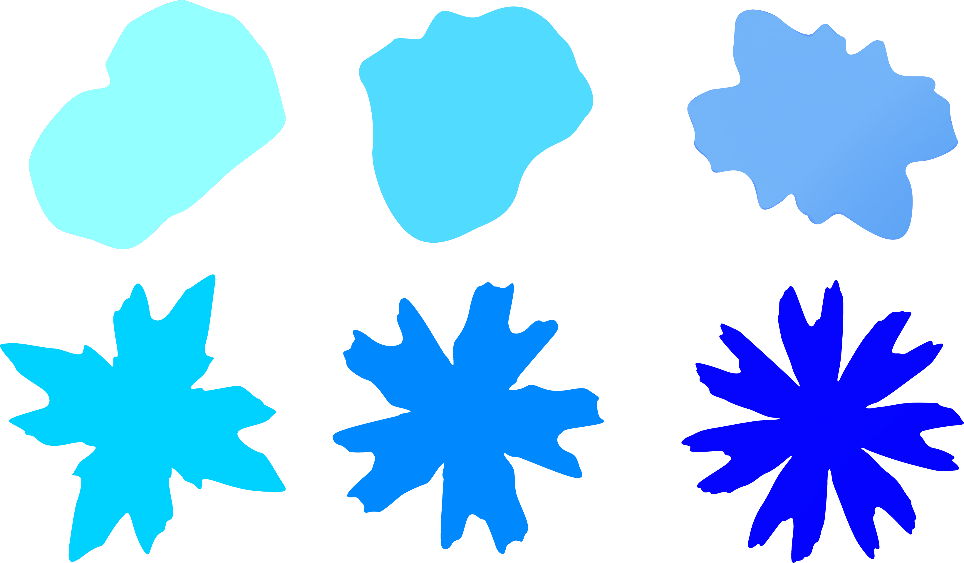
For instance, in experiment 6, when I separated the different forms and shapes derived from the generative design, and put these shapes together, it formulated this evolution of different stages whereby the shape becomes more and more complex as it grows, which in a way showcases the evolving form in a static manner.
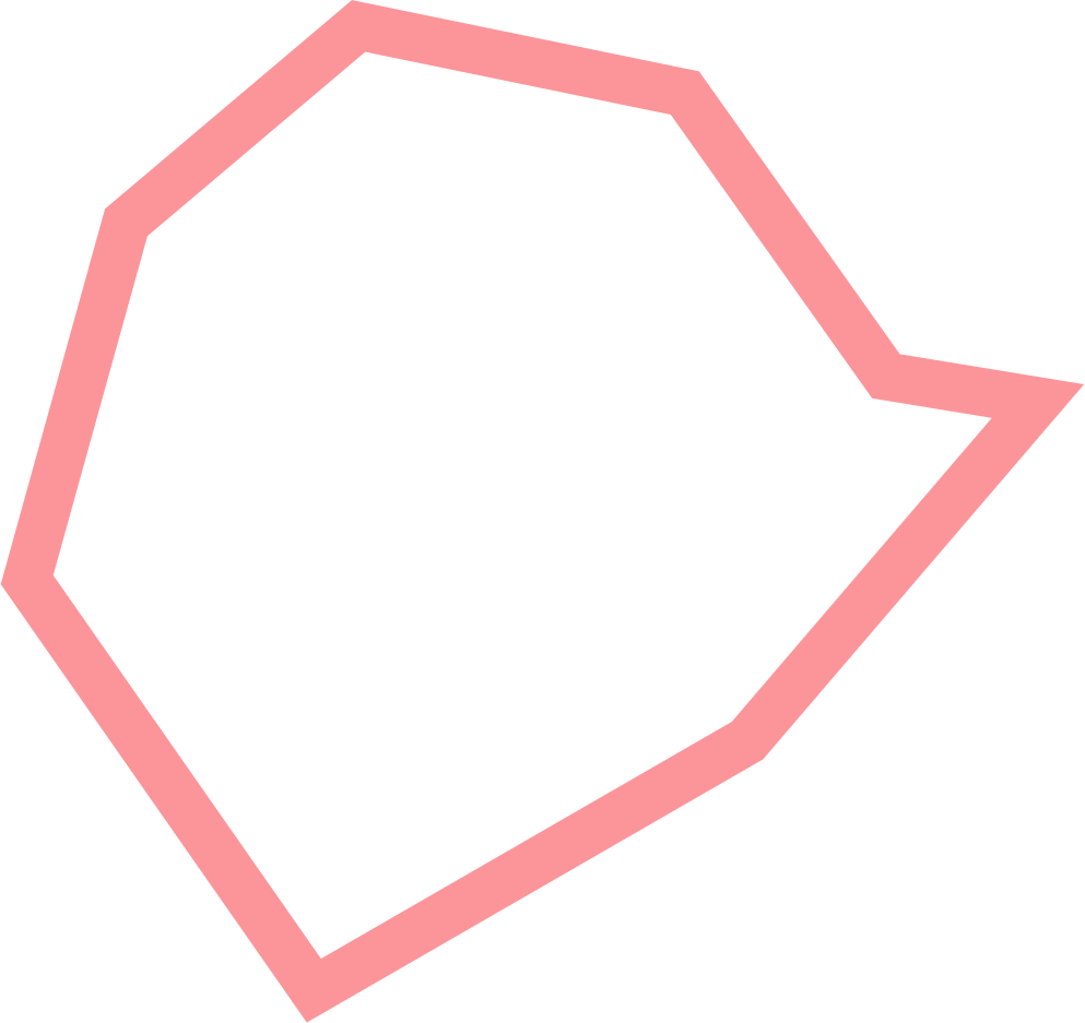
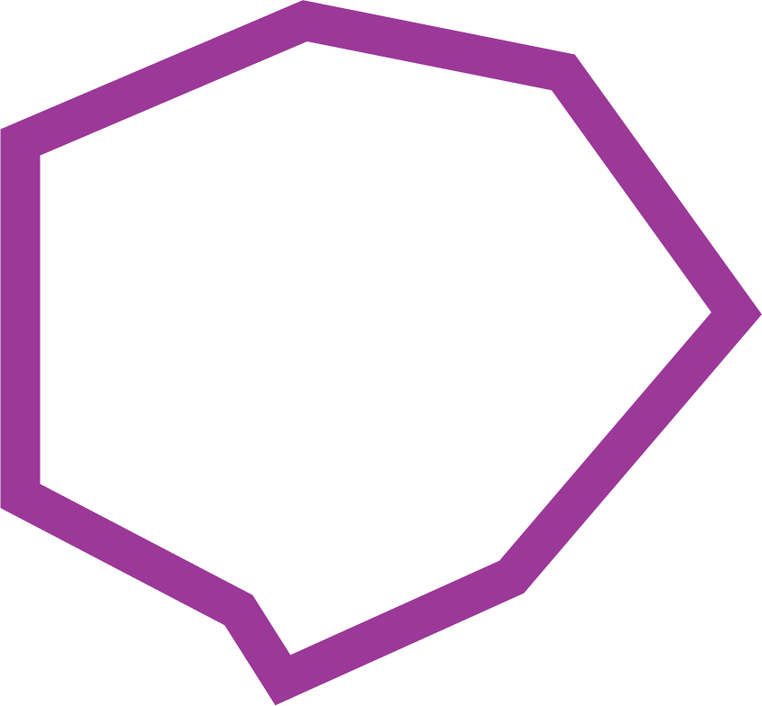

Also in experiment 5, when I looked into the data visualisation from the graph and illustrated the different shapes from the visualisation, it provided a lens into the layers within the data visualisation. Seeing how each shape outline is being formed, the hierarchy between different vertices, and what each unique shape connotates and means. Looking at how all these shapes come together to form a new piece of information in itself by showing the relationship between the different shapes, making it clearer to see and understand the data as well.
Linking Github → Netlify
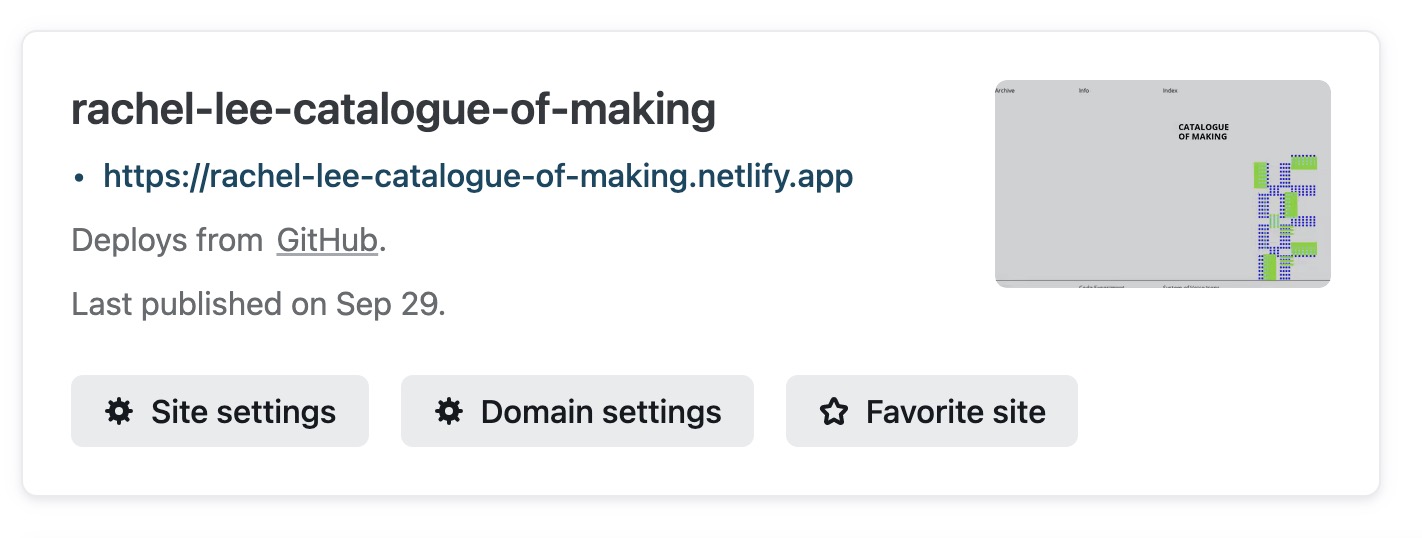
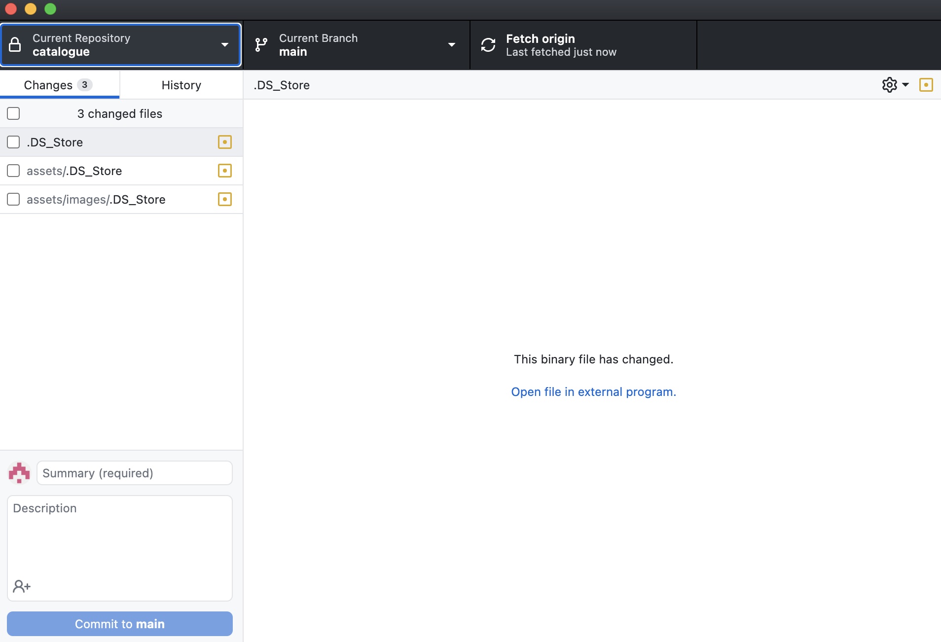
An additional thing that I picked up this week was to deploy my sites through github and netlify! It is a indeed life-saver as I need not manually update my site every time I make a change in my files over on netlify anymore, and github can help to make the new changes instantly.
COHORT SHARING INSIGHTS
I kept the overview presentation rather simple and straightforward, first covering how I derived the idea, followed by background context and concepts surrounding the idea, next the experiment processes and outcomes, and lastly steps moving forward.
After watching the presentations from other students, I took note of some pointers that I can improve on for my presentation as well. I should go more in-depth in the explorations and the construction of my research topic, why personal identities? why the online space?. I shoudl also go through the intiial case studies and readings that inspired my research topic as well. It would also be good to explain the correlation of my topic with the compendium from the previous semester and some how it has evolved into the current idea.
Sharing of presentations
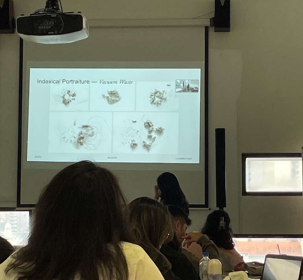
Project: Cordellia Putri. Indexical Portraiture
I thought this research from Cordellia was pretty thought-provoking and it got me thinking about all these questions like How to express disgust through indexical portraits Understand why hair disgusts people–is it because its someone else’s hair? Does soap make the hair appear ‘cleaner’? I think the project takes an interesting angle to look at hair waste and made me curious to learn more as well!
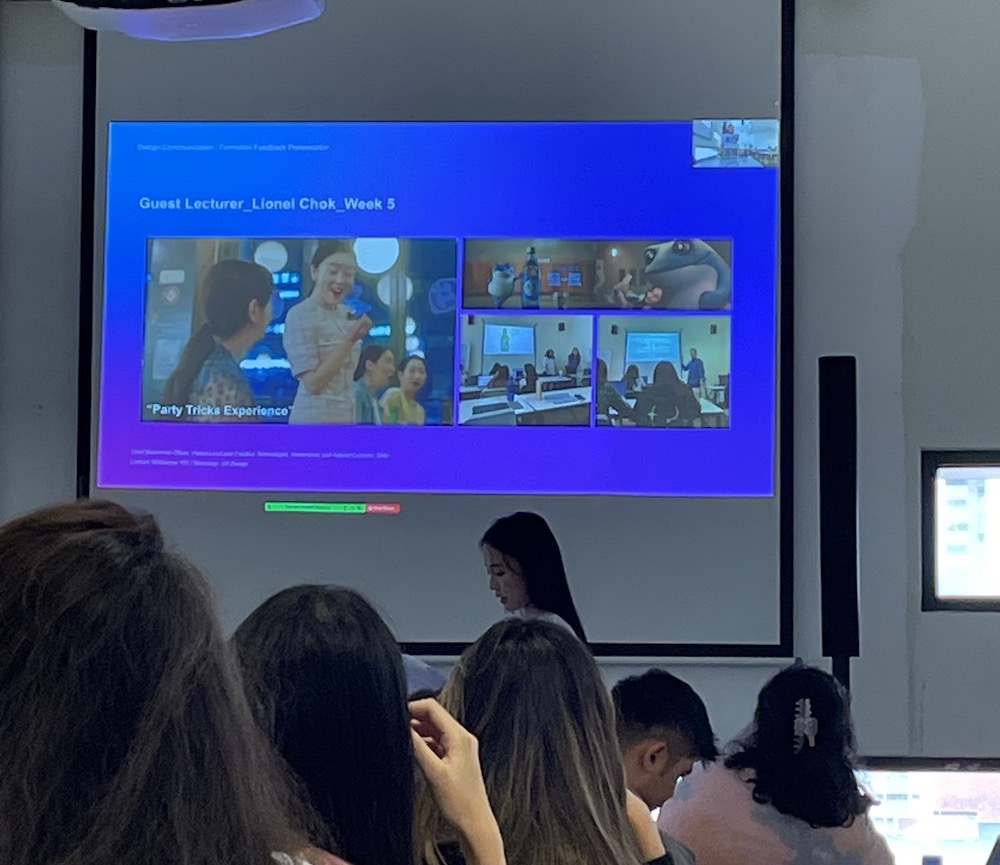
Project: Lee Yun Jeong. Effects of Short Form Video Content in Tiktok
I found it interesting the take on snack culture but with a different geographical standpoint, it reveals alot about the psychological influence of the culture of the country on the behviour of shoppers.
When I was speaking about this project with Yun Jeong, I learnt that her topic deveoped from the idea of 'Doomsday' scrolling which refers to infiinite scrolling on a webpage, which I thought was a really interesting technique used in alot of our shopping websites nowadays. This got me thinking about the psychological influence it has on our shopping culture so I am looking forward to seeing more outcomes from this project.
