1 / Exploration–Voice Analysis of Personalities
2 / Cohort Sharing Slides
3 / Cohort Sharing Insights
4 / 3D Printing Course
EXPLORATION–VOICES ANALYSIS OF PERSONALITY
From last week's readings on how the analysis of our voices could determine the personality of users, I tried to make sense of how the voice analysis could be mapped, and one of the ideas I had was to use type as a representation as that was the most direct reflection of how spoken words could be seen through visualisations. As such, I tried to look into case studies that are related to sound/audio-reactive typography.
I wanted to try experimenting with the manipulation of letterforms using the pitch and frequency of our voices, in order to do so I searched up openprocessing references and youtube tutorials.
While doing some visual research I came across this audio reactive typography tutorial on youtube which uses TouchDesigner. I've never used that application before, but I thought the tutorial was something closer to what I plan to do for my prototype, hence I tried to learn TouchDesigner!
I first attempted the above tutorial but soon realised it was too advanced for a beginner like me as I wasn't able to understand or keep up with what the youtuber was teaching. Therefore, I decided to go through a 22 part beginner tutorial course about TouchDesigner, to gain some basic skills for the app. 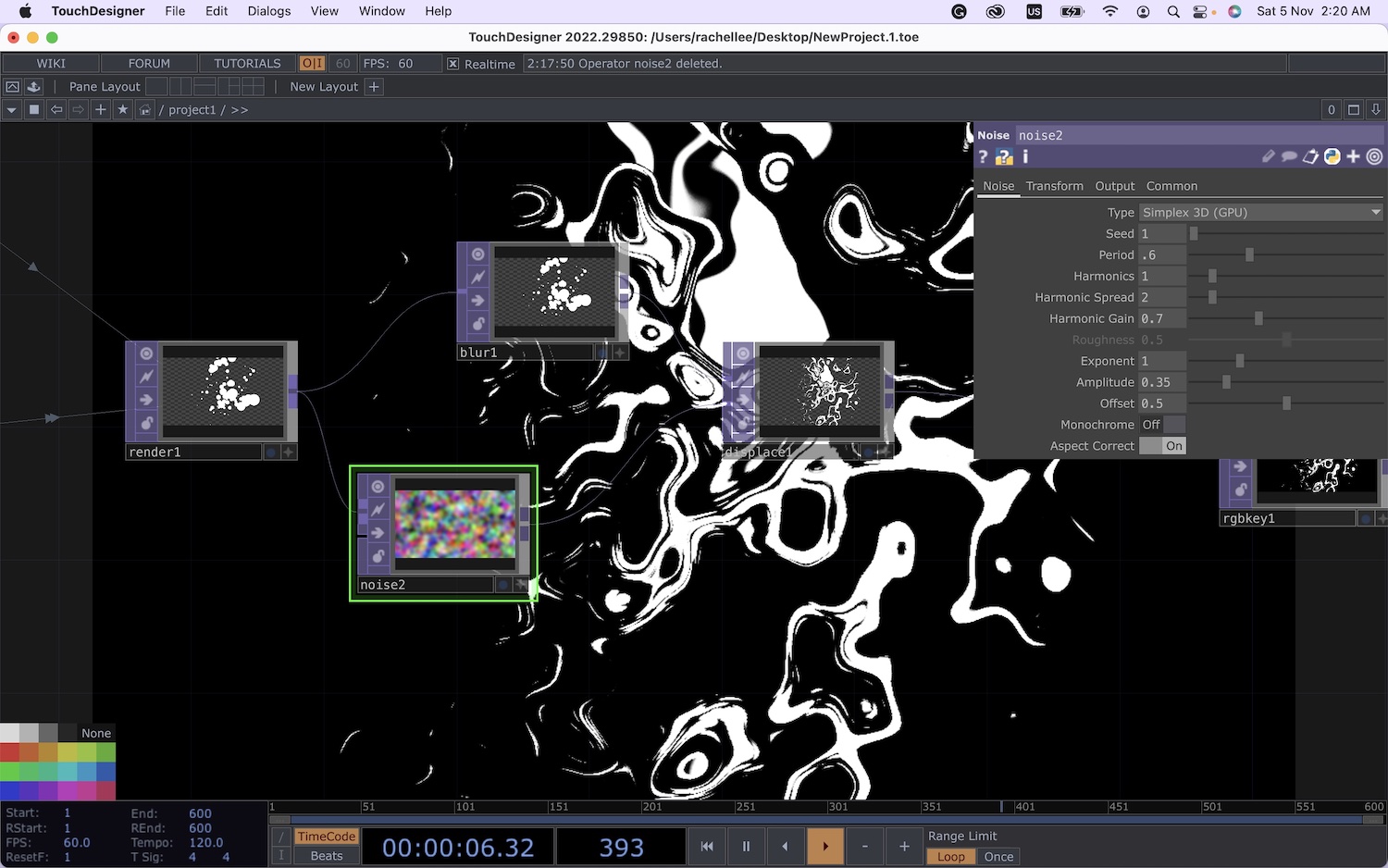 After which I re-attempted the above 'Abstract Speech Visualisation' and finally after a whole day of learning this app, I was able to recreate the same outcome in the video!
Below is an iteration that I explored in my own time after the tutorial, where I played with the RGBA values of the displaced noises. In this video, I played a song in the background which created this coloured rhythmn of the beats.
I'm quite happy with this outcome as the technical parts of the voice analysis functions perfectly. I think the mapping of the visuals is something I would need to work on next–something to do with type as the shapeform instead
COHORT SHARING SLIDES
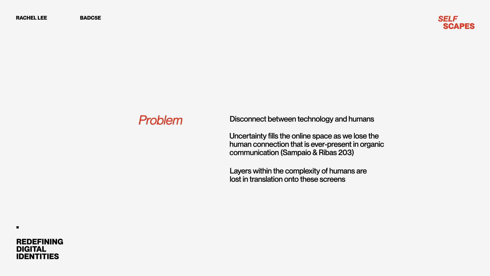
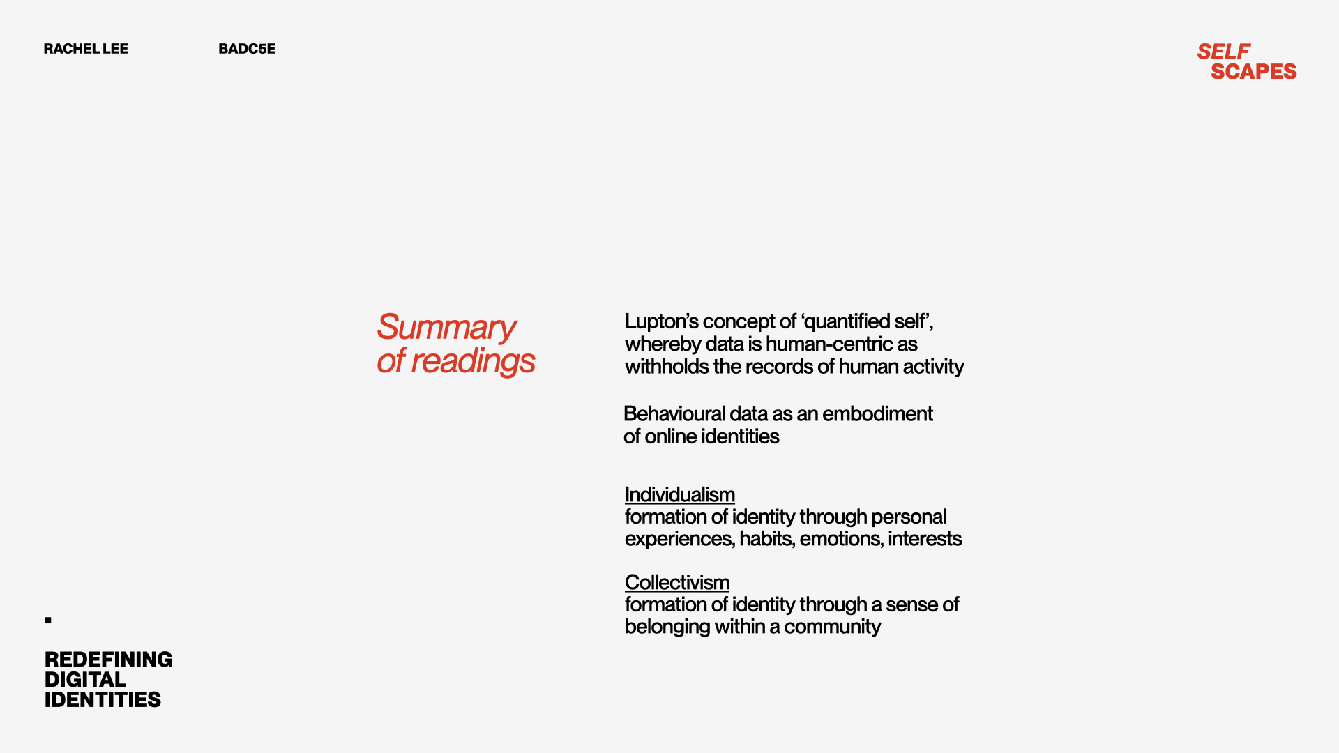
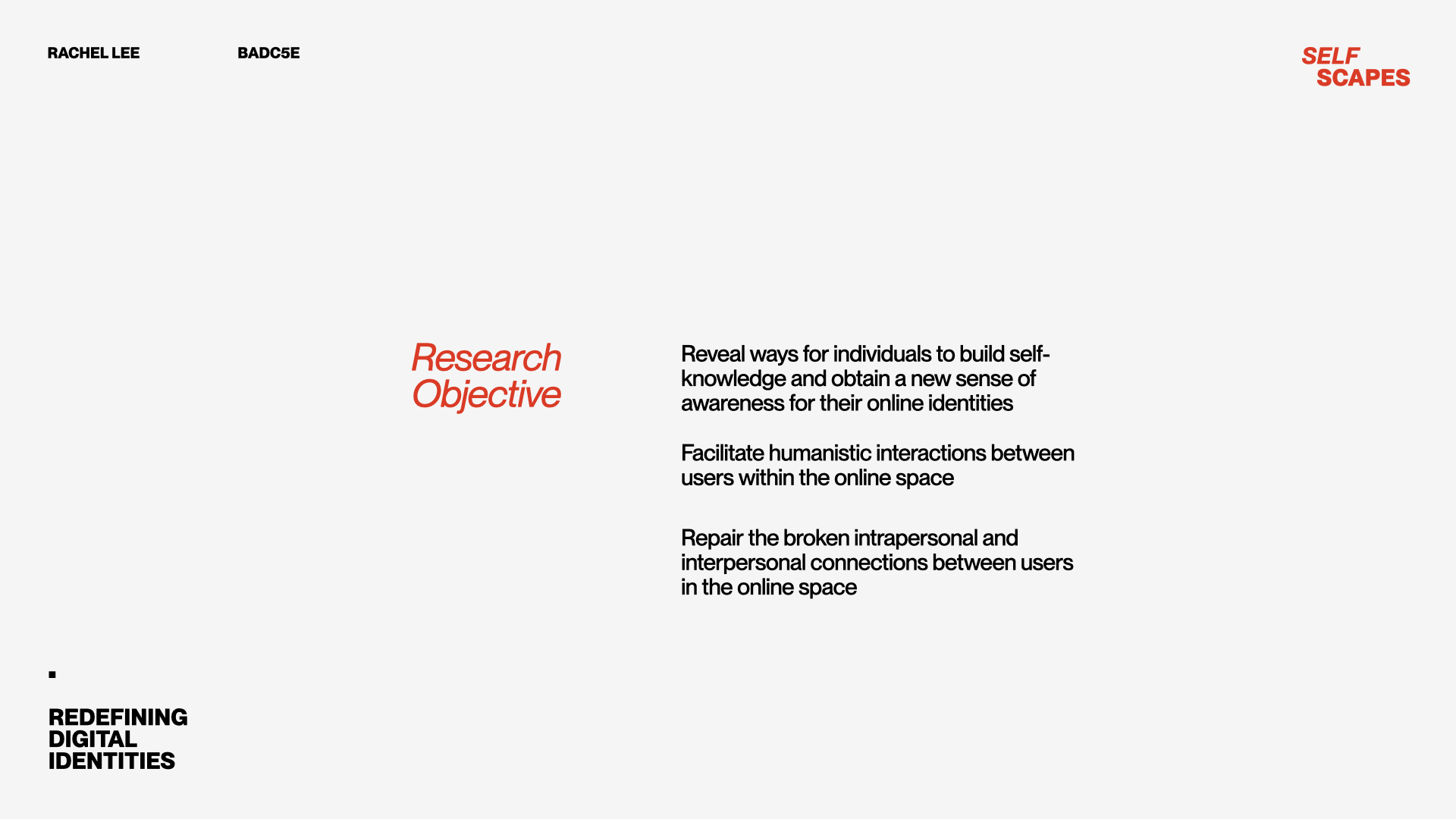
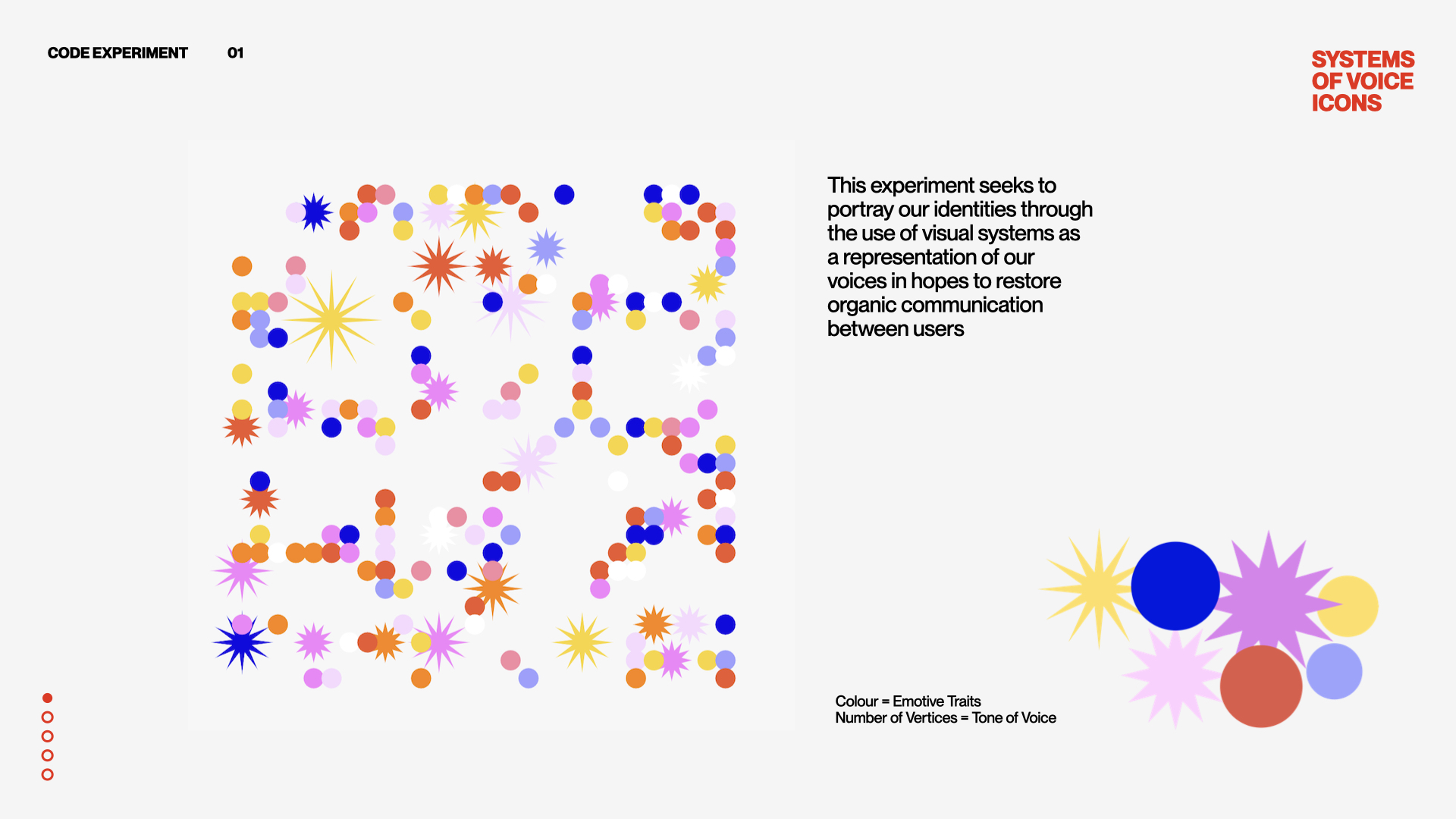
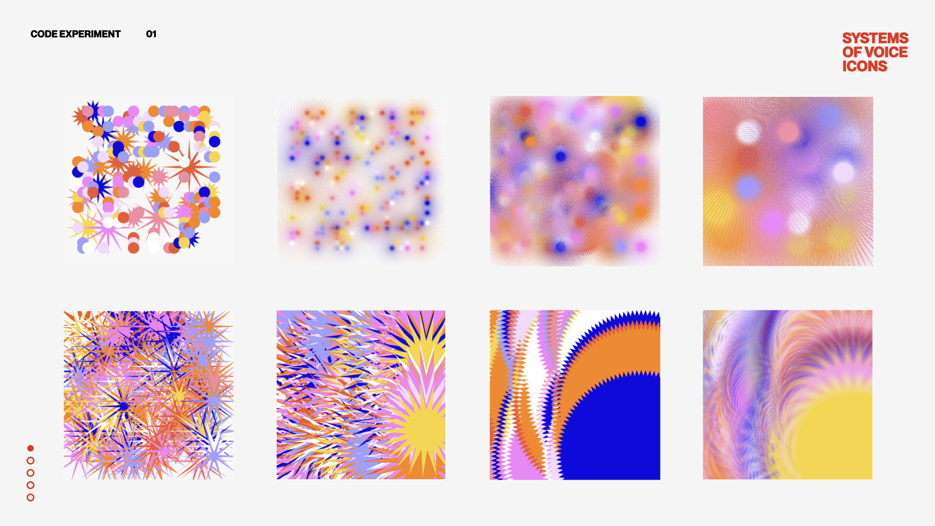
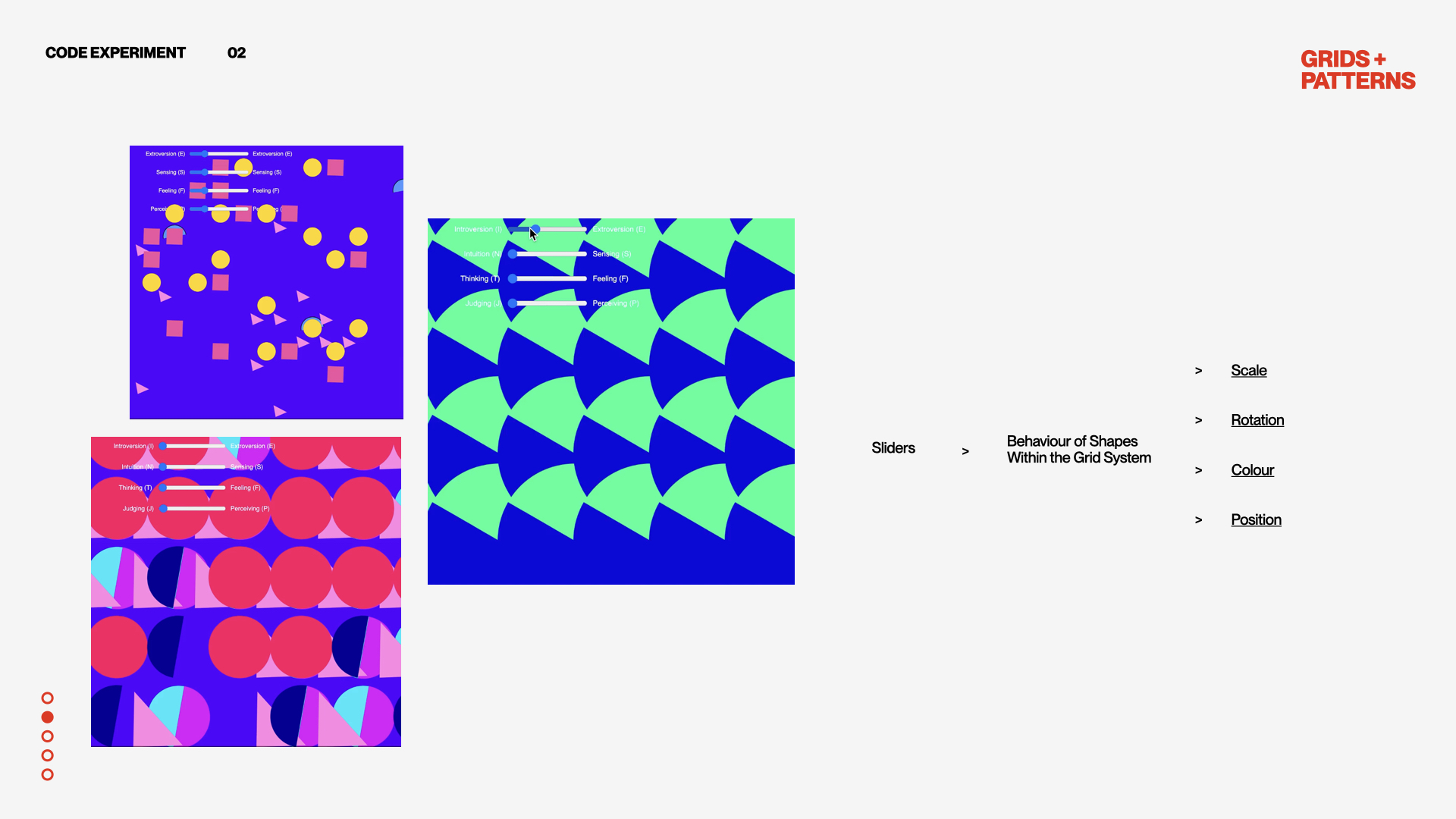
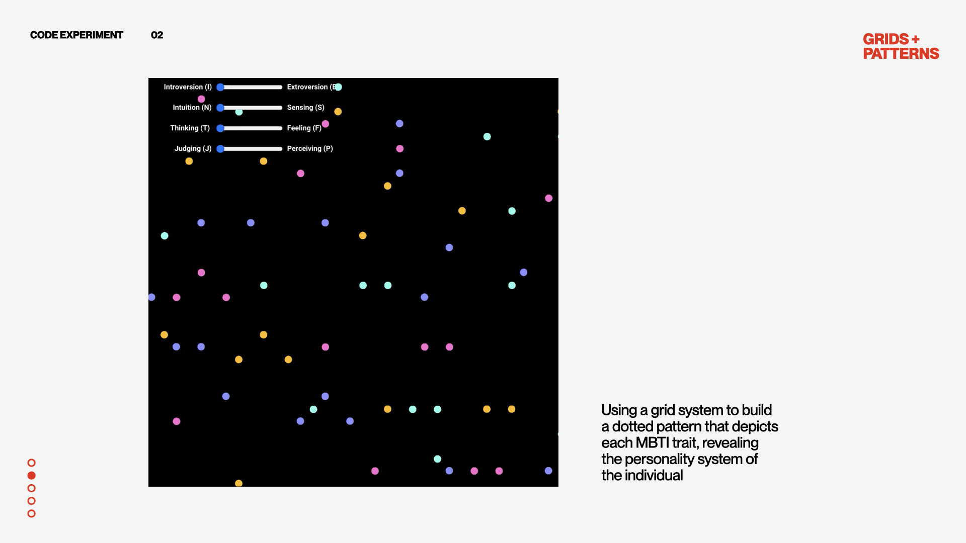
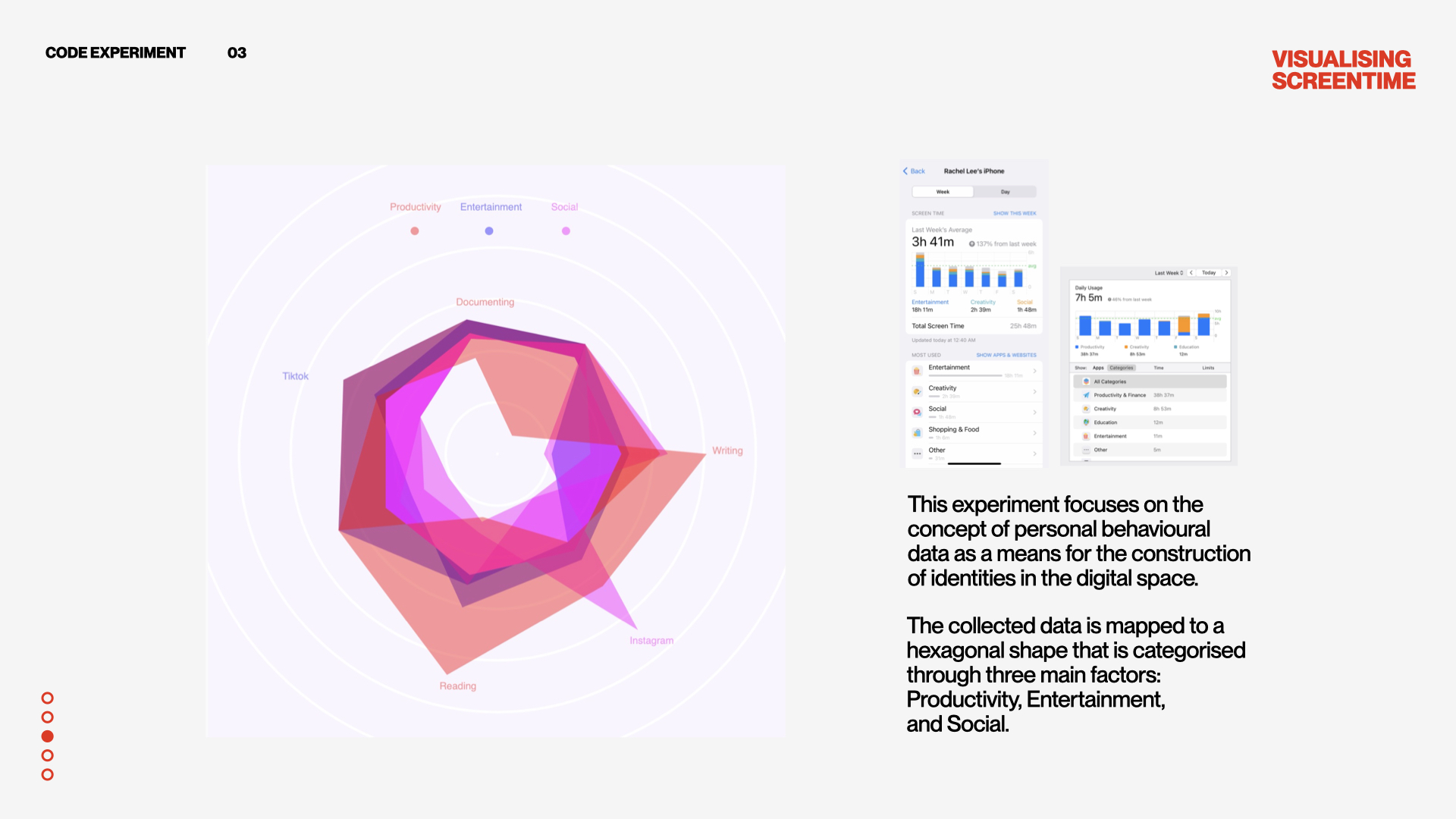
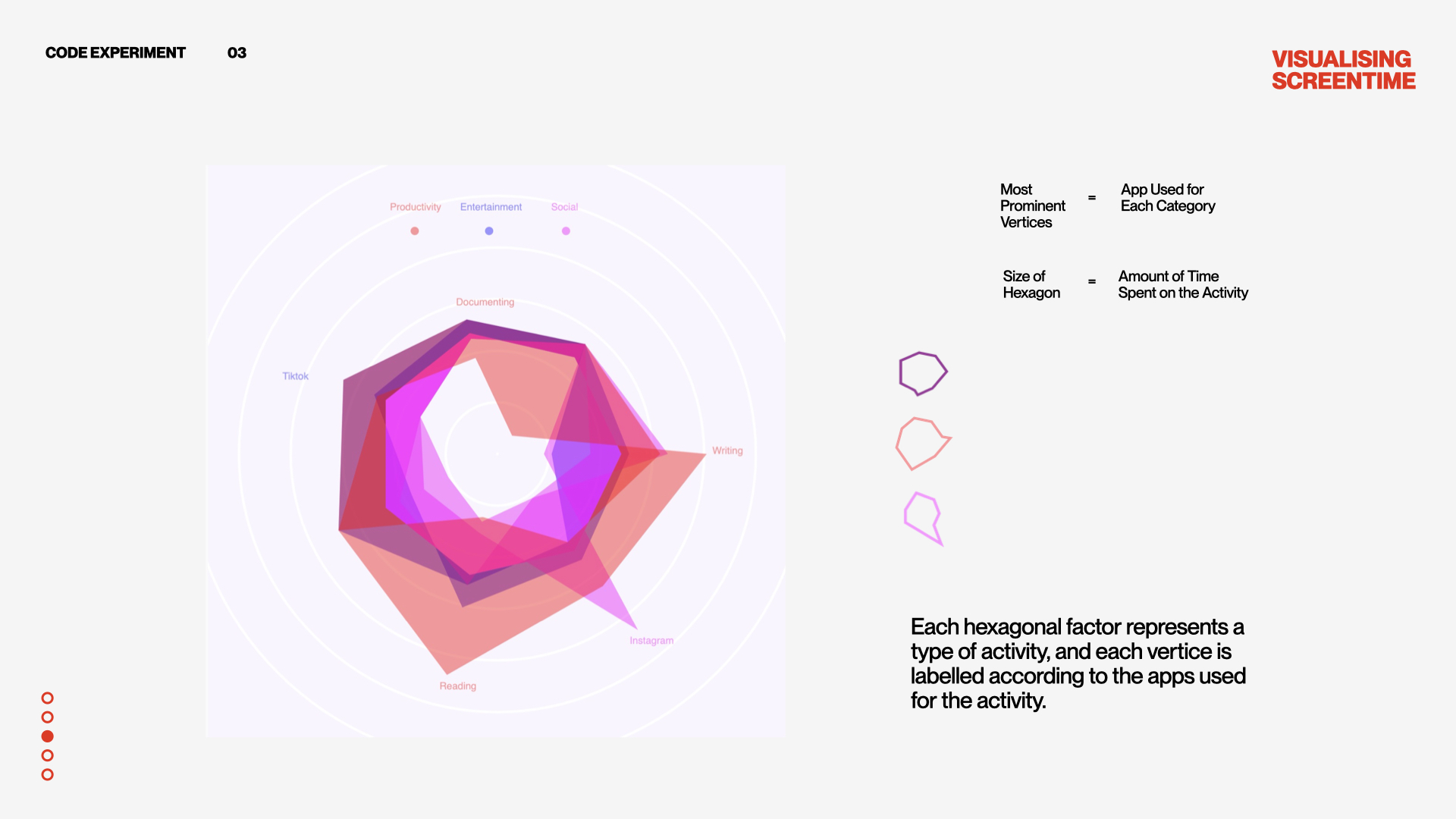
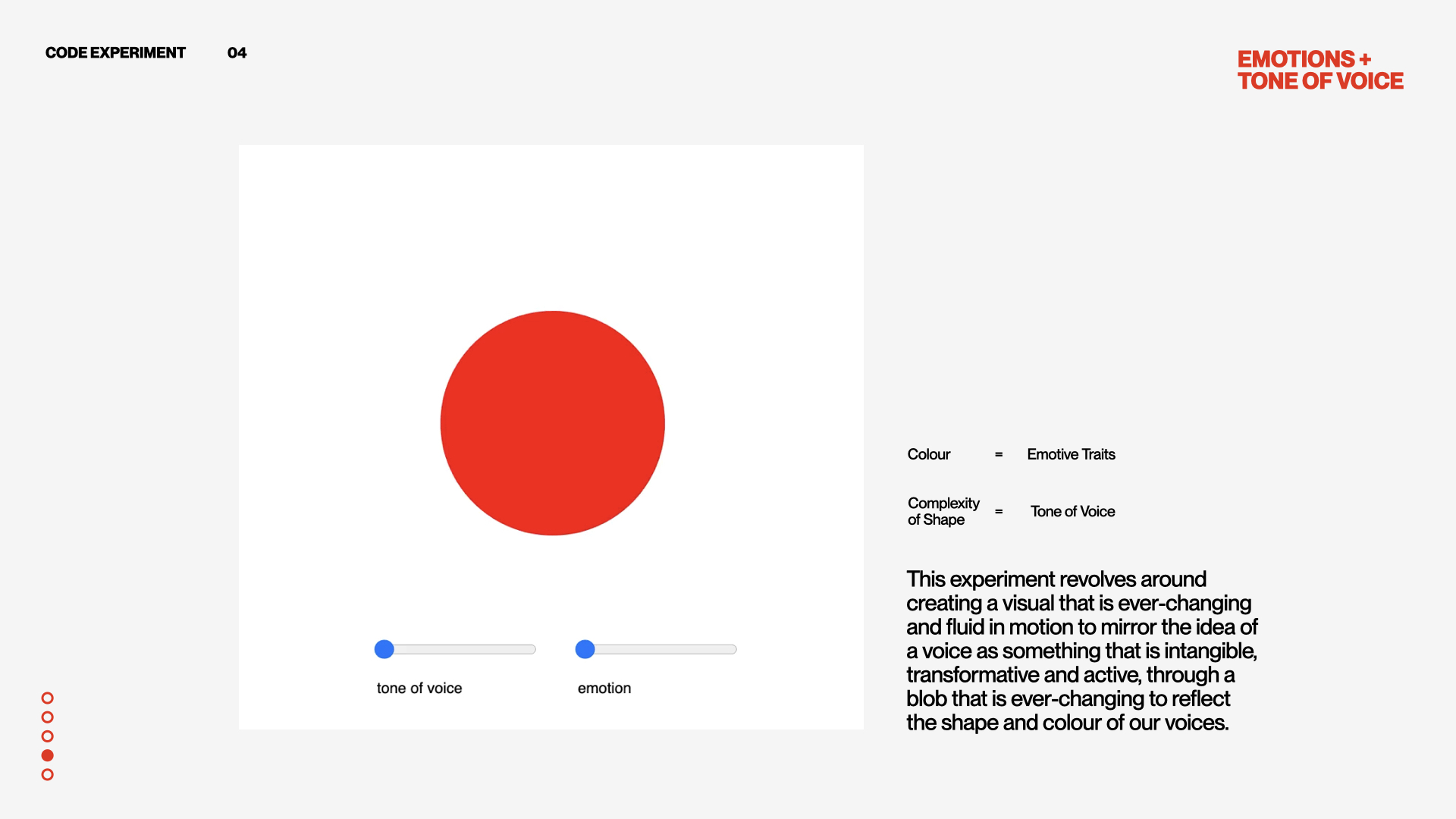
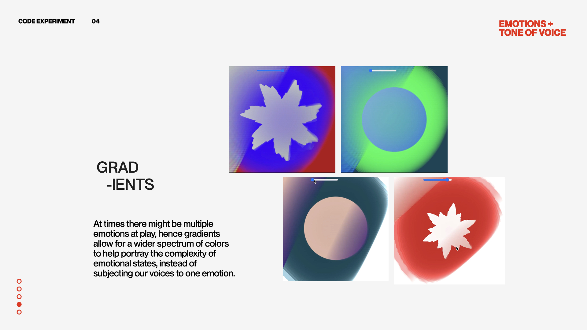
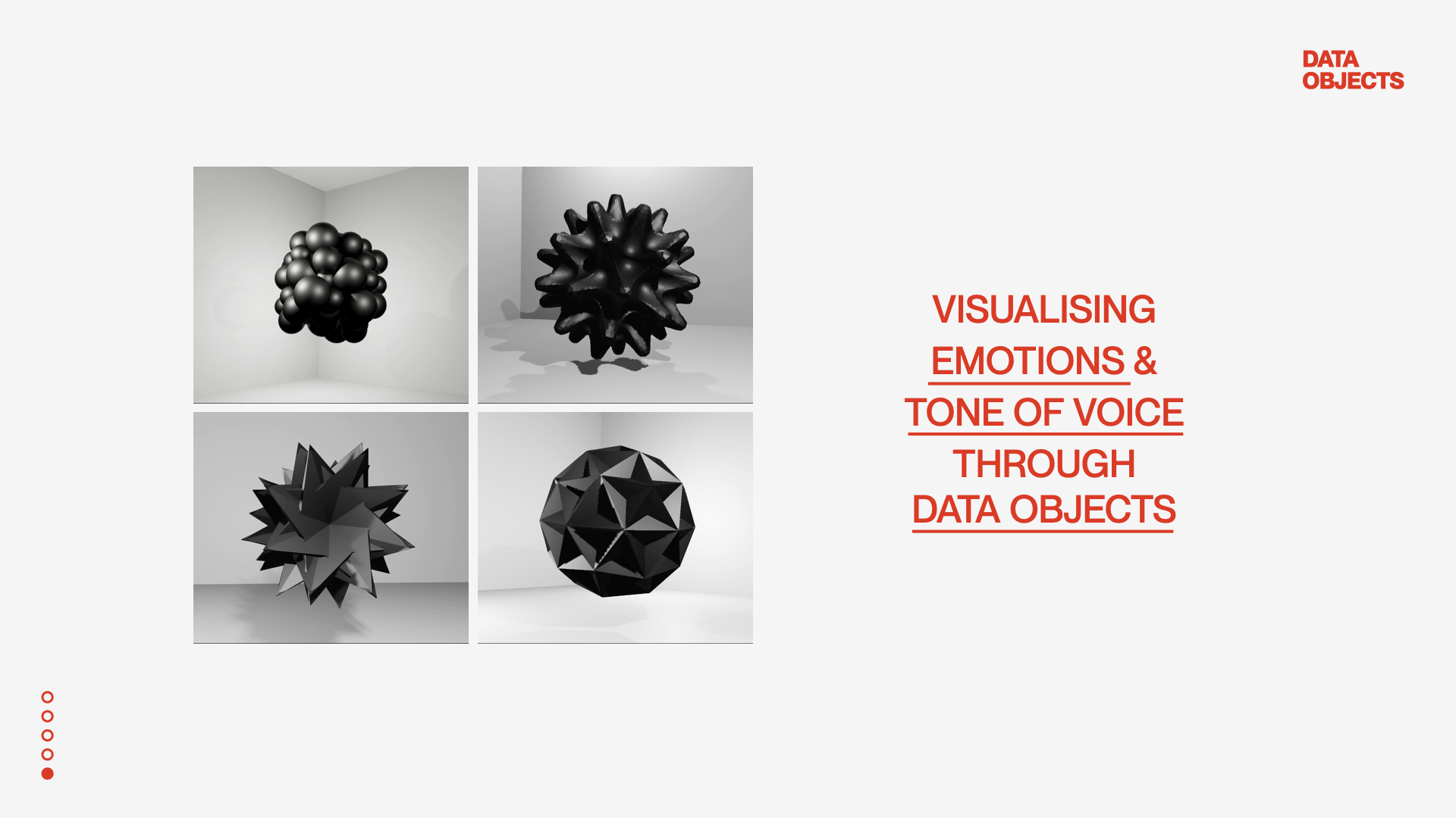
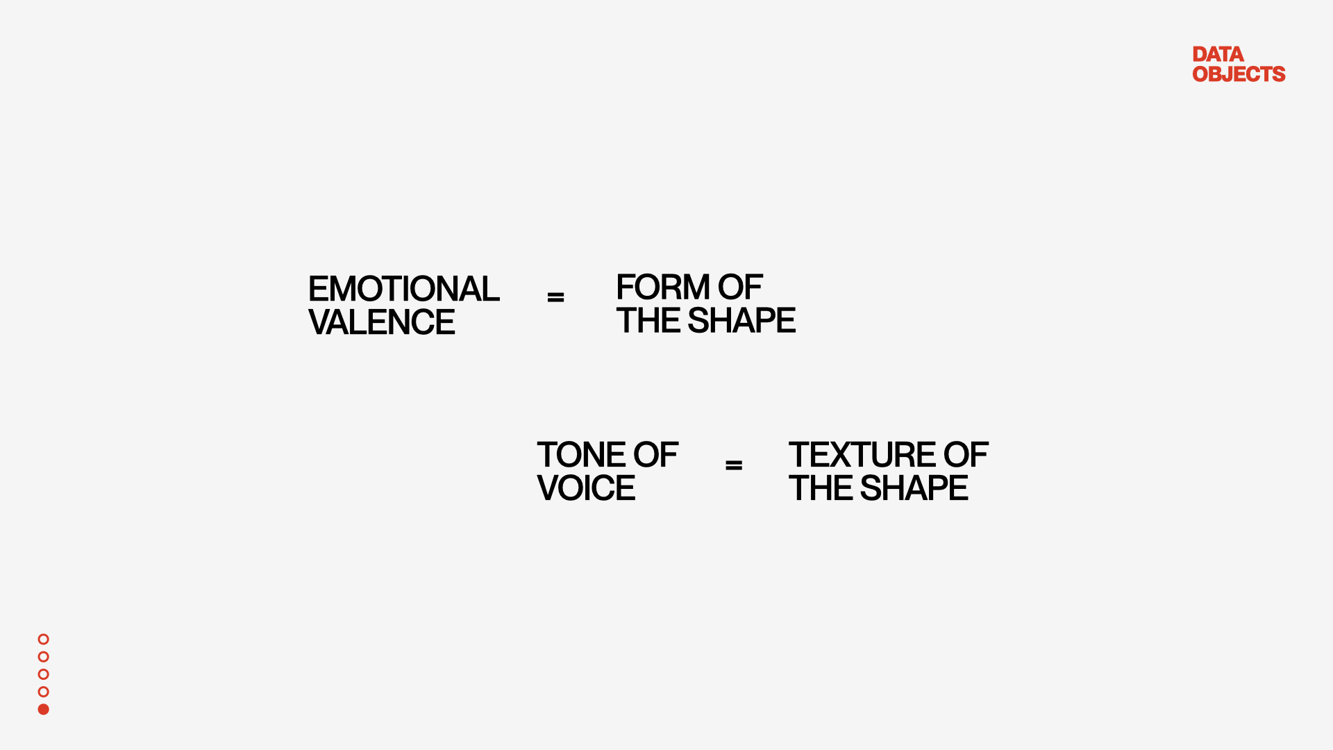
For the cohort sharing, I showed my progress from term 1's experiments to my current works in term 2. Before sharing the experiments, I also provided some background context into my research area by referencing some of my readings and concepts. Hopefully this would provide a better understanding of the motivations behind my experiments. Lastly, to sum it up I explained what I wanted to pursue moving forward with my current experiments and how I want to go about my further research.
CONSULTATION
Before the cohort sharing, we had a short consultation to check through our content for the slides. From the consultation, I got a better sense of what data collection entails and means. In term 1, I think I was unsure of my experiments because I didn’t know if what I was experimenting with was a way of data collection, but through this consultation, I gained clarification on what the type of data collection I was mainly looking for–which is through self-evaluation as most experiments need the user’s input to conduct the experiment.
Notes from
consultation:
What form of data collection is being used?
–Through interviews, Sliders, self-tracking, based on what I browse, self-evaluation, automated tracking, close door tracking
There's many ways of collecting data like filling out a survey, corporations tracking while your browse, cookies online
From the experiments
Are you interested in seeing a change in data changed the visual representation on the screen?
Visual Exploration can be another way of interpreting data
For the 3D experiments:
You can talk about learning that skill, application etc.
How would you map data onto tone of voice to make the visualisation less abstract?
Could you utilise a technology that can track emotional valence?
COHORT SHARING INSIGHTS
In the cohort sharing, I found two presentations particularly interesting and insightful
-
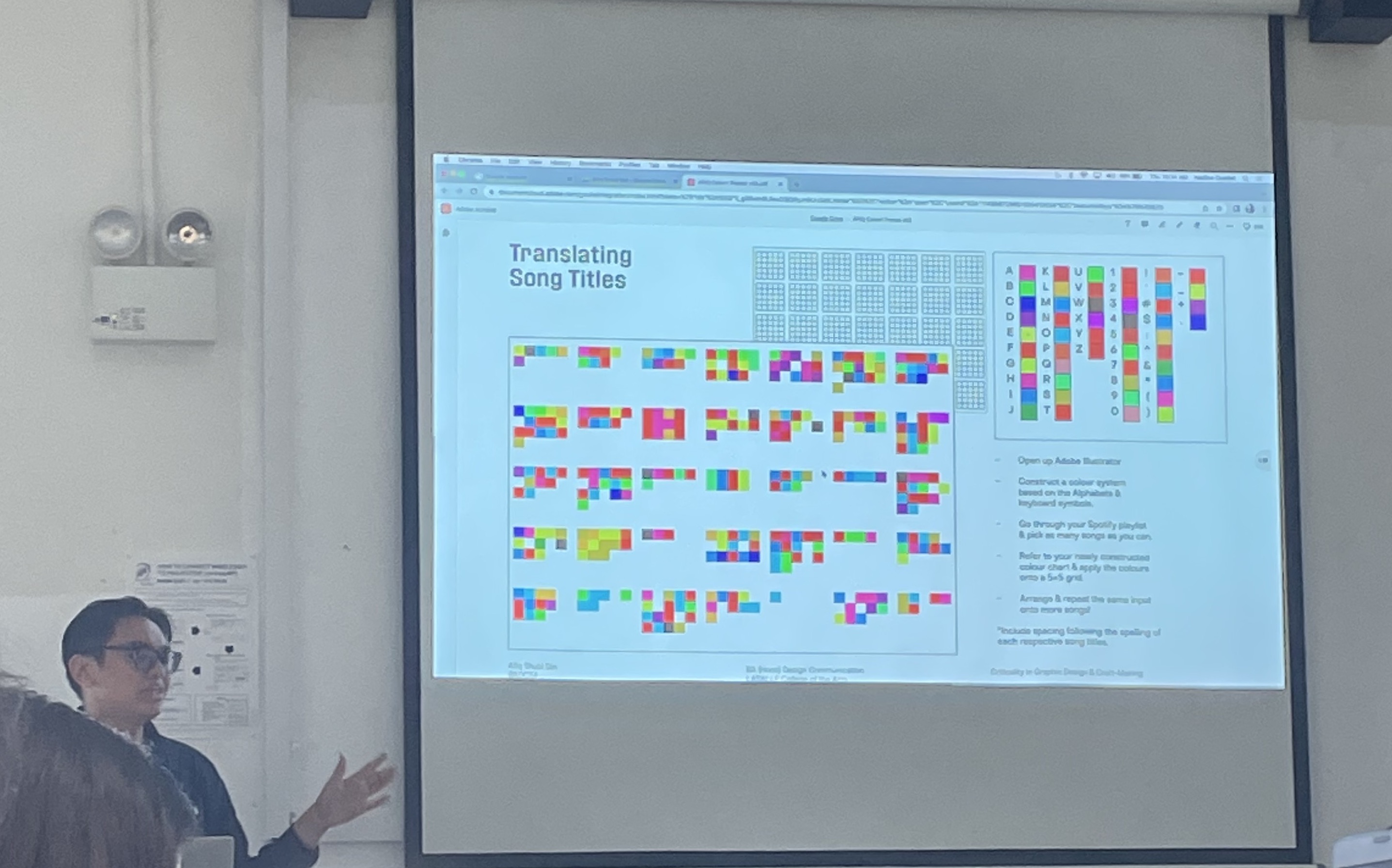
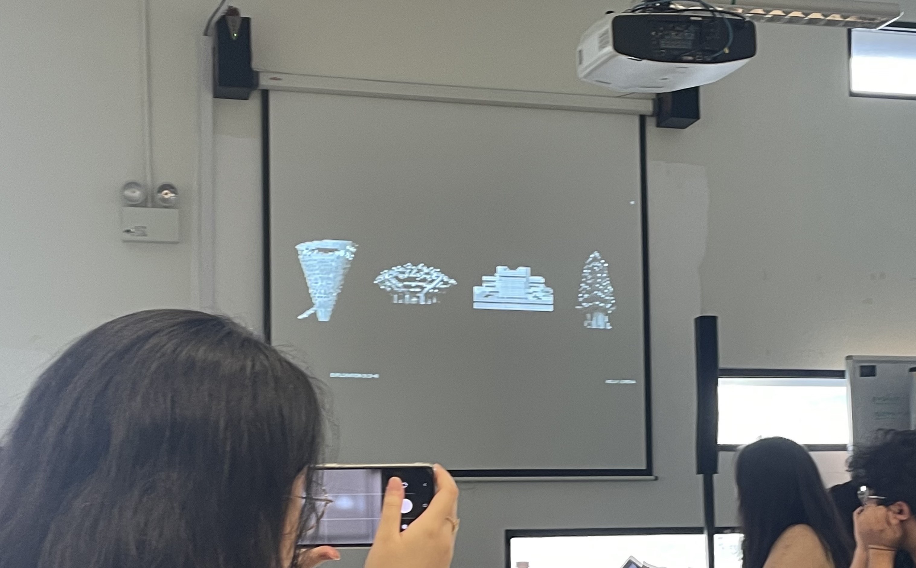
Firstly, the sharing by Afiq on the Colour Notations in Music inspired me as the way he showed the progress from tiled colour patterns into tiled systems that follow the musical notations in the score to the final outcome which is this seamless blend of coloured tiles to great a gradient that pose as the notation of the music notations. I thought that the mechanics of the coloured tile system was solid as the details were clearly communicated and the notation could be easily perceived especially by someone who has never seen this project before, I thought the system was very easy to understand and as a result, I was able to read the meanings behind the colour notations.

-
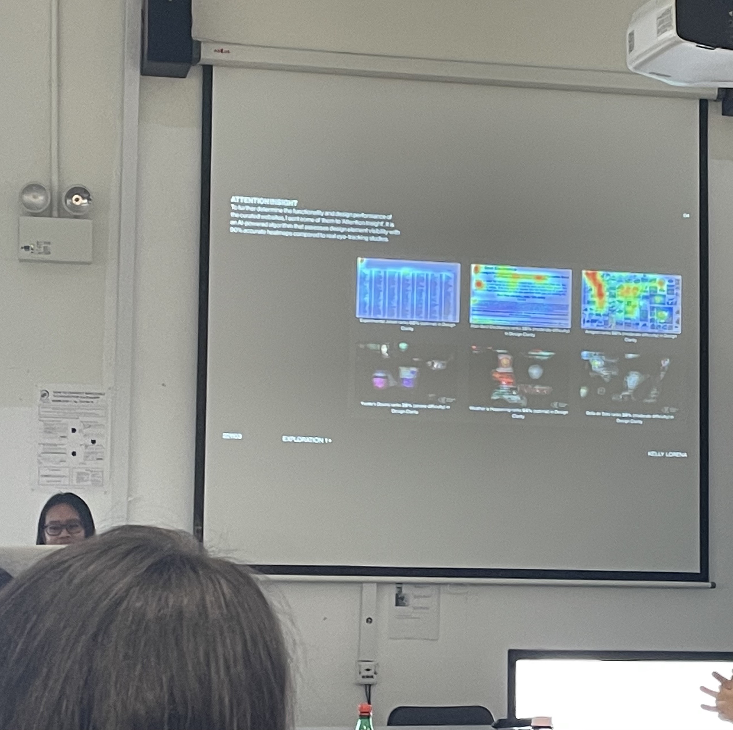
Second, the sharing by Kelly on brutalism, architecture and graphics was visually very intriguing to me. When she showed how she used scans of architectural images to build these unique shapes through the combination of architectures, it reminded me of a graphic system that uses the form of architecture as a determinant in the composition of the shape. Also, when she mapped a pixelation effect using p5.js onto the architectural image, it instantly transformed the look and feel of the images, the more pixelated the blurrier the image gets, also not sure if it was intentional or not but the pixels broke down the image into a grid system which I thought could be an interesting visual exploration to look into.
3D PRINTING COURSE
A few weeks ago I managed to book this 3D printing course which was a requirement by NLB in order to book their 3D printer services. The 4 hour course was held at the MakeIT space at the Woodlands library. It was quite a fun session as I was able to interact with people of all ages who shared the same interest in 3D prining technologies through this space.
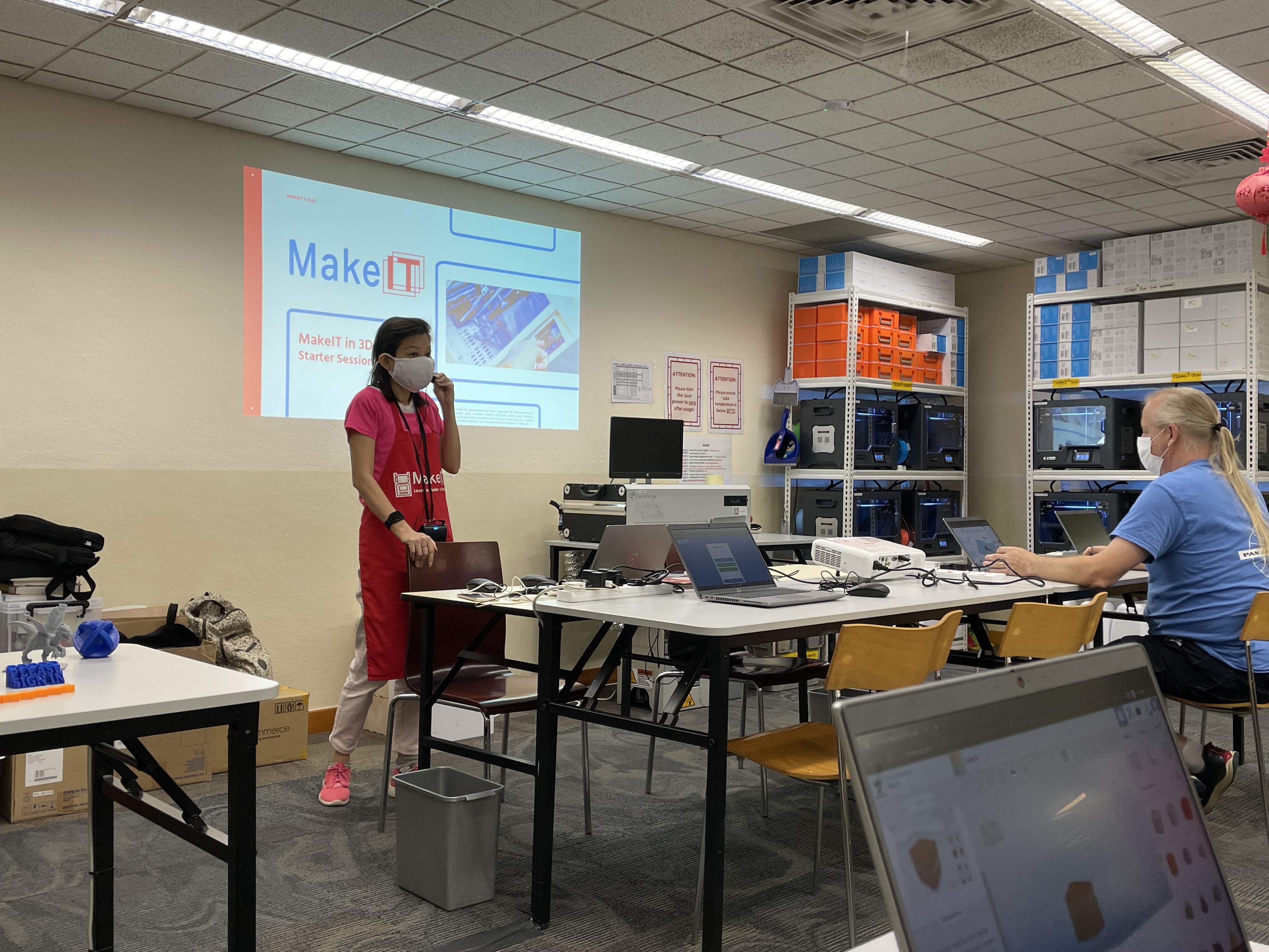
The class started off with some introductory slides on types of 3D printing techniques, how 3D printing has evolved throughout the times and the materials and tools we will be working with. The instructor also showed us some examples of things that could be printed through these machines–template pieces, gradient colours, intricate designs etc.
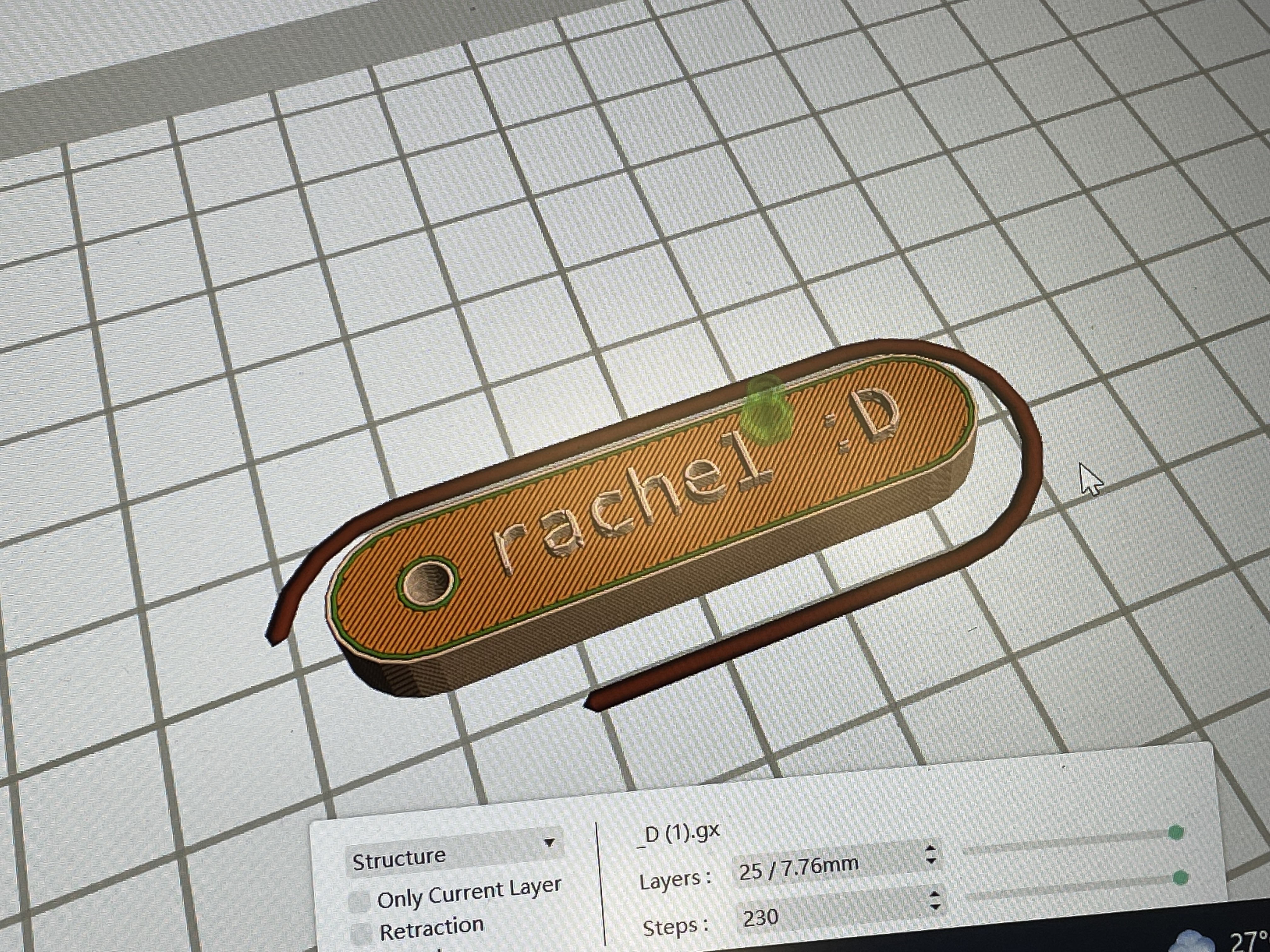
Then we proceeded to learn about the softwares for 3D design and preparing these files for printing. The 3D software used in this classs was called Tinkercad . Through the short tutorials and exercises we were able to quickly learn how to navigate through the application and use it to make our own nametags. From there, we were introduced to the software Flashprint to convert our STL. files into printable formats. By using the slice function and presents, the file is then ready to be used by the printer. I thought the slice preview function was very helpful as it provides an overview of how the structure that will be printed–how long it takes to print, what is the material/size/weight of the object, how many layers/steps is taken for the object to be printed. which makes the printing process transparent and easy for us to detect any errors before sending it for print.
Notes for file prep:
Navigating Flashprint
Check if object is highlighted with blue
Right click on object and select right extruder
Select the correct machine type(cretaor pro 2)
Click start slicing
Settings
Slice raft–fast
Enable raft–no
enable brim–no
Click slice
Slice preview–to check the printed object
Naming
R–right extruded
Time(M)
R13M
.gx file
Save the file twice one with right extruder one for left extruder
When to use raft–usually design that are thin or large surface area/big it wraps up when printed
Raft is the first layer printed out before your design is printed
When to use brim– use brim when it is a tall structure that needs a flat surface at the bottom like a support/base
After setting the correct configurations based on your design, the file is saved into an SD card that will be inserted into the 3D printer.
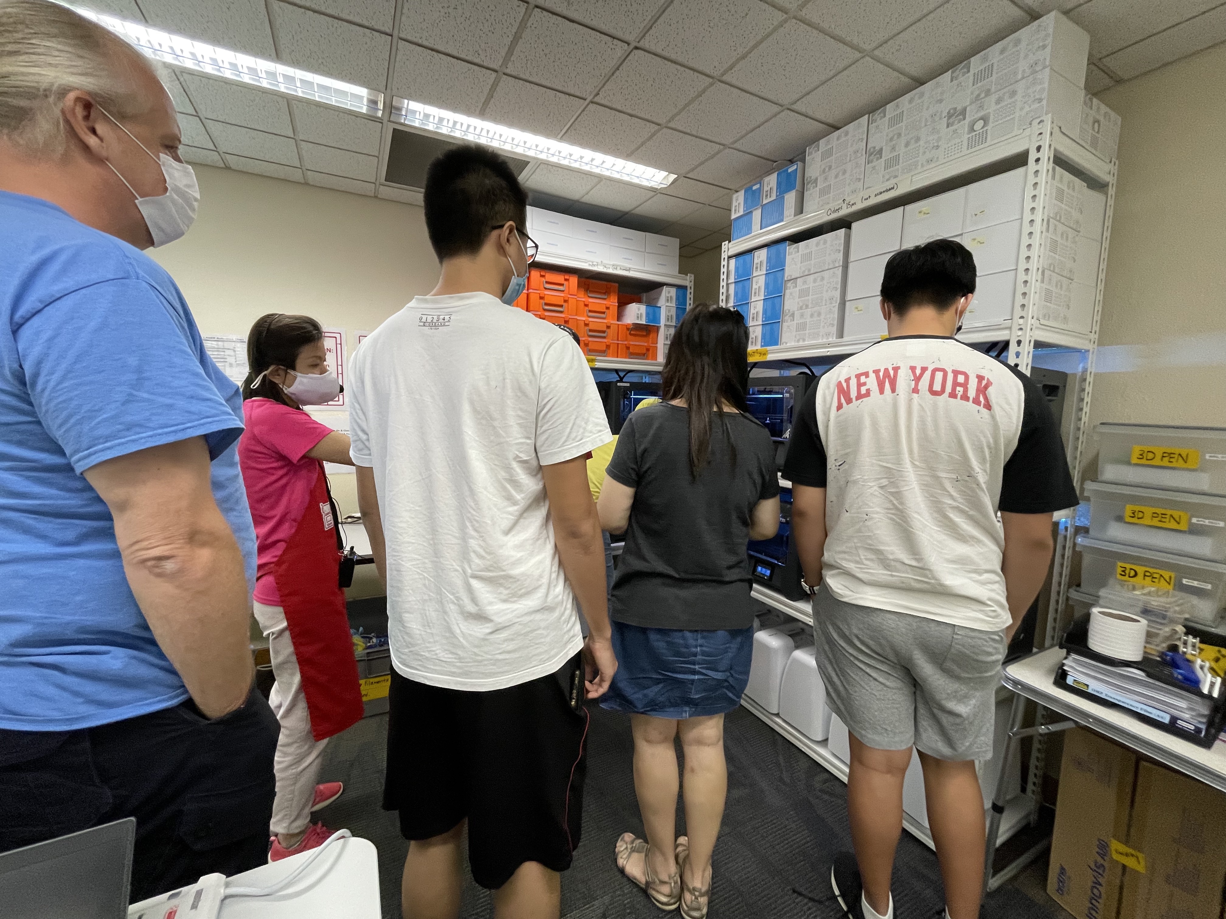
Some questions arised when we were trying to print. We weren't sure how to determine which extruder can be used on our files? After clarifying this issue with the instructor, we found out that the extruders will control the colour/material that is being used to print our files, hence when we are setting the slice preset we should take note of which extruder we would like to us beforehand in order to select the correct extruder settings before the file is converted to a .GX format.
The end result
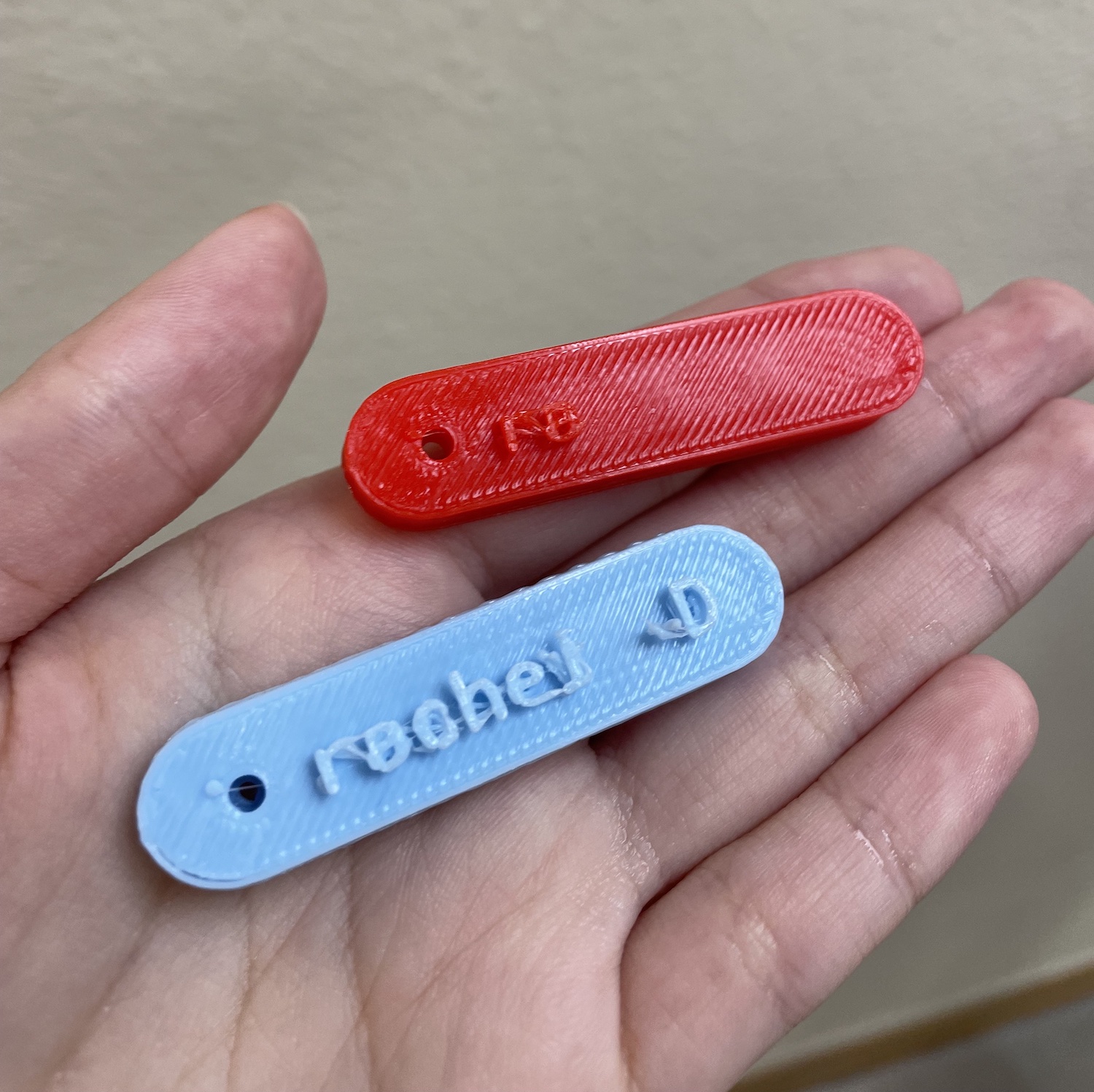
I printed my name tag twice as there was a problem with the printer I was using with the red name tag which caused the printing to stop halfway.
The second attempt (the blue name tag) was more successfull but not perfect as one of the eyes from the smiley face dropped off while printing. For future prints that include small details like this practice, I'll be taking note to add more supoort or scale up the prints in order for the printer to gain more surface to extrude.
Notes for printing:
Remember to check if theres a magnetic mat in the 3d printer before you print
Use the toolbox to clean the residue before and after
Clean it immediately before it cools down
Use the tweezer to take away the residue from the extruder
Use the scrapper to remove residue from the magnetic mat
Use the cutter to cut away the residue from the printed object
