1 / Analysing Papers–Urban Probes
2 / Random Connections Method
3 / Case Study: Mood Meter
4 / Study On Works By Macoto Murayama
4 / Workshop–Halftone Portraiture
ANALYSING PAPER–URBAN PROBES
Urban Probes:
Encountering Our Emerging
Urban Atmospheres
Paulos, Eric &
Jenkins, Tom.
2005
In week 10’s dissertation class on Tuesday, we were to complete a set of questions relating to the research essay we have selected to study. Ellie, Farhan and I picked the essay Urban Probes, which I personally thought was quite a challenging piece to read as it discusses themes that I was unfamiliar with such as urban atmosphere etc. However, I did find the research rather insightful as the writing style was very detailed which helped to cover the new terms found in the reading quite well.
We worked as a team to answer each question–our approach for this task was to leave the abstract till the last as we found that answering the rest of the questions first helped us gain a more accurate understanding of the research which would allow us to summarise the contents of the essay better.
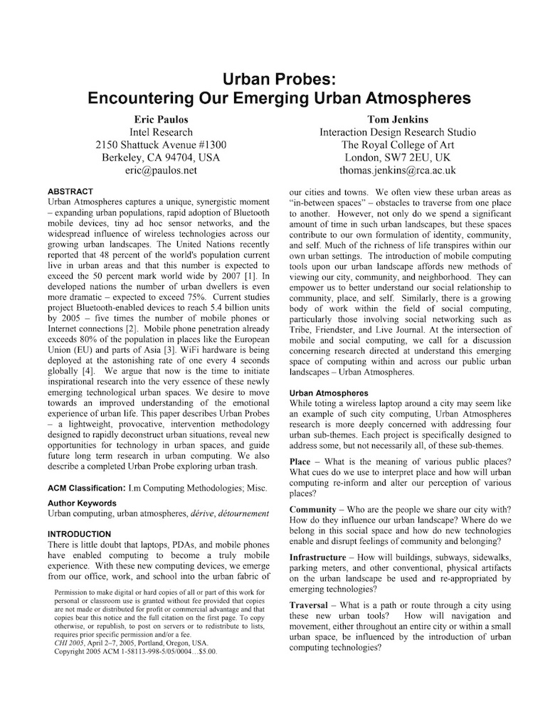 Link to
article→
Paulos, Eric & Jenkins, Tom. Urban Probes:
Encountering Our Emerging Urban Atmospheres. CHI. 2005.
DOI: 10.1145/1054972.1055020
-
1.
Briefly summarise the paper that you have read. What is it about?
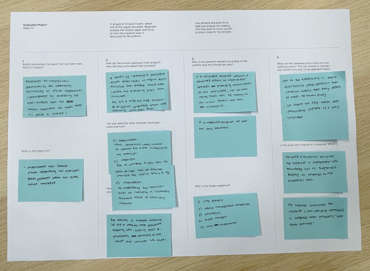
Research to reveal new opportunities for emergings technologies in urban experiences/atmosphere by studying the trash pattern, flow and further reflection on urban trash, its valve & usage!
What is the objective?
Understand how future urban computing will transform social patterns within our public urban landscape2.
How did the authors approach their project? How did they write about their process?
A series of lightweight provocative urban proto tasks. to inspire direct+ discussion from people about the current and emerging public urban landscape.
He did a step-by-step execution of an actual completed Urban Probe exploring urban public trash.
Can you describe what methods have been used and how?
1) Observation Using a concealed video camera to capture the scene surrounding the trashcan
2) Interview: Ask to comment if each item was trash or not and to describe who left the object behind & why.
3) Intervention: To understand the individual level of curiously in accidentally discarded traces of fellow city inhabitants
How well is the process described? Why do you think that is?
The process is in-depth because he wrote in a well-structured and systematic procedure, beginning with finding goals, analysis of the result and concluding with insights -
3.
Why is the research relevant according to the authors and why should we care?
It is relevant because, without a concerted effort to understand between emerging technologies on our landscape, we will risk losing touch with the reality of our urban streets and inhabitants.
It is relevant because we are the city dwellers.
Who is the target audience?
1) city planers
2) waste management companies
3) architects
4) trash workers
5) city inhabitants4.
What are the takeaway points that you find useful to share?
This can related to context and content and also to the approach taken.
One of the takeaways is, qualitative data gathered from individual actions that they define as trash to throw away.
We start to see trash as a provocative element of a city landscape.
Is the work very original or innovative? Why?
The work is original because the trashcan is integrated with technology such as augmented reality as compared to the traditional ones.
The method conducted for research ( lost post and techniques is adapted from Milavart's lost letter technique, hence it is an adaptation instead of an original technique.
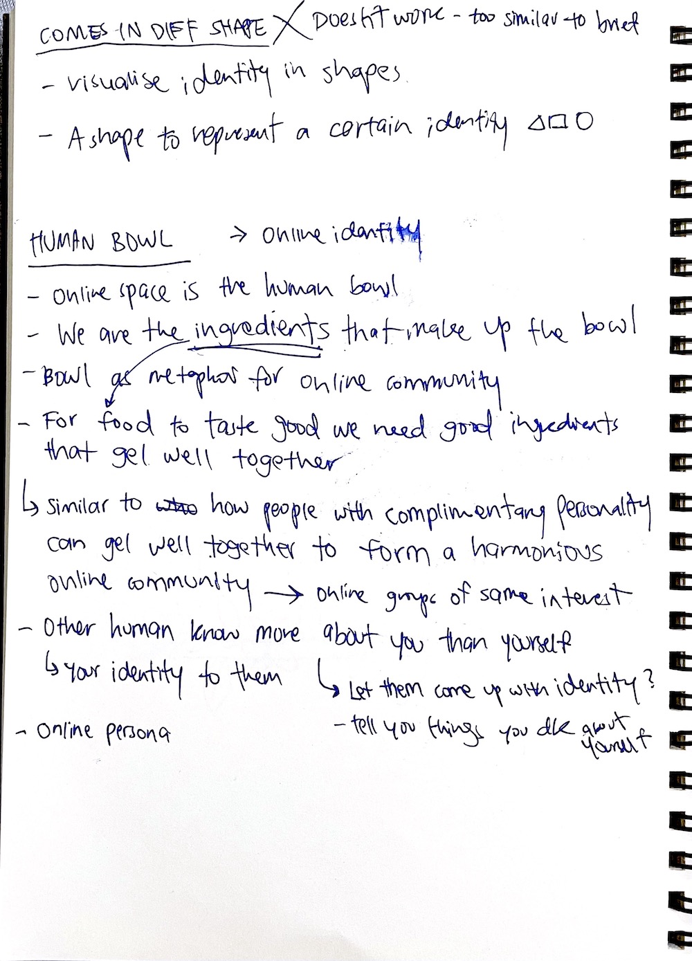
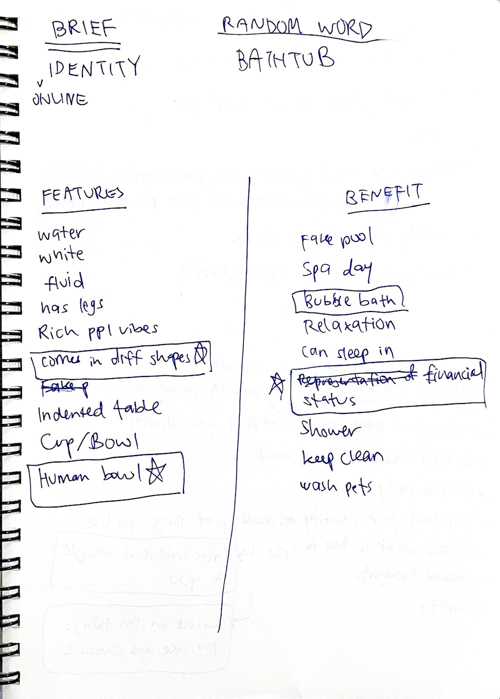
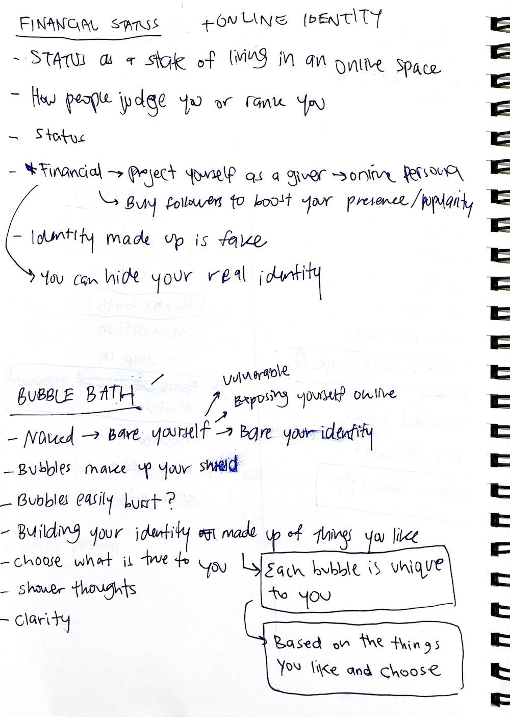
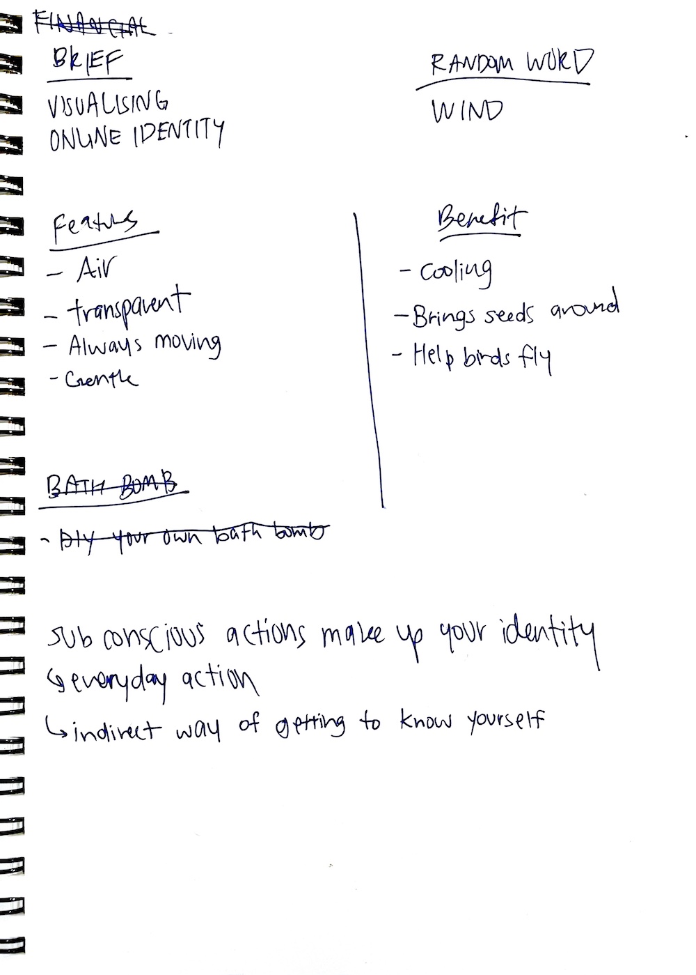
RANDOM CONNECTIONS METHOD
Random connections method, is an exercise to conceptualise and generate ideas from random themes and keywords. This method was introduced to me by my cousin who attended an advertising workshop on the analysis of briefs and brainstorming of ideas.
An idea that was derived from the keyword “human bowl” sparked the most discussion amongst us, as I thought that this term was quite interesting as it could function as a metaphor representing the online community. In this context, us as users become the ingredients within that bowl. Further building onto that idea, we thought of how ingredients needed to complement each other to make the perfect dish, in this way similar personalities gel well together, strengthening the bond within the community and creating a good synergy between different identities
This exercise brought about alot of unexpected outcomes, which helped to broaden my perspective about identities and online communities. Through the random keywords, I was able to stray away from the terms that I was constantly working around in my research and explore new themes that helped to generate fresh ideas. I think this exercise expanded the range in my design thinking about what identities could be and also allowed me to rethink and solidify the concept of identity constructed based on communities, which I was researching about in my dissertation. It also opened up more possibilities of how I can incorporate theories from my writing into the execution of concepts and artefacts.
CASE STUDY–MOOD METER

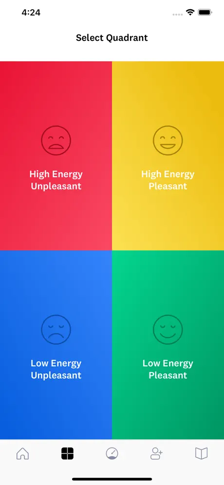
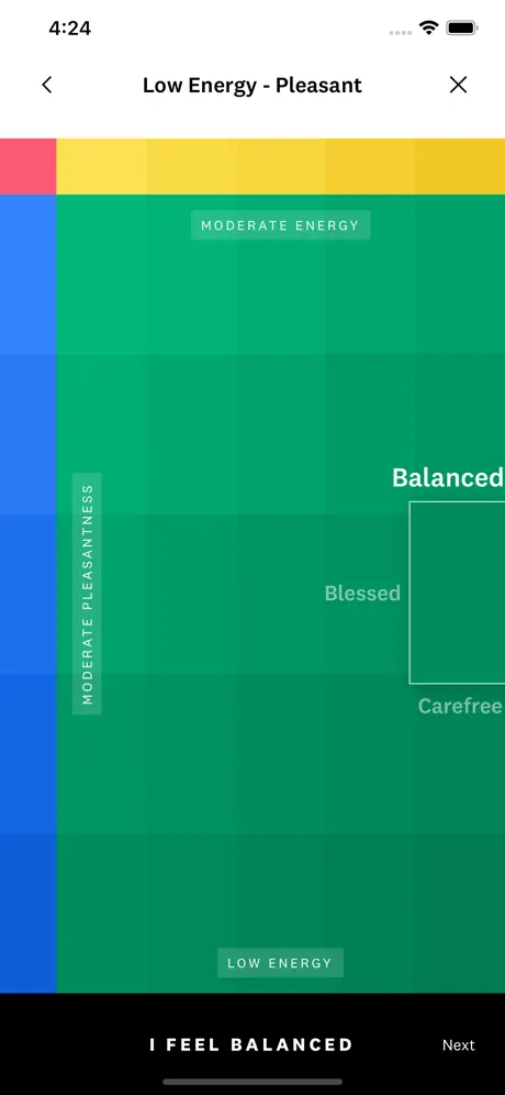
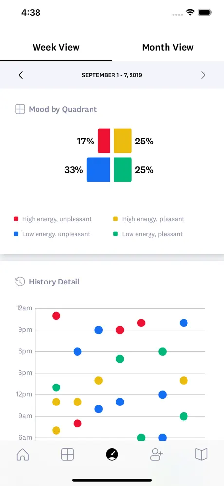
Over the week I discovered this app called Mood Meter, which is an app developed by Maarc Brackett–author of 'Permission to Feel' where he first introduced the technique of mood meter and the concept of emotional intelligience, that helps to keep track of one’s emotions and regulate shifts in emotions. This app allows users to gain awareness of the self through the discovery of emotional nuances and equips the user with the ability to transition into different emotions.

Personally, I found that the use of an application interface to simulate the mood meter technique was a smart way to devise this technique as a digital tool.
Originally, back in Year 2 when we were gathering research for our compendium, I came across this case study Focus Ex by Vatány Szabolcs, which was a digital reading tool that utilises generative typography for ADHD sufferers. It was from this case study, that I got a sense of what I wanted my concept of visual systems to function as–an interactive tool that could help users learn about themselves or it can also be a tool for self-expression and a tool to facilitate online communication.
One possible output for this digital tool which I thought of at that time was through an application, similar to the functionality of this Mood Meter case study. This was because an application is something that is readily accessible to all users through any technological device, as such they will be able to utilise the digital tool anytime and anywhere which made it convenient for the users to consistently update and discover new identities of themselves.Images: Screenshots from Mood Meter application
GUEST LECTURE-DARIUS OU
Attended the guest lecture talk by Darius Ou that was held by Gideon. The talk focuses on typographic practices and goes through examples of such practices through examples of typographic-centric independent works done by Darius. During the sharing session, Darius went through three different approaches to typographic-centric works–through motion & shapes, gaps & lines and spaces & intersections.
-
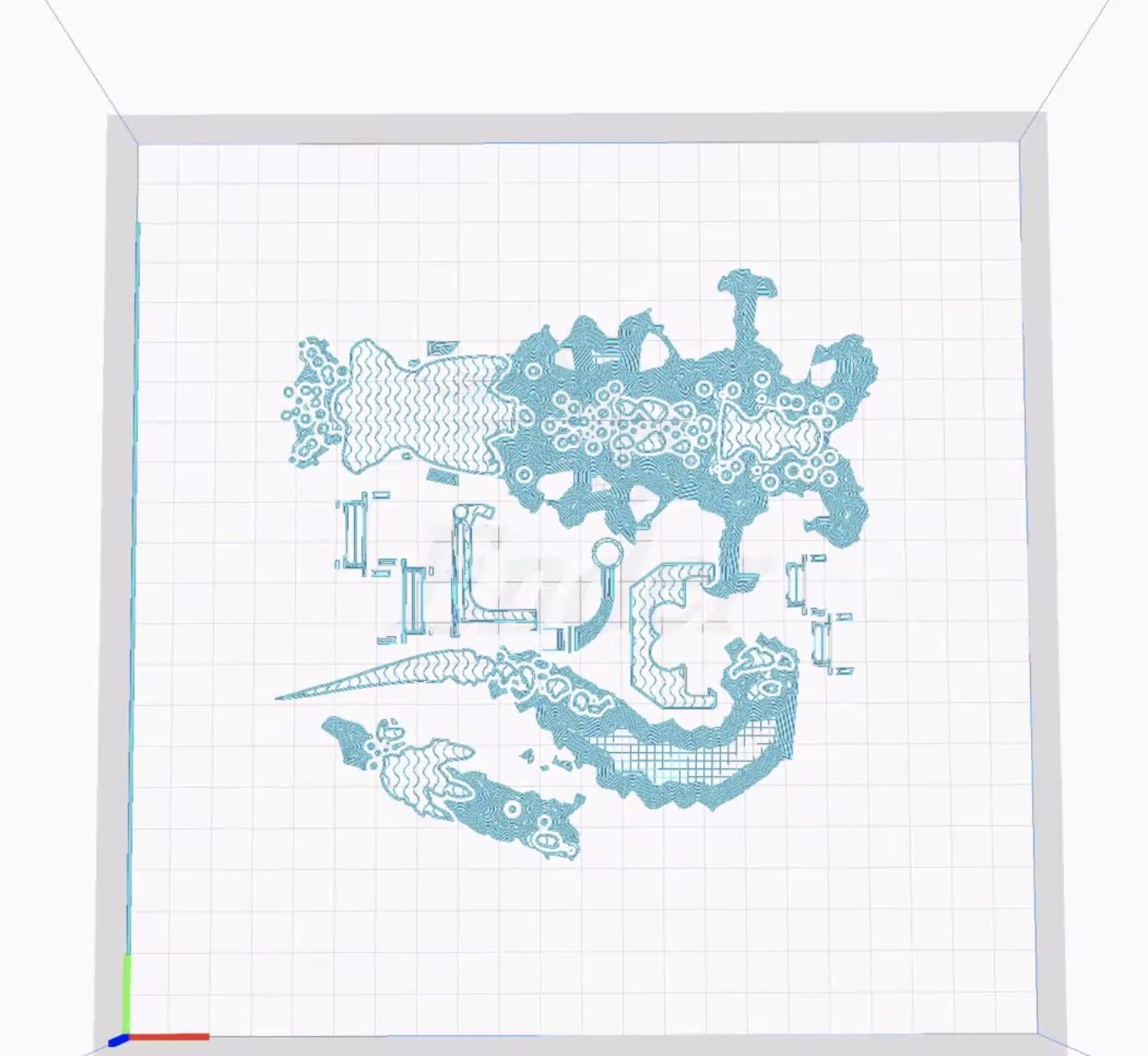
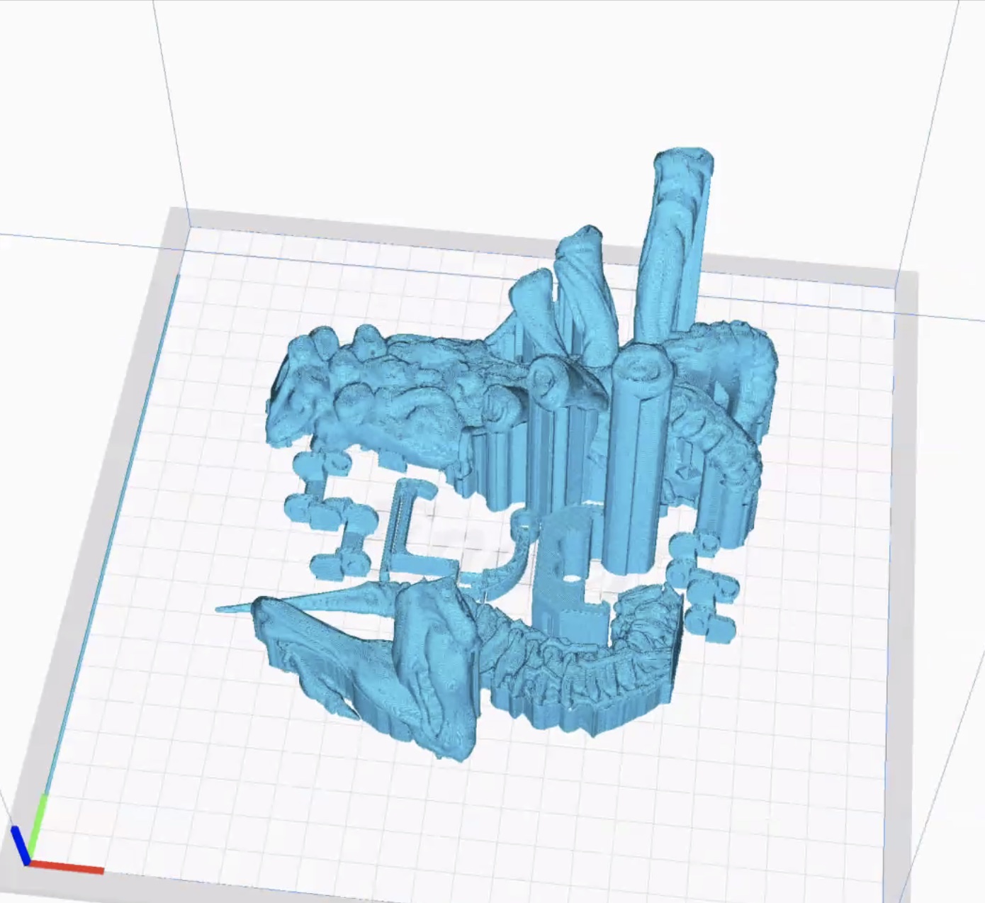
Images: Screenshots of SLIC3D project from the presentation during the lecture
One of the works that he shared during the lecture which intrigued me was ‘SLIC3D’, a fully 3D-printed book that explores and documents the 3D-printing process beyond its immediate use case for rapid-prototyping/object manufacturing — as a tool for graphic-making and re-examining the material properties.
He mentioned that during the design process for this project, he discovered that the lines and bleeds made by the 3D printer created this new type of aesthetic, in a way these accidental mistakes gave value to these abstract design. Thus, his statement of “harnessing the 3d printing process as an aesthetic” inspired me to view even the design process, all the failures and attempts as a way of design, and look at the failed experiments in a different lens to bring forth new insights.
STUDY ON WORKS BY MACOTO MURAYAMA
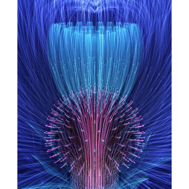
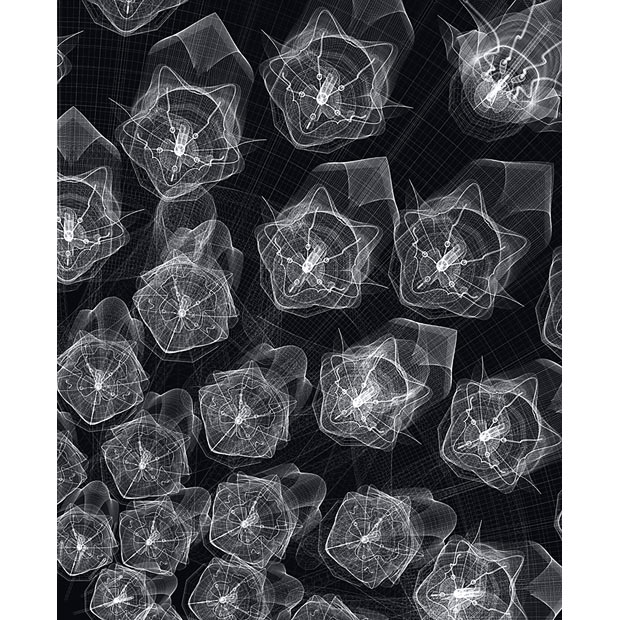
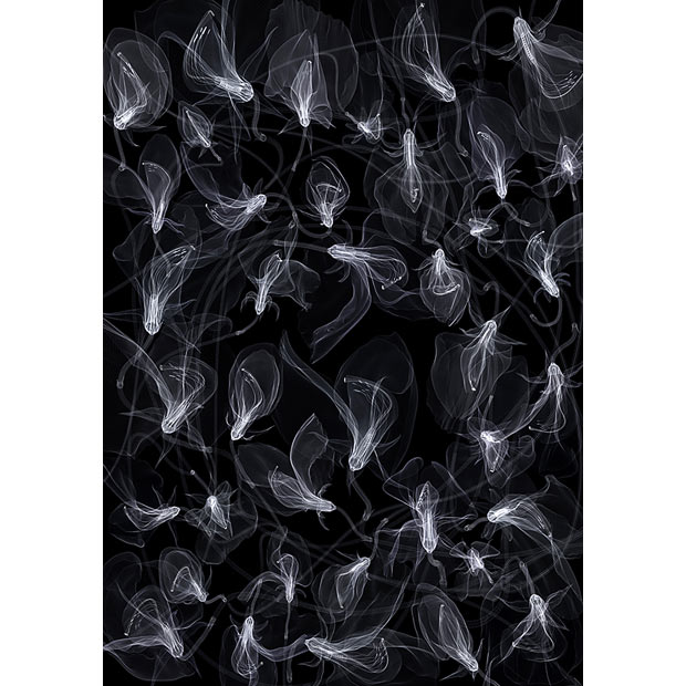
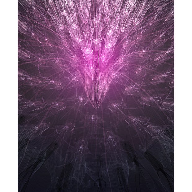
In Tuesday's class, as we were catching up with each other’s progress over the project week, Matin & Aditi brought up the idea of the 3D flowers which they had previously suggested, which I have yet to try out for myself. After experimenting with Blender, I think 3D flowers could be a possible next step in the 3D practice. Additionally, Aditi sent an article about Macoto Murayama’s digitally generated flower artworks, which I found visually interesting and could potentially be a thought starter for a data visualisation project.
Images: Macoto Murayama.2009.
↘Link to workEspecially liked these four types of generative illustrations as I could see how the different elements of the flowers intersect to form new dimensions/layers of the flowers which I thought could reflect how the different layers of our identities overlap and interact to form the complexity within our identities.
Looking at the iterations of the digital flowers also shows some kind of relationship when all the flowers are gathered, this thought reminded me of a reading that I had cited in my research paper called “PeopleGarden: Creating Data Portraits for Users” by Rebecca Xiong, & Judith Donath, that uses petals as a representation of the user’s digital footprint, and the size of the flower to symbolise the digital presence of the user. These two works are similar in terms of the use of flowers as their main subject for representation, as stated by the authors of the cited paper, the use of flowers was a convenient way of representation as flower petals could be perceived and processed as numbers, allowing the data visualisation to be easily comprehended. This made me think about, what other ways can I do to make a data visualisation easily perceivable, what shapes there are or what subject matter can be used to do so?
WORKSHOP–HALFTONE PORTRAITURE
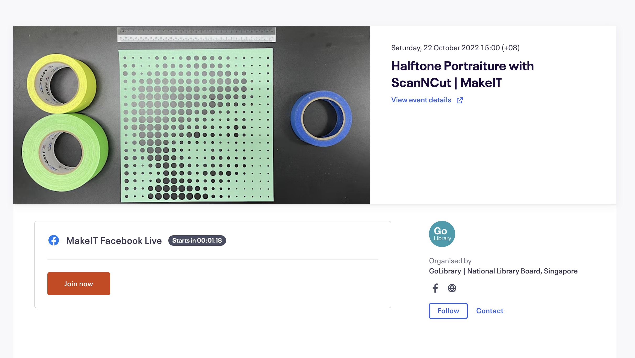
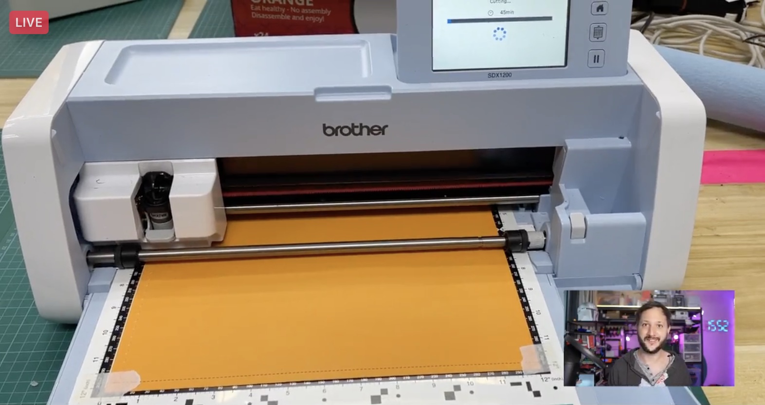
A couple of weeks ago, I signed up for the Halftone Portraiture with ScanNCut workshop by MakeIT. During the online session, the instructor showed how to apply the technique of halftoning, or representing an image as a grid of dots, lines, or other regularly oriented objects, to print “images” using the ScanNCut digital cutter.
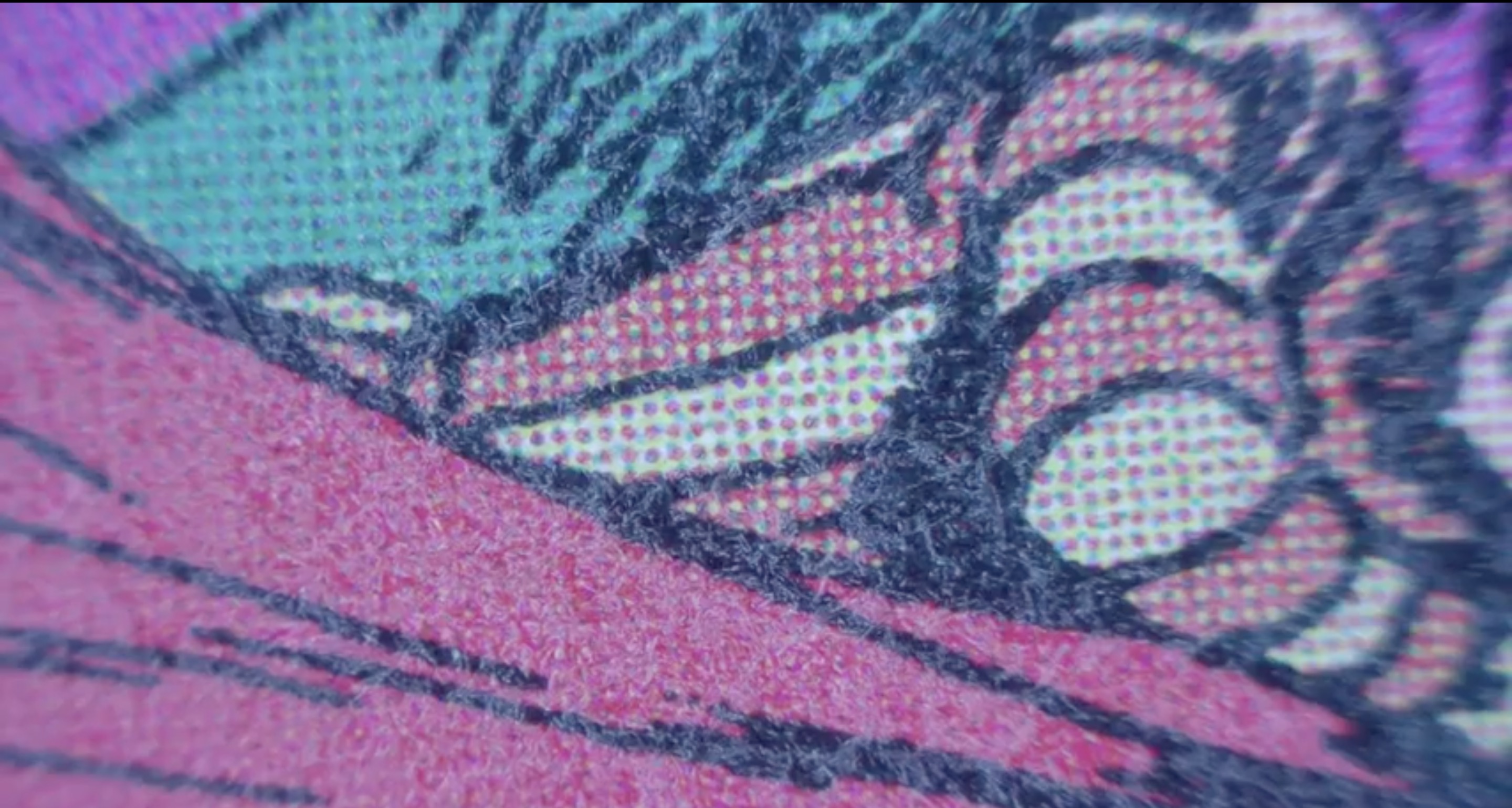
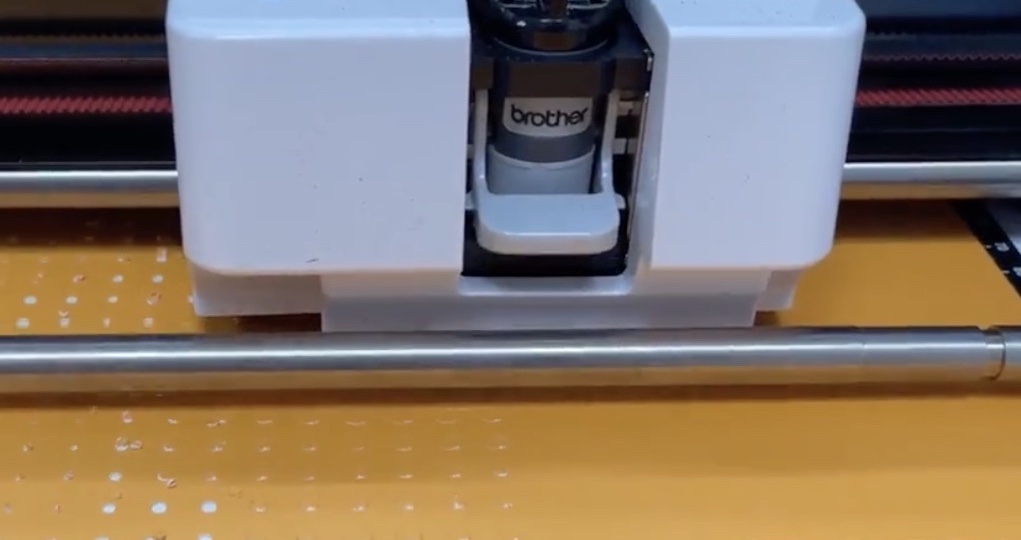
Images: Screenshots from MakeIT Halftone Portraiture with ScanNCut workshop
I found out that actually, every printed material uses an array of dots to visualise an image, illustration etc. This can be easily seen in the example of comics when put under a microscope, where the colours and shadings of the illustrations are made up of different coloured circles.
-
Bonus tips I've gathered
from this workshop:Also, I discovered this new term called ’Facial Pareidolia which is the concept behind the optical illusion of halftoning–whereby the more dots allows for the image to be seen clearer, conversely, the lesser dots makes the image less seen. This also ties in with the relationship between the size of dots and the space between dots, as tighter spaces allow the image to be seen more easily.
When working with the image for halftoning, slightly adjusting the brightness of the images to make the black areas more contrasted can help to speed up the halftoning process as the darker pixels are mapped to larger and tighter dots will be used to fill those spaces.
A tip for pasting the two layers of papers together–Use a stick on double sided type or different adhesive instead of white glue as it cause the papers to bend and crease after it dries.
Through this workshop, I was introduced to a variety of digital cutting techniques, methods and applications used to facilitate the process of halftoning. Using Inkscape, I was able to experiment with the ‘clone’ function to generate dots/lines/shapes into a grid system to represent the imagery. I also learned how to use CanvasWorkspace to transfer the halftoned image into a grid of dots to cut for the ScanNCut digital cutter.
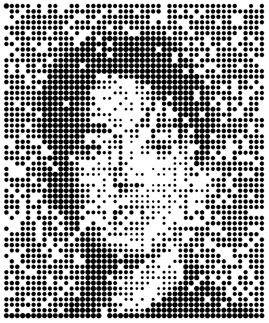
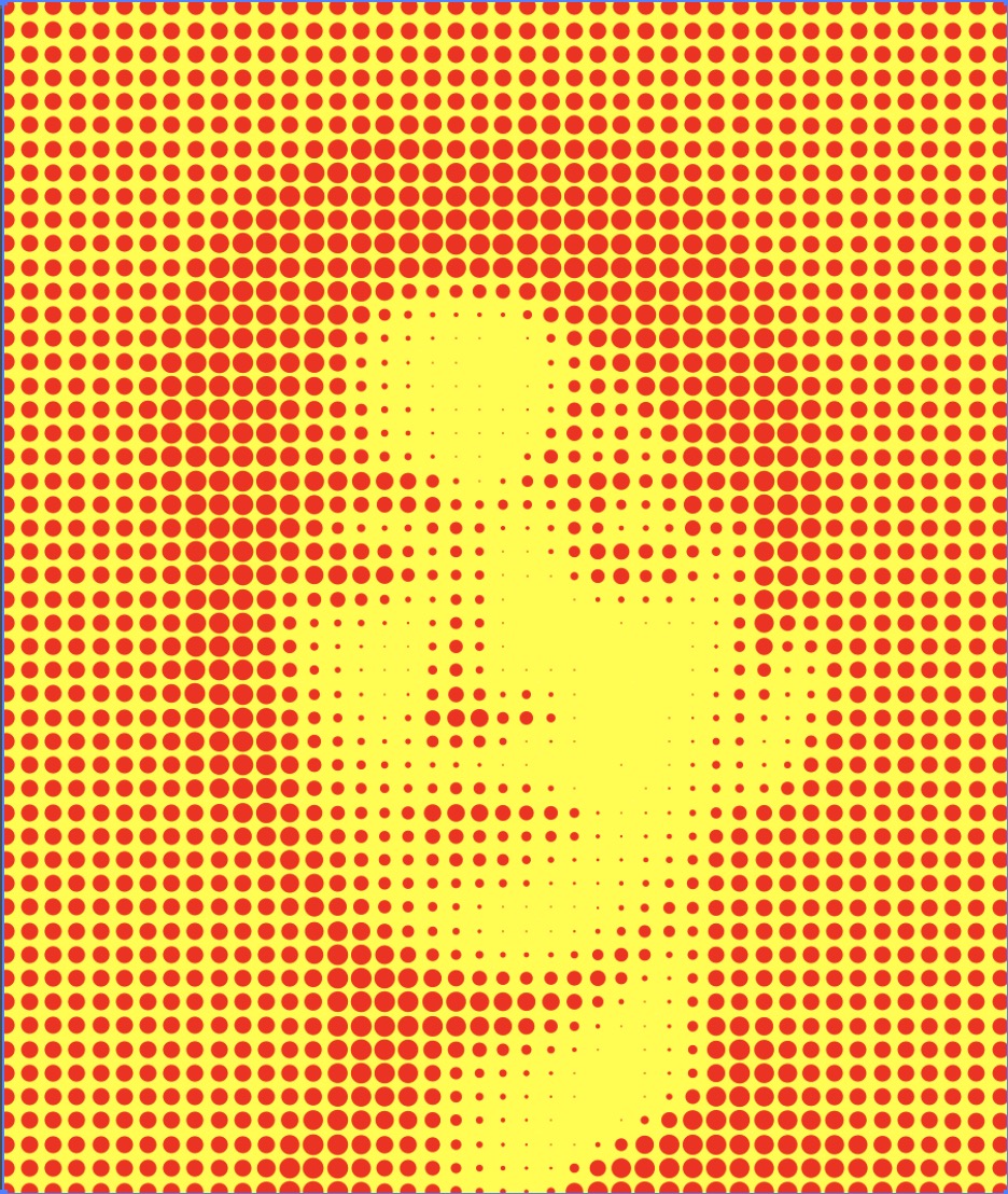
Here are some of the outcomes I’ve achieved through the use of Inkscape and Illustrator halftoning techniques. For Illustrator, I learnt the effects of pixelation & colour halftone through the youtube tutorial by Kim Jong Yoon.
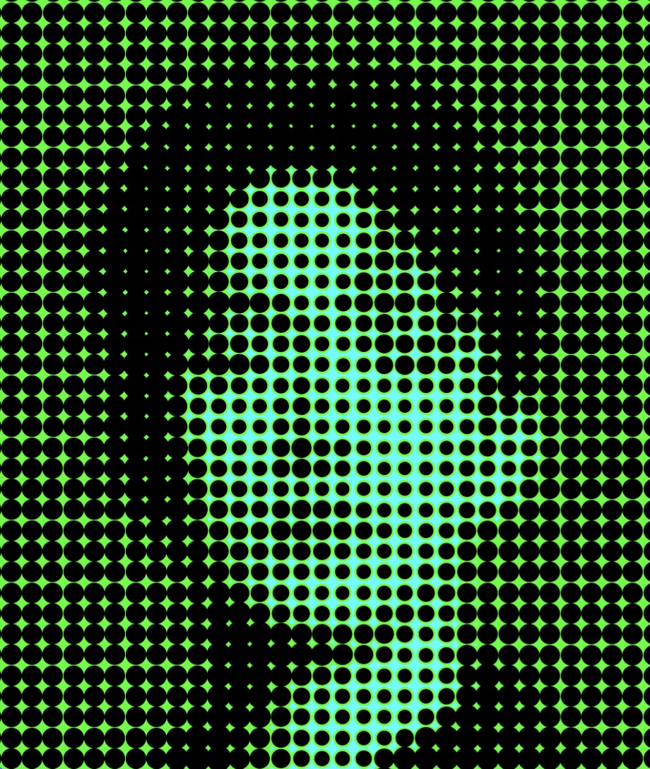
Moving forward, I want to try this halftoning method in terms of identity visualisations, exploring how can I use shapes to represent the personality of the user and create a personality portraiture.
